David Williams & Co. Identity
2025
Designed by Stephen Ledwidge at Chart
Motion Graphics: Cian Ryan
Categories: Identity
Industry: Commercial
Tags: Architecture / Typography / System
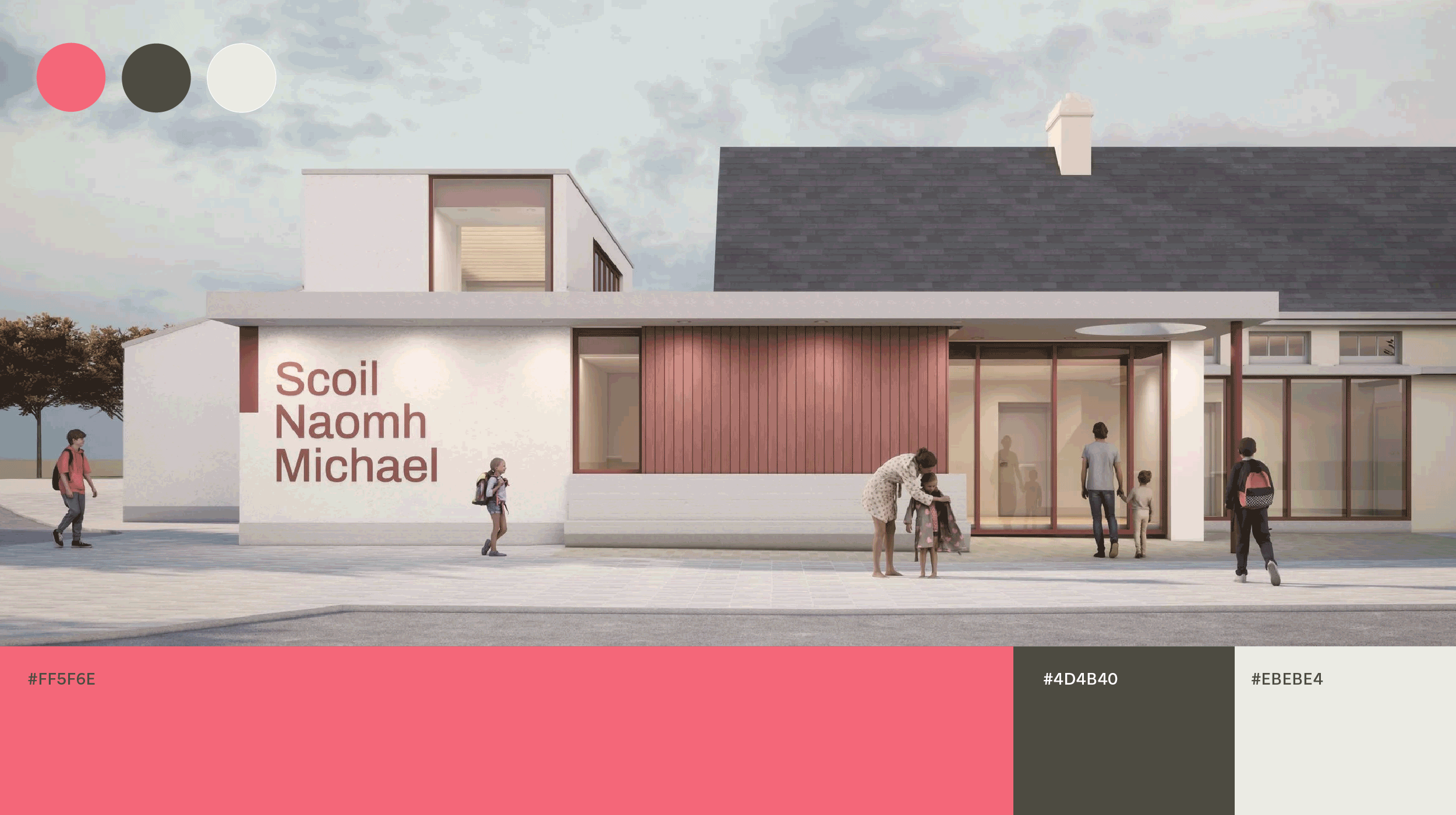
David Williams Architects are an award-winning architectural practice, based in Dublin, that have grown in reputation and scale over the last number of years. As the team expanded, founder David Williams looked to evolve the brand to better reflect the studio’s ethos: creating sustainable, meaningful buildings that positively transform communities and ecosystems. The name no longer captured the highly collaborative and innovative nature of the practice, while a radical change risked diluting their recognition.
We developed a refreshed brand strategy, values, and the updated name, David Williams & Co., signalling continuity and collective creativity. A new identity and flexible visual system to embody adaptability and context-specific design.
The visual identity is rooted in the practice’s values of sustainability and care. A clean, adaptable wordmark reflects its design approach—flexible and responsive to context. The typeface Tenon, from Signal Type, was selected for its balance of precision and warmth. Its geometric structure reflects the precision of architectural design, while its approachable character connects to collaboration.
The colour palette was developed from tones found within the practice’s projects — natural stone, timber, and landscape hues — contrasted with a vibrant highlight colour. A structured and flexible toolkit was designed to enable the identity to be applied consistently across all communications, from proposals, reports and tenders to social and digital.