DCU Office of Student Life
Designed by Scott Burnett and Seán Mongey at Aad
Categories: Identity
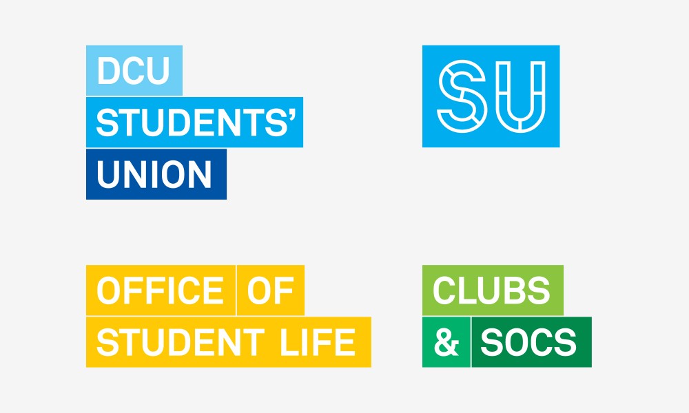
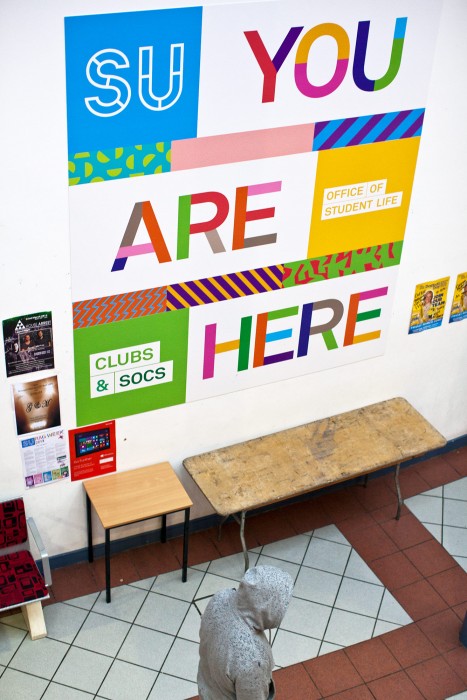
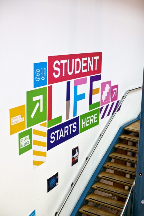
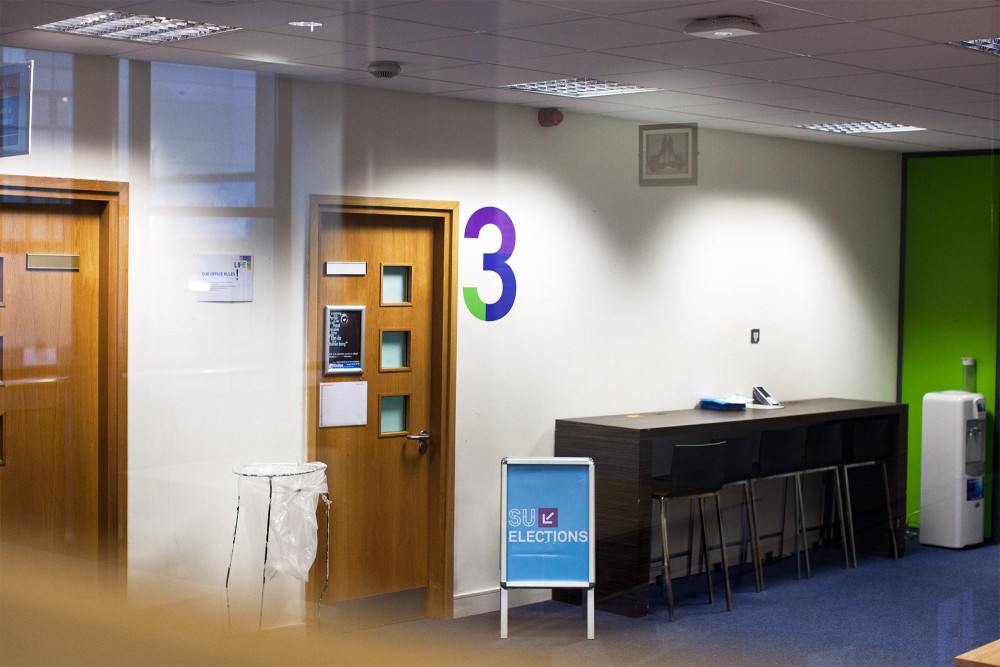
DCU Office of Student Life approached us with a couple of tricky problems. The first was that they’re generally referred to as the Students’ Union or SU, but there are actually 3 organisations who share a space and have distinct remits. The second problem was not only did students not understand the differences and relationships between the 3 bodies they also had no idea where they were, what they stood for or how much they were involved in.
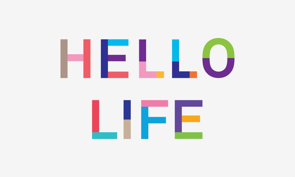
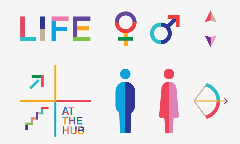
To help them answer these challenges we developed a flexible and fun identity system. At it’s core are simple typographic logos for each body that each use a system of interlocking blocks in different colourways. The visual language bursts into a much bolder, brighter version that they share to communicate about student life and leave students in no doubt as to where they are and how much they do on campus.