DDI Rebrand
Designed by Al Murphy, Elena Stevant, David Stanley and Paula McEntee at Red Dog
Categories: Website / Identity
Industry: Education
Tags: Typography / Digital
Website: dublindesign.ie/
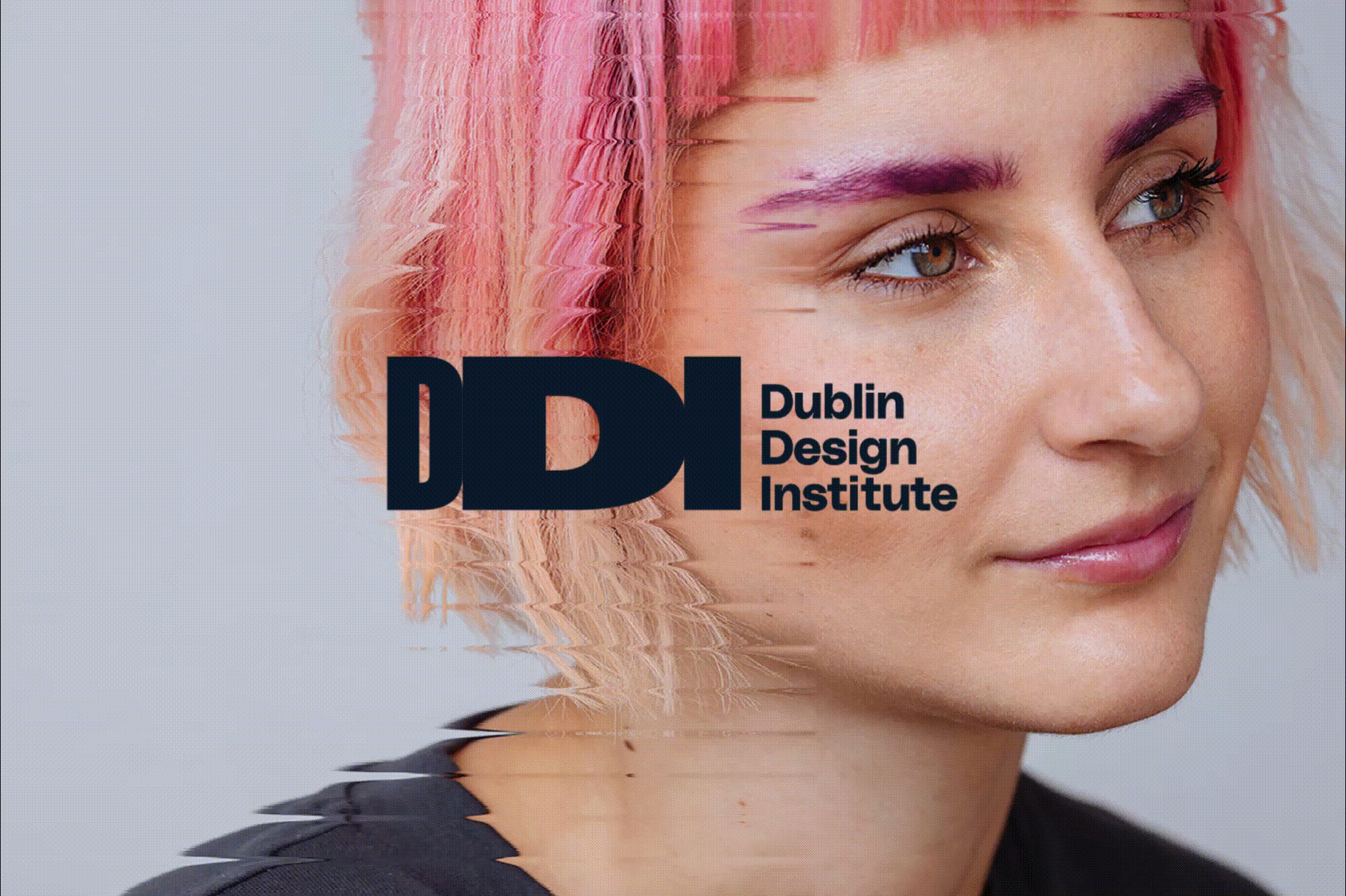
Dublin Design Institute (DDI), a privately owned education institute, has been producing skilled, employment-ready graduates in graphic, fashion, interior and UX design for over twenty years. The Institute has recently strengthened its position by aligning its accredited programmes with QQI standards. To coincide with this, DDI required a brand identity refresh to underline its ambition, enabling it to communicate its courses and the potential it offers to students in an engaging way.
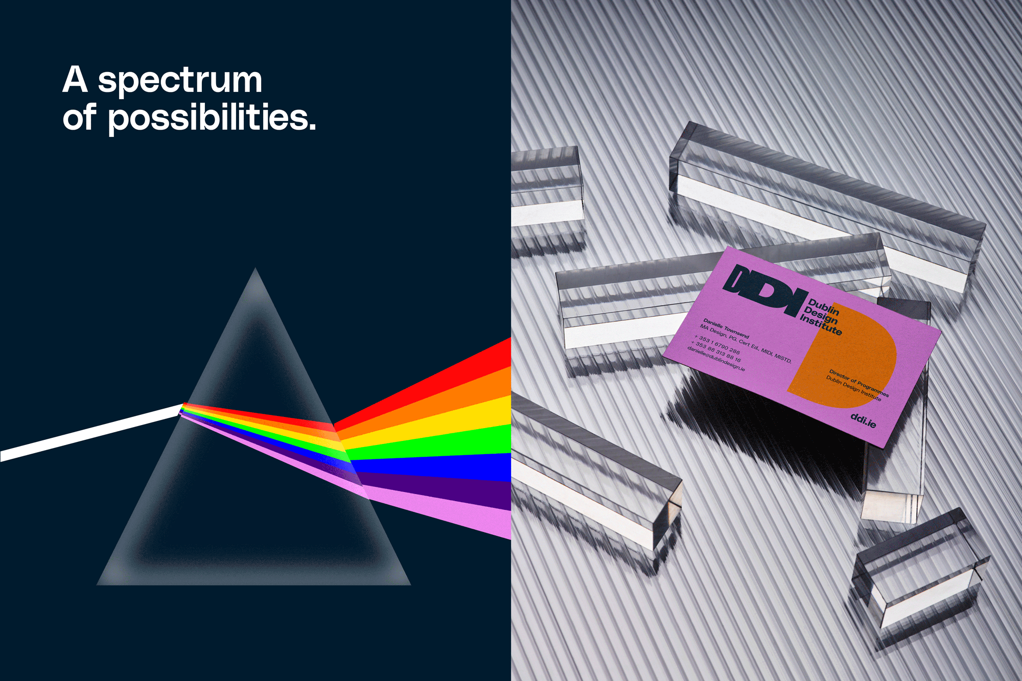
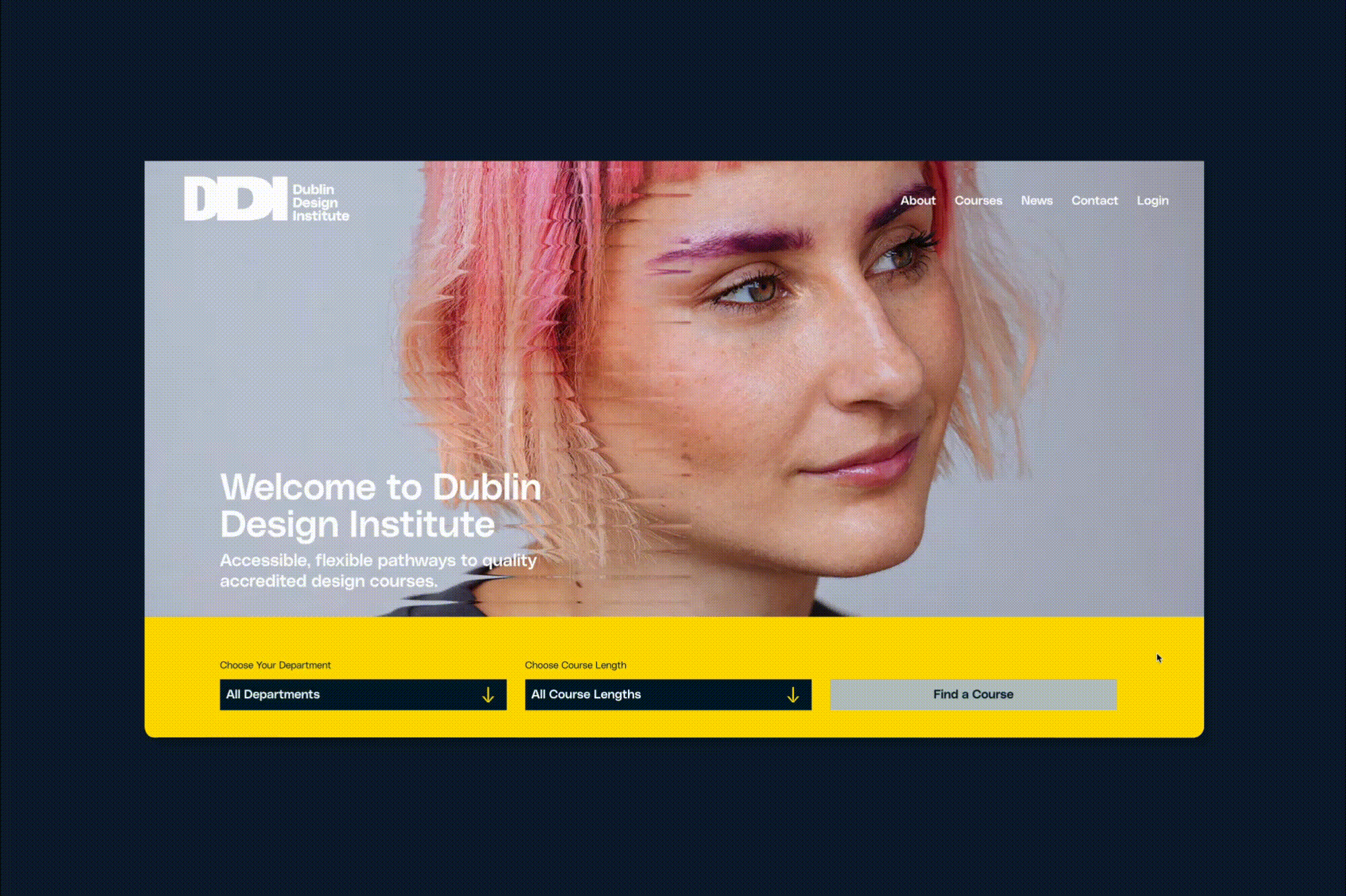
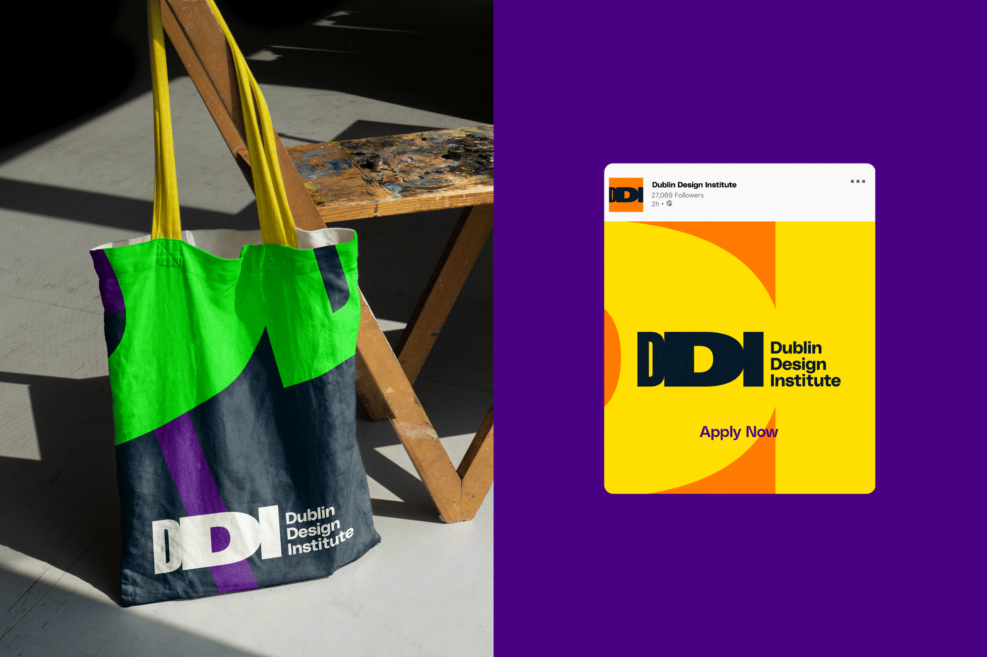
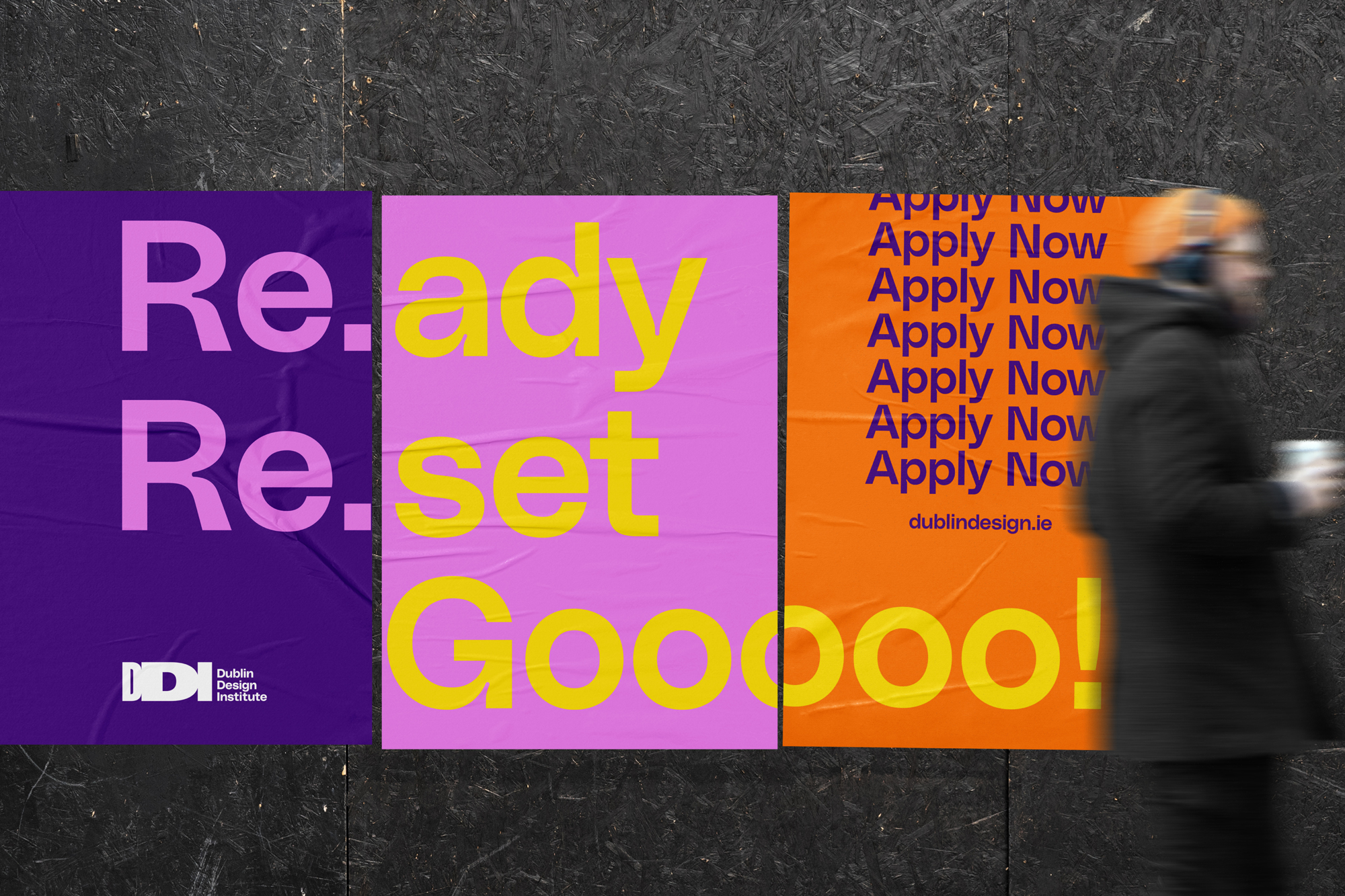
Our creative solution focused on harnessing the concept of flexible, progressive pathways. It features a robust and dynamic logotype and energetic colour palette that was chosen with digital presence in mind. In all iterations of the logotype, the central ‘D’ is always the most prominent as it represents ‘Design’ – the single theme that encompasses the entire enterprise. The concept of dispersion, whereby white light separates into visible colours, informs the brand’s palette and the treatment of the hero images. Upon passage through a triangular prism, white light splits into red, orange, yellow, green, blue, indigo and violet. These colours form the basis of the colour guide system.
The brand’s typeface is PolySans, which we selected for its playful personality, clarity and eye-catching details. The logotype informs the visual language as interesting shapes are used in diverse ways to keep layouts fresh across screen and print. The tagline – Re.flect Re.claim Re.ignite – communicates directly to the student. It acts as an explicit call to action that challenges the reader: reflect on yourself, reclaim your path and reignite your passion.