Debra Rebrand
Designed by Martin Fanning and Paul Guinan
Strategy: Celine Dee
Tone of Voice: Leigh Morrow
Illustration: Ciara Mohan
Digital: David Dowling, Liam Willis
Categories: Identity
Industry: Charitable
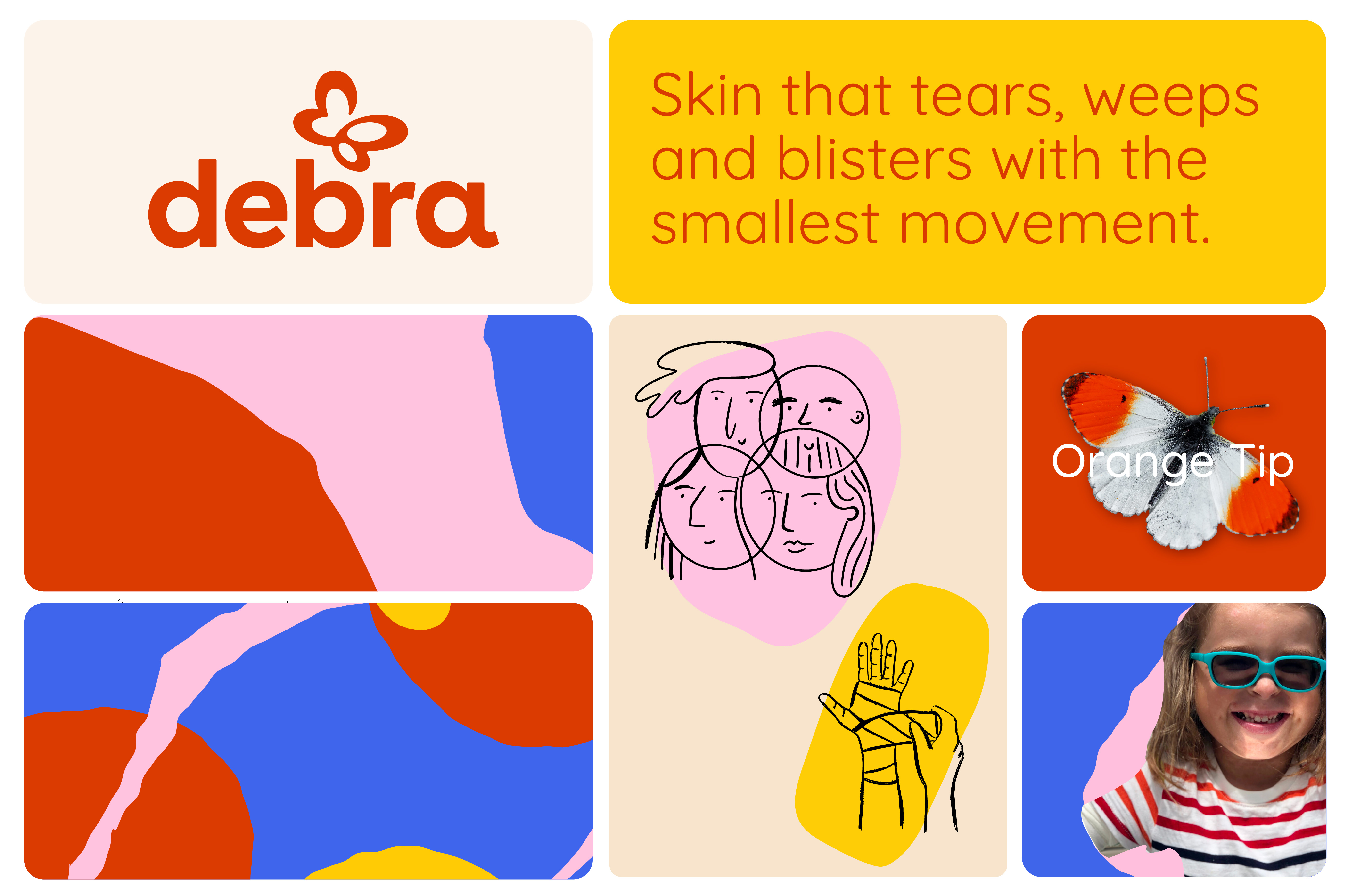
Imagine if your skin was as fragile as a butterfly wing. If it tore apart and split at the slightest touch. If your mornings began with bandaged bruises. If every hug or step ended in stinging wounds, blisters and debilitating pain. What if caring for your child meant inflicting pain with every bandage-wrapped blister or sore? This is the reality of people with Epidermolysis Bullosa (EB), a painful and distressing genetic disorder that affects the body’s largest organ; the skin. A disorder that permeates people’s every day, at every moment, sometimes on every inch of their body.
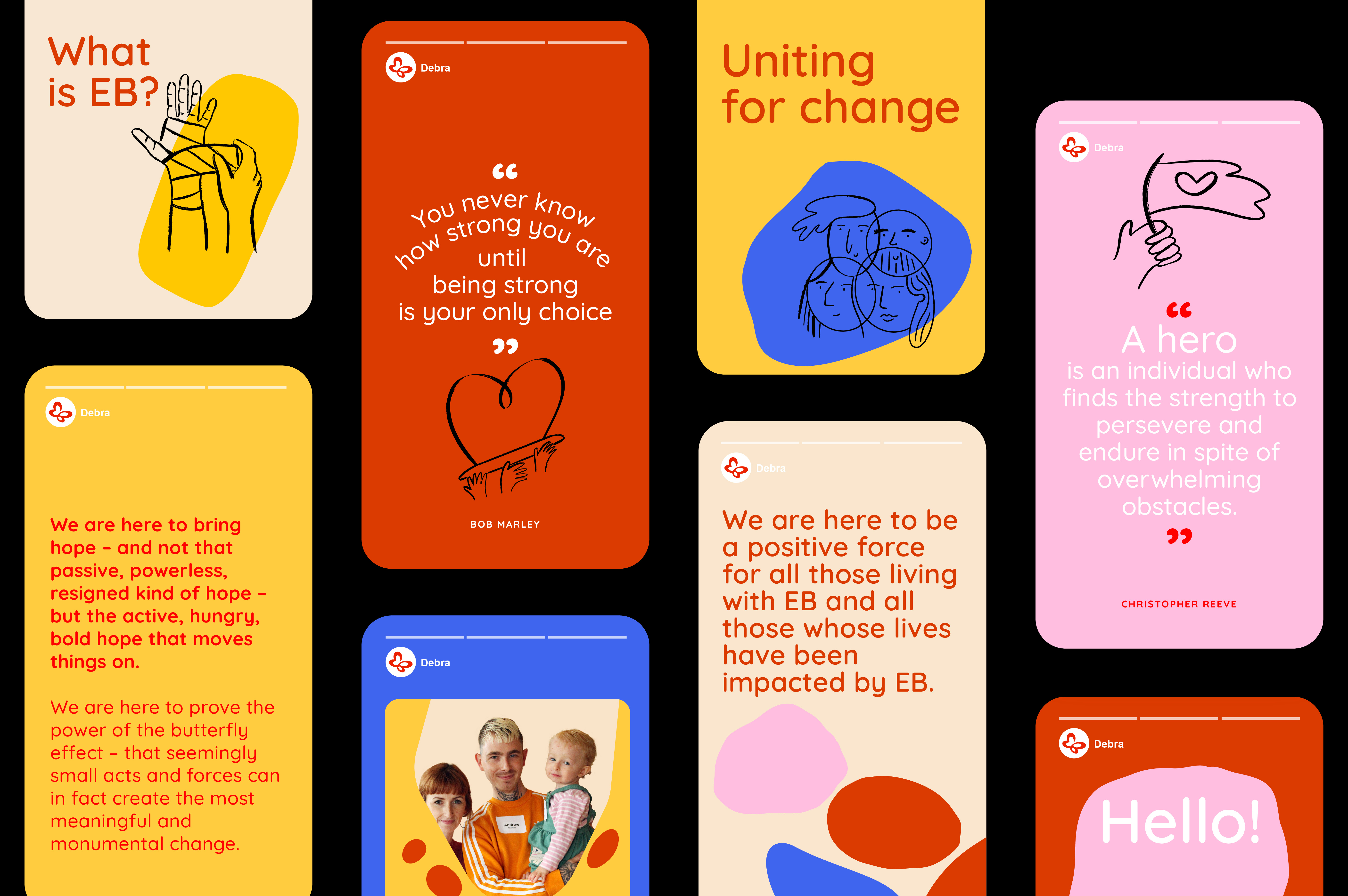
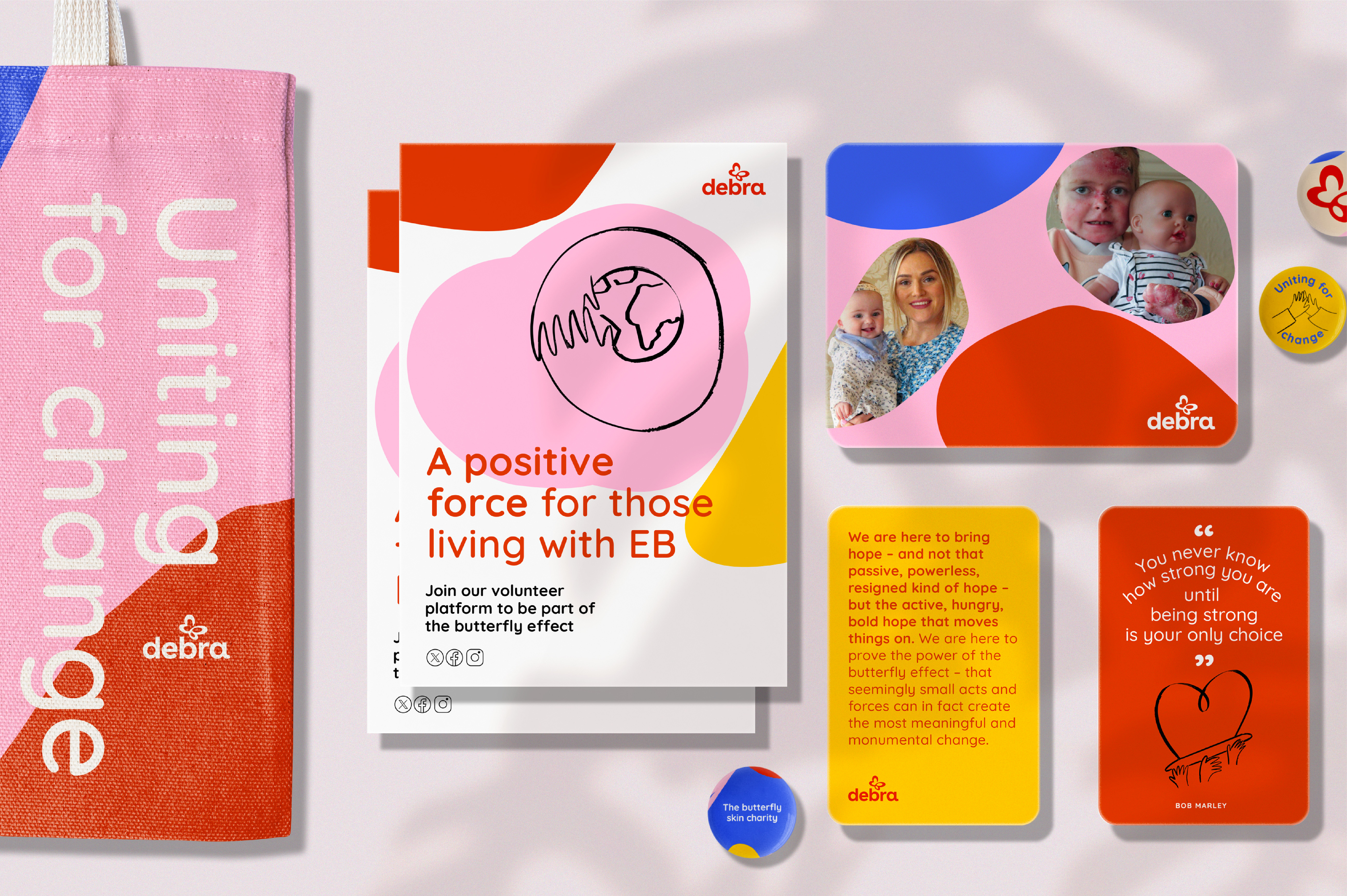
Debra is an Irish charity working tirelessly to transform the lives of those affected by EB. The problem was a lack of awareness of who Debra was or of EB as a condition. Our task was to create a compelling brand to help raise vital awareness of EB and its devastating consequences. Without awareness there is no funding. Without funding there is no research. Without research there is no hope.
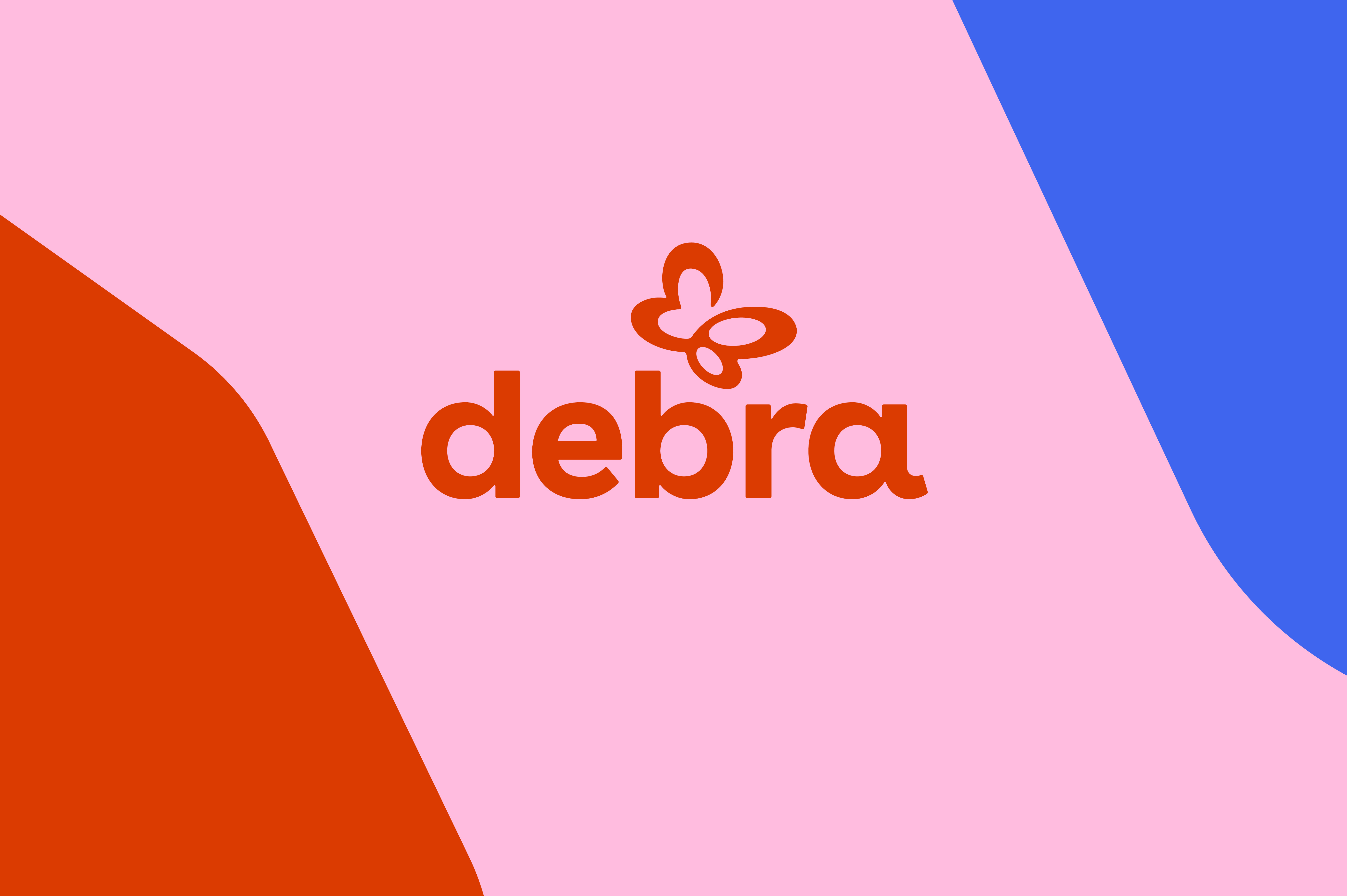
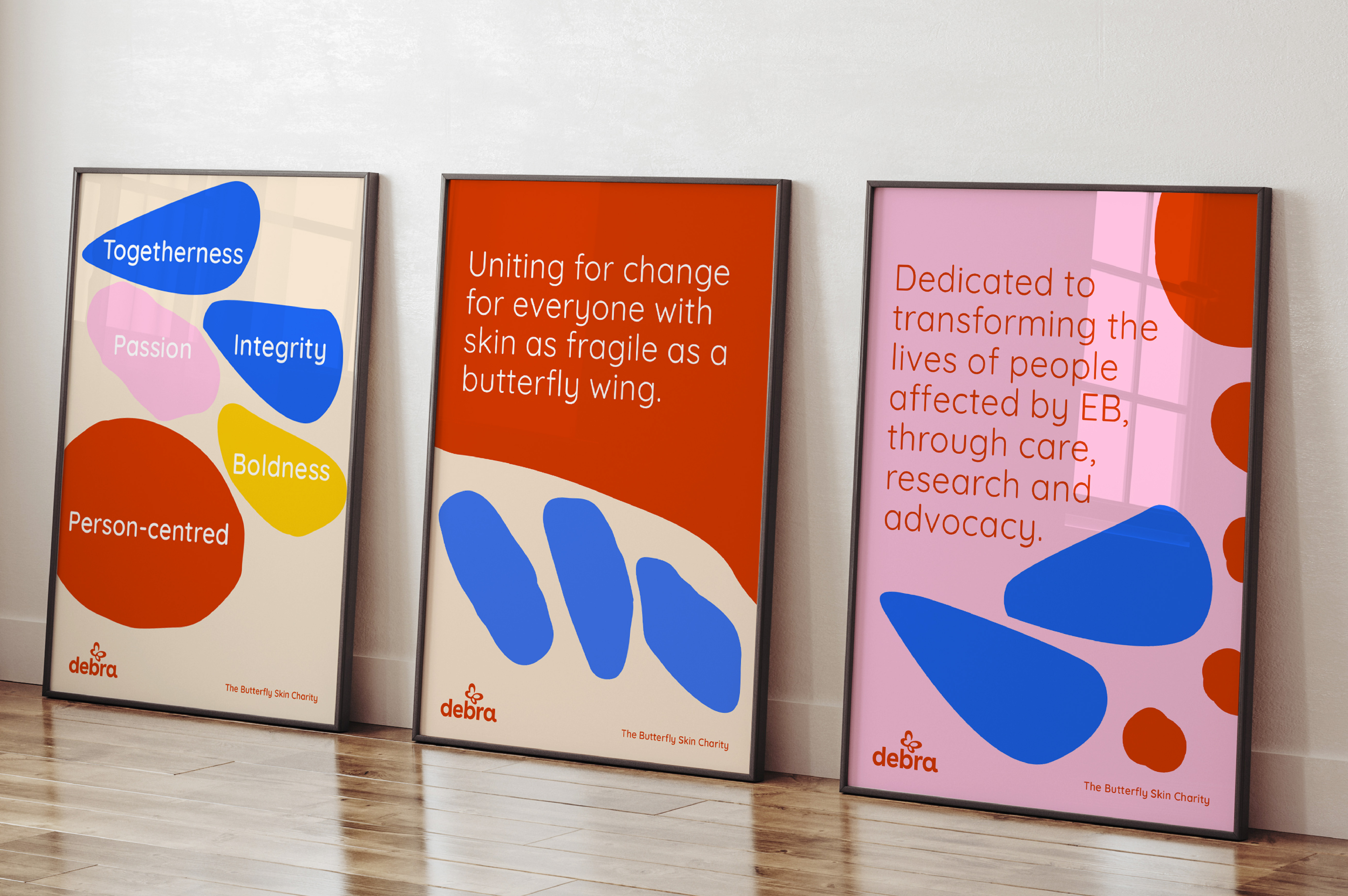
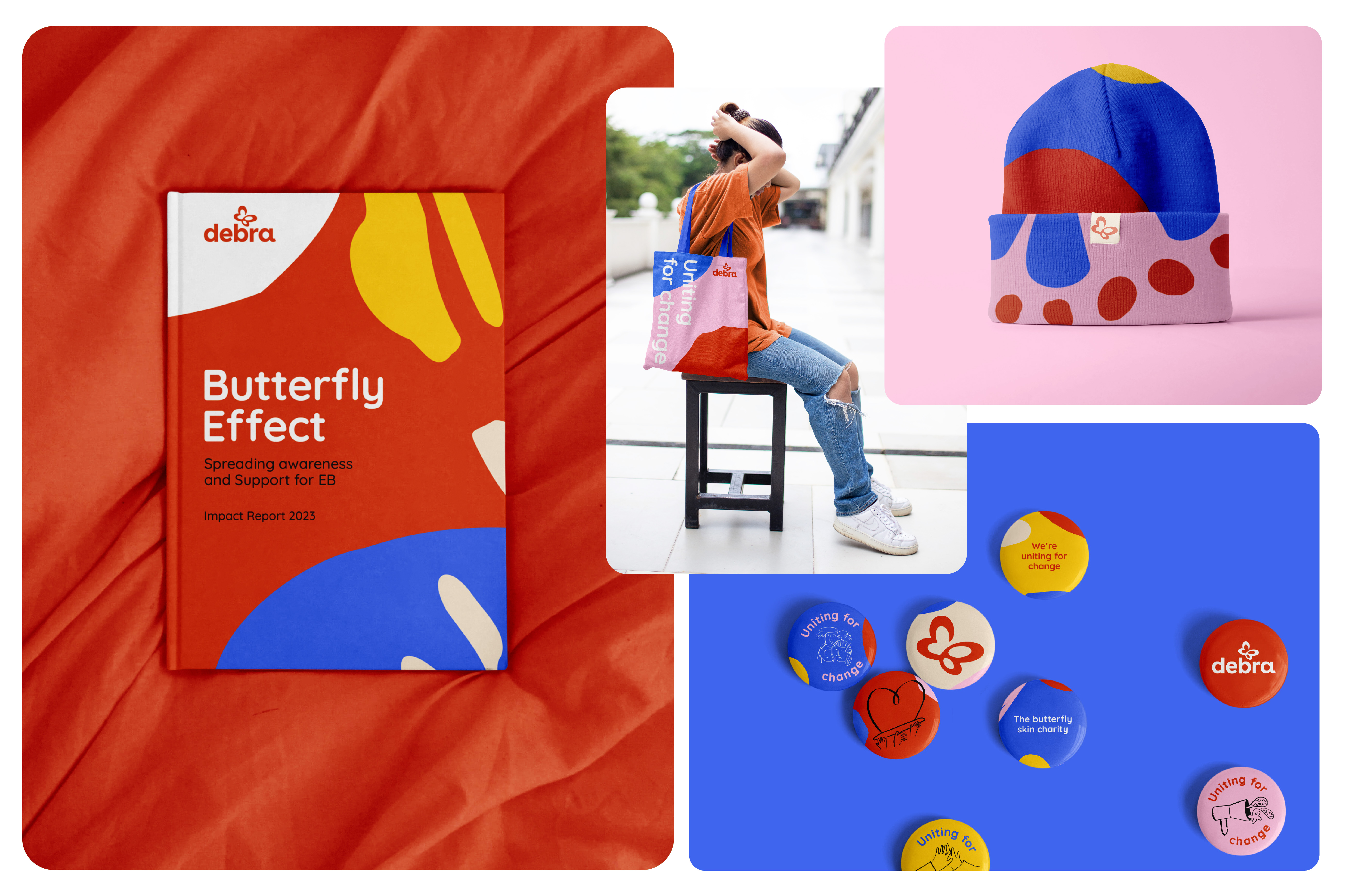
Our new brand was grounded in the power of the butterfly and everything it inspires. Brightness and boldness came into play. Softness came through organic shapes and rounded corners
The new identity is crafted to be strong, vibrant and supportive. Our words were evolved to invite everyone in and spark dialogue. Warmth, reassurance, straightforwardness, empathy and optimism are paramount.
We chose Quicksand as the brand typeface – it’s clean with no sharp edges, but more critically, it is open source and free, an essential consideration for a charity with limited budgets and resources.
Drawing from the intricate patterns and markings on butterfly wings, we designed a bright and colourful palette to represent the 4 EB strains. These patterns also mimic the shapes of skin cells when observed on a microscopic level.
We wanted to move away from sharing the distressing and most intimate parts of people’s lives. Instead we created a bespoke illustration style that allowed us to compassionately convey topics where images may not have been appropriate.
The brand now reflects the vibrancy, passion and hopefulness of the brand, elevating Debra’s incredible work – at every level, uniting for change for everyone with skin as fragile as a butterfly wing.