Dick Mack's Whiskey Packaging and Identity Design
2020
Designed by Eimear Malone and Paul Devereux at anne+co.
Categories: Identity / Packaging
Industry: Commercial
Tags: Food and drink
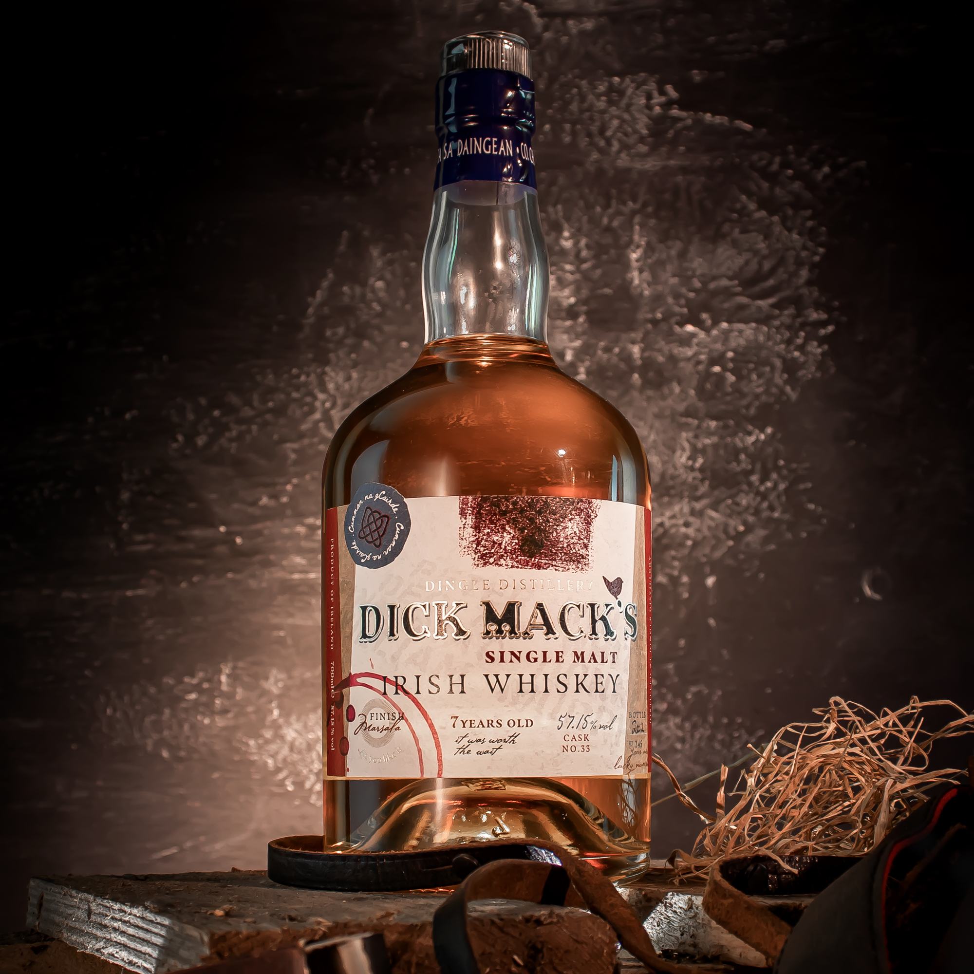
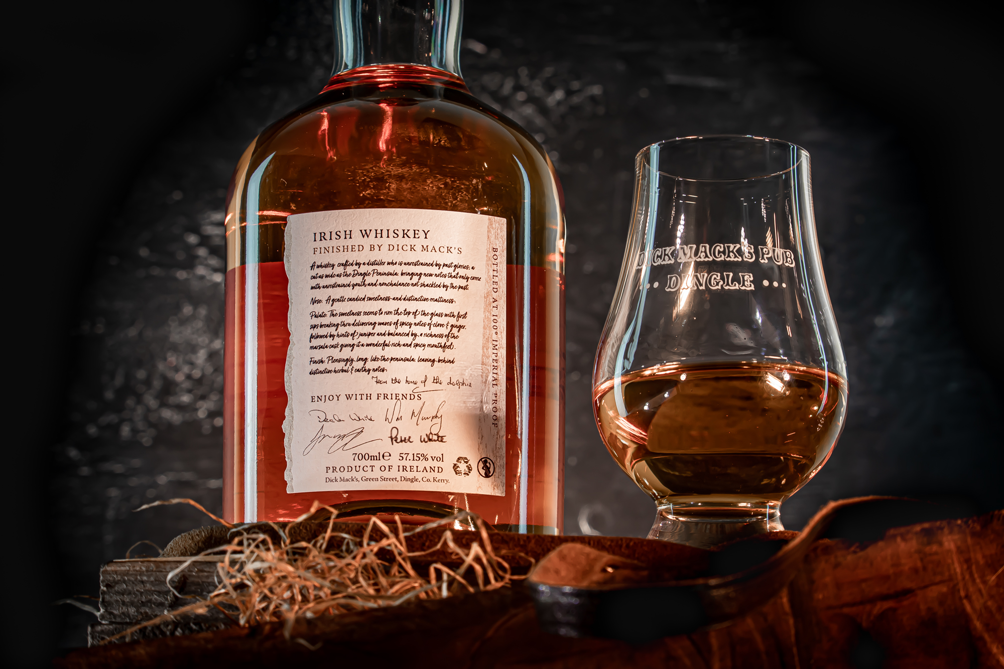
The Mac Donnell family have been serving up liquid refreshments in Dick Mack’s pub, Dingle, Co. Kerry since 1899. As a dual-function pub you will find beer and a fine selection of whiskeys on one half of the bar, and a leather shop on the other. Visitors near and far come to absorb the atmosphere of this unchanged Irish pub.
In recent years, they have won Munster and overall Irish whiskey bar of the year for 2014, 2015 and 2016. Expanding on their winning streak, Dick Macks released their first whiskey bottling in 2020. We worked alongside them to design and curate the story and the look & feel for the packaging.
It was crucial that we encapsulated the unique character of this Irish pub within the label. Steeped in history, Dick Macks has been described as, “stepping back in time… doing things that have been done 100 years ago”. Taking inspiration from this, we wanted to capture the new and fuse it with old, making consumers feel like they were sitting in the iconic Dick Macks when enjoying their whiskey.
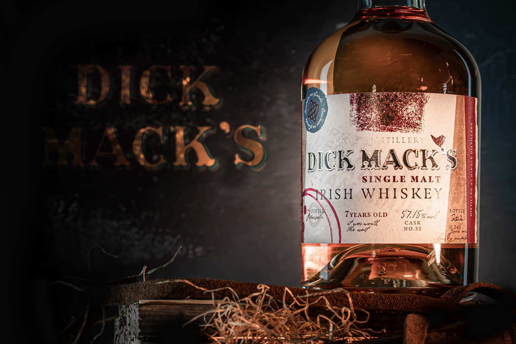
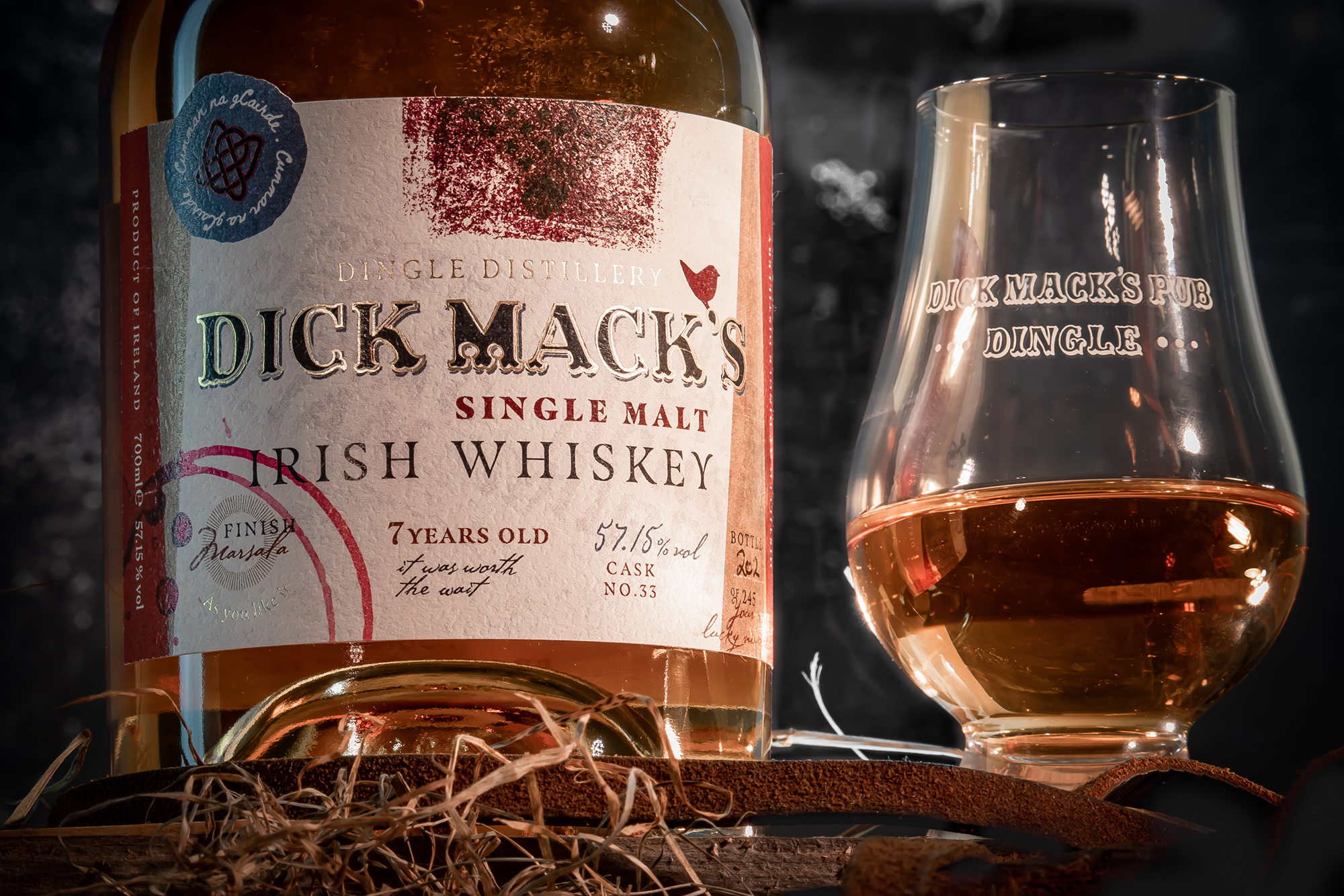
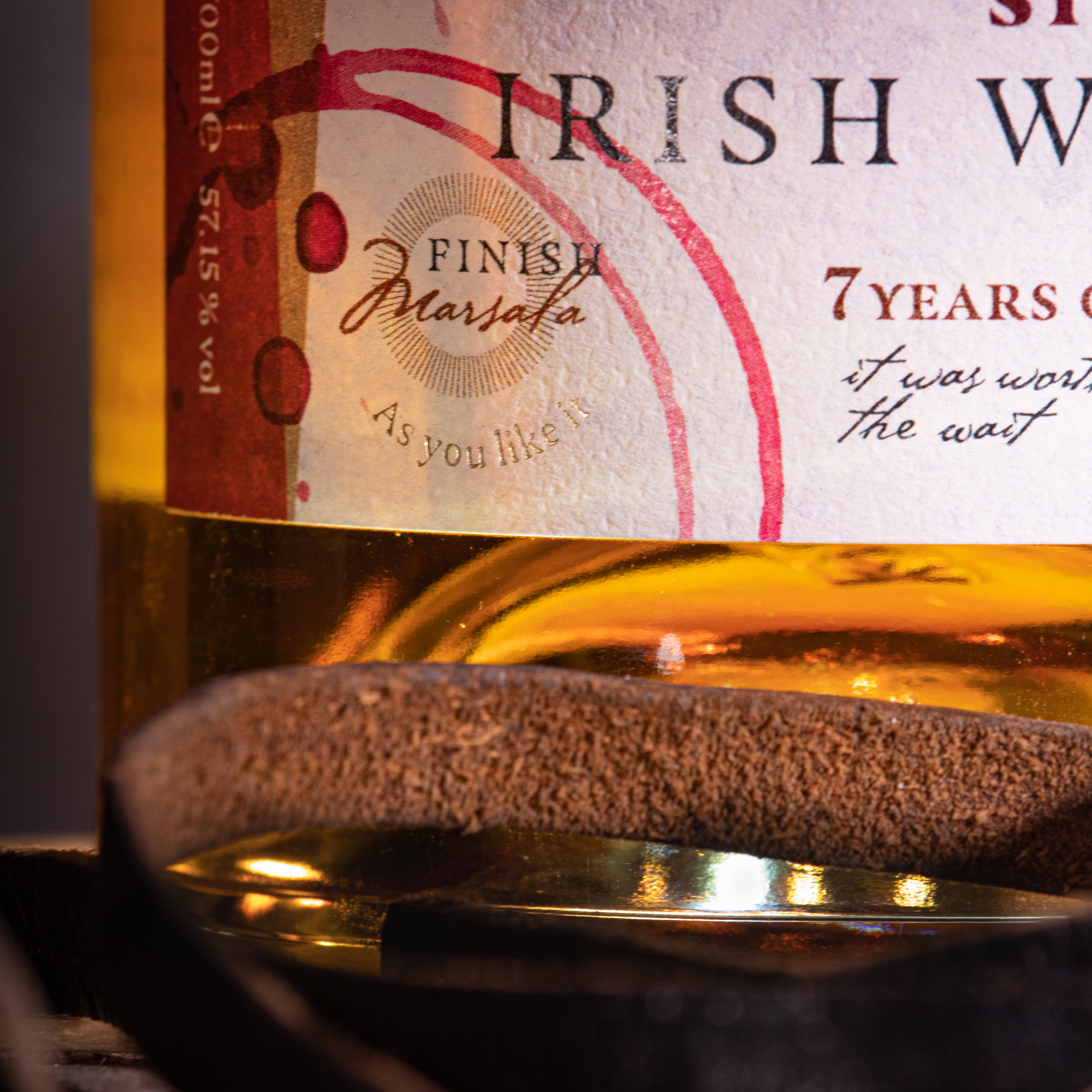
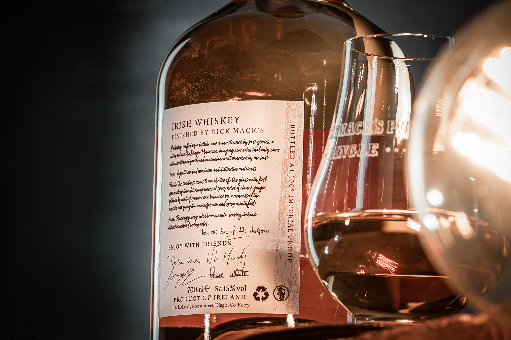
The red bands of colour on either side of the label are a nod to the red doors that you pass through when entering the pub. The texture on the label is an etching that we took from the well worn wooden bar top in the pub (we got some strange looks from the locals). The wine splashes on the label signify the Marsala cask finish used for the whiskey and allow the consumer to easily visually recognise the influence of wine in the tasting notes.
Founded by Finn, Willy, Declan and Peter, incorporating friendship was an important consideration for the packaging. This symbolises the friendship of the founders but also the friendship shared with those who enjoy a drink of whiskey together at the bar. The essence of this friendship was visually communicated by creating a custom stamp embedded in the Irish language. This stamp reads ‘Cumann na gCairde’ (Irish for the Society of Friends).
Limited to just 245 bottles (which sold out within a couple of days), a friendly message “your new lucky number” was incorporated into the design to highlight that each bottle is uniquely numbered by hand.
The label needed to be old style with Irish influence without being cliché, the result was a strikingly unique whiskey which mirrored the atmosphere that greets you when you step into Dick Macks. Each individual element was intentionally designed and thought through to achieve this. Keep an eye out for more to come from Dick Macks…