DigitalWell: Communication without complexity
2022
Designed by Lisa Clarke at Rowdy Studio
Categories: Website / Identity
Industry: Corporate
Tags: Illustration / Digital / Icons
Website: digitalwell.com/
DigitalWell, formerly Welltel, is a leading enterprise communications group, sitting at the intersection between behemoths and middle-market players.
Since 2007, Welltel had expanded to over 230 employees servicing over 3,000 clients—with a product and services portfolio that spans the digitisation journey of its clients. Its fast growth is fuelled by a strong track record of delivering excellence.
Following its successful period of M&A, the time had come for a strategic approach to effectively market its growing portfolio and create a unified presence. Its ambition: to be recognised as a trusted market leader in enterprise communications, delivering secure collaboration and customer experience internationally.
A new, compelling brand was needed to stand out in a space traditionally dominated by old-style heritage utilities, localised arms of global players and start-ups. A refreshed name, identity and experience were essential to unlock this growth while remaining united in purpose as a team.
Smart people, not just smart tech
Welltel’s brand needed to from a product to solutions-focused offer, enable seamless future acquisitions and build a unified presence that will stand the test of time.
Its challenger positioning – built around smart people, not just smart tech – is ‘the Founder’s Mentality’.
From this positioning, we developed a new name: DigitalWell. The name connects the company’s digital service offer with the source of value, alongside connotations of getting things done thoroughly.
Digital with added human
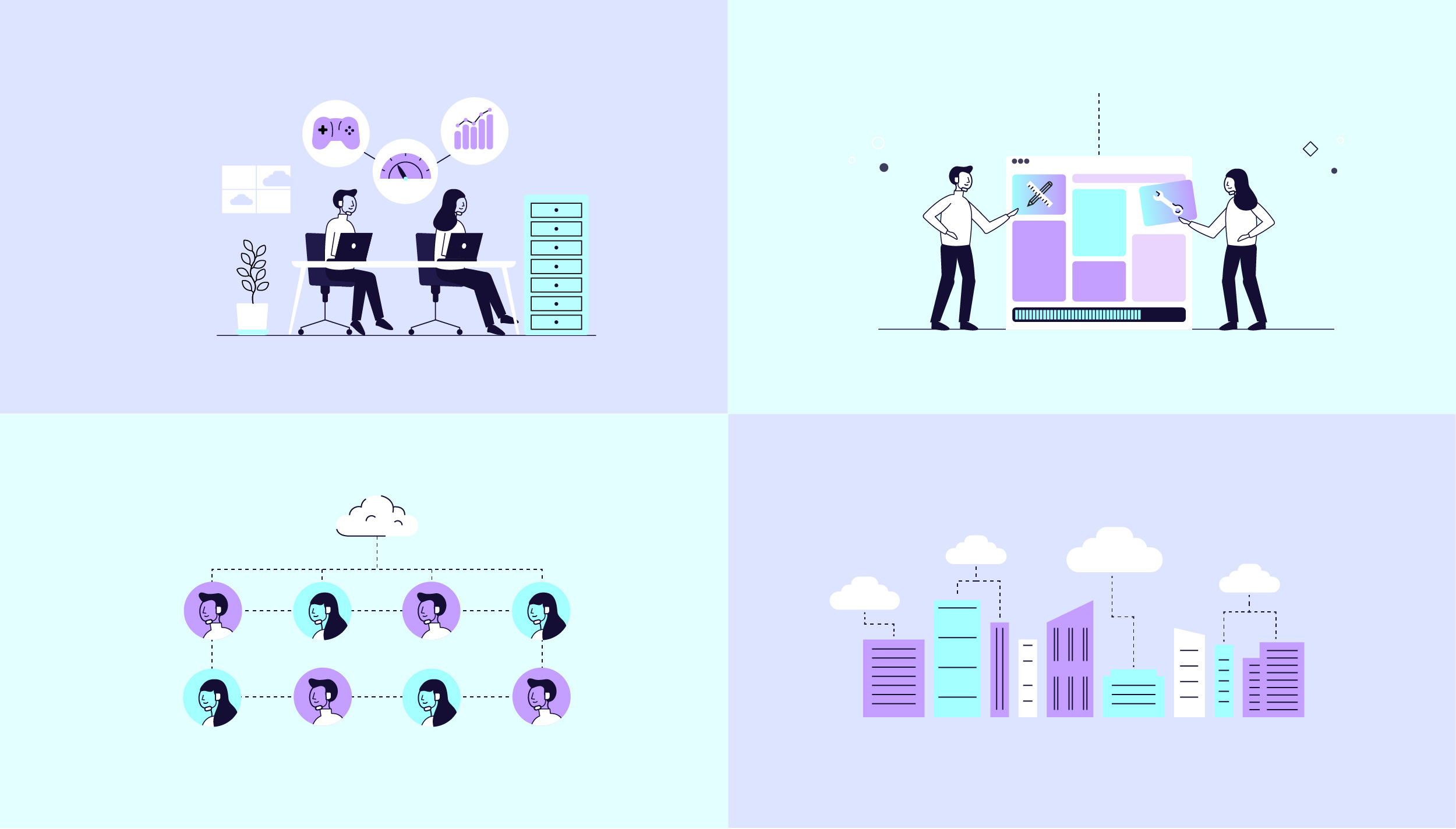
The brand identity needed to be smart, ambitious, imaginative and modern. It is centred around the concept of customer centric, frictionless efficiency – made possible by a team of the best experts in the business.
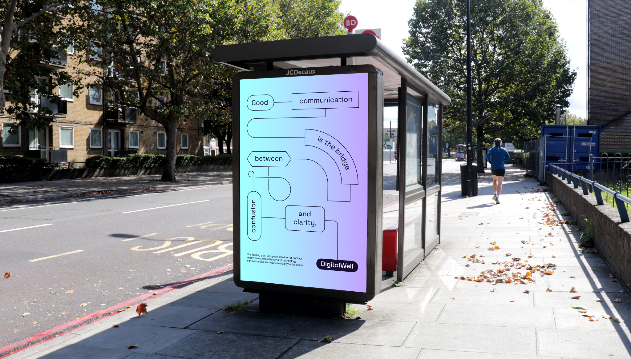
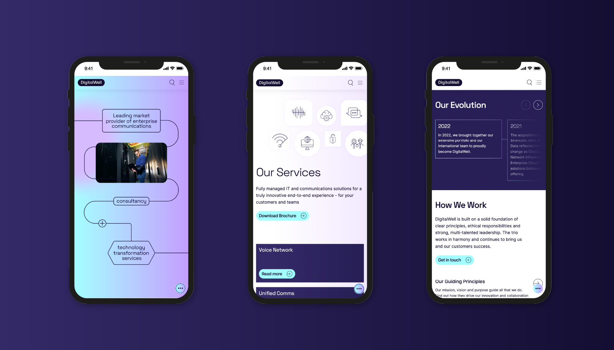
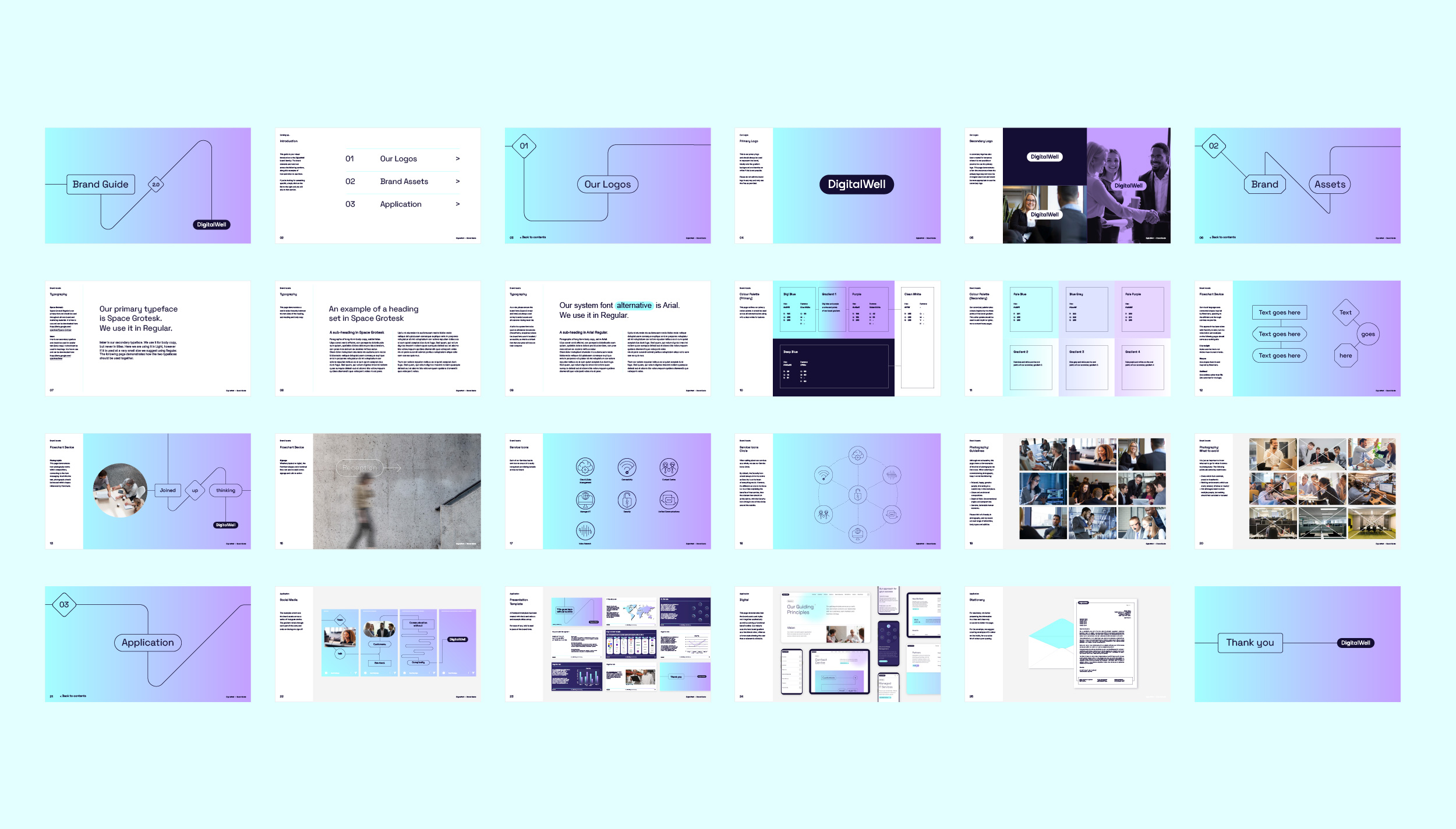
The flowchart visual device brings tech to the fore. Juxtaposed with photography that showed people engaged with technology to reinforce its client centric approach to delivering digital solutions.
The new brand language balances people and tech. Simple phrasing reflects the effortless experience of working with the specialist and integrated DigitalWell team.
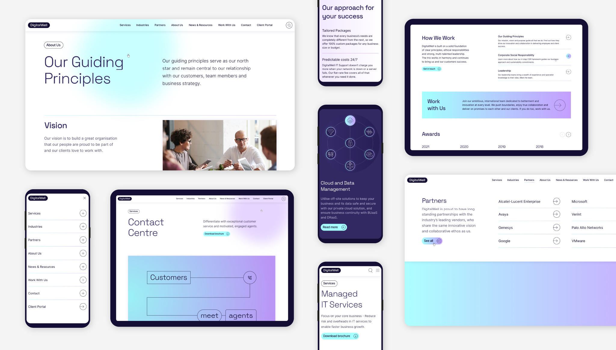
Iconography clearly signals DigitalWell’s different service offers. The brand colours are bold and vibrant, while the use of the gradient stands out in the sector and provides an eye-catching device for use across digital applications.
A joined-up experience
We implemented the new brand across core materials including motion, key templates, and stationery, with clear direction provided in a set of comprehensive brand guidelines.
From here we were invited to continue to partner and develop DigitalWell’s new website, to act as a powerful cornerstone for the brand in a digital space. Working in close collaboration with the DigitalWell team, we created the website—from site map and wireframes through to specialist technical copywriting support, User Interface design and build.
The brand comes to life on the website through a frictionless user experience, clear CTAs, an easy-to-use CMS, accessible design and SEO optimisation. The result: a visually stimulating and effective lead-generation platform that communicates without complexity who DigitalWell is today.