Dublin Airport
Dublin Airport means many things to many people; we are a gateway to Ireland and to the world; for business and for tourism, for holidays and connecting with loved ones near and far, or for many of us, a place where we work.
Dublin Airport is the first and last impression of Ireland and our identity looks to capture the many facets of Dublin Airport.
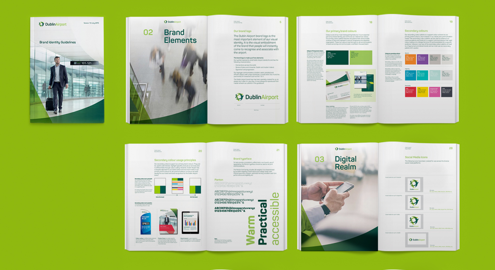
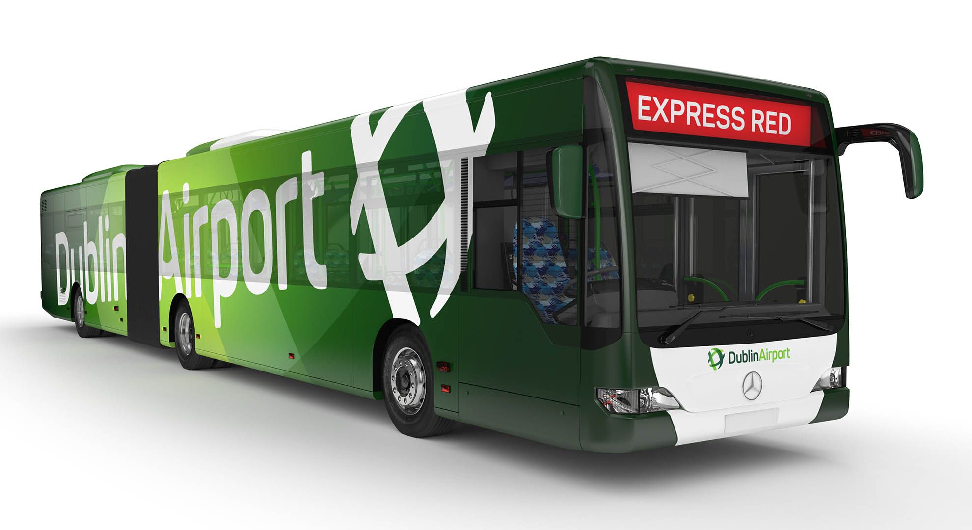
The brand logo is made up of two elements. Our symbol which represents what Dublin Airport stands for. It has characteristics that reflect connections across the world, a sense of place and character; Dublin and modern Ireland, dynamism and progression. The logotype communicates a modern, warm, practical and efficient airport with unique attributes; a smile within the ‘A’ and the partnership of characters such as the ‘r’ & ’t’.
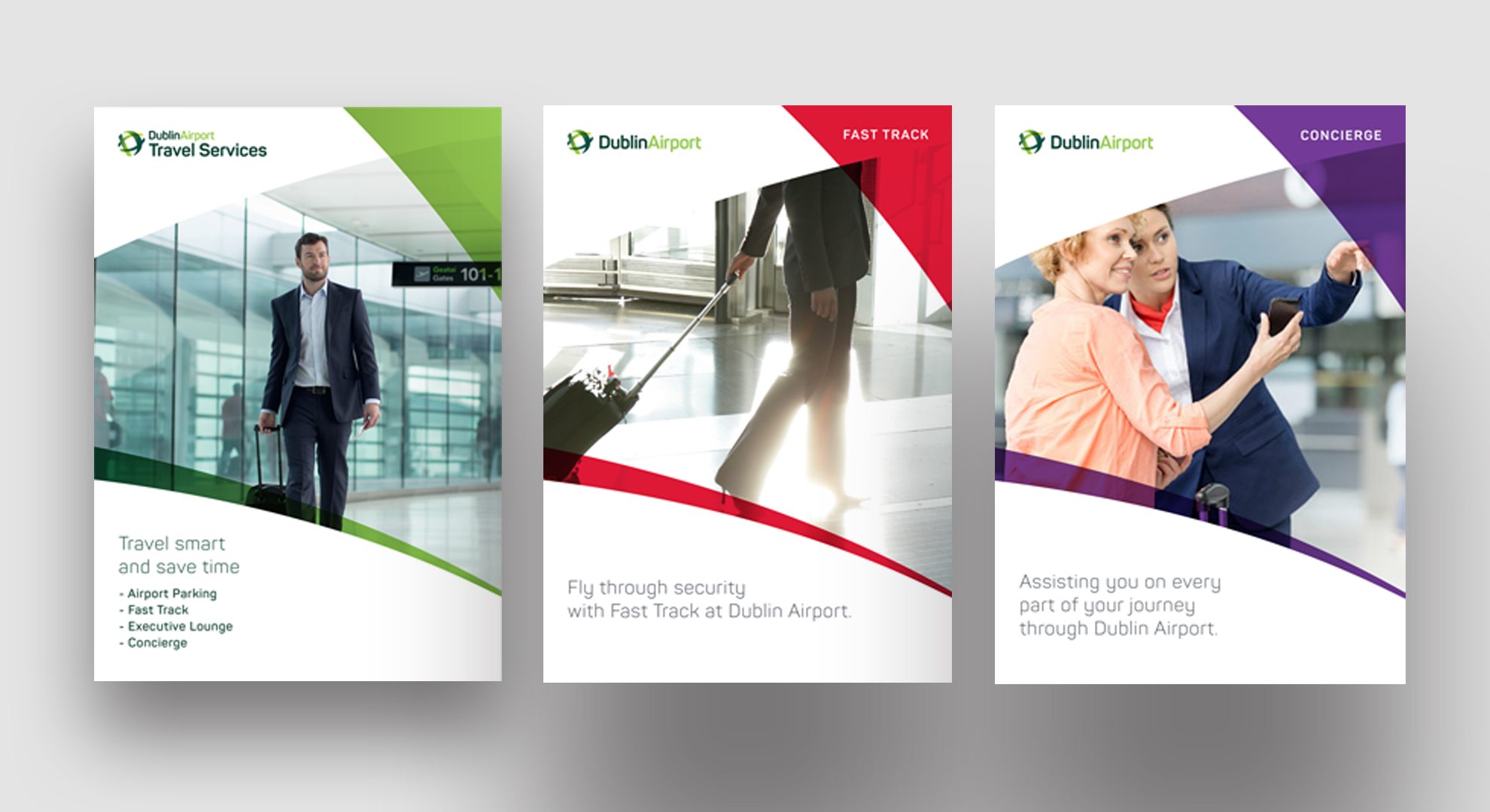
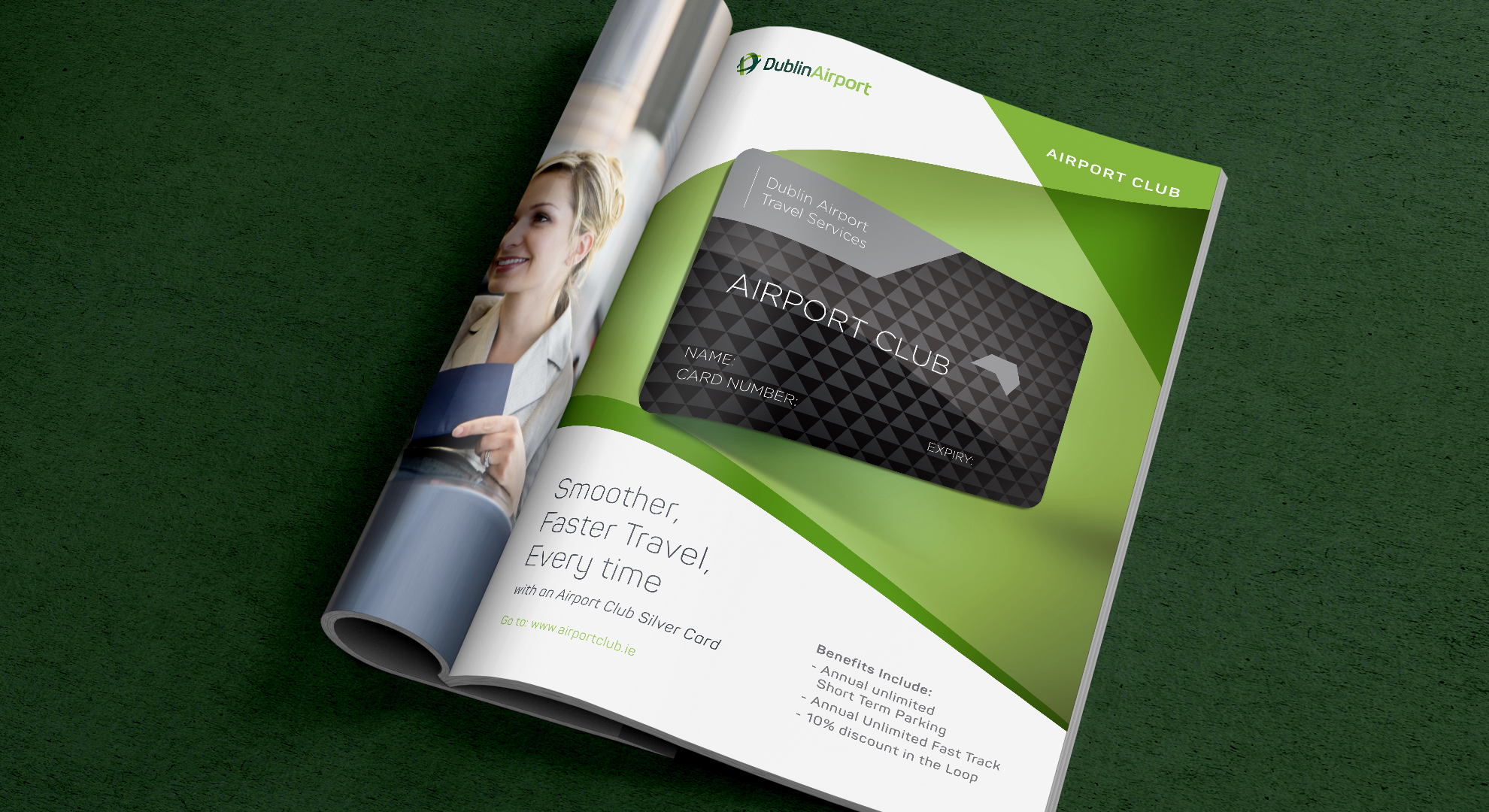
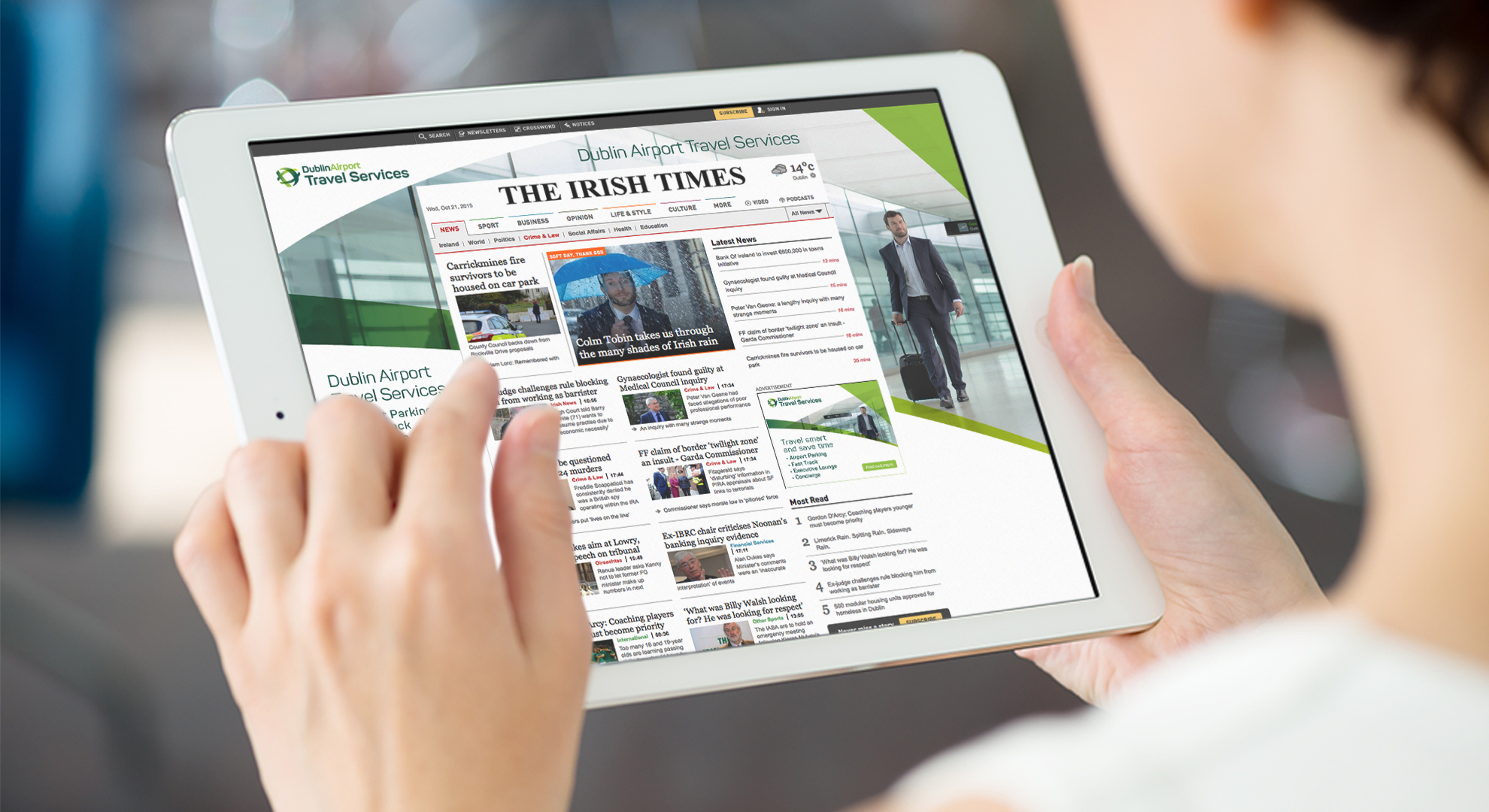
The new brand identity delivers a new focus for Dublin Airport whereby all products and services unite under a unified master brand. Having been largely invisible from its own campus, the new identity has become a catalyst to rethink the physical environments and brand experiences and focus on creating an enhanced customer journey. When tested in research our solution out performed the brand criteria reinforcing a modern, international, innovative and friendly airport.
We adopted a highly participative and inclusive process, which ensured diverse stakeholders were involved from strategy through to research ensuring buy-in at every stage. The new brand identity, brand architecture and creative expression broadens the conversations that Dublin Airport can have with its many audiences allowing the brand to stretch into new interesting and innovative areas. As the brand is implemented our role includes establishing guidelines, brand guardianship, product naming and the realisation of brand communications.