Dublin Fringe Festival
2013
Designed by Eleonora Bigi at bigO
Copywriter : Ian Lamont
Art Director: Karl Davis
Producer: Miriam Fayne
Creative: Jane Lawrenson
Photographer: Myles Shelly
Project Lead: Ricky Harris
DOP: Braun Junior
Editor: Enda Rowan
Assistant Photographer : Adrian Wojtas
Composer : Dunk Murphy
Categories: Editorial / Print / Publication
Tags: Photography / Festival
Website: bigo.ie/portfolio/dublin-fringe/
The Good, the Bad and the Brave
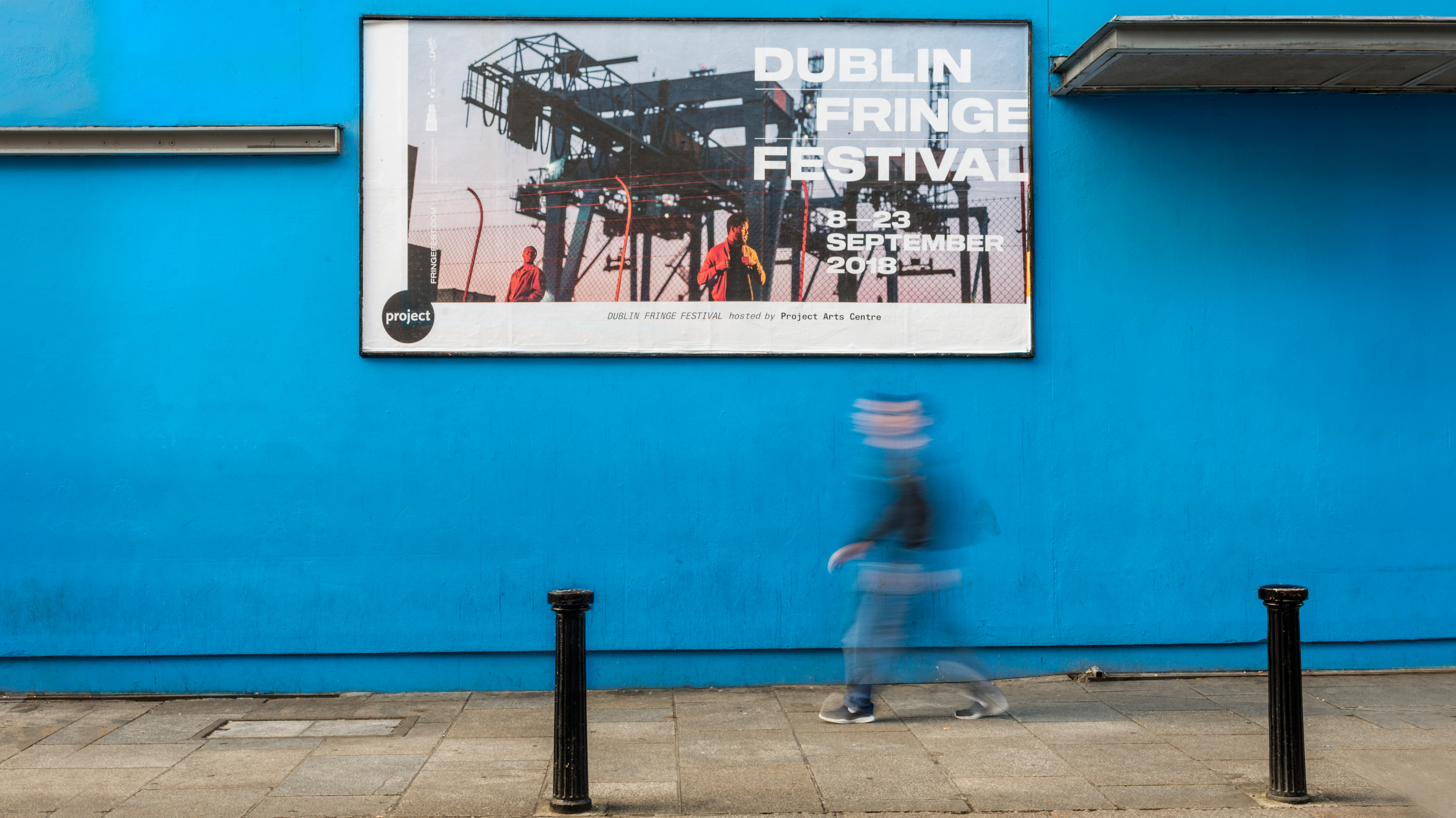
Dublin Fringe Festival is a name synonymous with bold ideas, brave performing arts and adventurous audiences. Drawing more than 30,000 spectators over the course of 16 days and nights, each September, the festival is a spectacle of firsts where the city becomes the stage and all who participate can escape the ordinary and expect the unexpected. Of course, when you’re dealing with a festival so chock full of bravery, brilliance and boldness, a launch campaign needed to be devised that was as adventurous as the programme it promoted.
Things Ain’t Always As They Seem…
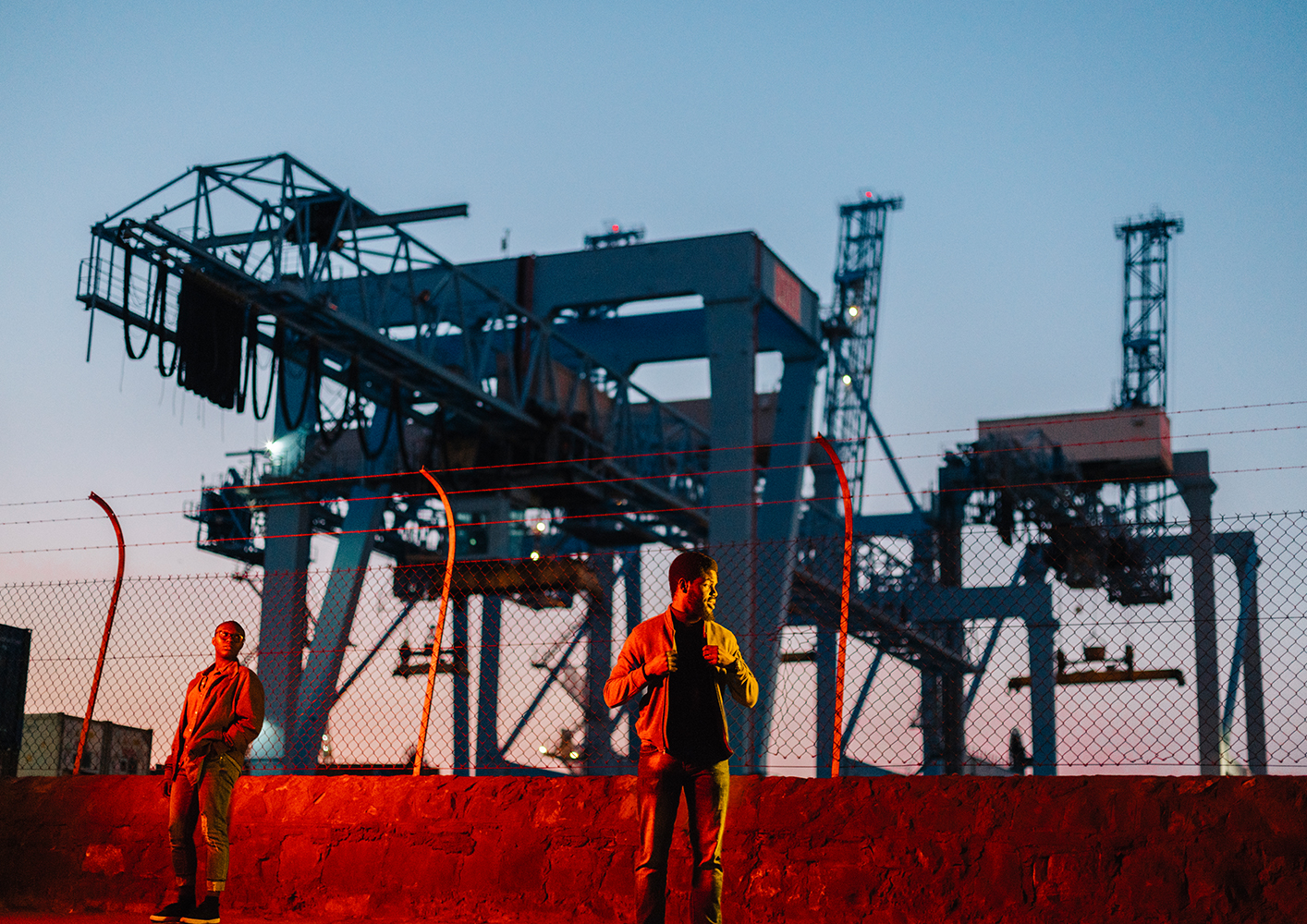
When it comes to all things Fringe, subversion is the name of the game. After all, the performers might be having a laugh but they certainly aren’t messing around. And neither were we. Using the physics term ‘Interference Fringe’ – “any of the light, dark or coloured bands produced by diffraction or the interference of light” – as a theme we explored how light, colour and refraction could be used as a means of interfering with or disrupting the ordinary. So literally we invited the viewer to look at things in a different light. Sprinkle with a little of a ‘Dublin Disrupted’ concept to illuminate and distort the darkest, oddest corners of our surrounds and you’d almost baked yourself a campaign.
Of course, the art needed to come first so we pushed the people who made it to the forefront. The absolutely amazing and talented Thommas Kane Byrne, Dagogo Hart + Felicia Olusanya and Liv O’Donoghue were chosen as upcoming artists whose work represented the scope the diversity of the programme. Using the talented lense of photographer Myles Shelly and our own not-too-shabby production team, we wanted to show how bringing disruptive and challenging ideas out of the shadows is a valuable pursuit.
There needed be a sense of independence and mischief, a change of perspective and a gritty, urban and slightly seedy feel. Then – because we enjoy a challenge – we set ourselves the mighty task of creating not ONE but THREE different covers, shot panoramically in a folded triptych.
During the photography shoots we also captured footage of the artists. This, combined with epic aerials, desolate shots of Dublin and techniques such as light diffraction, paint flares and some post production magic, combined to create a teaser video that really packed a punch.
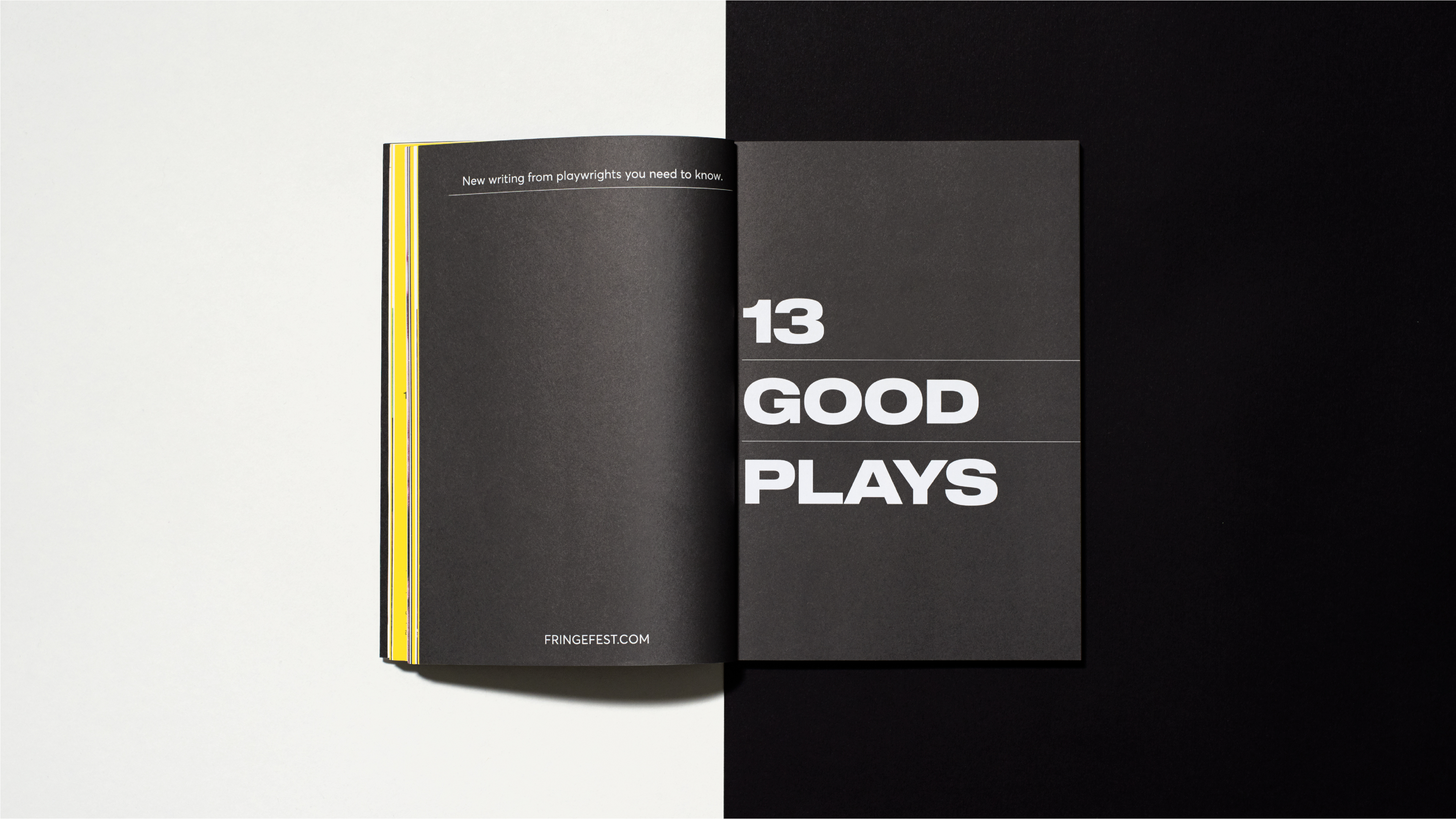
Making Words Work
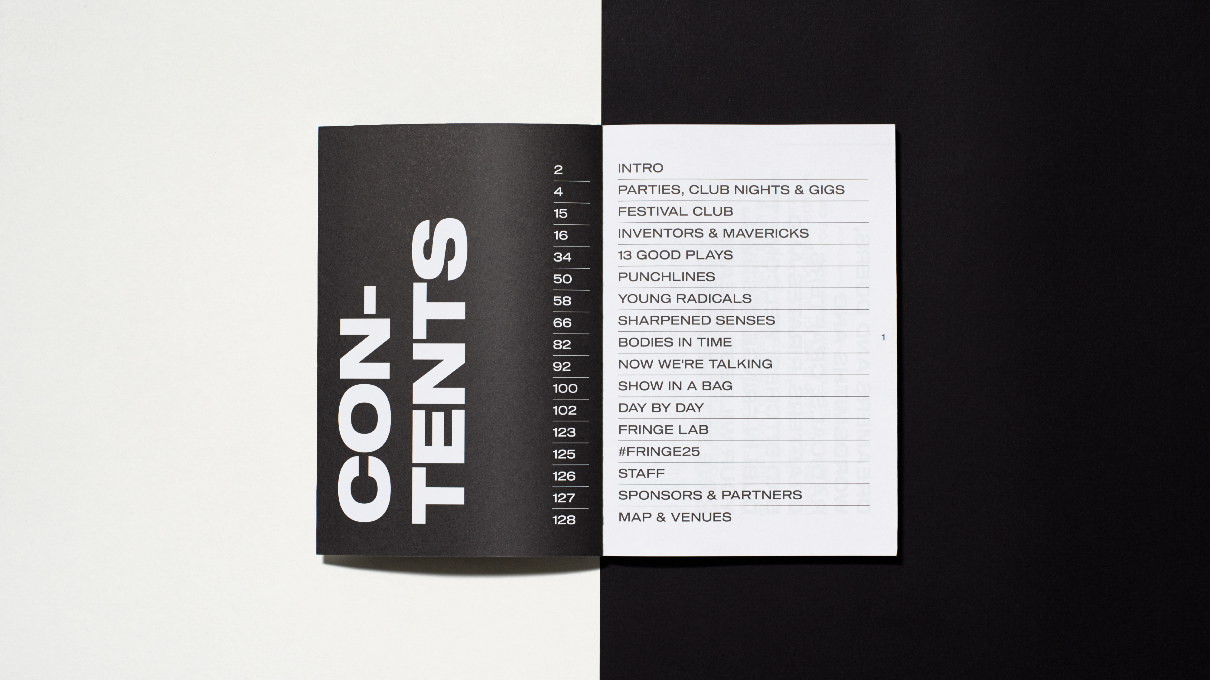
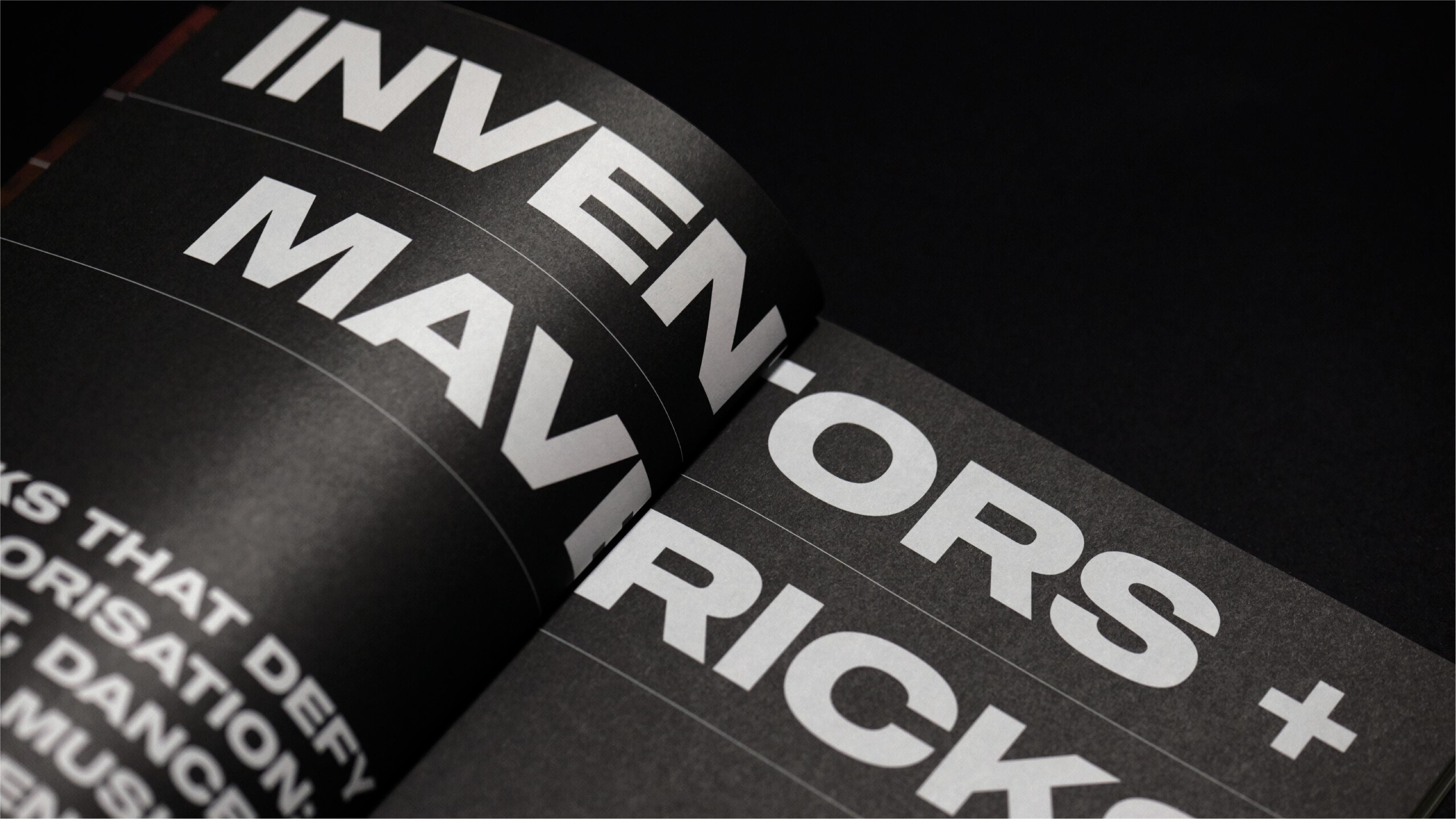
In our redesign of the brochure, we made it much more user-friendly by prioritising the name of the show/work and differentiating it from the artist’s name. We jazzed up the content with editorial pages to create impact and simultaneously provide relief from the brochure listings.
An extra user-friendly edge came in the guise of commissioning Irish graphic designer Richard Dalton to create a map of Fringe’s 22 venues.
Feelin’ Good
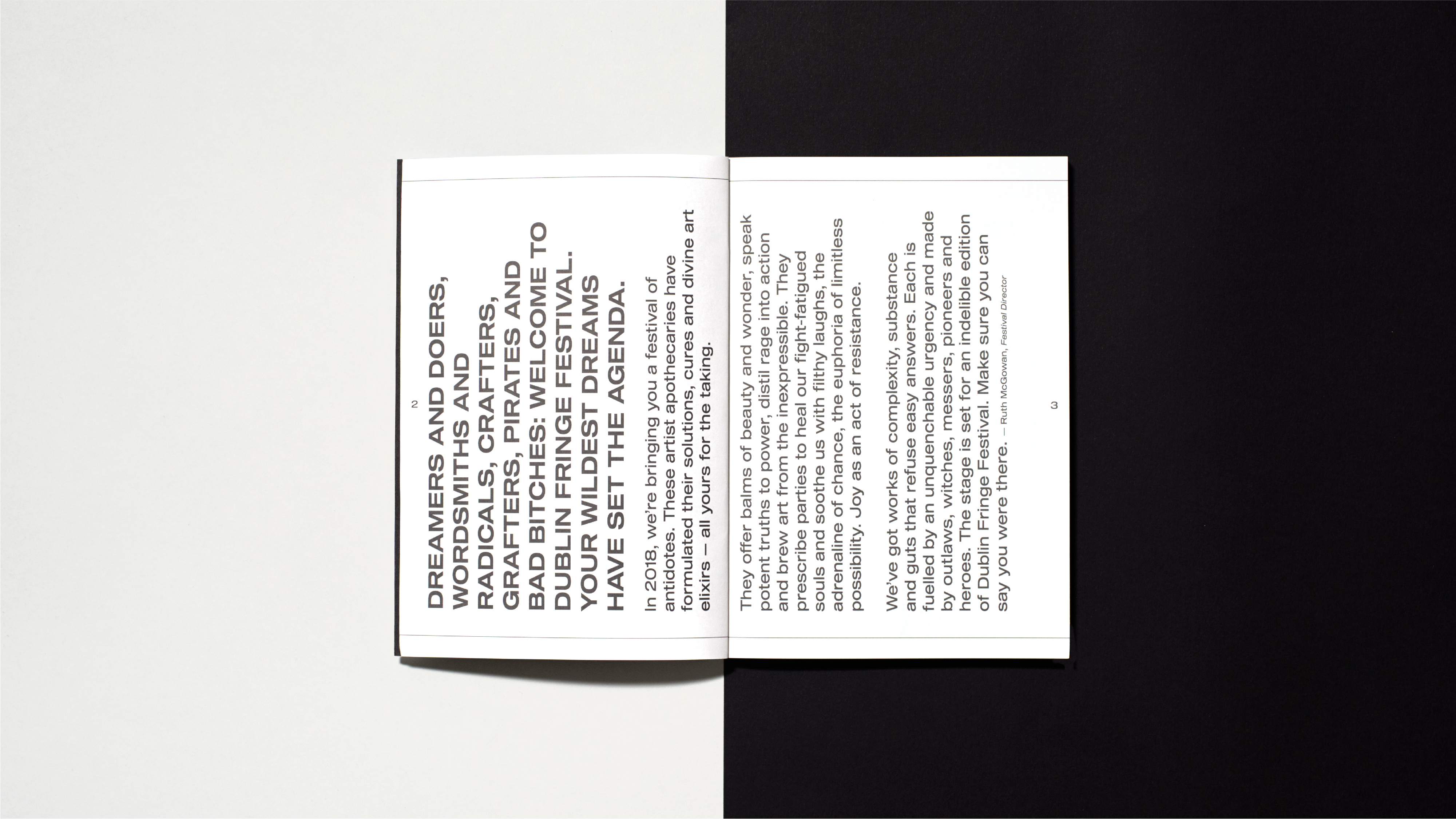
The revamped and refined brochure structure and the use of imagery, icons, bold type and disruptive page orientations throughout, mirrored the festival’s fresh approach and helped the reader to easily navigate its event listings. The unadorned cover and the distinct colouring highlighted the artists, while the rigid, oversized type set the pages alight.