Dublin Youth Theatre
2022
Designed by Ste Murray (Freelance) with Ste Murray | Photography & Design
Motion Graphics: Elliot Ruddy
Categories: Identity
Industry: Cultural
Tags: Typography / Digital / Stationery / Theatre
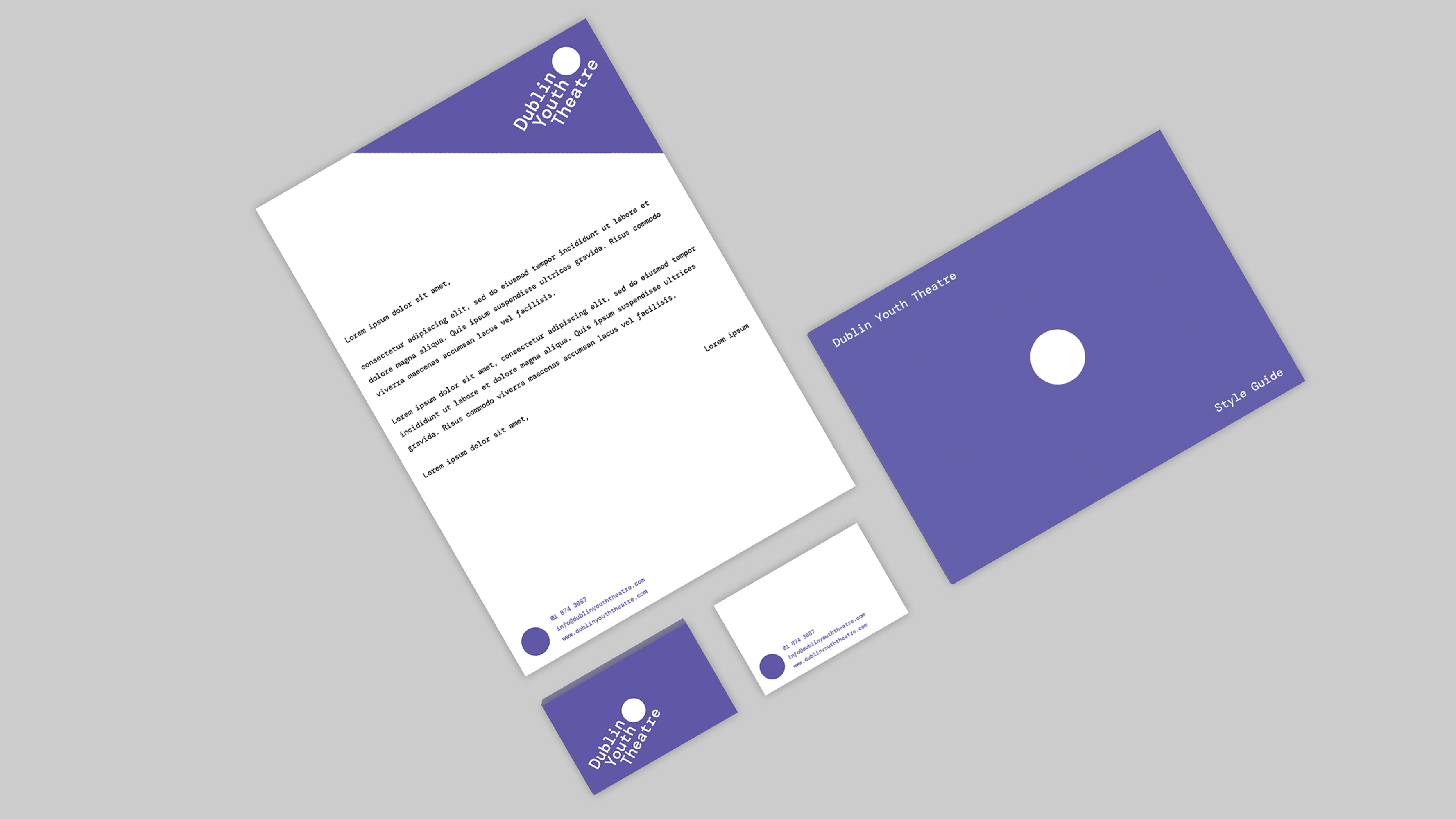
Dublin Youth Theatre is a beacon for young people - creating a sense of place and belonging for its members. With that in mind, this redesign of their identity seeks to simplify their branding - providing a fresh colour scheme and typeface for the group to use across its various platforms and posters.
A monospaced typeface (DM Mono) is chosen for its accessibility and for its balance; referencing the core value that DYT is open to all young people equally. The 30° angle in the layout is inspired by the group’s logo from the 90s, honouring the legacy aspect of the group, along with its alumni who form such a large part of the current landscape of Irish Theatre.
The design represents the creative freedom instilled in its members, while simultaneously working across the organisation's more formal collateral of funding and campaigning. The organisation’s commitment to being a strong foundation for young people to spring into adulthood is manifested in the logo’s clear and structured layout.
The image of the circle, synonymous with both the idea of inclusion and also the practical fun of drama games, becomes a vehicle for showcasing the unity within the members. It also conjures notions of a point of focus, a ball to bounce to your scene partner, and a place to play.
An accompanying strategic plan booklet allows the opportunity to test the design in action; laying out a working style-guide for years to come.
For an organisation that has long been searching for a permanent place in the city to call home, the hope is that this identity starts to give a sense of pride and act as a badge of honour; providing a common vision while this search for new surroundings goes on...