Duhallow Organics Brand Identity Design
2023
Designed by Clare Lynch (Creative) at Clare Lynch Creative
Categories: Promotional / Identity / Screen
Industry: Cultural
Tags: Illustration / Food and drink / Art direction
Website: Website TBC
Duhallow Organics was founded in 2017 as a collaborative effort between local organic farmers and butchers who passionately believe in producing wholesome natural food that has been grown locally and with respect for nature.
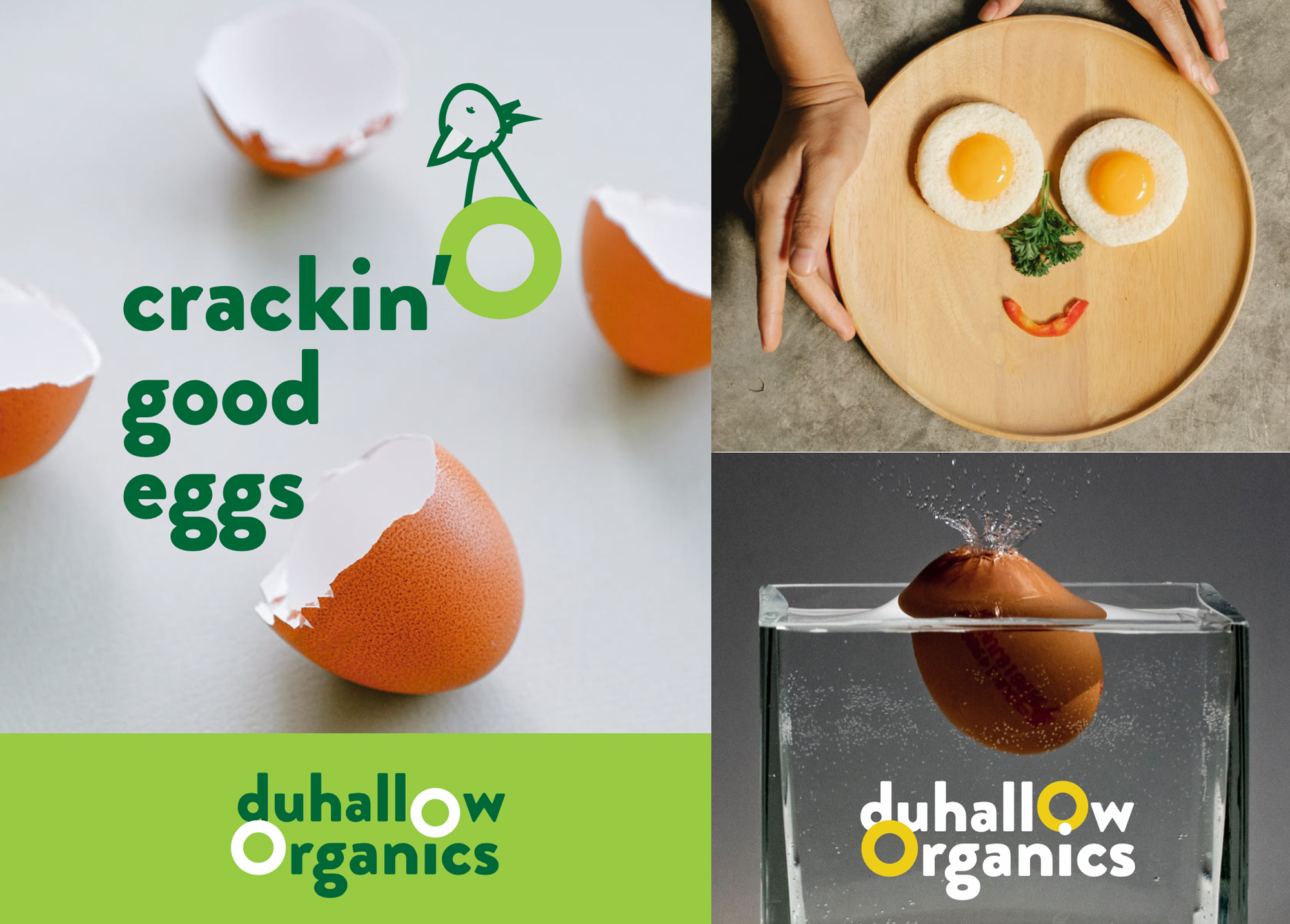
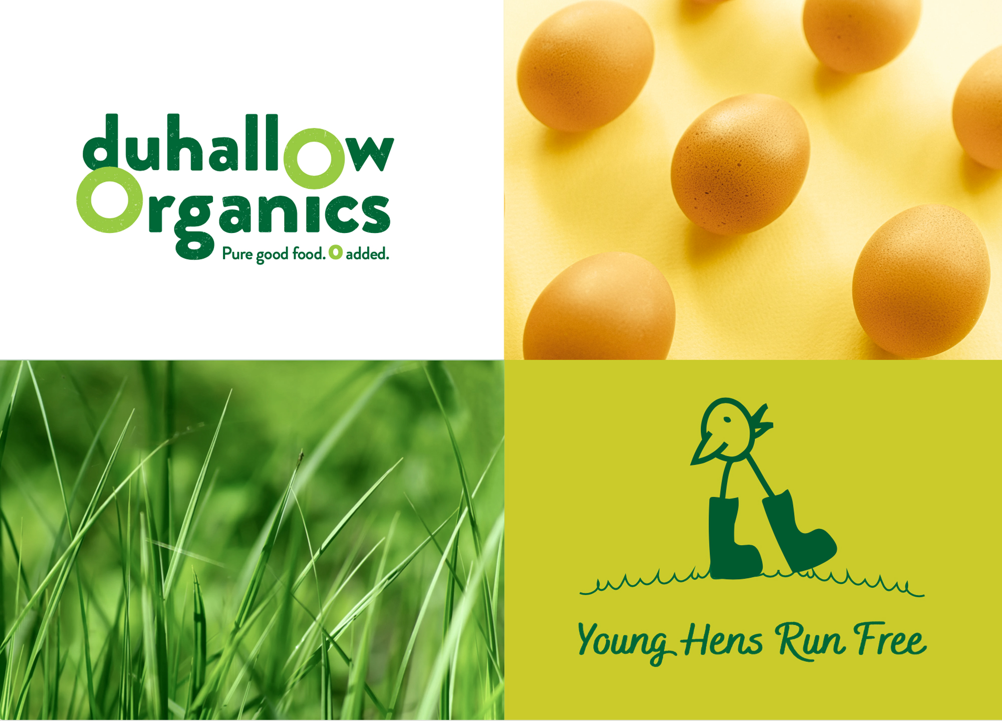
The Duhallow Organics farm is situated on the old Moynihan family farm in Boherbue in the heart of Duhallow, Co. Cork. They are Certified Organic and produce Organic Eggs and grass finished Dexter Beef.
Duhallow Organics care about People, Animals, Sustainability, Biodiversity & the Community. Everything they do has these values at their core. They create Pure Good Food, Cork style, with 0 Additives, Pesticides, GMOs or Fertilisers. They farm for you and your family. They have been farming organically since 2005 and believe that organic farming is a positive philosophy which rejects artificial fertilisers, pesticides and chemical inputs. Moreover, it is a sustainable approach to farming which views the farm as a whole system in harmony with the natural surroundings and nature itself as well as the local communities. They take their role as caretakers of the land very seriously and have adopted a regenerative approach to farming which includes regenerating topsoil, restoring wild flower and clover meadows as well as hedgerow and field margin management. As well as providing their animals with all of the nutrients, vitamins and minerals they need to thrive, this also supports a diverse range of insects and wildlife. They have planted over 1000 trees over the past 14 years as trees play an essential role in carbon sequestration which is an important part of creating climate resilience
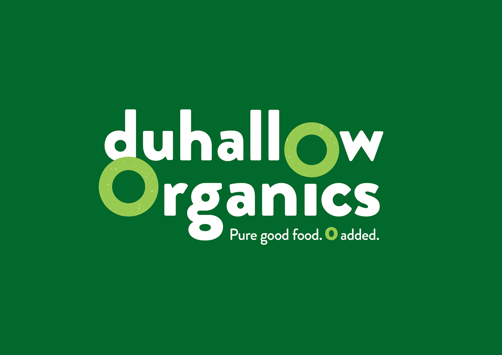
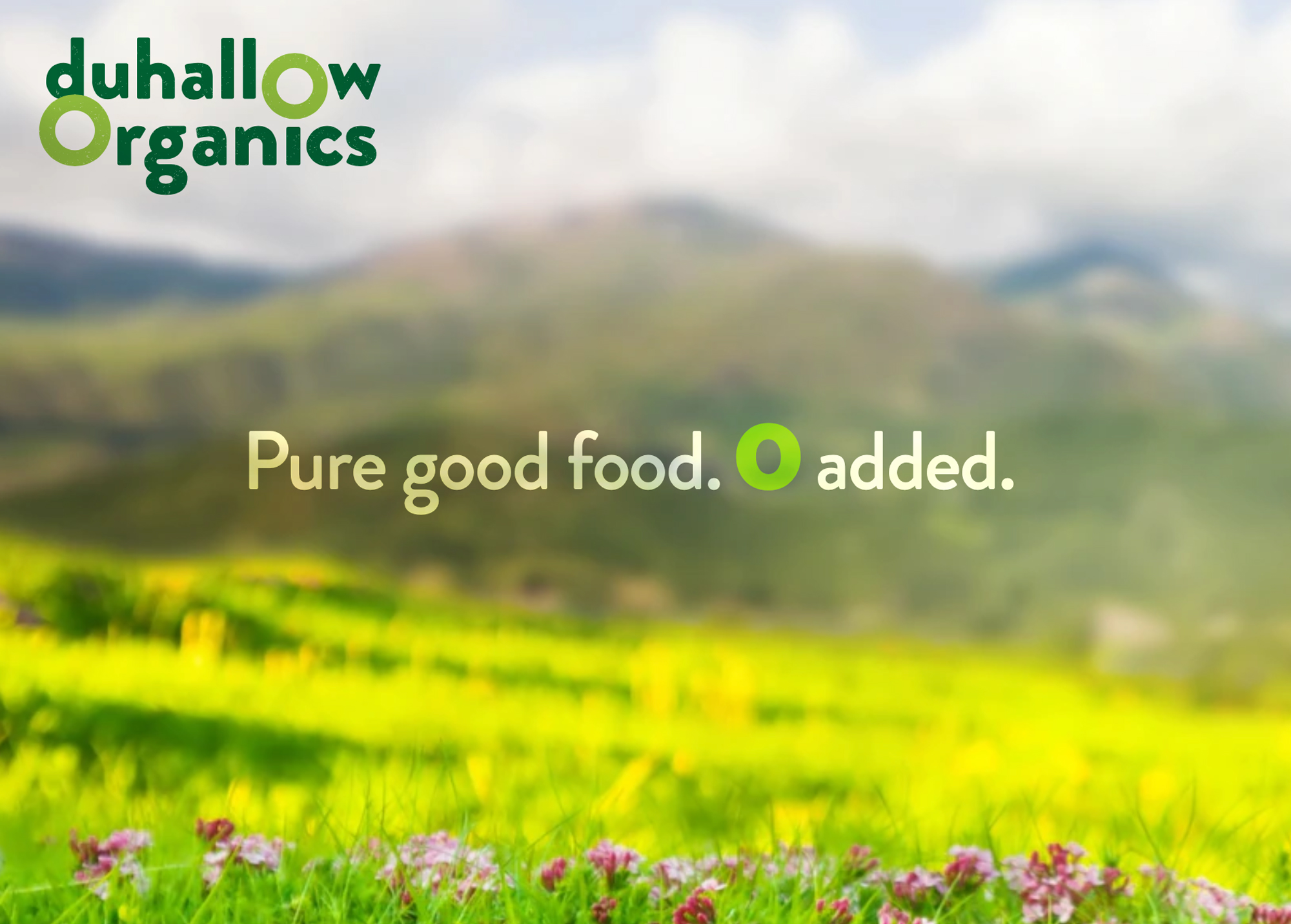
Within the brand logo design, the 0’s have been highlighted to emphasise how there are zero additives used in the food that they produce, as it is organic and natural. There is a grain texture within the letters of the logo, to further communicate the natural and organic aspect of the food produced from this farm.
The tagline we developed for them is ‘Pure good food. Zero added‘. The word pure cleverly plays on the way native Cork people use the word ‘pure’ is used to say ‘very’ or ‘absolutely’ and also how the farm is organic so the food produced by Duhallow Organics is very clean, healthy and pure.
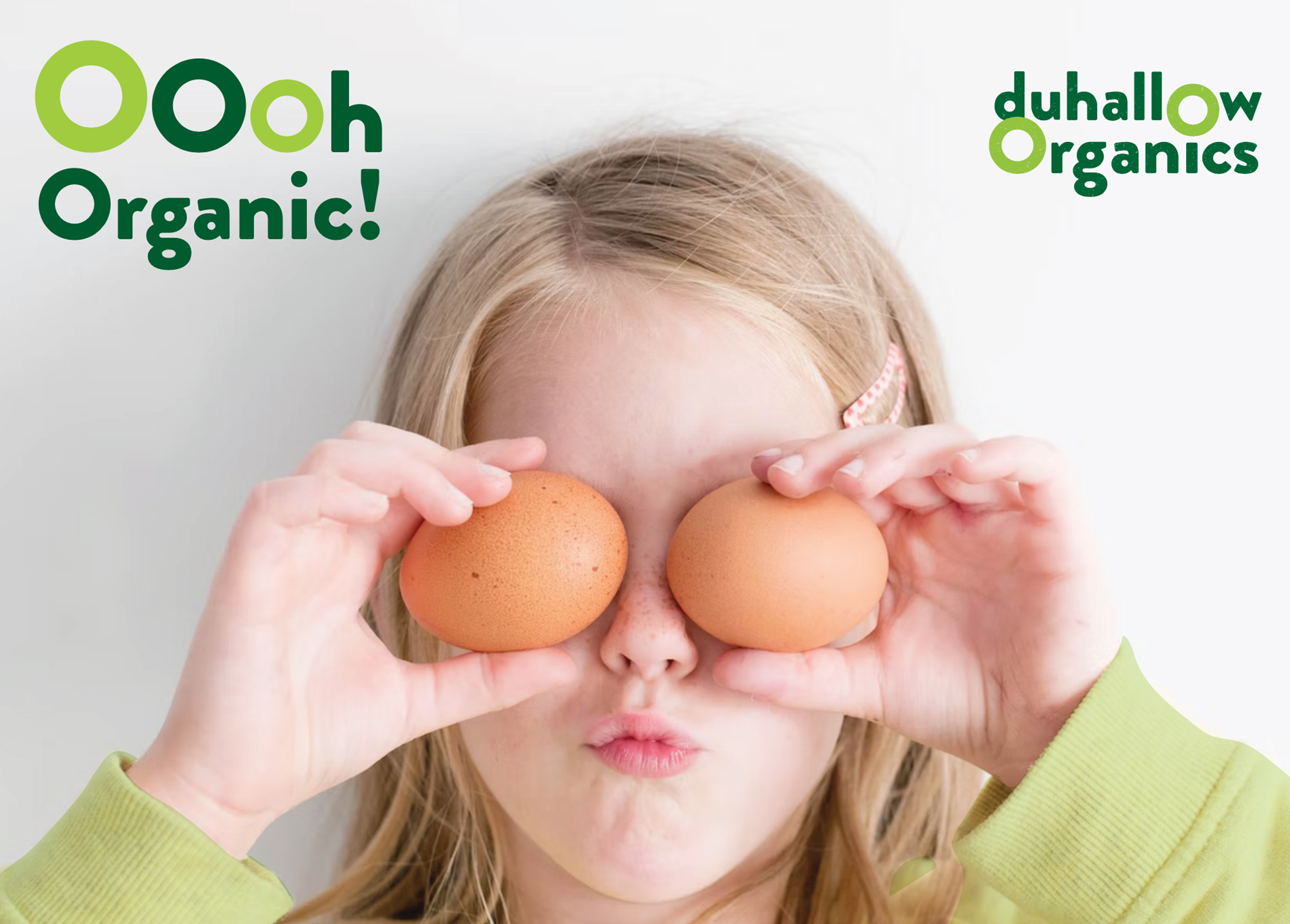
The Duhallow Organics brand is fun, quirky, bright and playful to appeal to customers and indicate how their animals live freely and happily – while still clearly communicating the brand ethos and values, to signify what they stand for, such as how they care about animals, the environment and sustainability at their core.
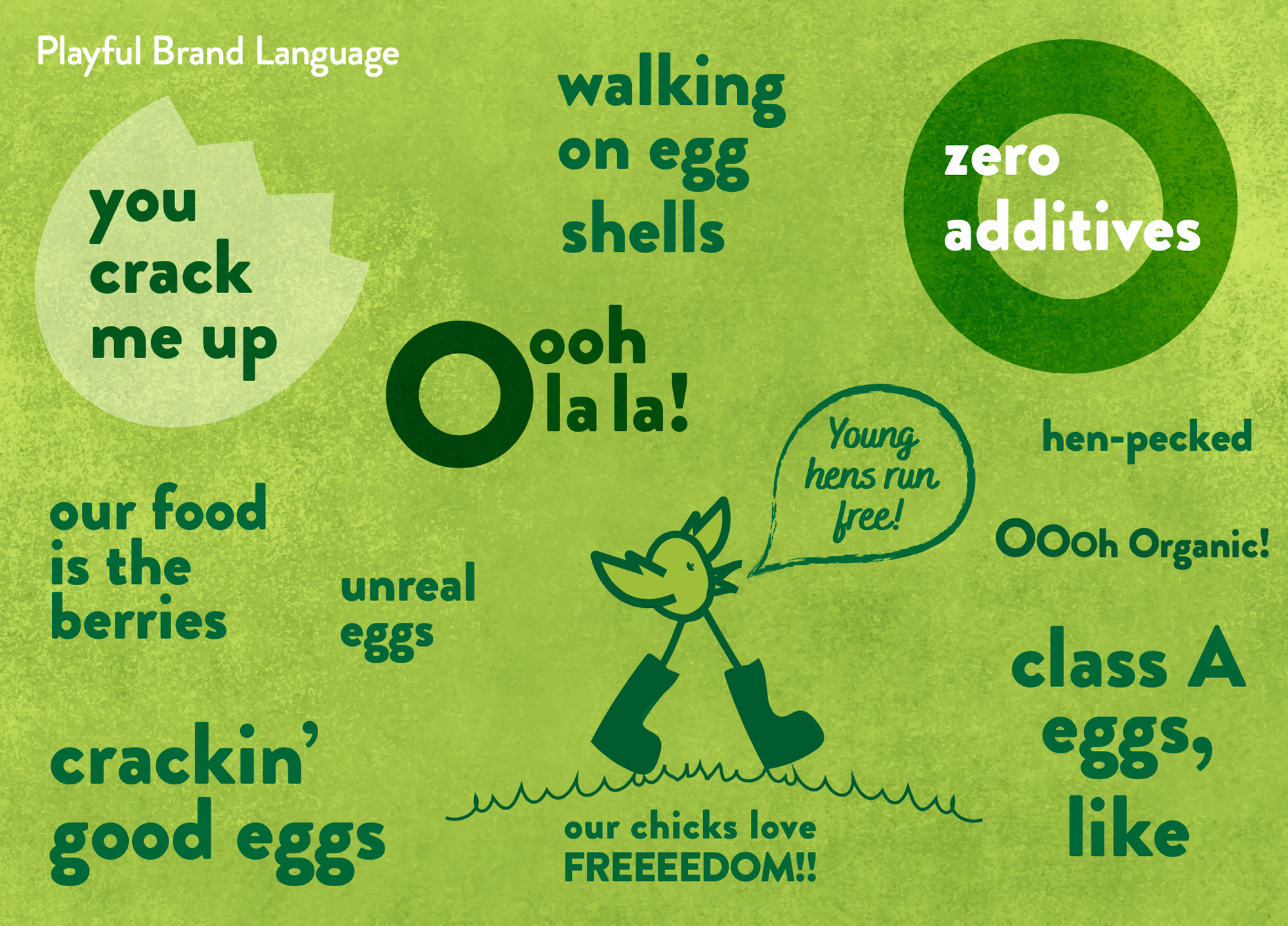
A mini guidelines were included with this brand identity project. The colour palette, typography and photography style chosen are earthy, natural, bright and fresh to indicate these aspects of how the Duhallow Organics farm runs. Illustrative icons and descriptor text communicate some of the other brand USP’s, such as that the eggs are ‘Class A‘ and have ‘zero additives’, that there is ‘0% additives, pesticides, GMO’s or fertilisers‘.
The brand identity is playful, featuring an icon of a cute and playful chicken in welly boots walking freely over a hill on grass, symbolising how the hens are happy and free. We worked together on packaging design for their organic eggs also, this has yet to be launched.