DuPont Brand Refresh
Designed by Brendan Murphy at Lippincott
Design Director: Michael Guerin
Designer: Kaito Gengo
Designer: Coco Han
Designer: Jeroen Sikma
Design Intern: Sudiksha Krishnan
Brand Strategy: Nital Patel
Brand Strategy: Liz Green
Categories: Identity
Industry: Commercial
Innovating an iconic industry leader
In 2017, Dow and DuPont merged with the intent to integrate their complementary portfolios before spinning them off into distinct publicly traded companies. This shift to more focused portfolios would enhance each company’s competitive advantage, create costs synergies and enable growth. So, three new market-leading companies focused on Materials Science, Agriculture and Specialty Products were created. The Specialty Products division is the new DuPont.
Following the merger of Dow and Du Pont in 2017 that integrated their portfolios and spun-off them off into distinct publicly traded companies, we were engaged to develop a fresh global brand identity for the new DuPont that would recognize their heritage while conveying their transformation and focus on customer-led innovation. The new logo and visual system further needed to convey DuPont’s leadership position in the market while differentiating from competitors, while aligning the brand expression to the positioning and personality characteristics of the new DuPont.
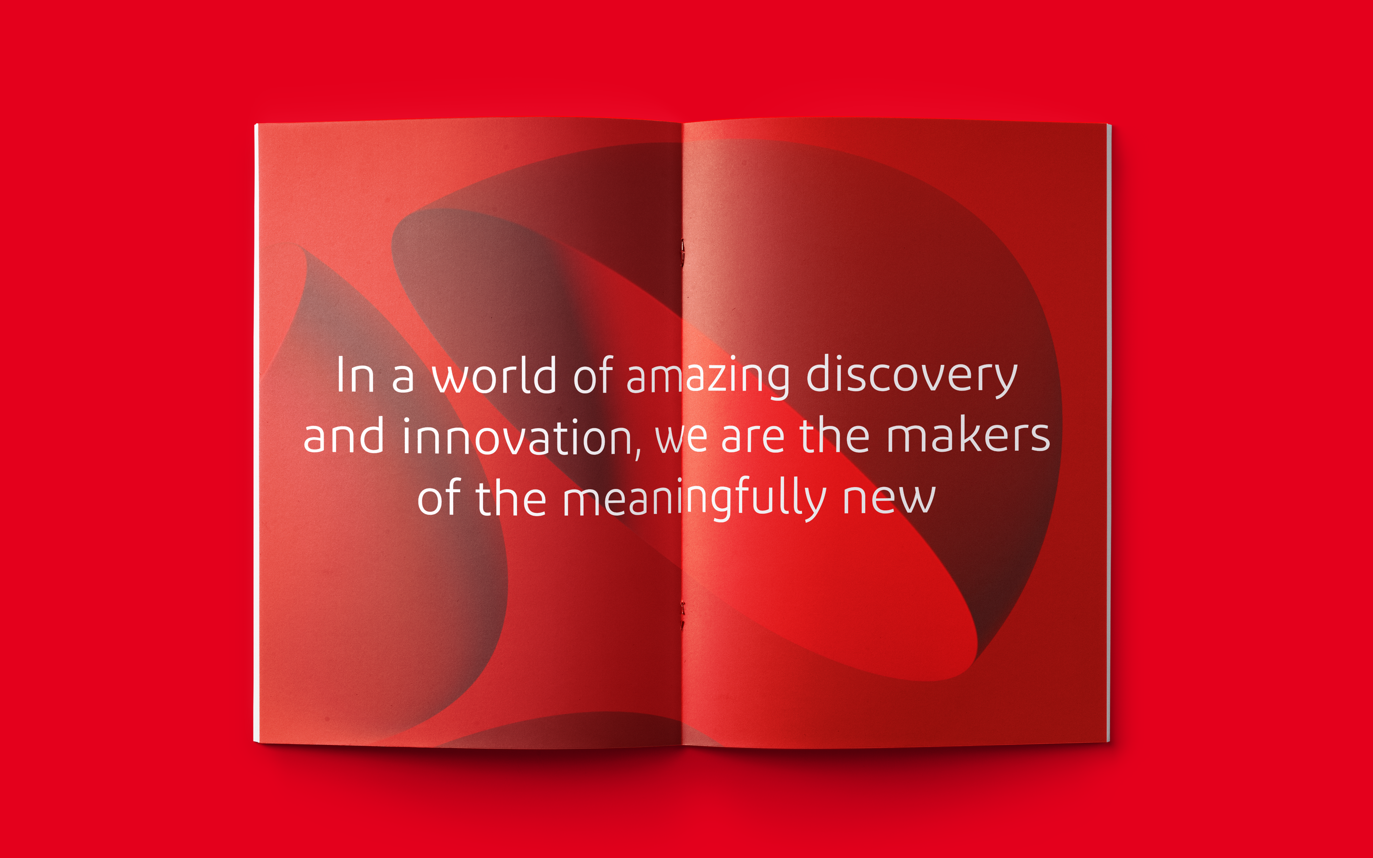
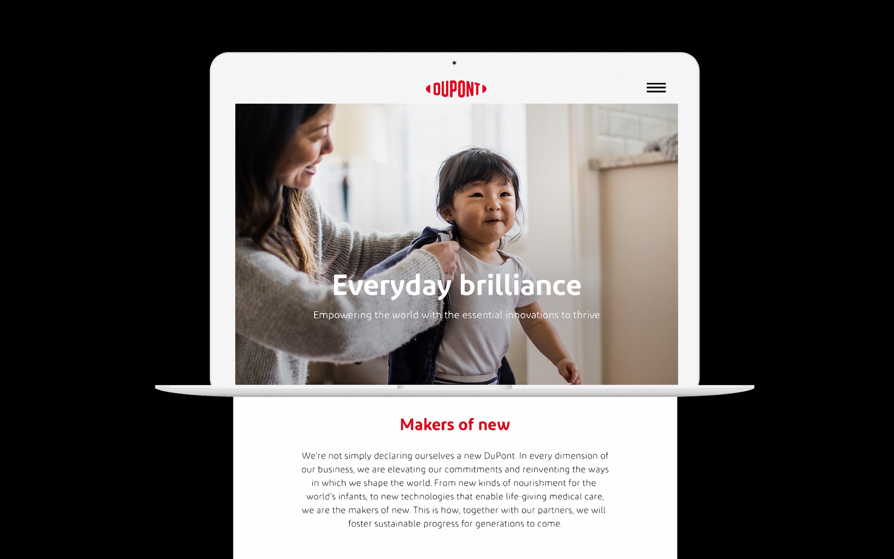
We began with a new brand purpose – “To empower the world with the essential innovations to thrive” – which builds upon a rich history of discovery and progress. This vision was further enriched by a set of commitments and design principles that honor the past while pointing energetically to a future fueled by life-enhancing innovations.
The DuPont logo is one of the oldest and most iconic untouched corporate marks in contemporary culture. It has endured wars, economic upheavals and technological transformations. Because the distinctive oval has remained virtually untouched since 1906, we approached the challenge with great respect for the equity of the classic mark.
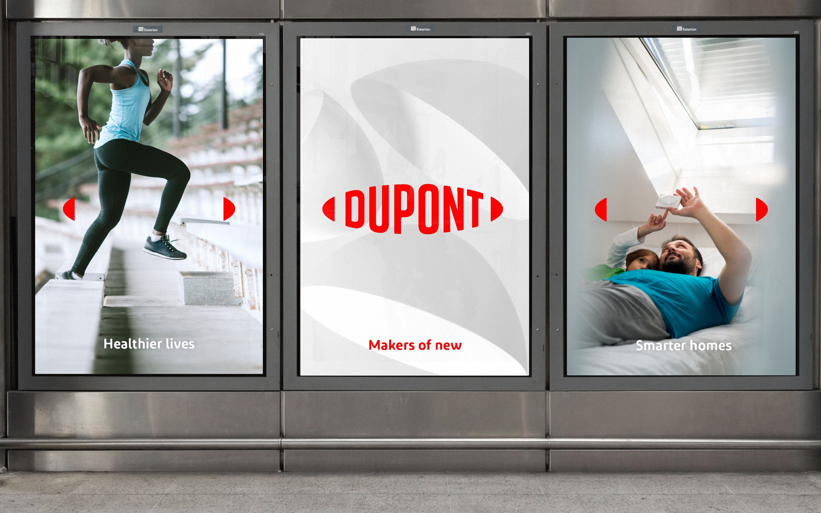
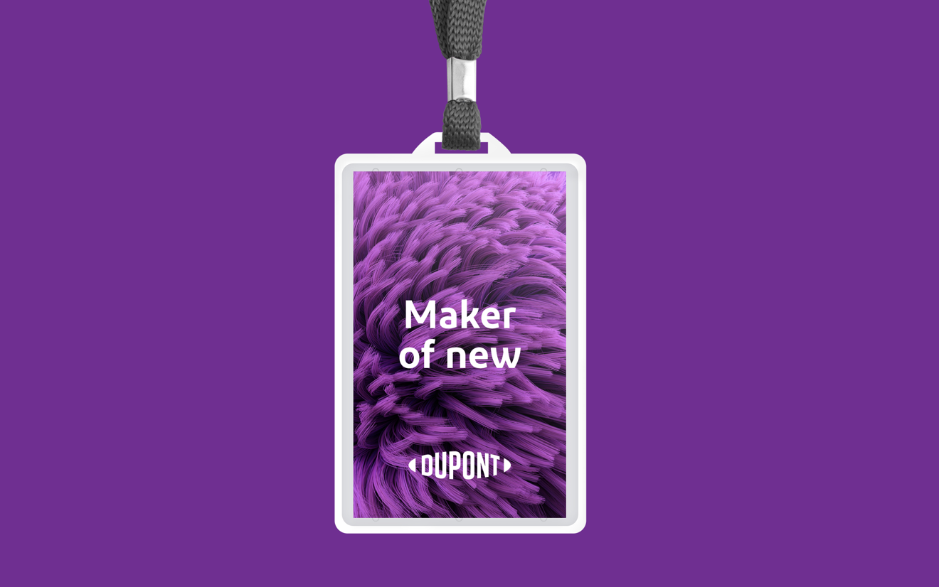
The new design system is similarly bold, open and vibrant. Imagery spans macro impact to the micro essentials. The new brighter DuPont Red is supported by a vibrant and diverse color palette. The DuPont typeface balances crisp edges and rounded curves to make it feel both precisely engineered and approachably warm. The oval and end-to-end logo graphics add a rich visual texture to the identity system.
Not only does the new mark and system allow the DuPont name to be connected and leveraged across its market-leading stable of brands, it builds a strong identity that can help connect and unite DuPont’s workforce.
The new mark features a simplified name that unites the 2-word “Du Pont”. We embraced the name with an all-new typographic design that expresses a bold, contemporary attitude. And by opening the oval, the mark now signals a collaborative and open flow of ideas and innovation.
Armed with a new brand, DuPont continues to tackle life-changing opportunities – whether wearable electronics, bio-sensors, smart homes, autonomous transportation or personalized nutrition – as the company proudly holds its rightful position as the market leader in industrial transformation.