Dysfluent Issue 2: Stammering Pride
2023
Designed by Conor Foran at Take Courage
Editor: Conor Foran
Producer: Bart Rzeznik
Categories: Printed Publication / Editorial / Publication
Industry: Self-initiated
Tags: Typography / Visual art / Publishing
Dysfluent Issue 2 is an independent magazine of interviews and visual artwork celebrating and challenging stammering pride. Stammering pride has emerged as a compelling movement in the cause for self-affirmation, dignity and equality for people who stammer. But what does it mean to be proud of something you associate with struggle and pain?
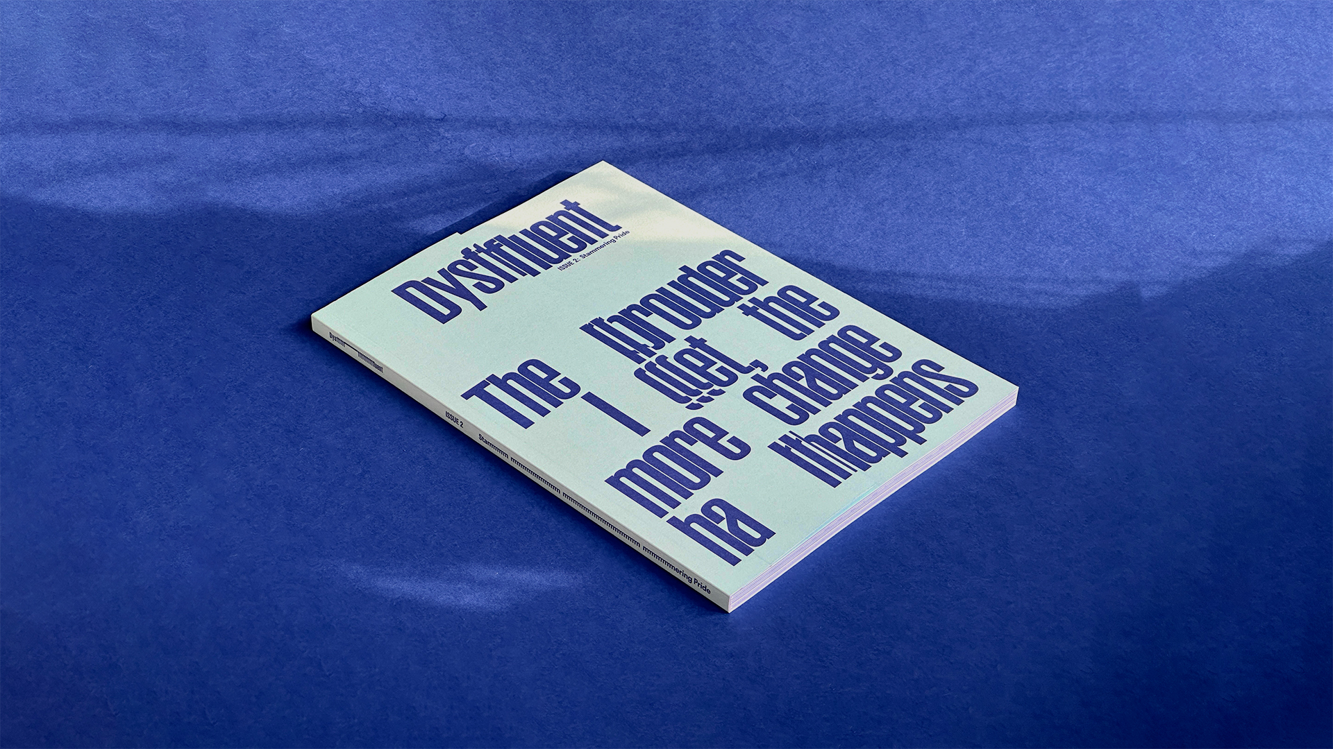
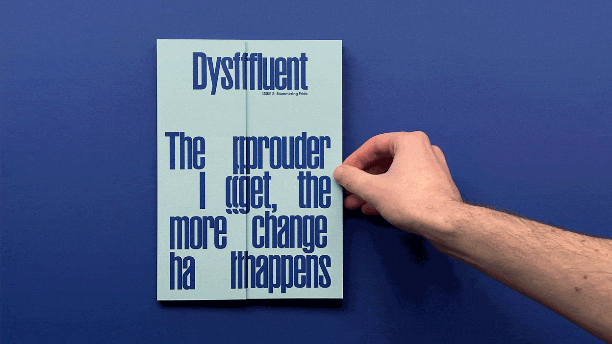
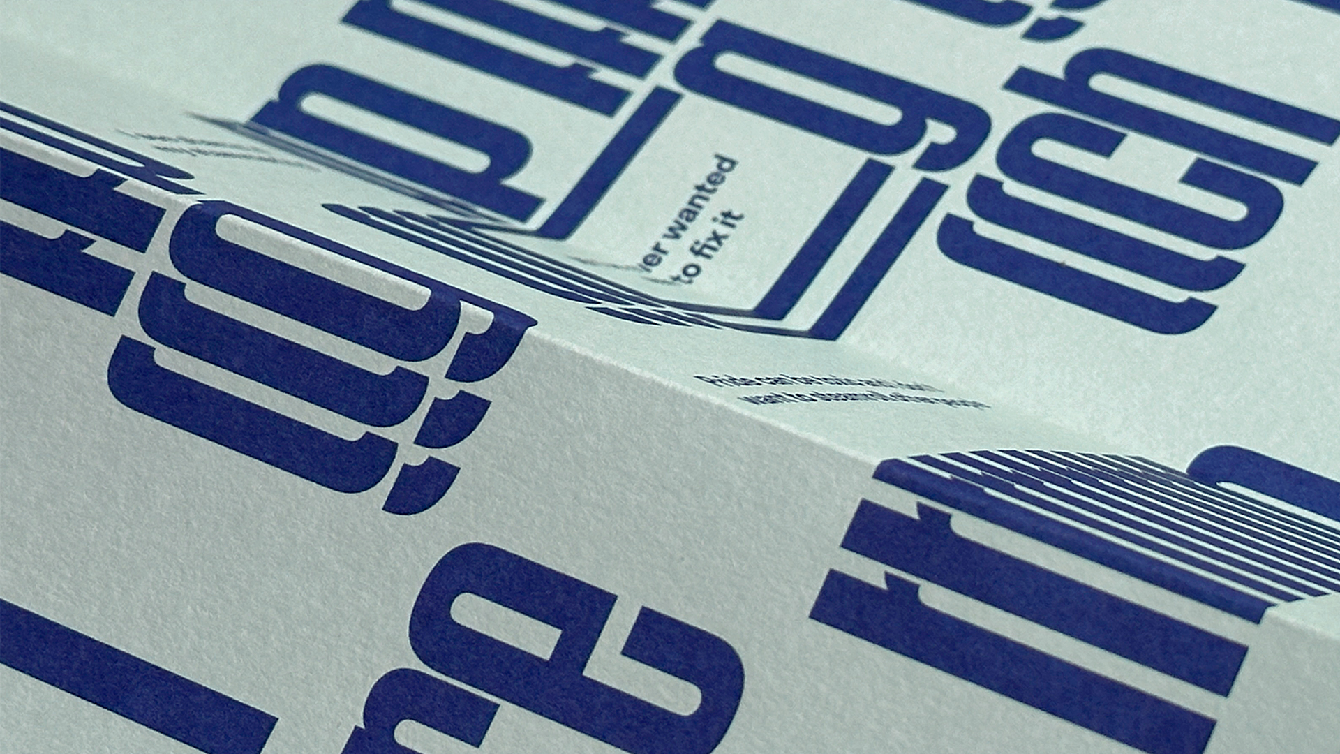
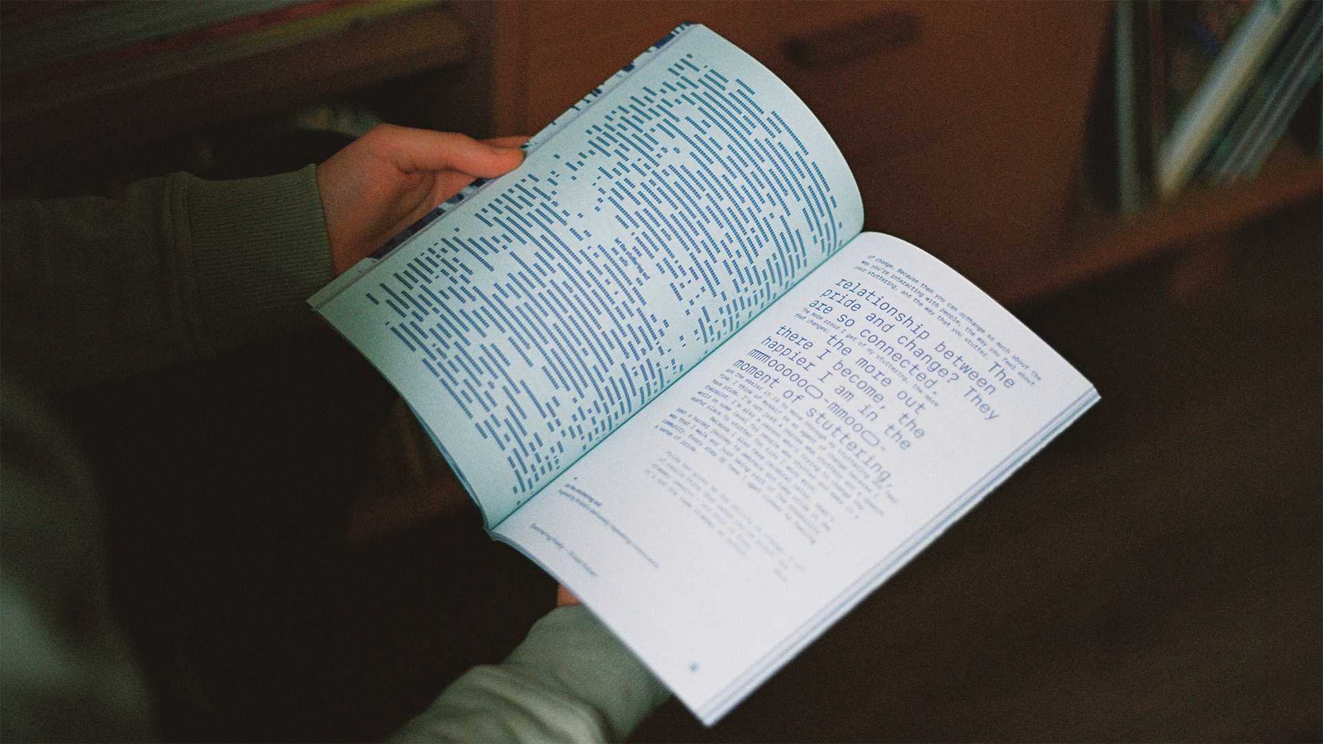
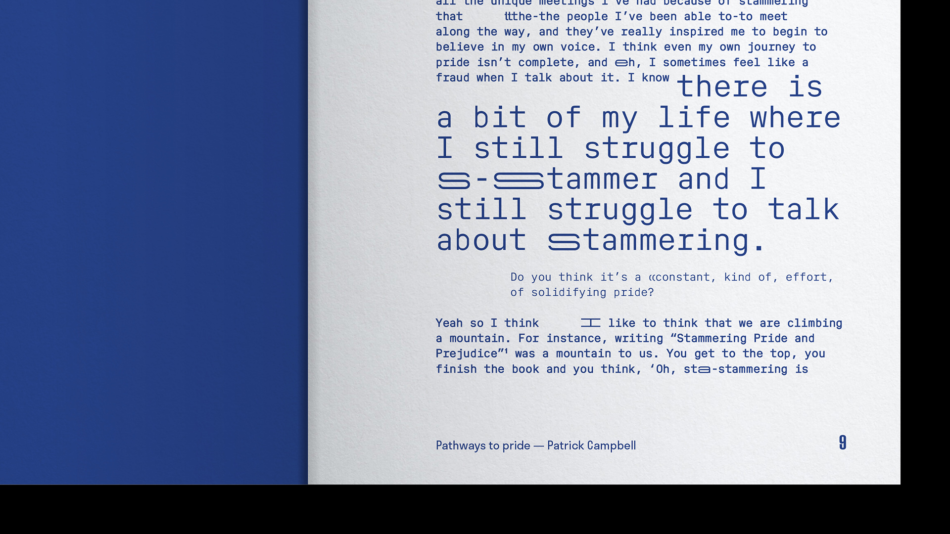
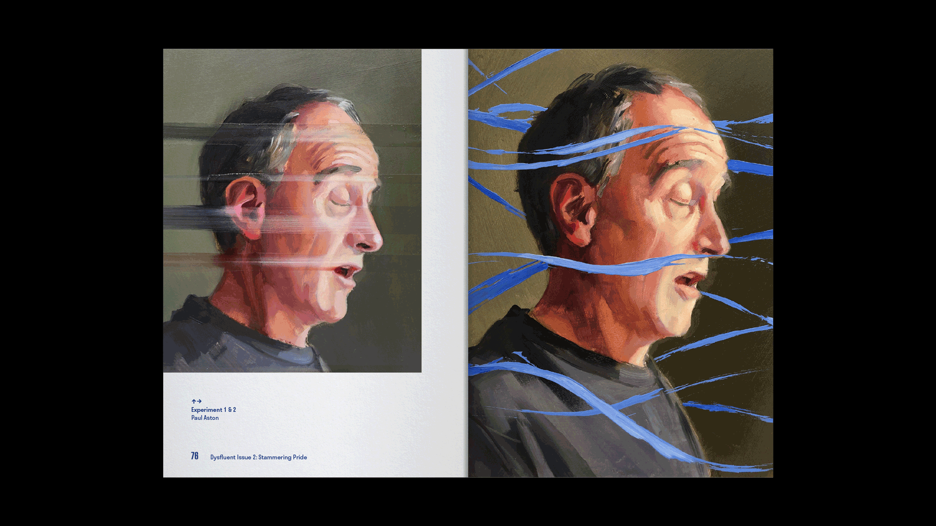
We designed the magazine, asking: what could/should a stammering magazine look like? The cover unfolds to reveal an inner dialogue amongst stammering letterforms. The issue's title stammers across the spine. The 'pull quotes' remain in their paragraphs, challenging the idea of the perfectly-said phrase. Each interview is set in Dysfluent Mono, a font representing the person’s stammer. The expressive, typographic illustrations are inspired by the uniqueness of the interviewee's voice. The magazine creatively questions society’s obsession with hyper-fluency which leaves little room for organic moments in language.
Typefaces: Dysfluent Mono by Dysfluent, Stratos by Production Type, Ruder Plakat by Lineto