Field Gothic
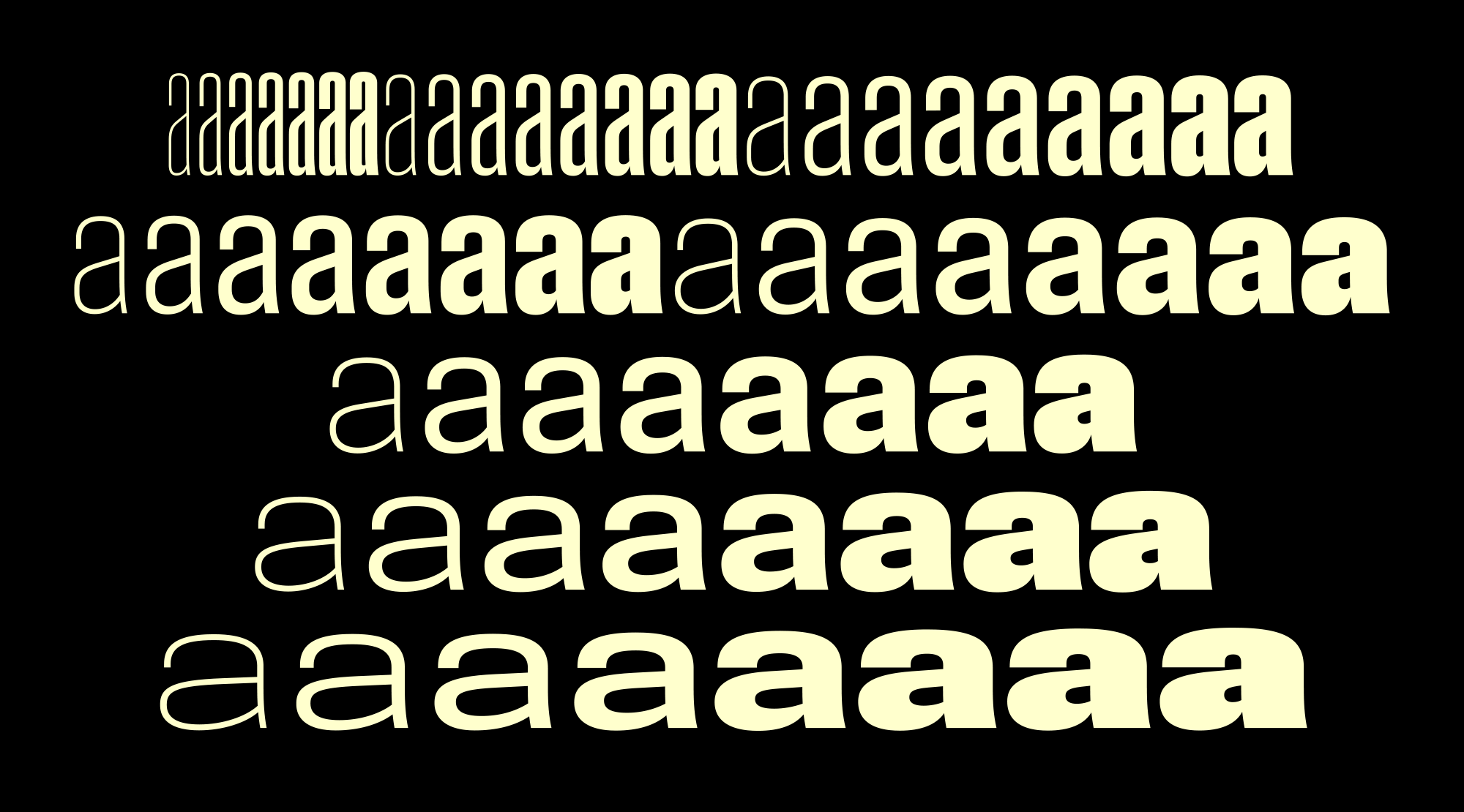
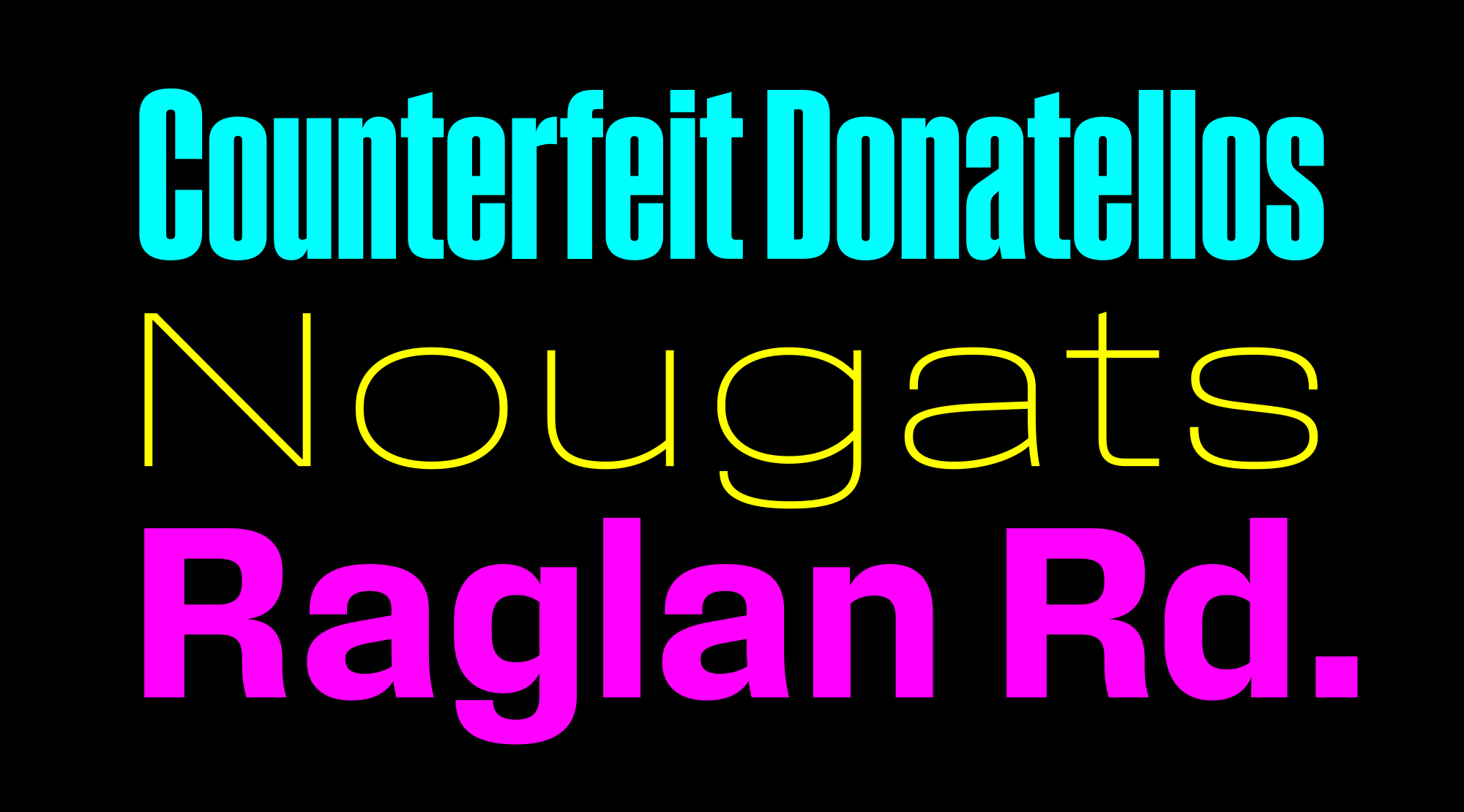
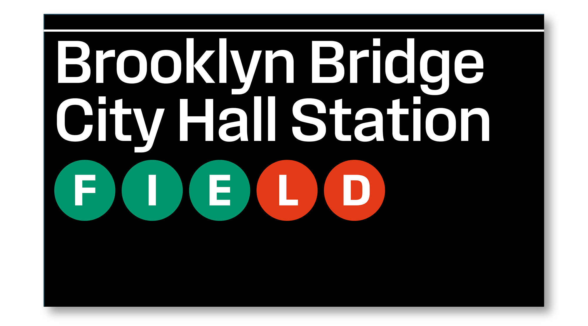
Field Gothic is an eight-weight, eight-width, 64-style journey through the history of American and European sanses. Inspirations include Unimark subway signage, midcentury Geigy promotions, old Westinghouse lightbulb packs, vintage Columbia and Blue Note jazz albums, Letraset Compacta, and Schelter & Giesecke type specimens. Overall, the look is crisp and on the cool side, with slightly superelliptical curves. The lightest weights are almost monoline. Above that, arches and bowls have sharply contrasting junctures and a snug fit. Intended principally as a display superfamily, Field Gothic is still carefully balanced for extended reading in all but the most compressed styles.
