FiXX Coffee
2012
We had worked with Hancock & Abberton for over 10 years when they decided to align their disparate coffee brands under one name - FiXX. The relaunch required deep positioning work, in collaborative sessions, to clarify and solidify the brand as an unpretentious, grounded, top quality offering.
We first developed the Fixx wordmark based on a single rectangular bar shape which is stacked, clipped and rotated to build the four letterforms of the brand name. This bold, functional approach is rooted in the brand values we developed with Fixx team.
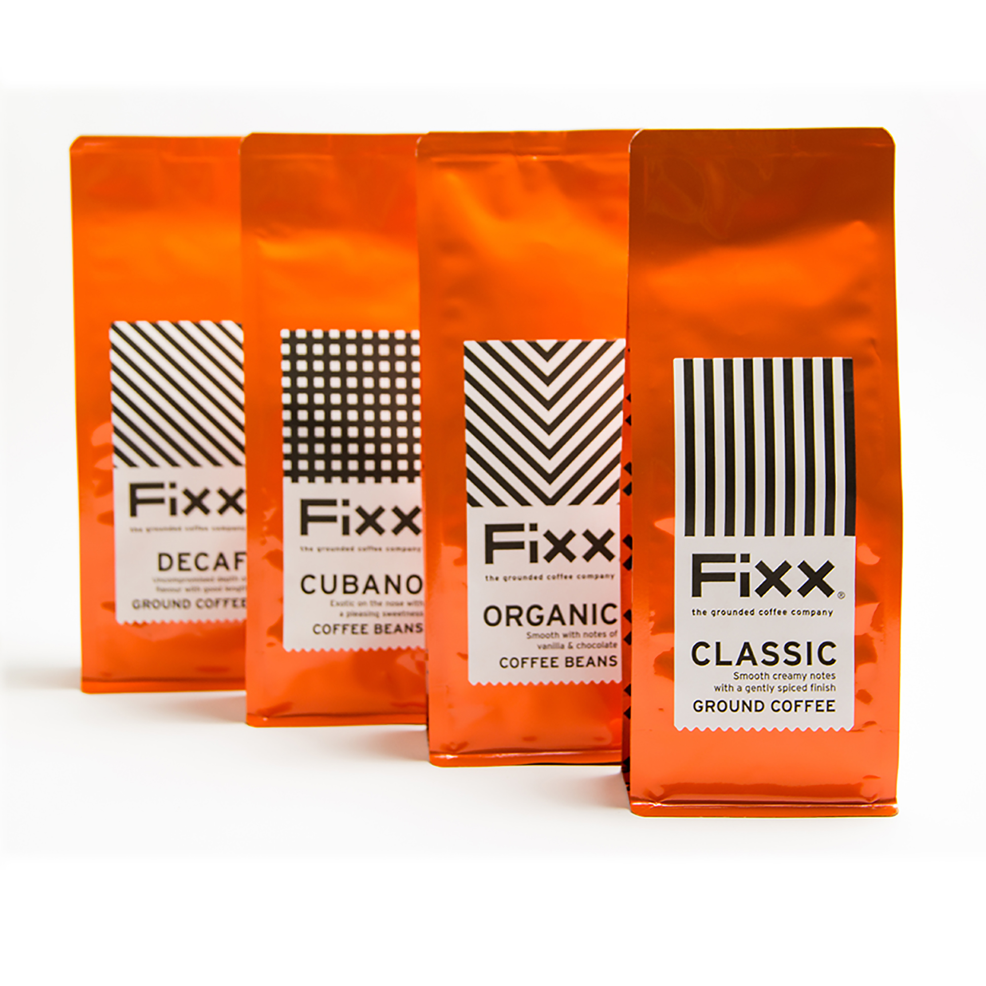
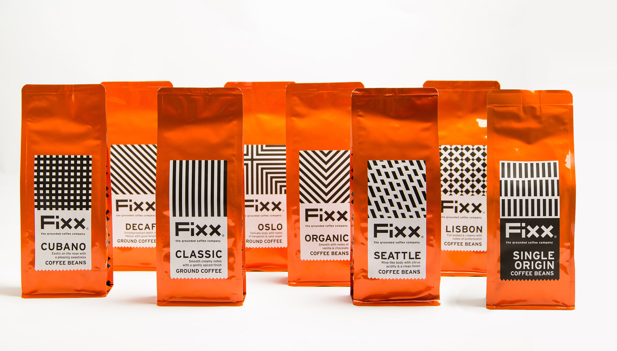
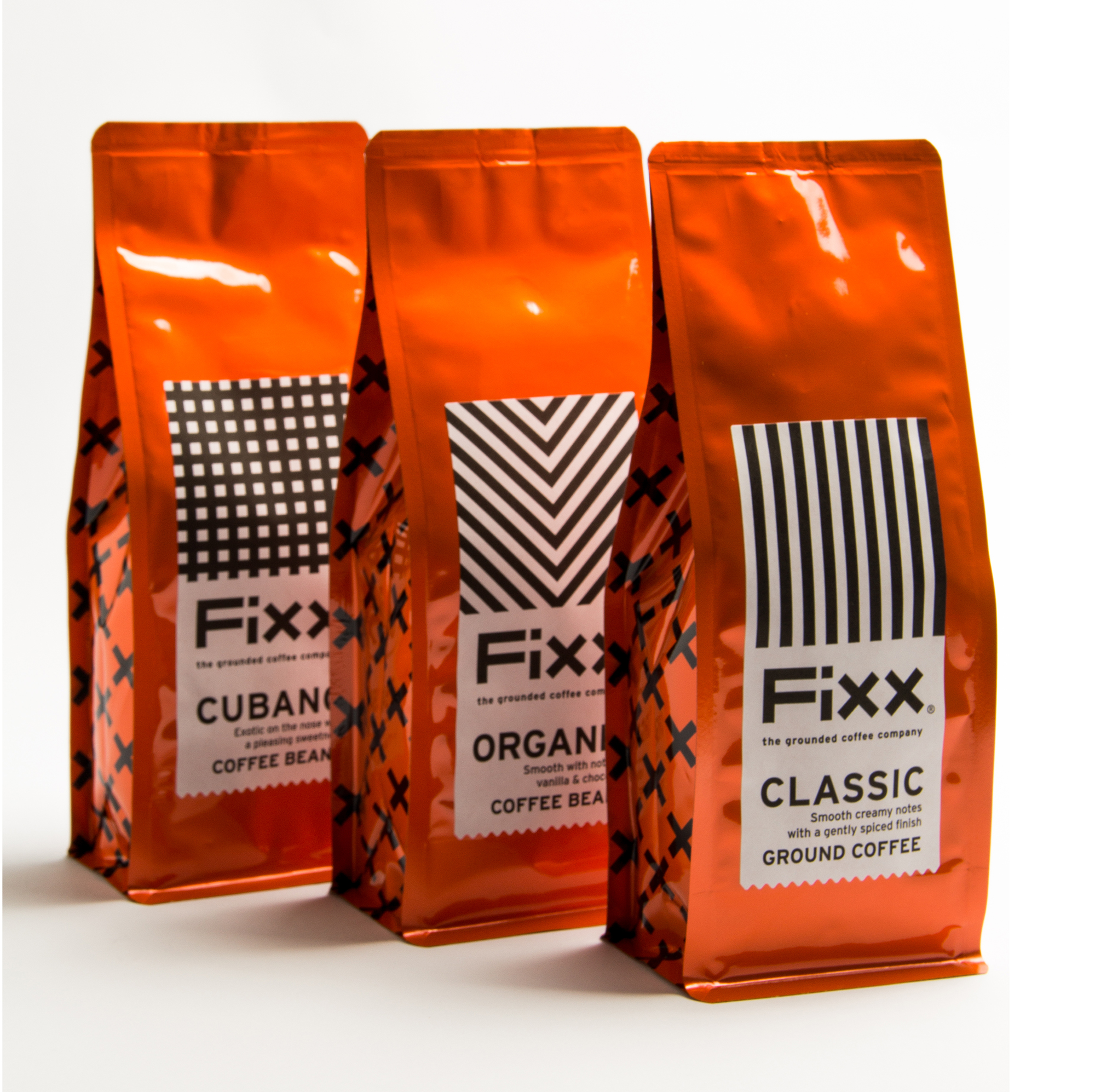
Using the bar form we built a system of patterns to define the range of coffees available under the FiXX brand.
CLASSIC; Straight up and down bars
CUBANO: Square made from bars (poetic licence for cube)
ORGANIC; Veins of a leaf
DECAF; Diagonal negative bars
LISBON; a grid of Ajuzelo tiles from overlapping bars
OSLO; a Danish flag of bars
SEATTLE; slanting rain drops
SINGLE ORIGIN; '1'
It's a bold distinctive approach with considerable shelf presence.
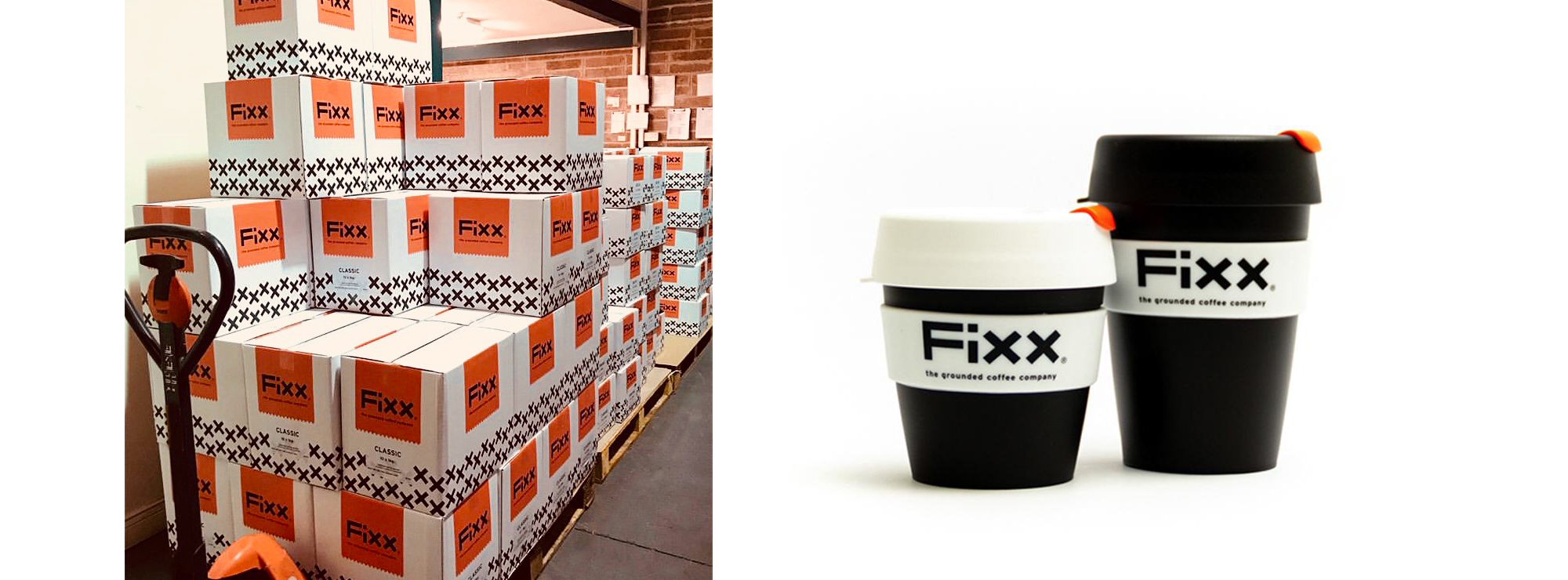
The repackaged range, including distinctive shipping cases (wholesale & e-commerce) and merchandise have helped FiXX gain market share by standing out in a crowded sector and giving the team a clear tone-of-voice to work with.