Fluxe
2025
Designed by Robbie Roche, Claudia Morales and Henrick Urbano at noise
Categories: Website / Print / Identity / Packaging
Industry: Commercial
Tags: Digital / Art direction / Retail / Advertising
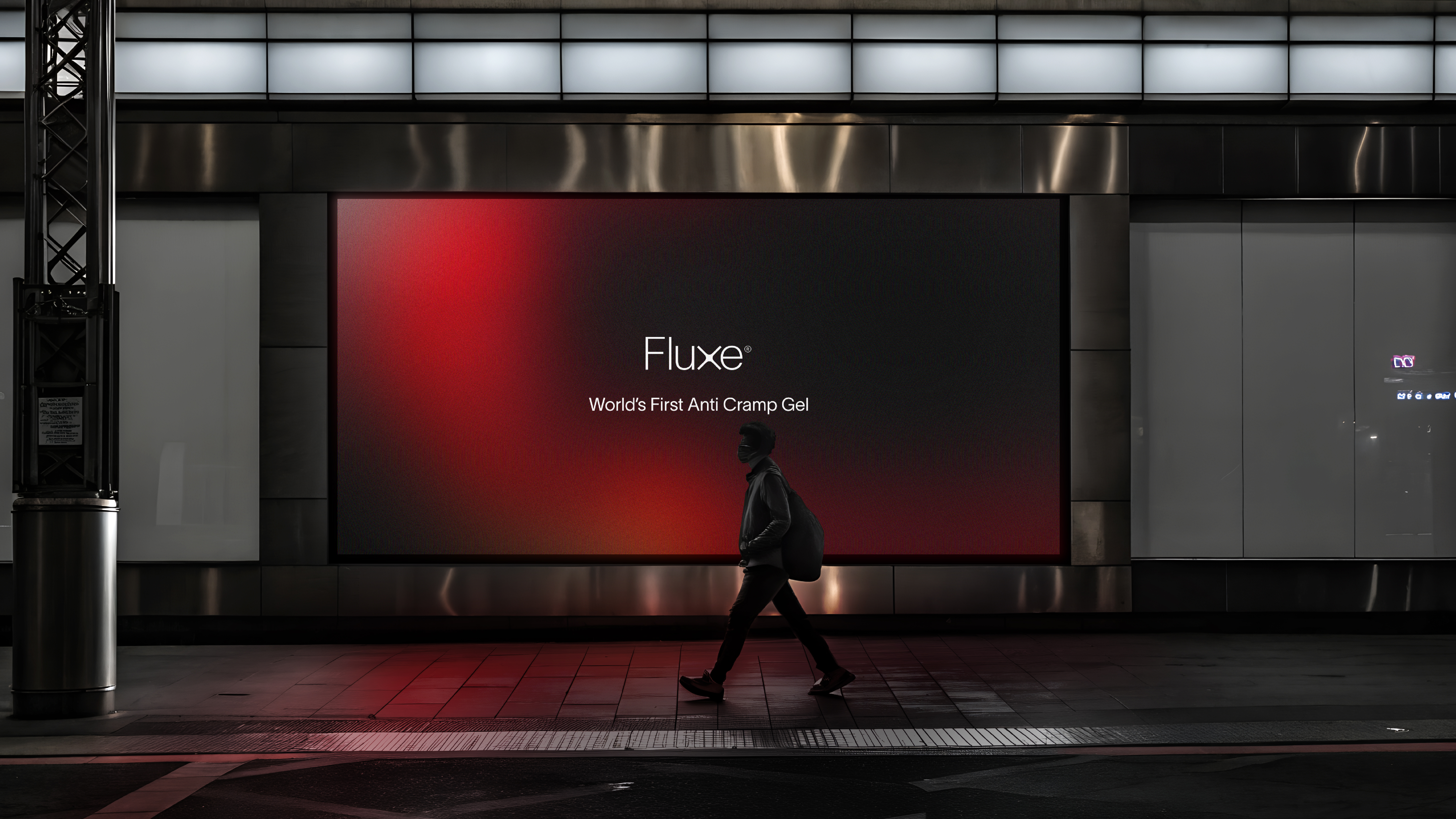
Fluxe is a brand born from the necessity of cleaner, more sustainable energy. We were absolutely delighted to be asked to define the brand’s conception, visual identity, and packaging system, creating a language that speaks to both the elite athlete and the busy professional.
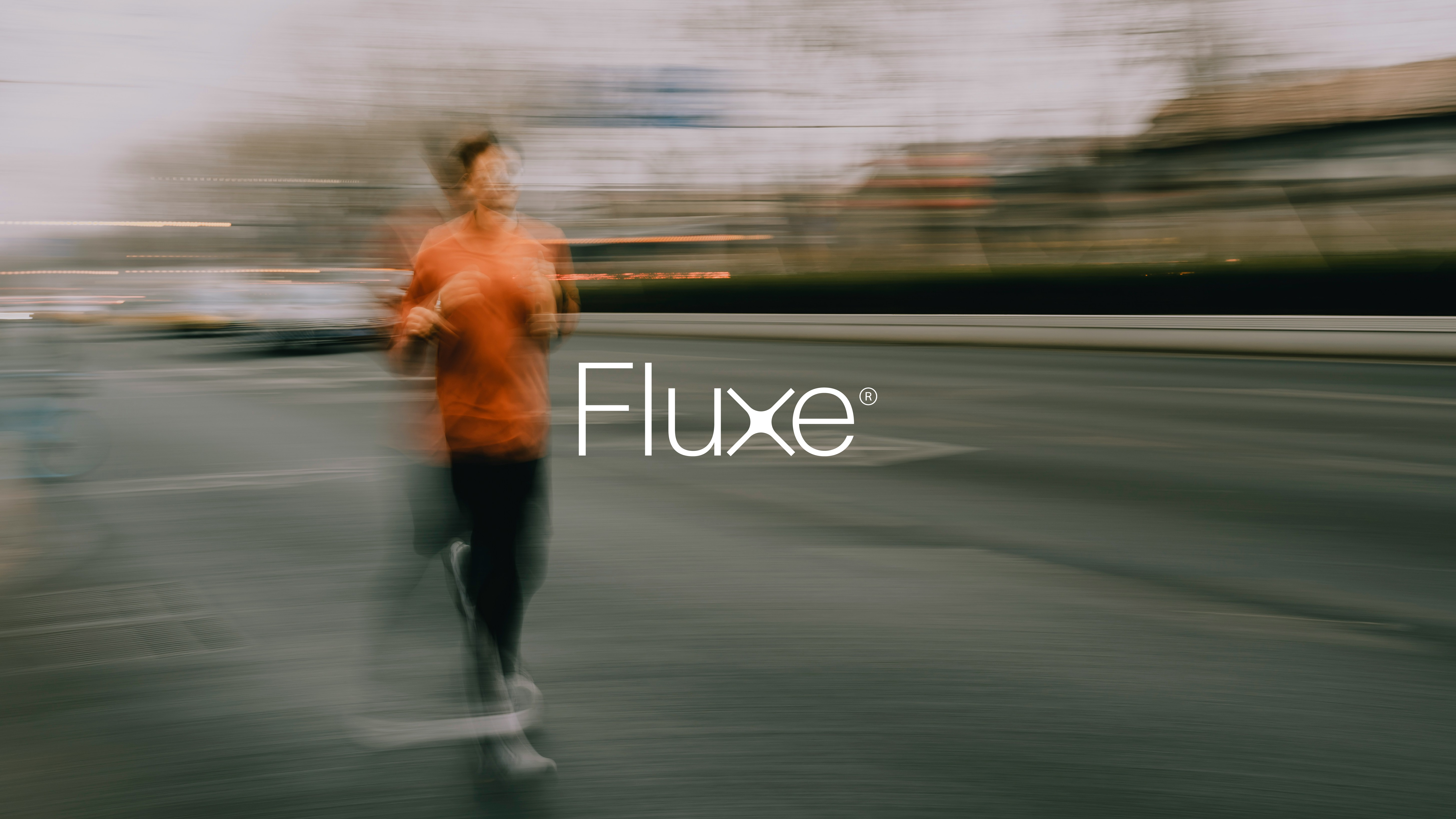
In developing the identity, we were struck by the concept of "sustained momentum", the idea that true performance isn’t a short-lived spike, but a consistent, high-quality flow. The word Fluxe seemed to suit this vision perfectly, acting as a nod to both movement and the fluid nature of energy.
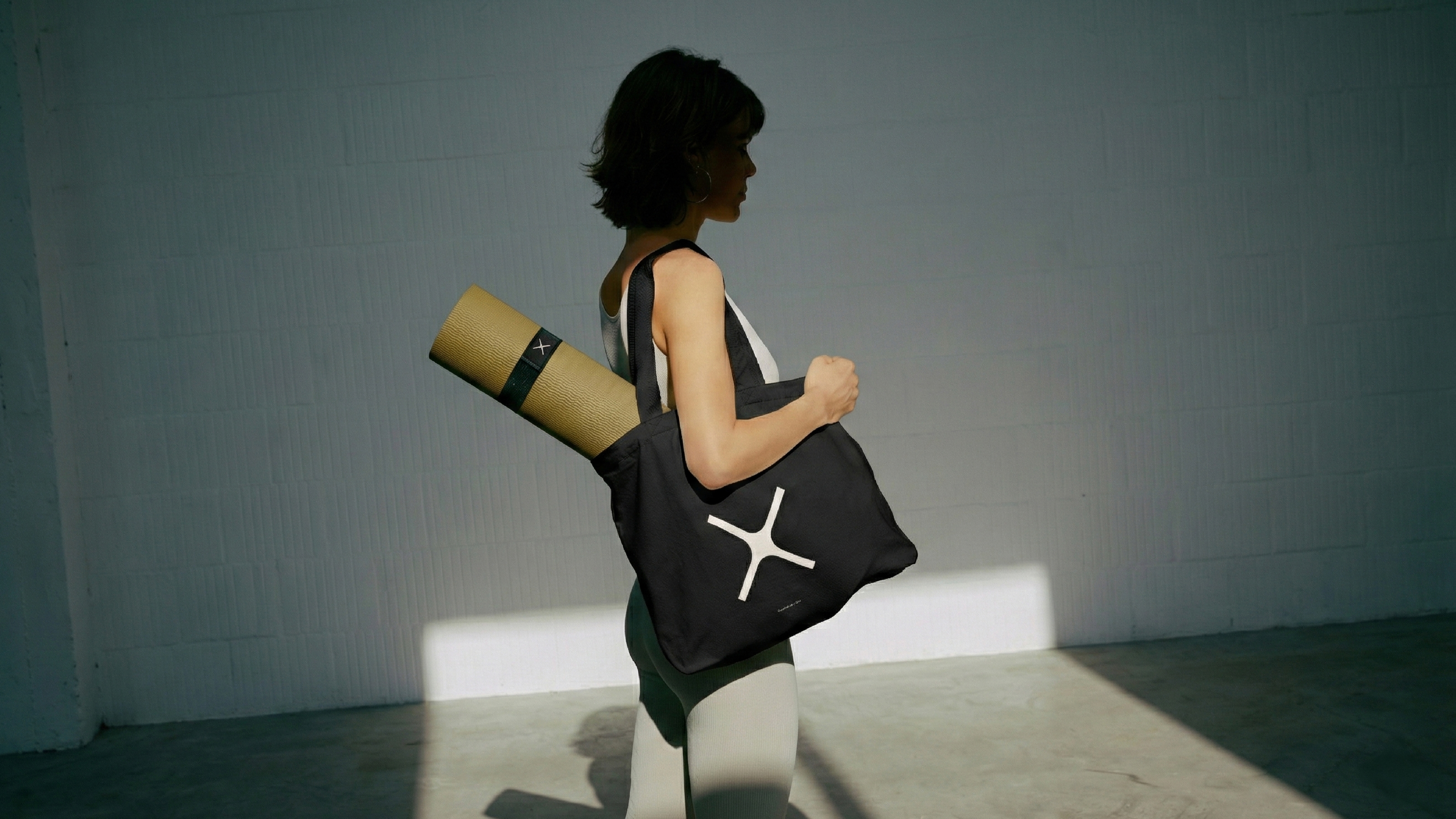
We wanted the branding to feel forward-thinking and dynamic, yet deeply rooted in a minimalist aesthetic. The addition of our core "X" motif signifies the funneling and release of energy. Its symmetrical form conveys stability and endurance, adding depth and grounding to the lighter brand marks.
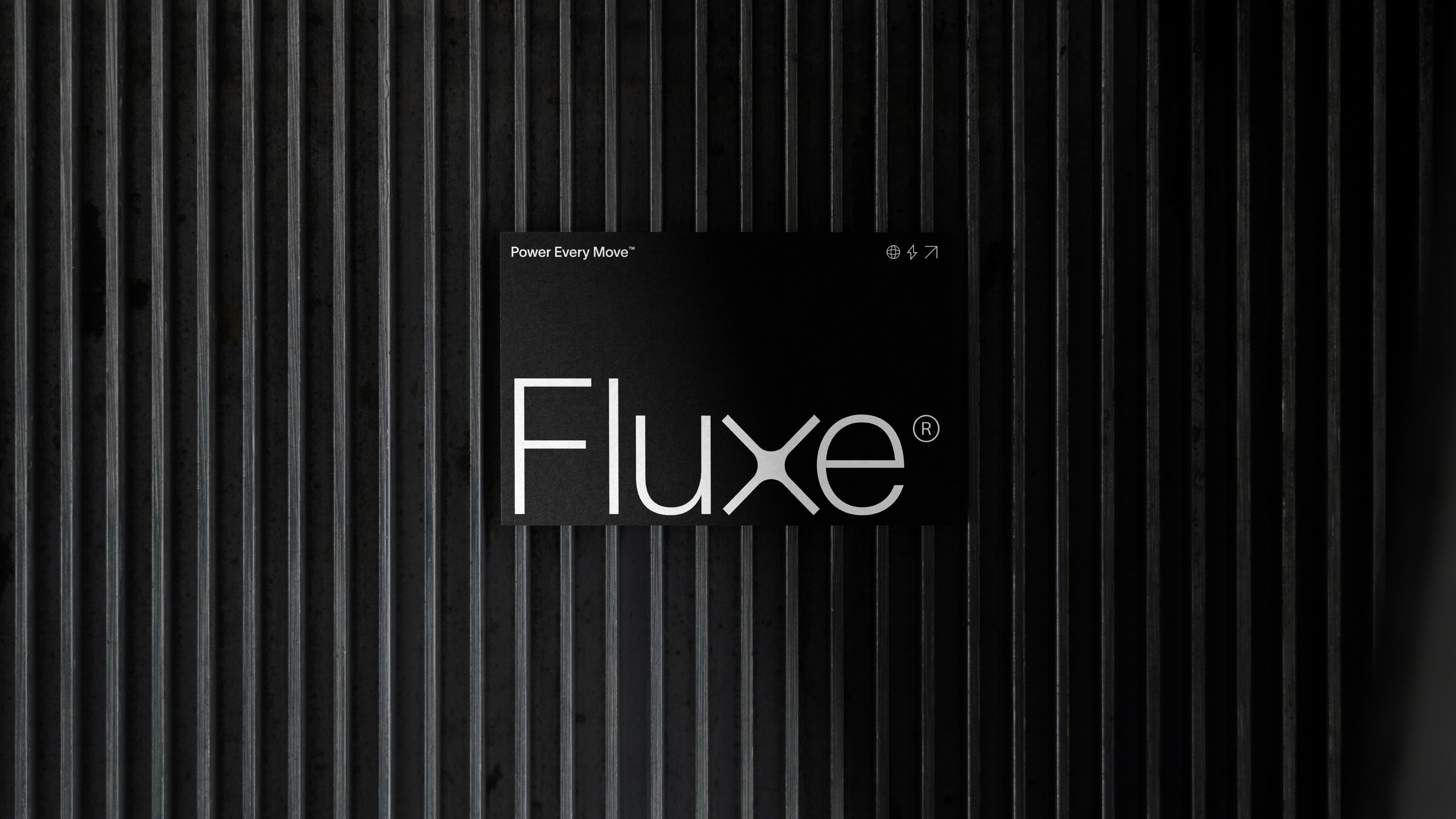
For the typography, we chose Lausanne Sans to bring the visual language together with sleek lines and functional clarity. The packaging design further reflects this eco-conscious ethos, using recyclable materials and foil colors that evoke movement.
The resulting system is a visual toolkit designed to empower people to harness their natural potential. From the tactile nature of the product to the digital promotion, every element was built with a singular purpose: to power every move.