FREESPACE – Visual Identity for the 16th International Architecture Exhibition (La Biennale di Venez
2018
Designed by David Smith, Oran Day, Isabelle McCarthy and Johnny Brennan at Atelier David Smith
Curators: Yvonne Farrell & Shelley McNamara
Grafton Architects Editorial Team: Emmett Scanlon, Nathalie Weadick & Alice Clancy
Venice Biennale Head of Editorial Projects: Flavia Fossa Margutti
Venice Biennale Web & Editorial Projects: Nicola Monaco
Editorial Production Team: Metodo Studio, Venice
Categories: Identity
Industry: Cultural
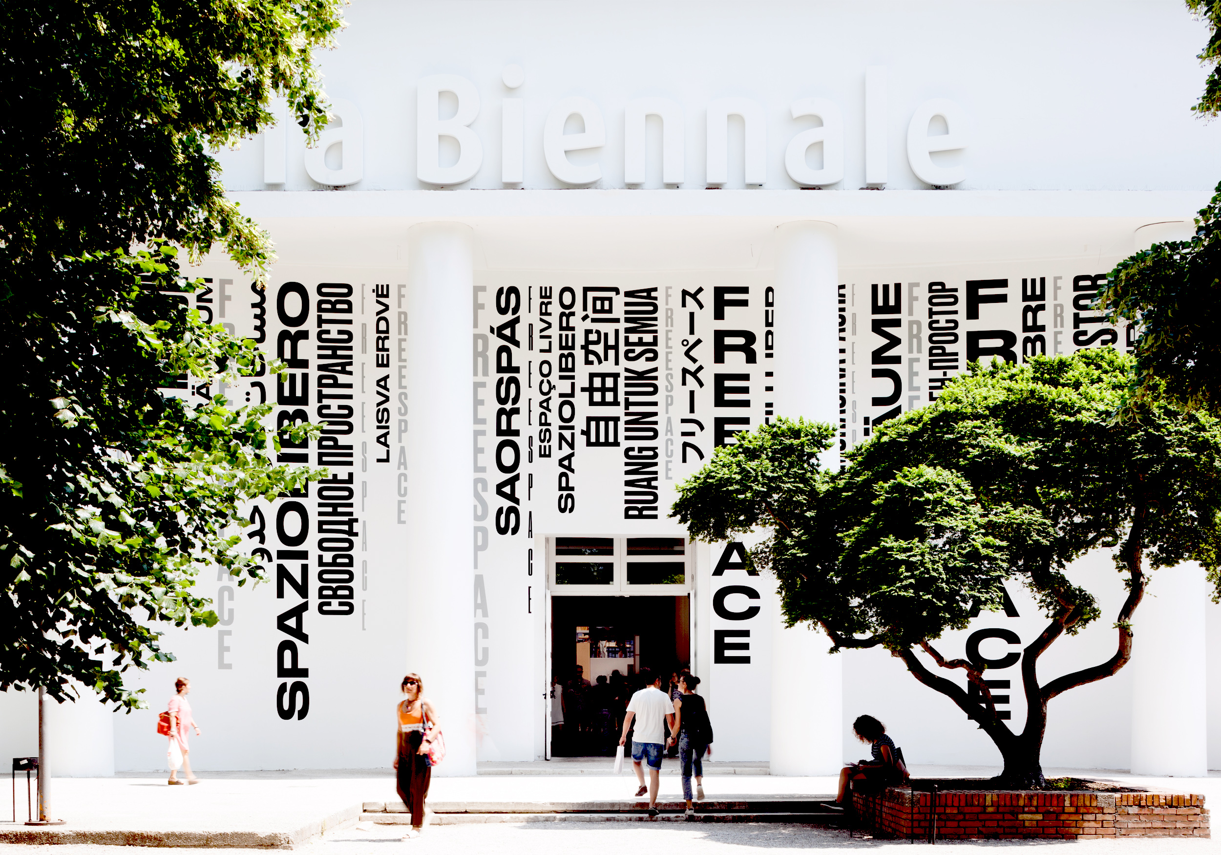
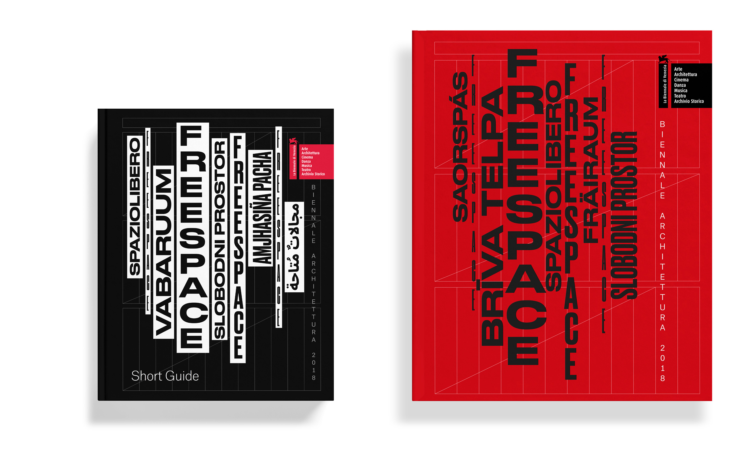
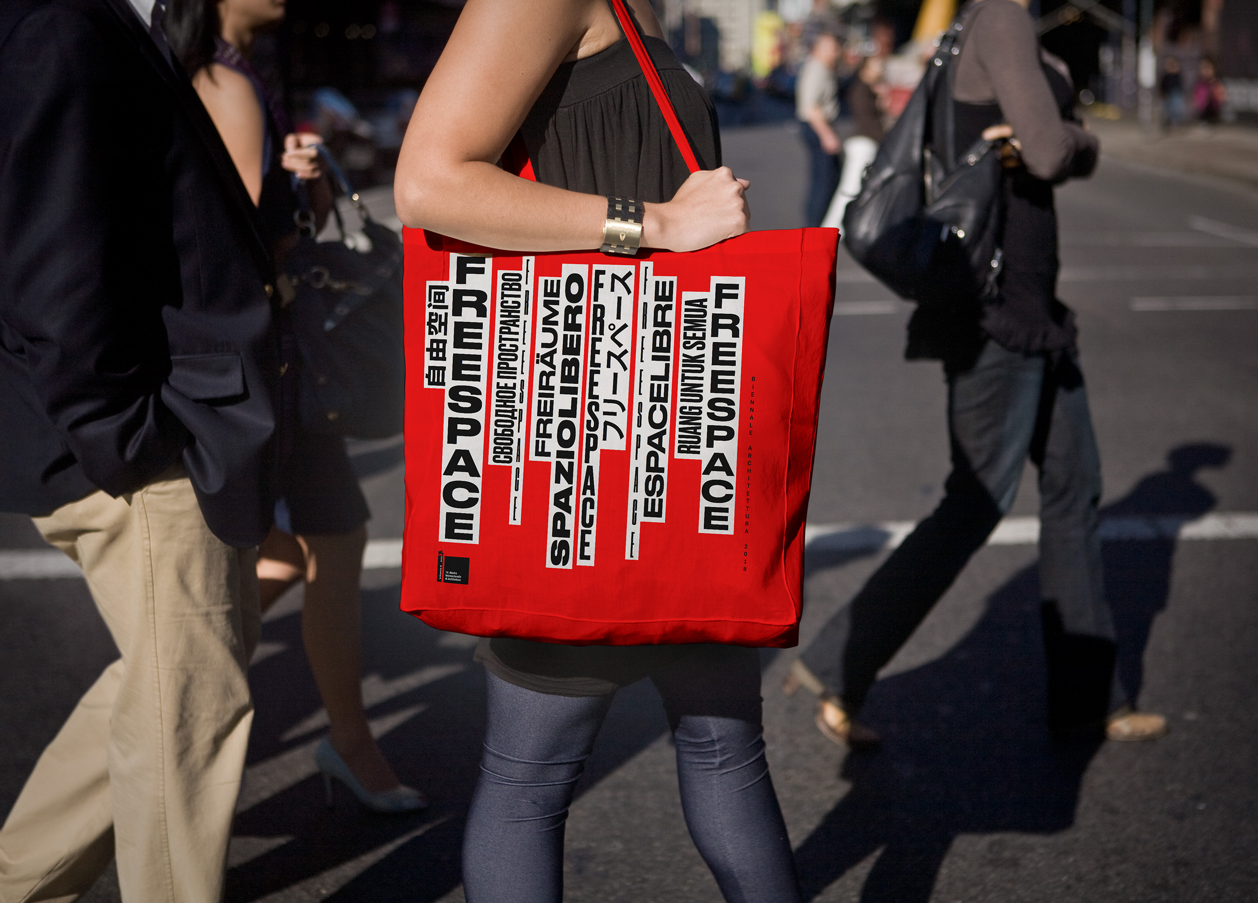
The graphic identity for Biennale Architettura 2018 seeks to visualise and communicate the ‘generosity of spirit’ and universal ideals at the core of Yvonne Farrell and Shelley McNamara’s FREESPACE manifesto.
The multilingual design concept for the FREESPACE identity visually references a number of historic, cultural, geographic and environmental antecedents – the typographic vernacular of the Futurist manifestos; the protomodernist structural innovations of Venetian opera and the distinctive columns of Arsenale/ Corderie and surrounding buildings.
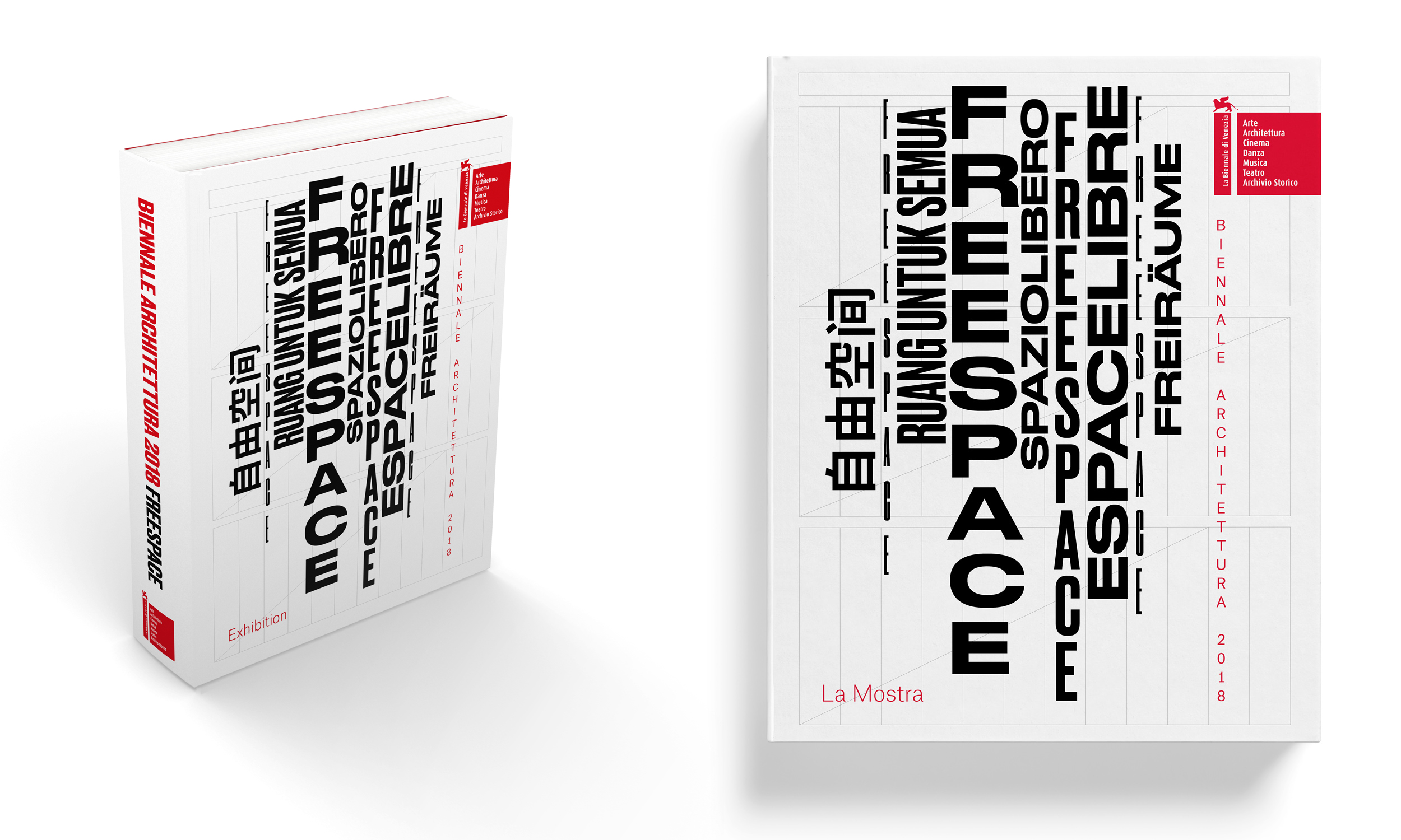
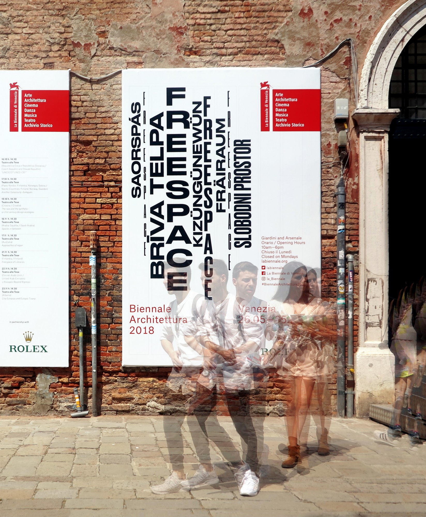
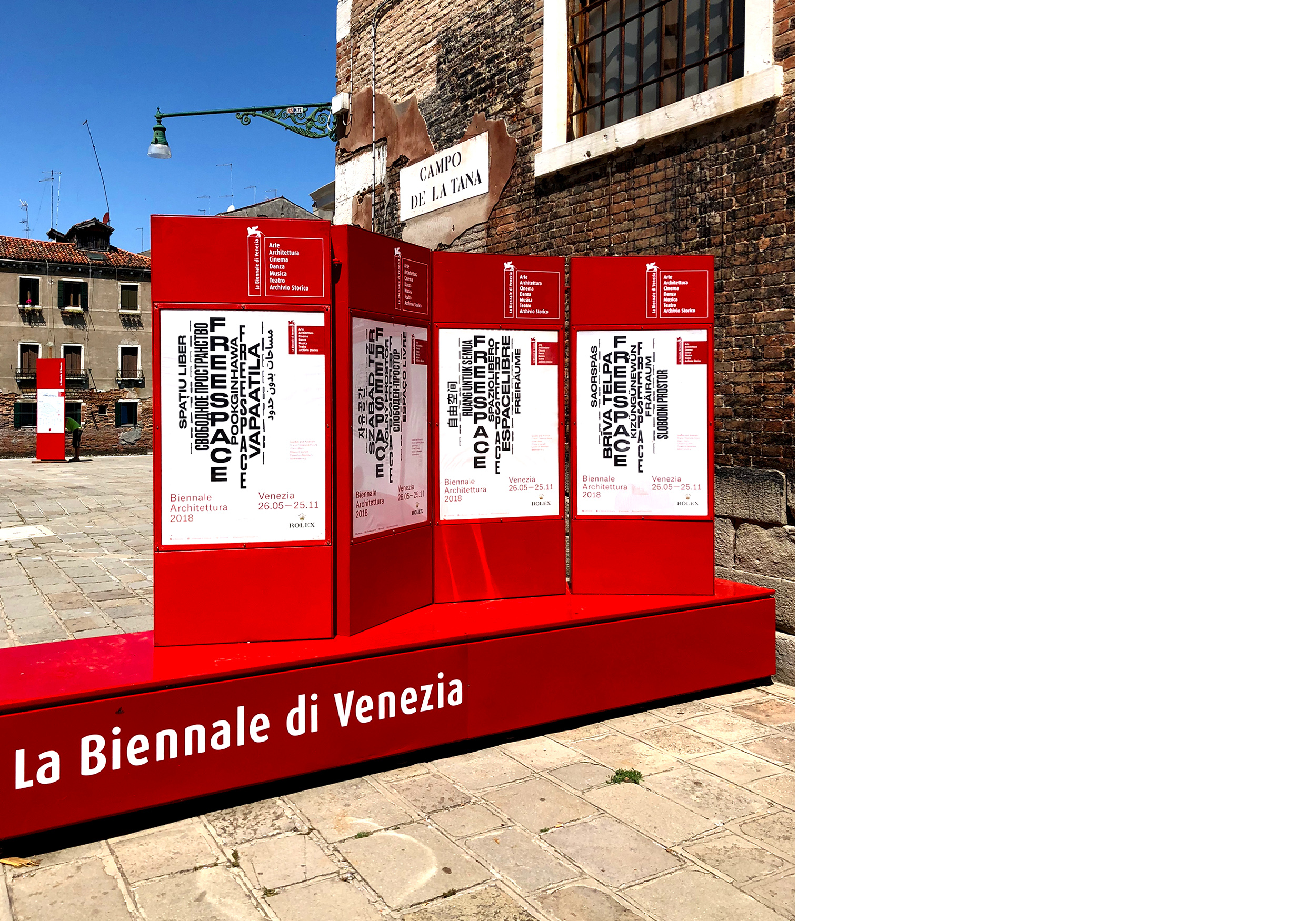
The FREESPACE identity offers a suite of modular ’typographic stacks’ (that visually reference the environmental staining on the columns of the Corderie), to be used in conjunction with the FREESPACE grid (based on the format of classical Venetian opera). These elements (along with the typographic and editorial standards in the Exhibition, Participating Countries and Short Guide books) provided the visual toolkit for the design teams working on Biennale Architettura 2018.
In keeping with the universal and egalitarian ideals implicit in the title/concept, FREESPACE has been translated into almost 100 official languages. These approved translations are used to construct additional/alternate FREESPACE typographic illustrations/stacks, for use on various FREESPACE collateral.
Language was used as a ‘shorthand’ to establish a *tereno commune* or common ground between all of the participants (and visitors). In translating FREESPACE into each participants language we established a sense of "belonging" and a shared identity across all of the collateral produced. Ten variants of the poster was produced and other variants/multiples were created for core communications and promotional merchandise.
The FREESPACE grid offers a graphic counterpoint to and a visual anchor for the ‘typographic stacks’. However it also provides a system for organisation of information and for proportional division of any appropriate space – poster, page, screen, banner, etc.
The FREESPACE grid’s construction references classical Venetian opera’s populist three act format – as pioneered by proto-modernist composer, Monteverdi (1567—1643). This three act format was usually preceded by an introduction/overture and the acts we’re broken into a varying number of scenes (usually not exceeding 15 scenes per act).
The principal typeface used is Druk – it was chosen for its association with wood-block printing and the display types that would have been evident in flyposting and banners of historic manifesto's. It is also results in a style or aesthetic that is purposefully ‘unrefined’, familiar and commonplace.