Galway 2020 Branding (2019)
Designed by Colin Farmer, Noelle Cooper and Chris Fullam at Unthink
Studio Co-ordinator: Laura Woulfe
Categories: Identity
Industry: Cultural
Tags: Typography
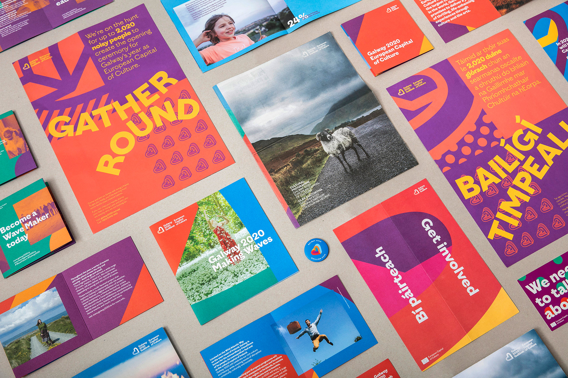
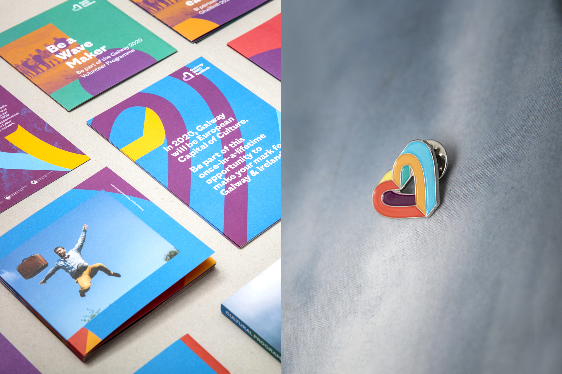
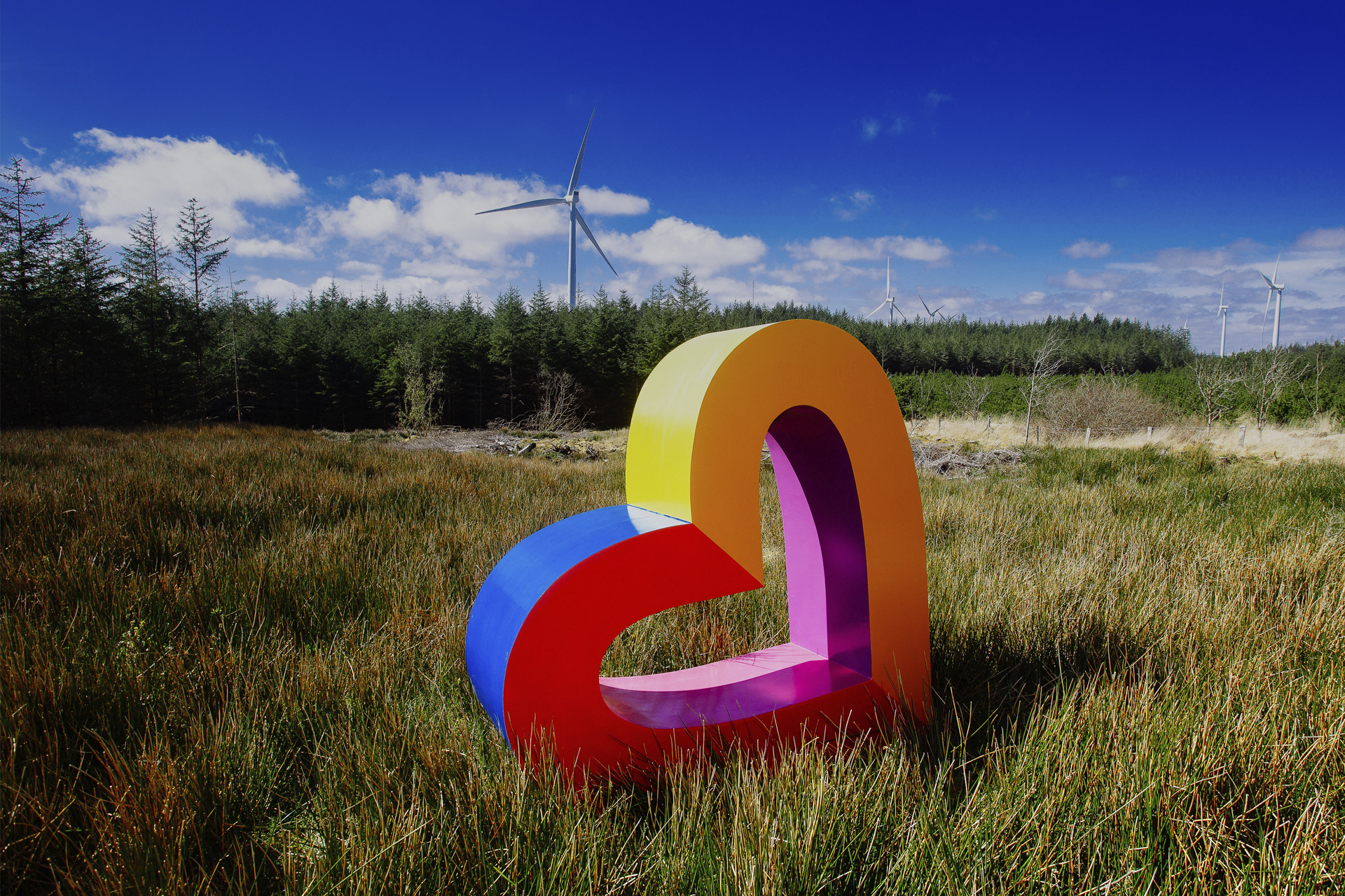
Having worked with Galway 2020 during their bid for the European Capital of Culture, we were commissioned to take on the branding for the year itself. The first part of the project was to develop a custom typeface, which was born of Galway and will be a gift to its people once the year is out. We then started looking at ways to inject new life into the existing brand, embracing the heart at its core. We proposed the heart could morph and adapt to suit the many audiences and diverse programme it needed to reflect. This newly invigorated heart could then be cropped and repeated to create an infinite number of outcomes, ensuring the brand could remain fresh during the intense 18month programme.
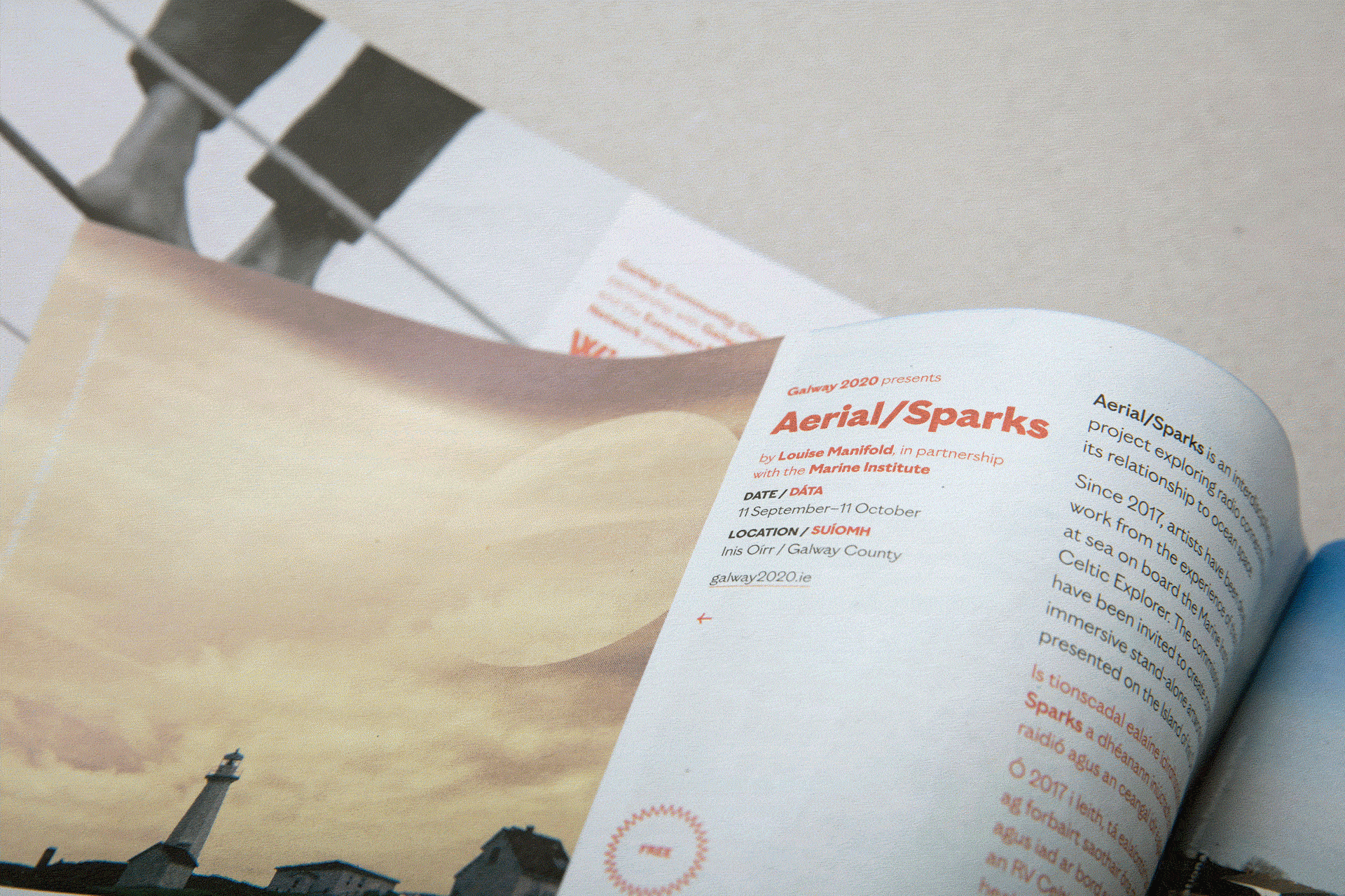
We have created a host of printed and digital material, ranging from badges to tabloid programmes which were delivered to every household in the county. The flexibility inherent in the brand allows us to achieve muted tones for the artistic programme or excitement for a public campaign. The diversity when collected together creates a lively diverse brand which showcases the best of Galway as it becomes the focus of European eyes.
The website was also overhauled to reflect the new branding and showcase the newly formulated cultural programme. The broad colour palette was designed to differentiate the various strands of the programme and help visitors navigate over 100 events.