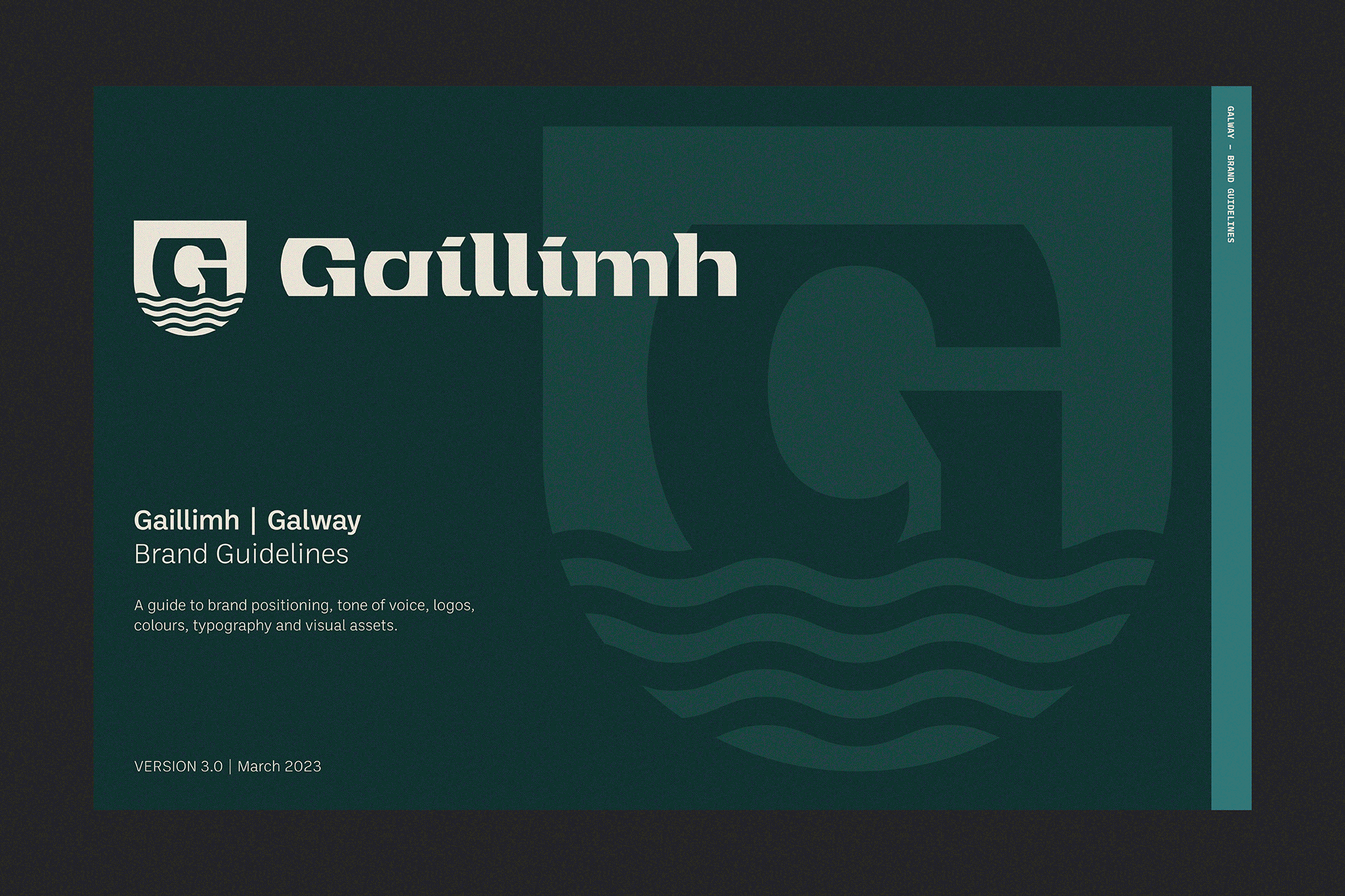
Galway Tourism
Designed by Trevor Finnegan and Shane Bonfield at Revert Design
Typeface: Max Phillips (Signal Type)
Photography: Matthew Thompson
Categories: Environmental / Identity / Promotional / Printed Publication / Typeface / Wayfinding / Signage
Industry: Civic
Tags: Photography / Digital / Art direction / Campaign
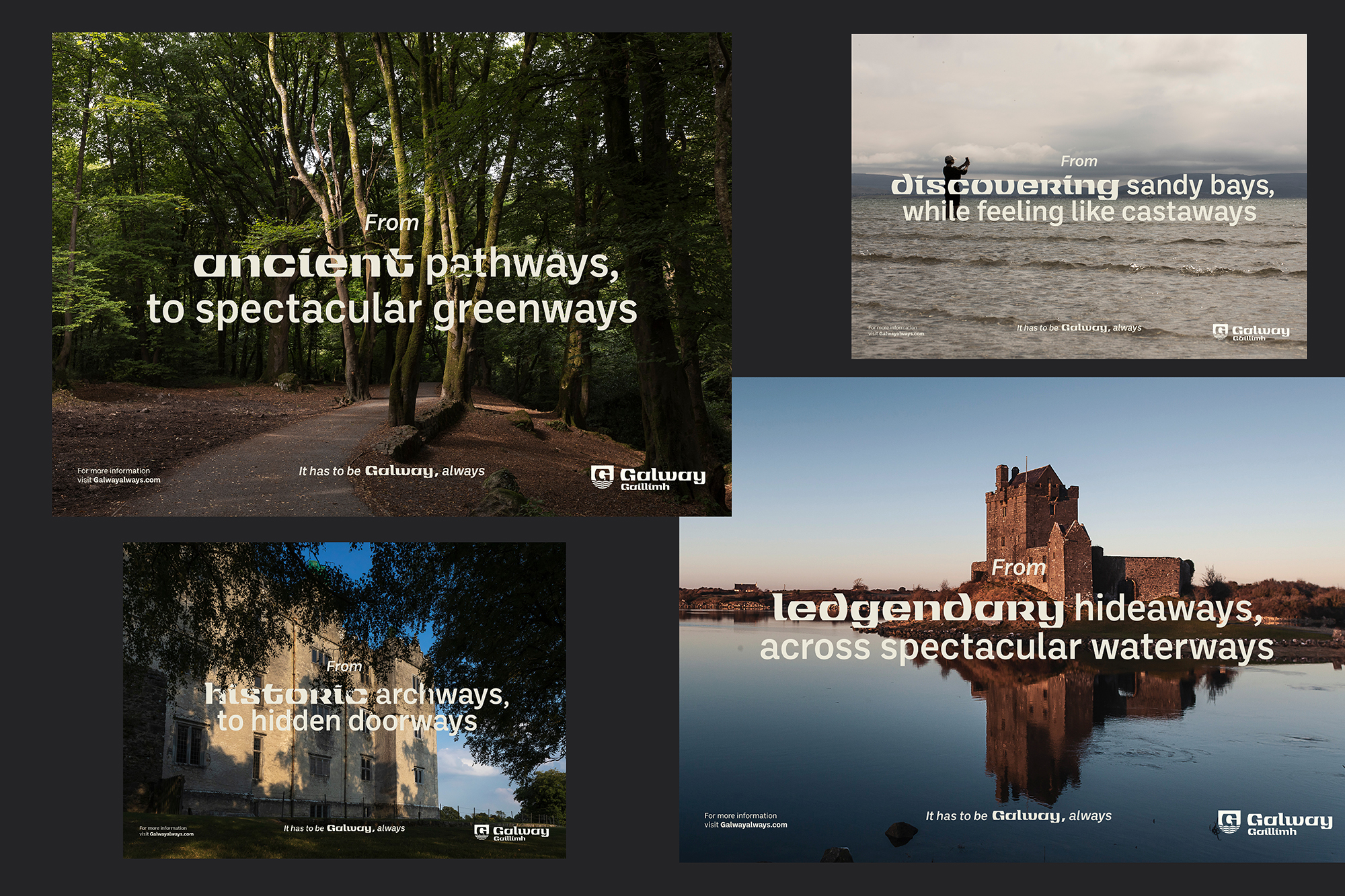
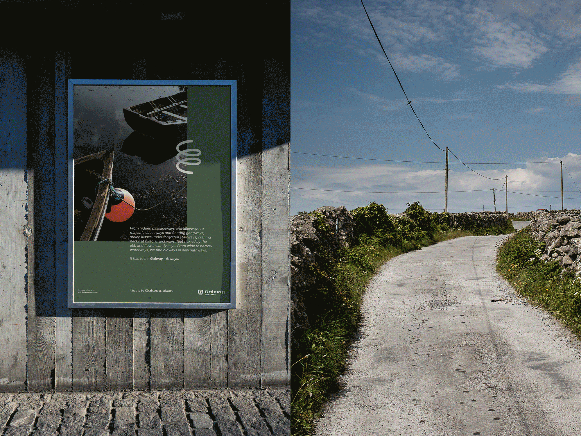
Galway is one of Ireland's best-loved and most unique destinations for tourists both domestic and abroad.
Working with Galway County Council we created a brand identity that would capture the outstanding natural beauty of a county that is vastly different in landscape from the Shannon region of east Galway to the wilds of Connemara of west Galway.
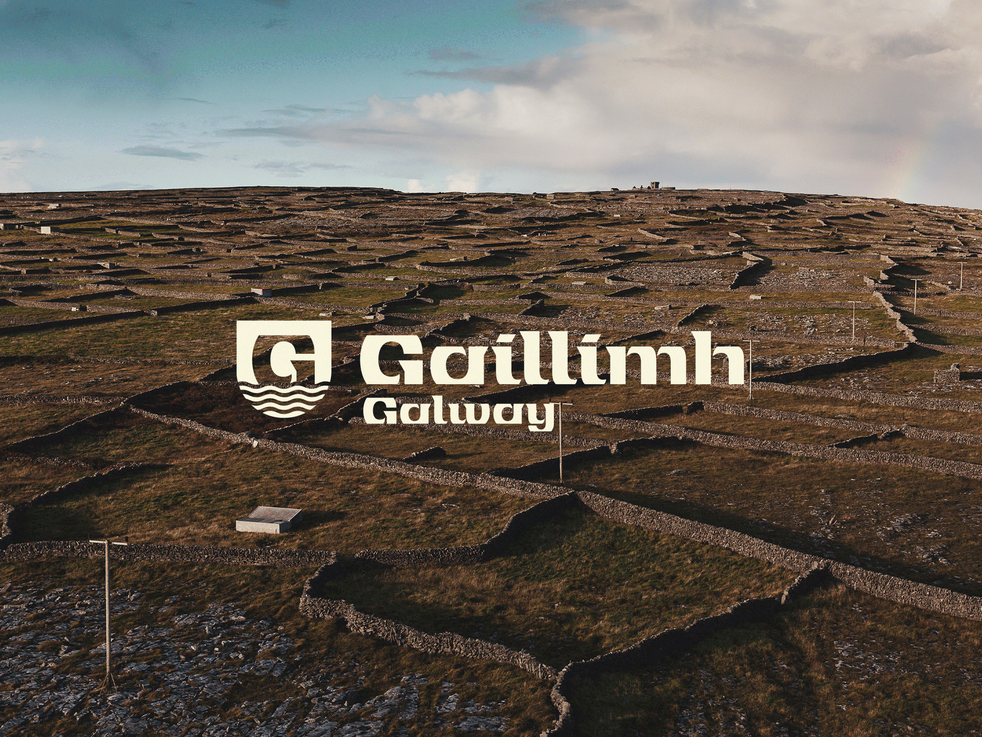
Having completed various field trips around the county we wanted to create a logo that would reflect the sharp limestone walls of the East through to the rough rugged open coastline of the West. We also looked at the rich typographic elements that are visible on traditional hooker boats of Galway which often use traditional Gailic type in their names.
We worked with Max Phillips (Signal Type) to create the logo mark from a font that he recently released called Jarlith. The font originally known as 'Tuam Unical' was developed by Jarlith Hayes back in 1970's and we contacted Max who recently finalised a digital version of the typeface. Photographer Matthew Thompson worked on photography and captured everything from the vibrancy of Galway city to the vast openness of the coastline on the Atlantic edge.
We also created an illustrated icon set that was inspired by local interests such as the Spanish Arch, Blackrock diving tower, Stone walls, Poitín still, Ballinasloe Horse fair, Pàdraic Ò Conaire and the Connemara Currach all synonyms with Galway.
These were then used on various other items such as merchandise, city and county pocket guides, promotional material and signage.