Gerhard Munthe, Enchanted Design
Designed by Evan McGuinness at Bielke+Yang
Art Direction: Christian Bielke
Bobby Tannam: Type Design
Categories: Identity / Exhibition
Industry: Cultural
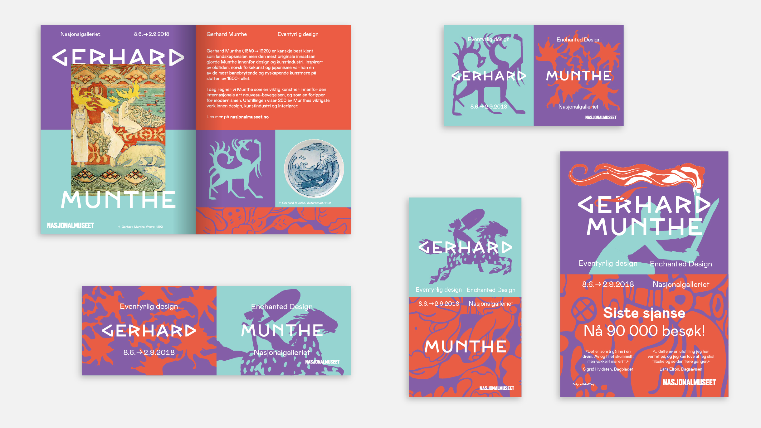
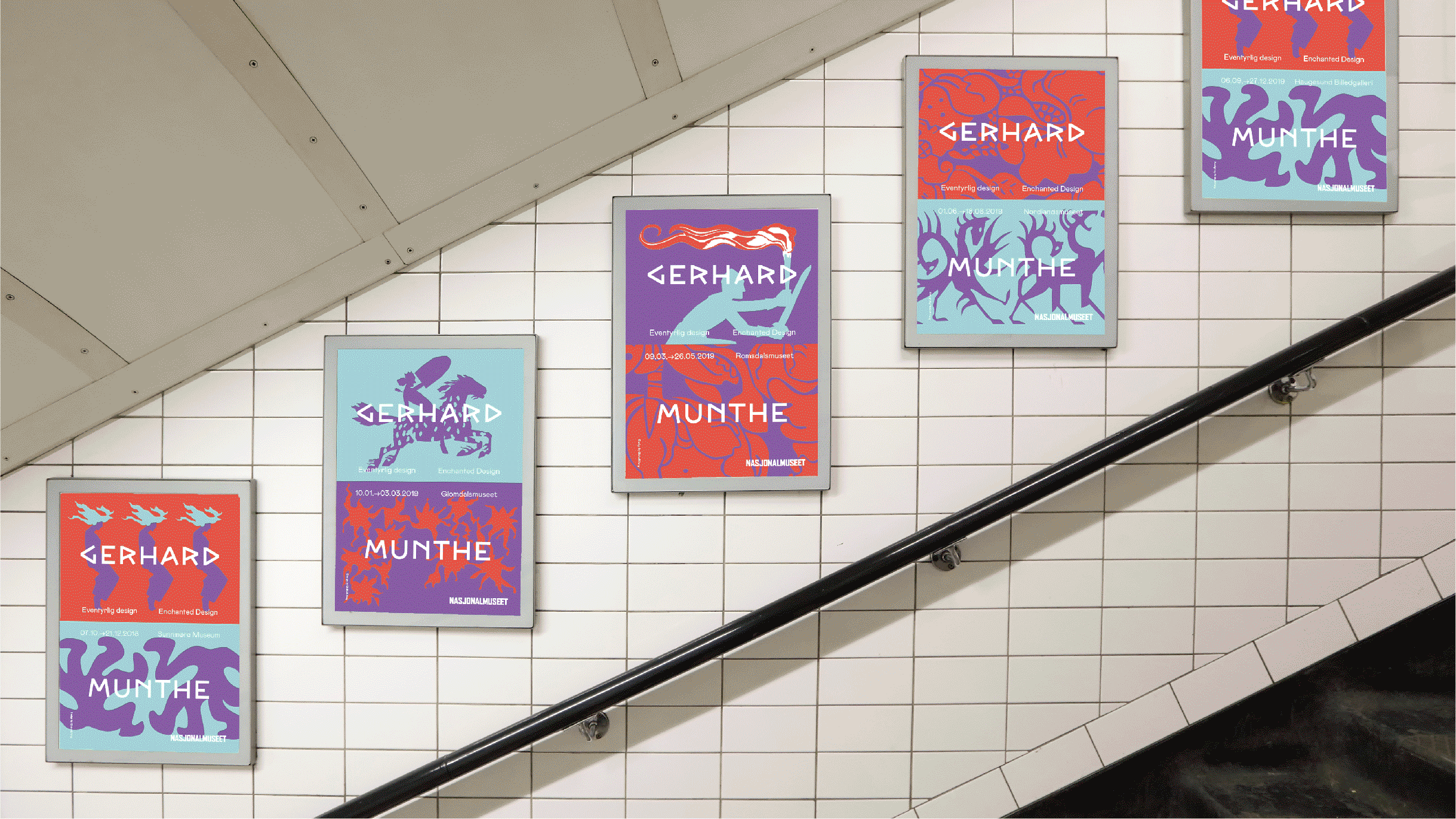
Although Gerhard Munthe (1849–1929) is probably best known as a painter, his most original, important contributions were in the areas of design and interior decoration. The exhibition is the largest presentation of Munthe's design and craft since 1917, with 250 works showcasing his comprehensive efforts as an artist for the industry.
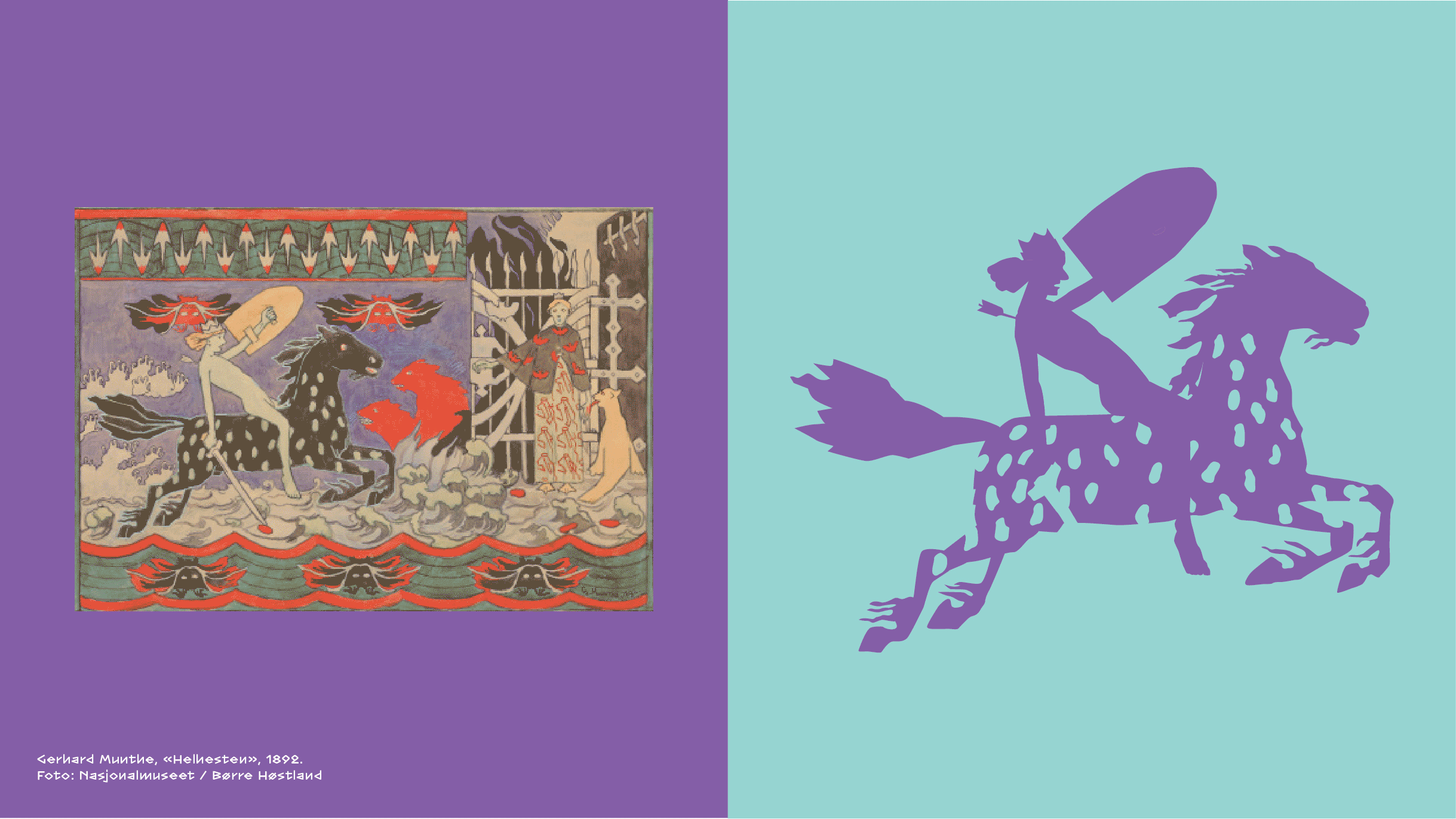
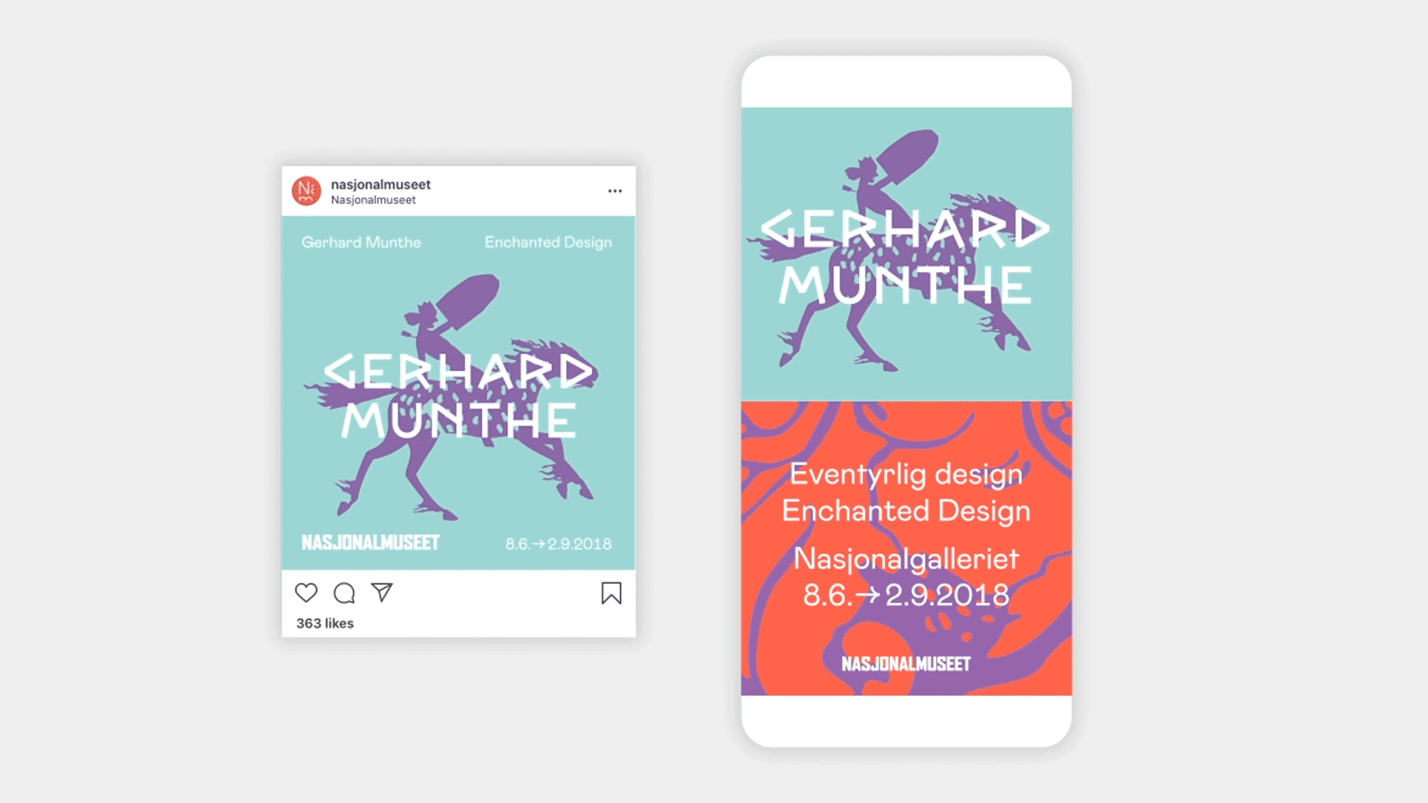
The exhibition's identity needed to be applied across a wide number of surfaces, where it was difficult to use images of Munthe's paintings, objects or textiles. Munthe's works, in general, are packed with information, full of detailed, multi-layered storytelling of Norwegian folklore. Therefore, recognizable motifs, patterns, and typography were taken from in the works and abstracted to simplified graphic forms that could be used across the identity material, these would be recognisable to those who know Munthe's work but surprising and engaging for those who did not.
The inspiration for the colour palette came from Munthes own "Norwegian-national color palette" of pink, reddish-brown, indigo, blue-green and yellow-tones related to Norwegian nature and folk art. Munthe himself used these colors in an unconventional way, combining them to create contrast and grab the viewers' attention.
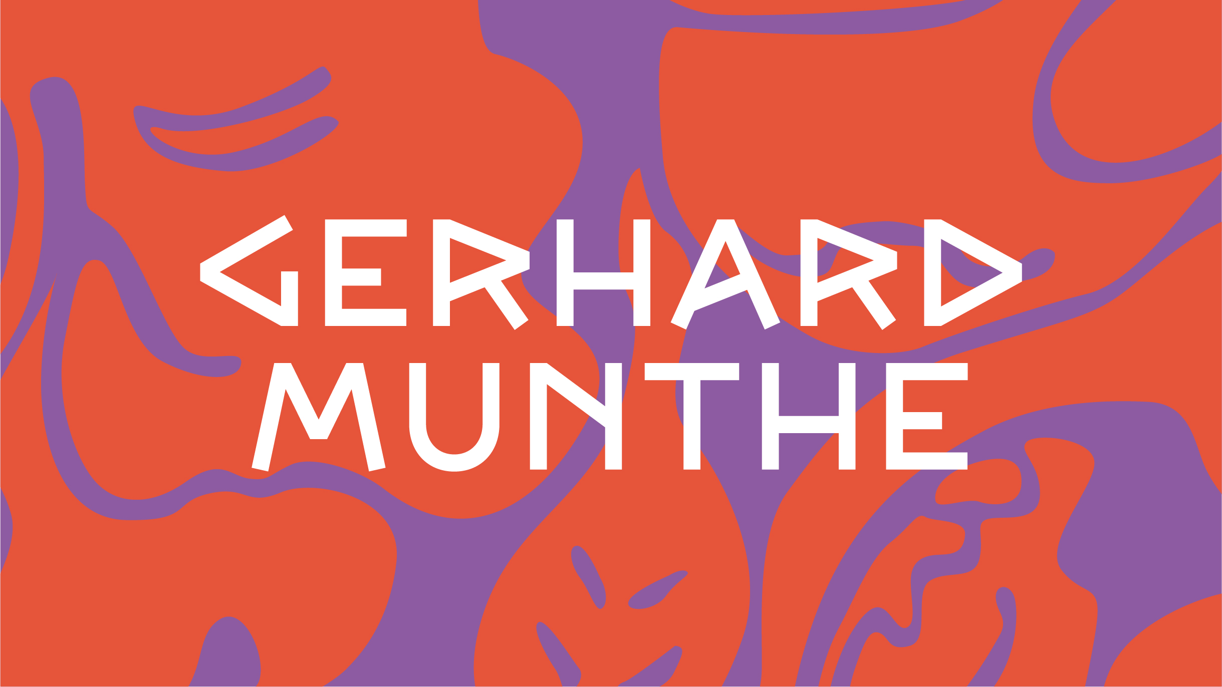
The typeface is a digitized version of Munthe's own font, used in the original illustrations of Heimskringla — this is the first time this has been made into a font.