Glantus
2021
Designed by Brian Wilson, Kathryn O'Driscoll and Sinéad Allen at Wilson Creative
Categories: Identity
Industry: Commercial
Tags: Rebrand / Logo / Branding / Identity / Brand Identity / Logo Design
Website: glantus.com
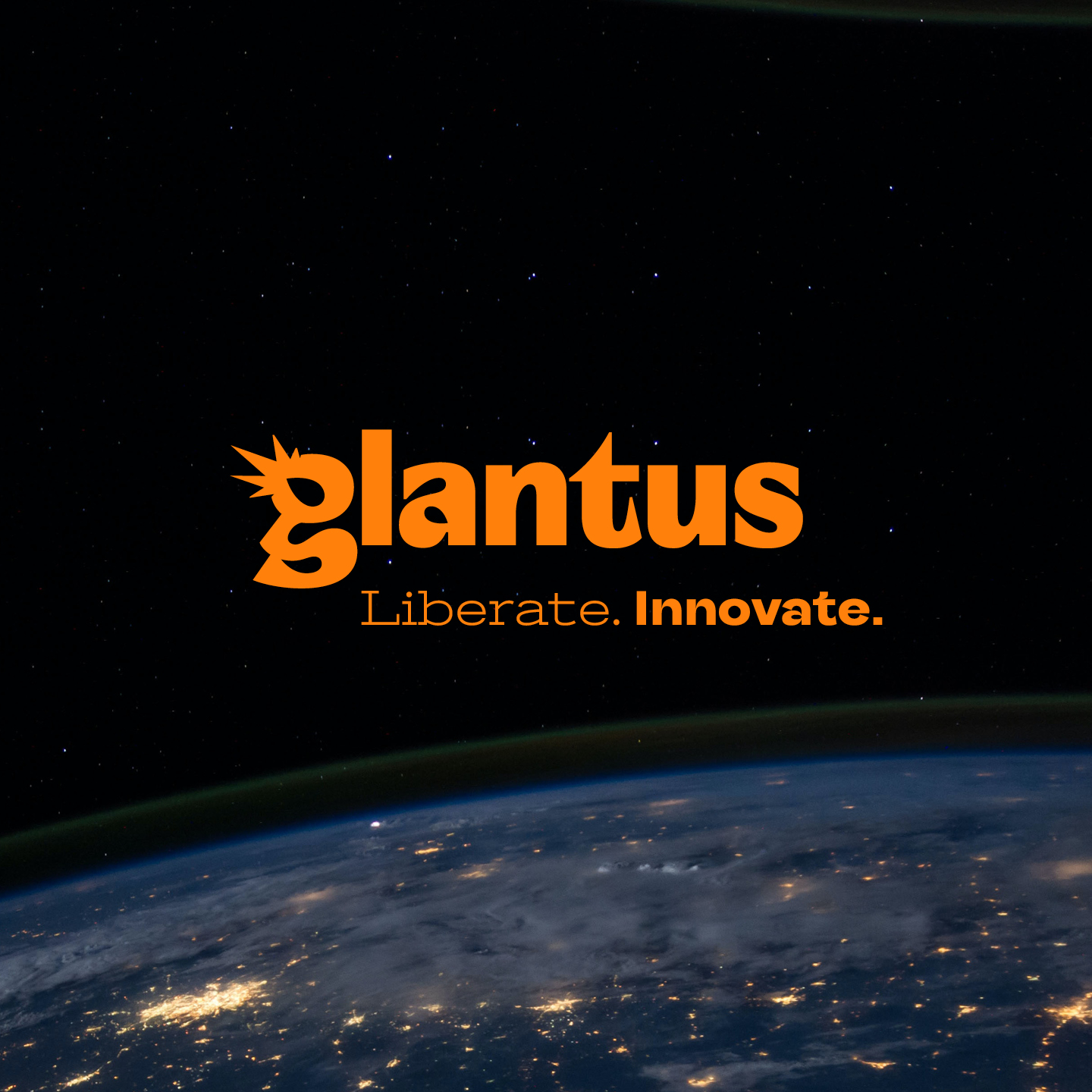
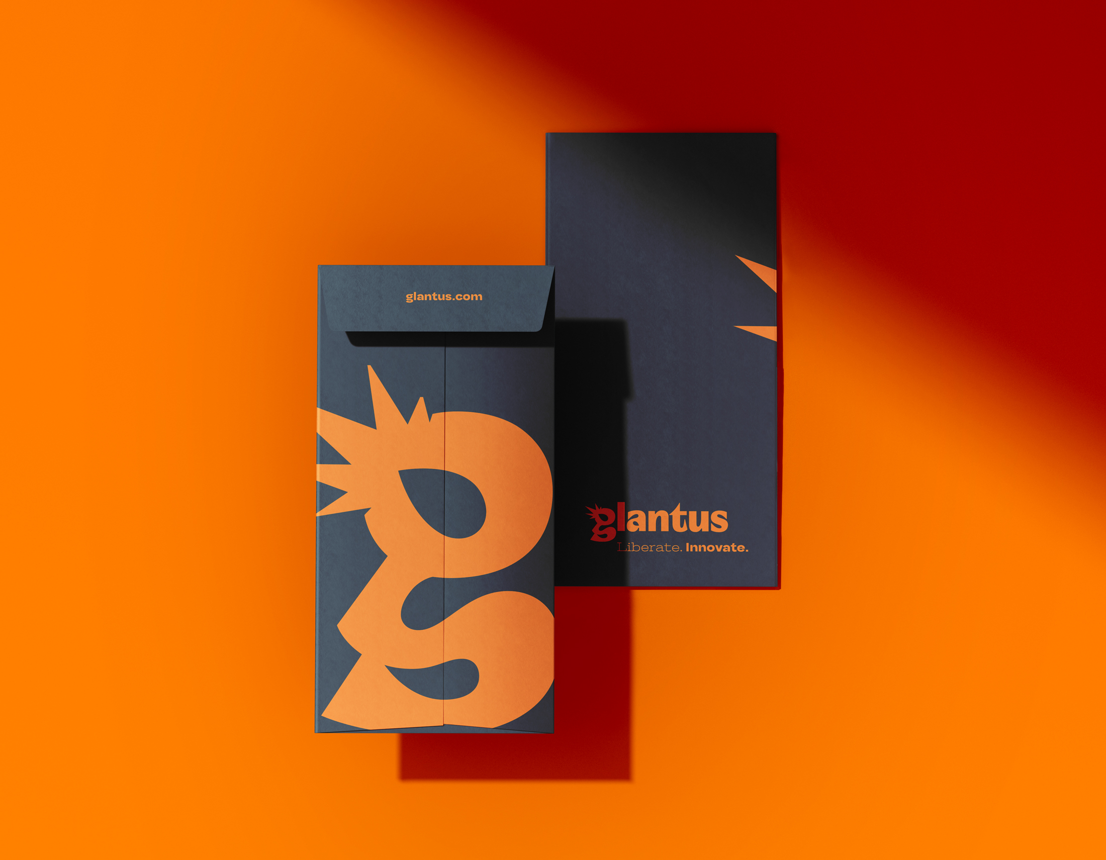
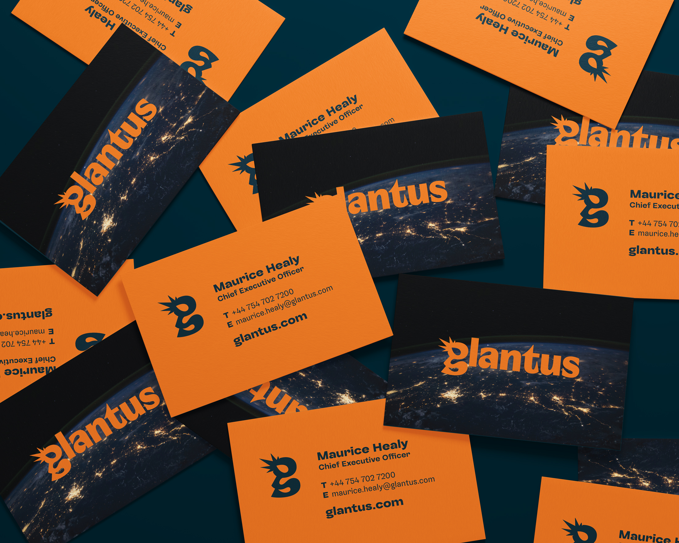
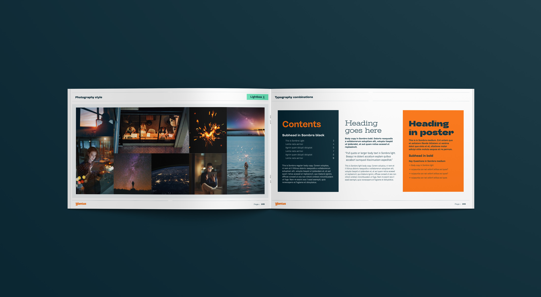
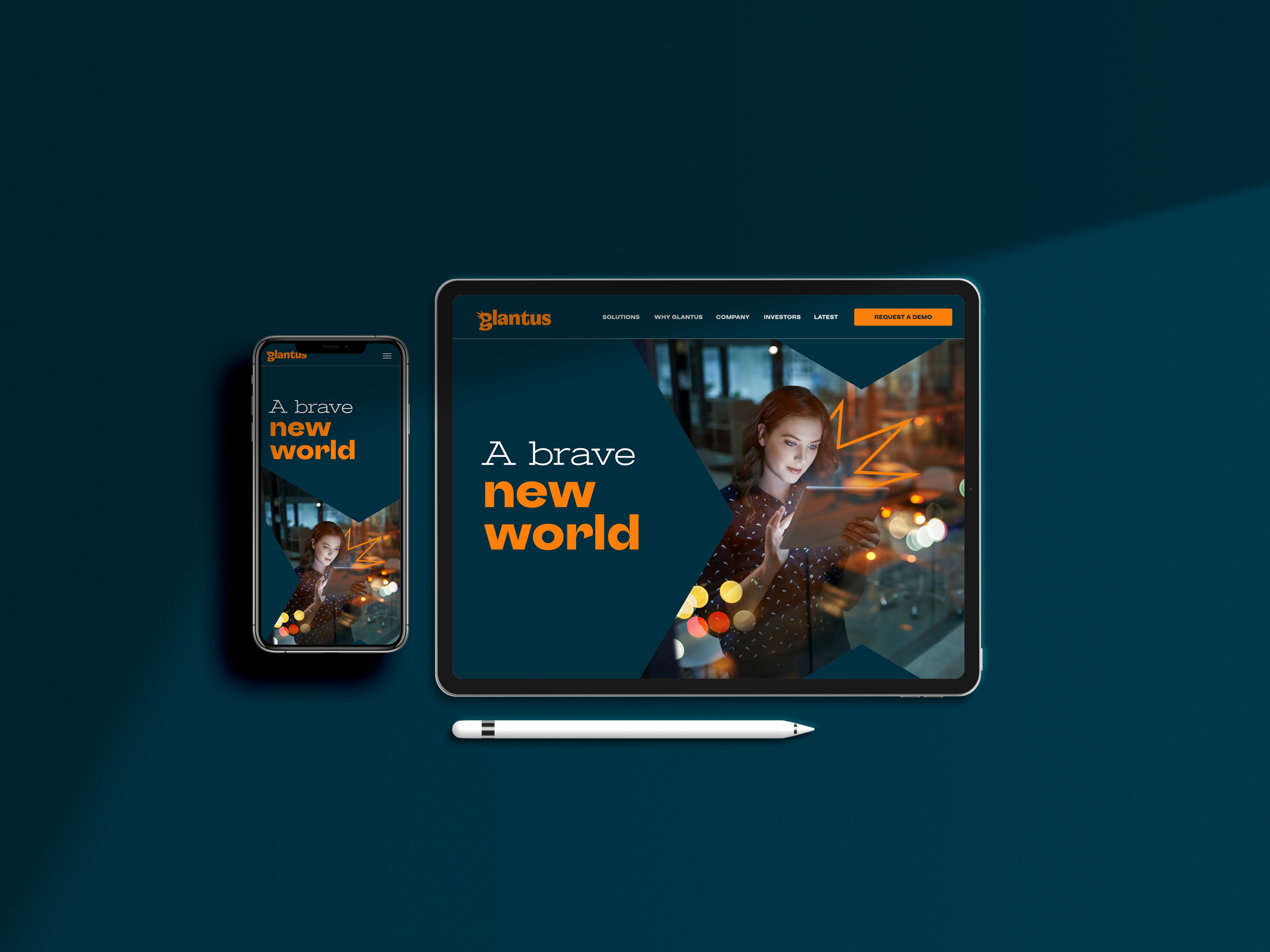
A brand refresh for Glantus, a global data analysis company working primarily in the AP sector. The identity hung off two key pillars, the people of Glantus and the world of Glantus. We created a bold and exciting new logo that features a comet (yes a comet) in it's 'g', this represents the Big Bang moment when data analysis and Glantus hit the AP world infusing it and evolving it so that it's people could be free to imagine bigger and better ways to improve life for themselves, each other and their clients. The supporting assets all serve to reinforce and support the excitement and the opportunity at Glantus as it grows and expands globally.