GradX–TU Dublin Graduate Exhibition Identity 2025
2025
Designed by Niamh Fanning, Adam Doran, Angie Hogan and Lenny Sanches
Tutor: Peter Maybury
Tutor: Brenda Dermody
Website Developer: Neil Creagh
Production Advisor: Anthony Collins
Categories: Promotional / Website / Print / Identity / Wayfinding / Exhibition
Industry: Cultural
Tags: Typography / Digital / Exhibition
Website: gradx.ie
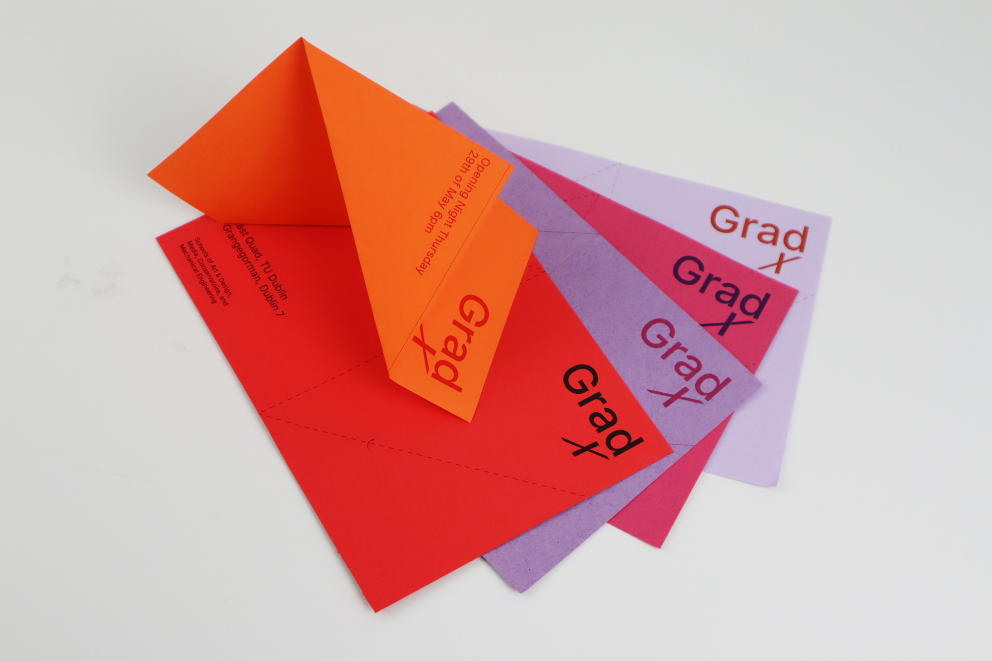
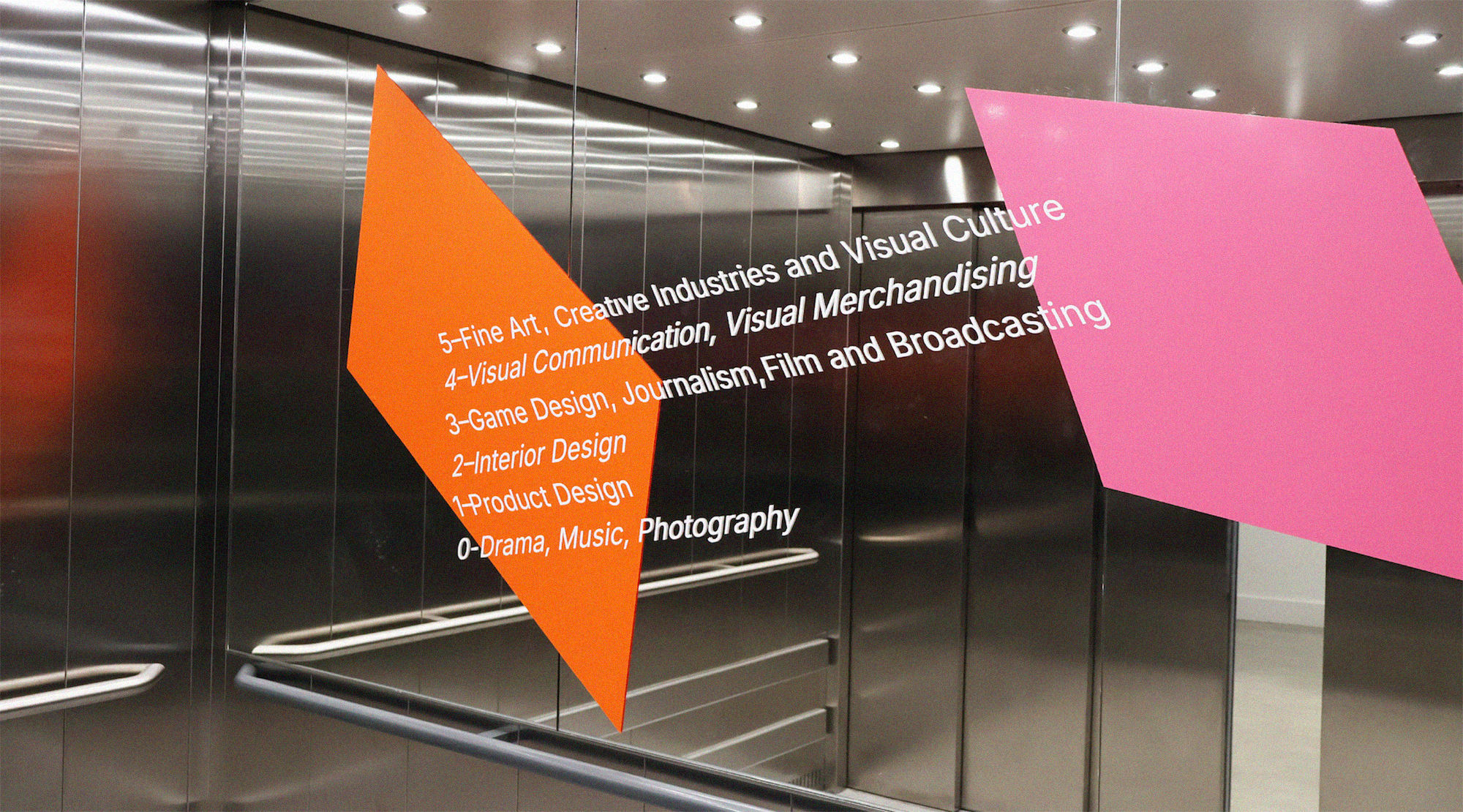
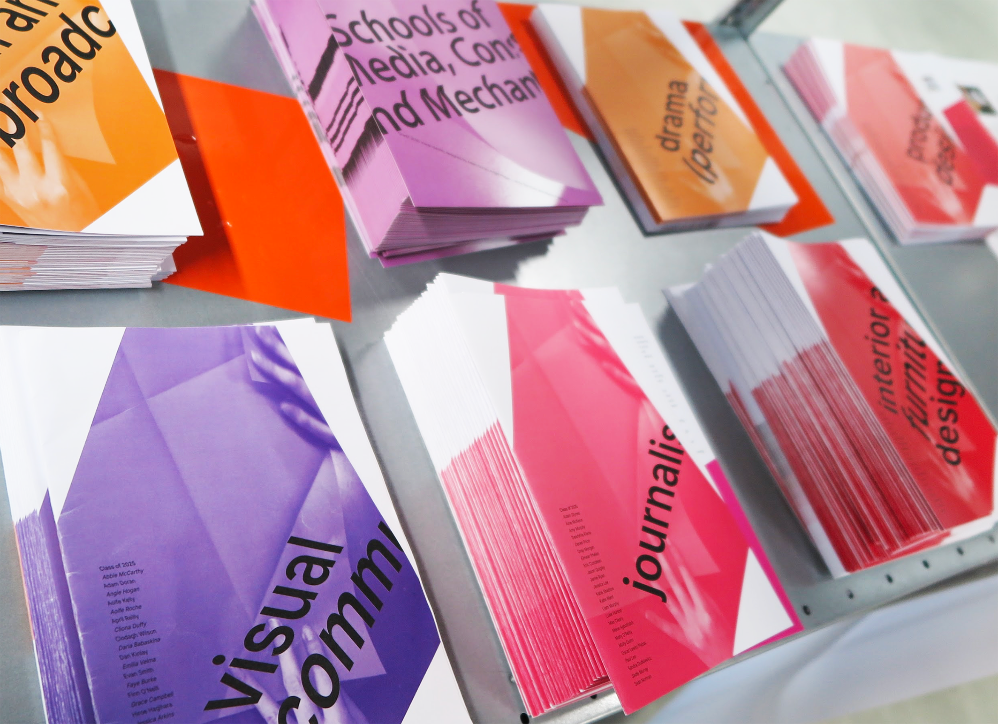
The GradX 2025 identity encompasses a creative solution for effective promotion and dissemination, visual identity development, and utilisation of the site of the East Quad and Grangegorman campus at TU Dublin. GradX incorporates twelve courses across four different schools in TU Dublin. This vibrant identity reflects the diversity of all these students, engages audiences through performance, and adapts to website, social media, campus wayfinding, printed brochures and invitations.
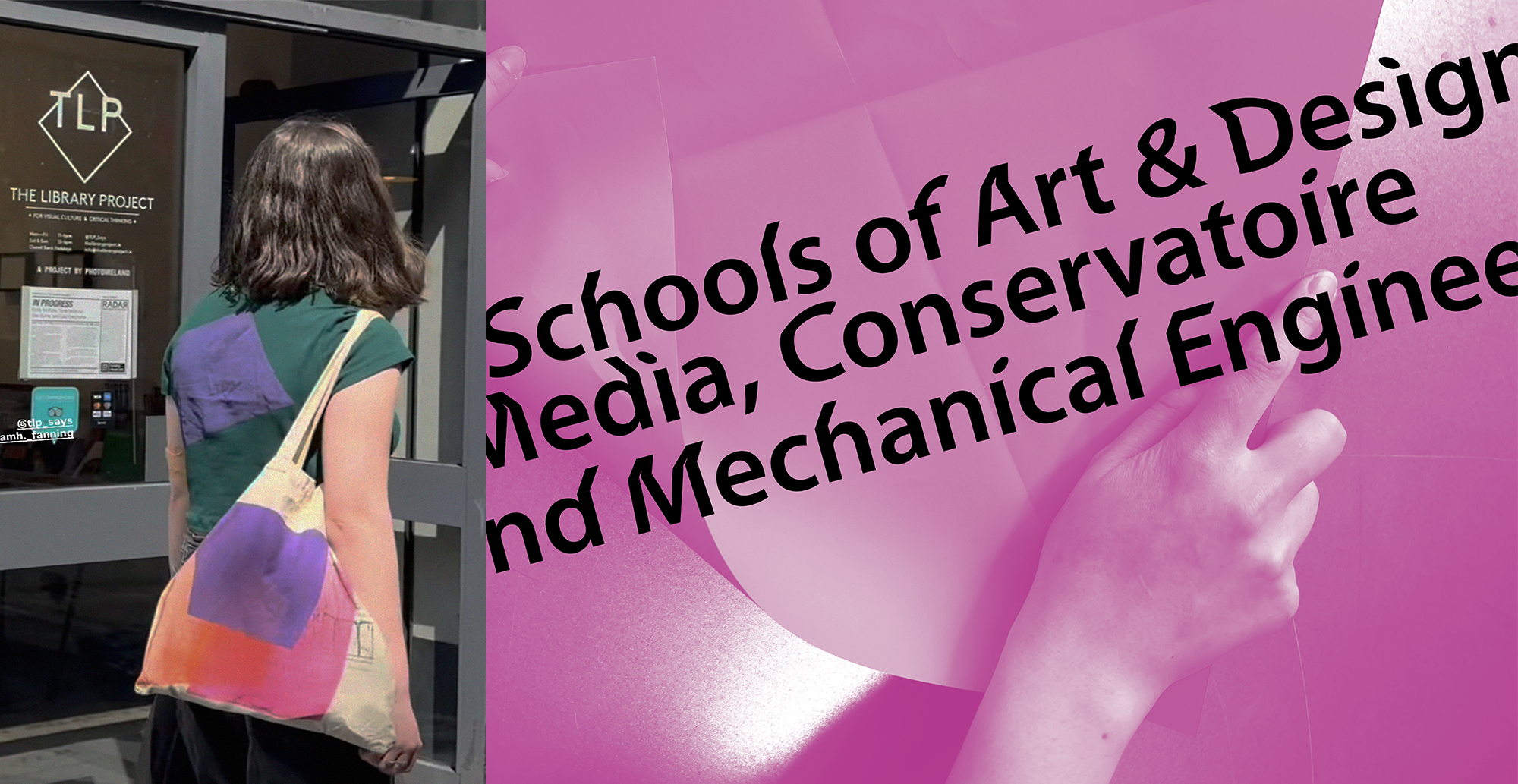
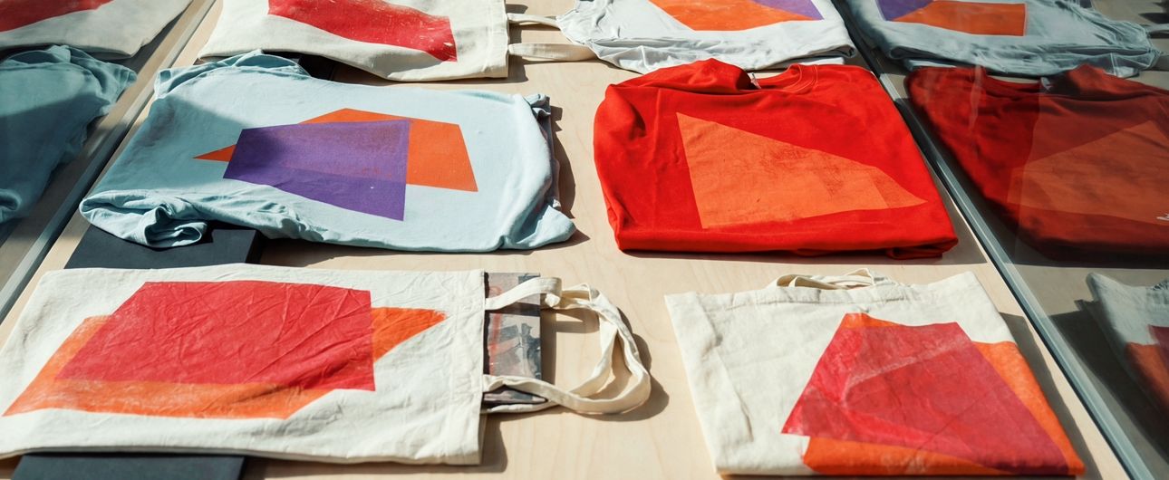
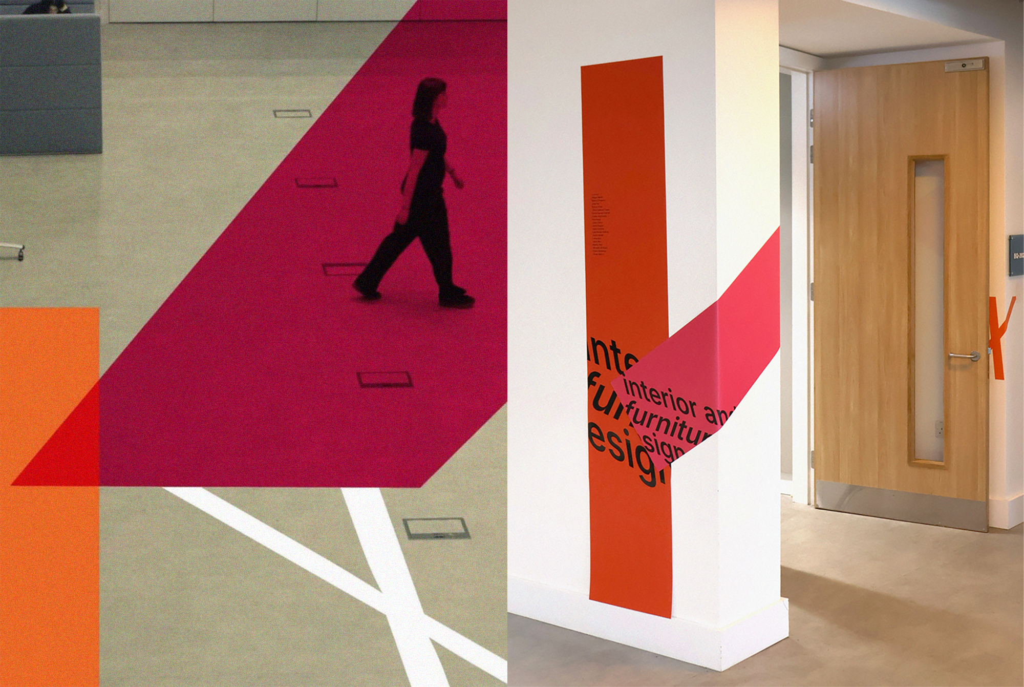
The identity uses page folds to make what is flat become spatial. Physical attributes and photography of paper is incorporated into the identity design, and show TU Dublin’s young creatives are folding out into the world and transitioning from students to graduates. Performance is key to this identity. Live screen-printing workshops at the exhibition invited students to bring their own clothes and print the identity over existing materials. The body itself became a sign of GradX. The colourful geometric forms danced across the physical space, mirroring the identity’s behaviour on digital website animations, printed brochures, and wayfinding. GradX collaborated with The Library Project in Temple Bar, and performed a paper-folding event. The folded pieces were left in the shop, and the paper became a performed sign of GradX.
A unique combination of backwards and forwards italics in the typography creates a sense of 3D space on flat surfaces. Colourful geometric shapes, relating to the idea of a folding page, are used as the main illustrative feature for the identity. This is incorporated in printed materials, and in digital animation. Score lines are printed on brochures and used on the website, and all wayfinding and invitations were folded and cut by hand to make this identity feel truly “live”.