Grove Farm Breaded Chicken
2022
Designed by David Walsh at Greenhouse
Food Photography: Jo Murphy
Copywriting: David Walsh
Categories: Packaging
Industry: Commercial
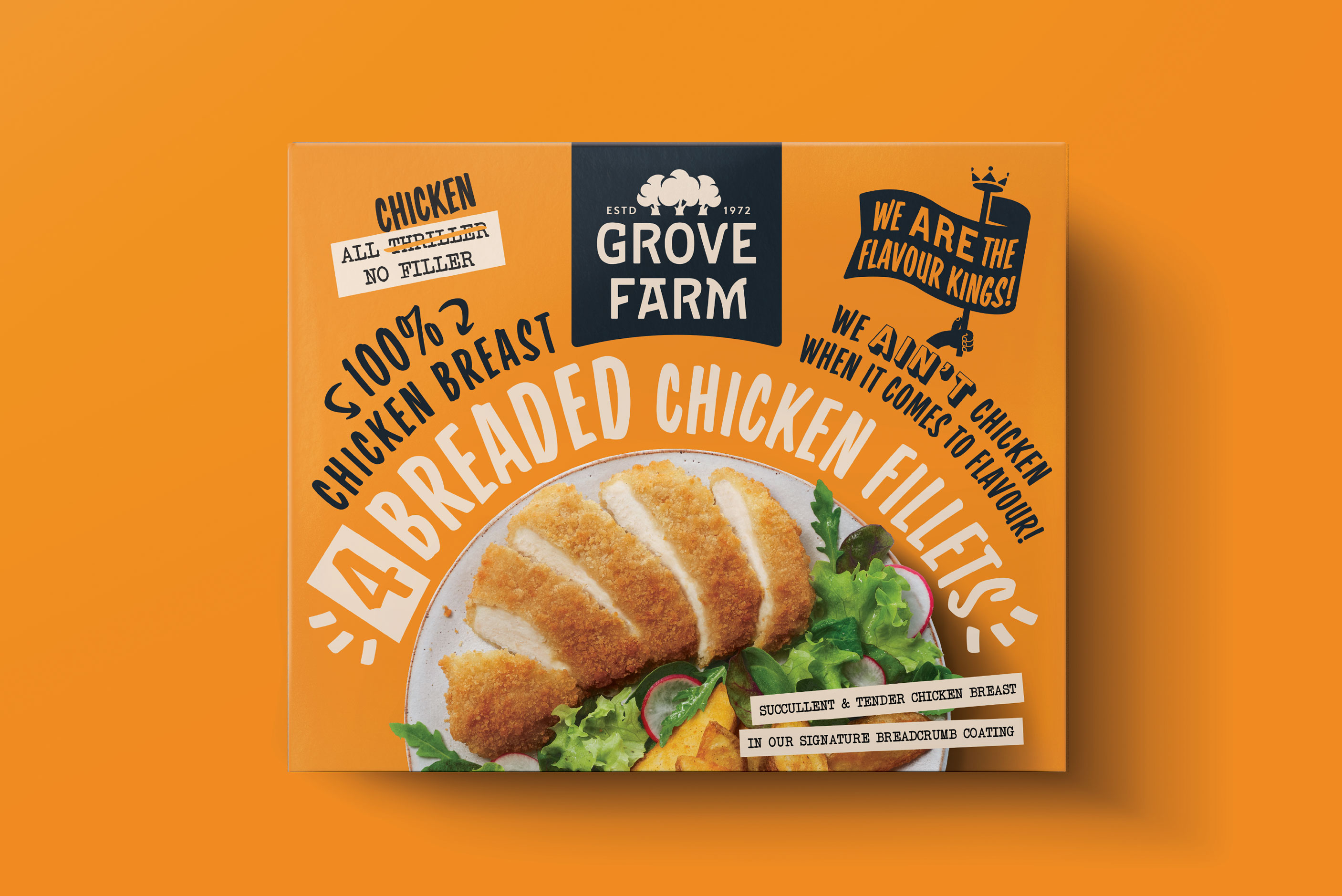
Bold and confident was the goal for Grove Farm's entry into the breaded chicken category. A category with stiff competition, we needed a brand with the personality to stand out from the crowd.
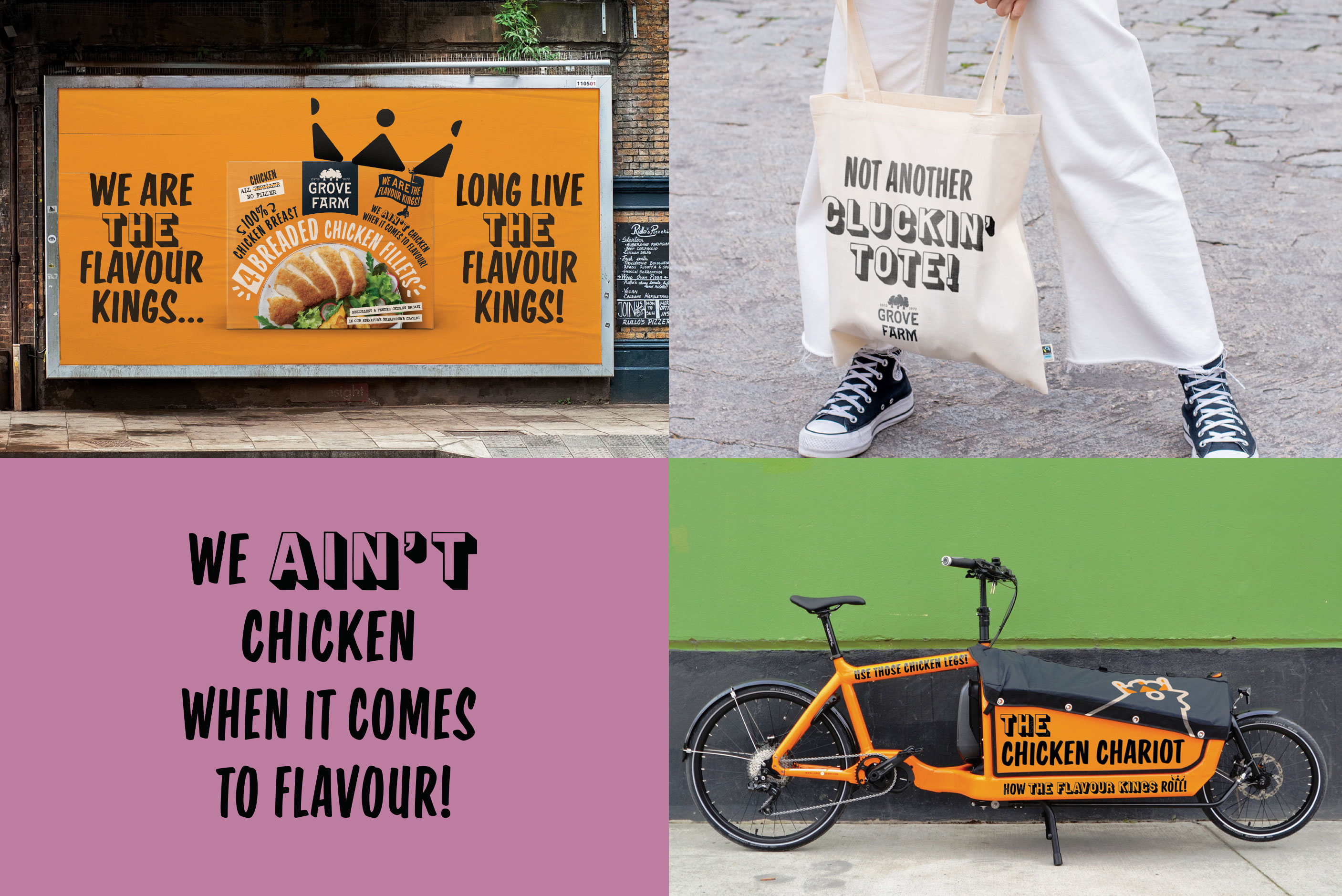
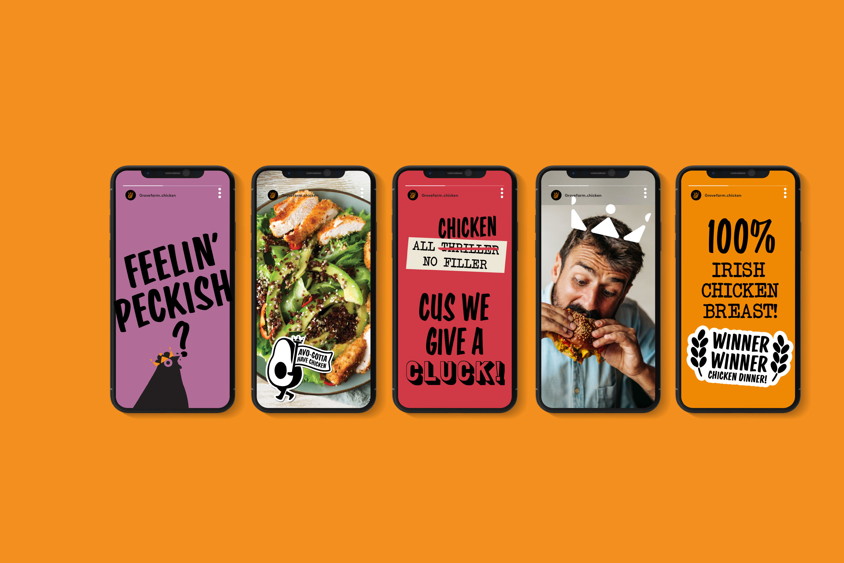
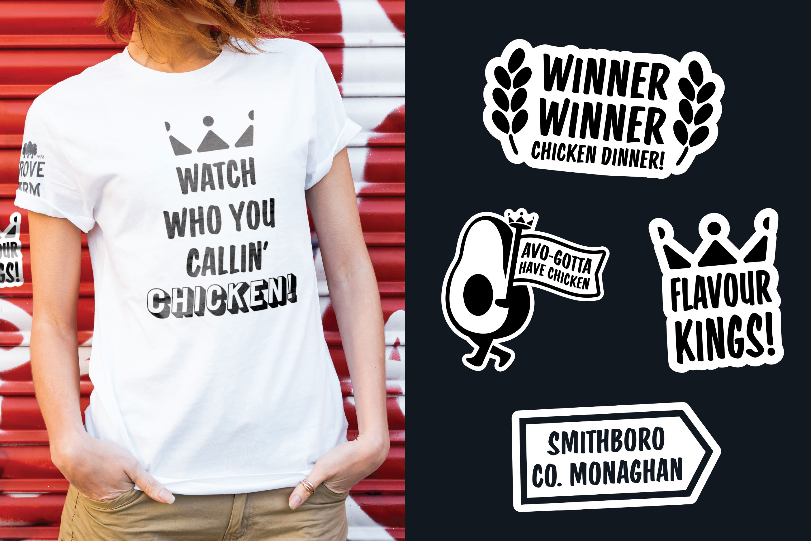
In todays world, anything protein based has got immediate recognition from a younger audience and the gate-keepers of the house-hold know this also. Landing on a proposition of ‘We are the flavour kings’ allowed us to develop both a bold visual language and energetic tone-of-voice that can live up to this big claim. And having a product that is very tasty made it easy to get behind and drive through.
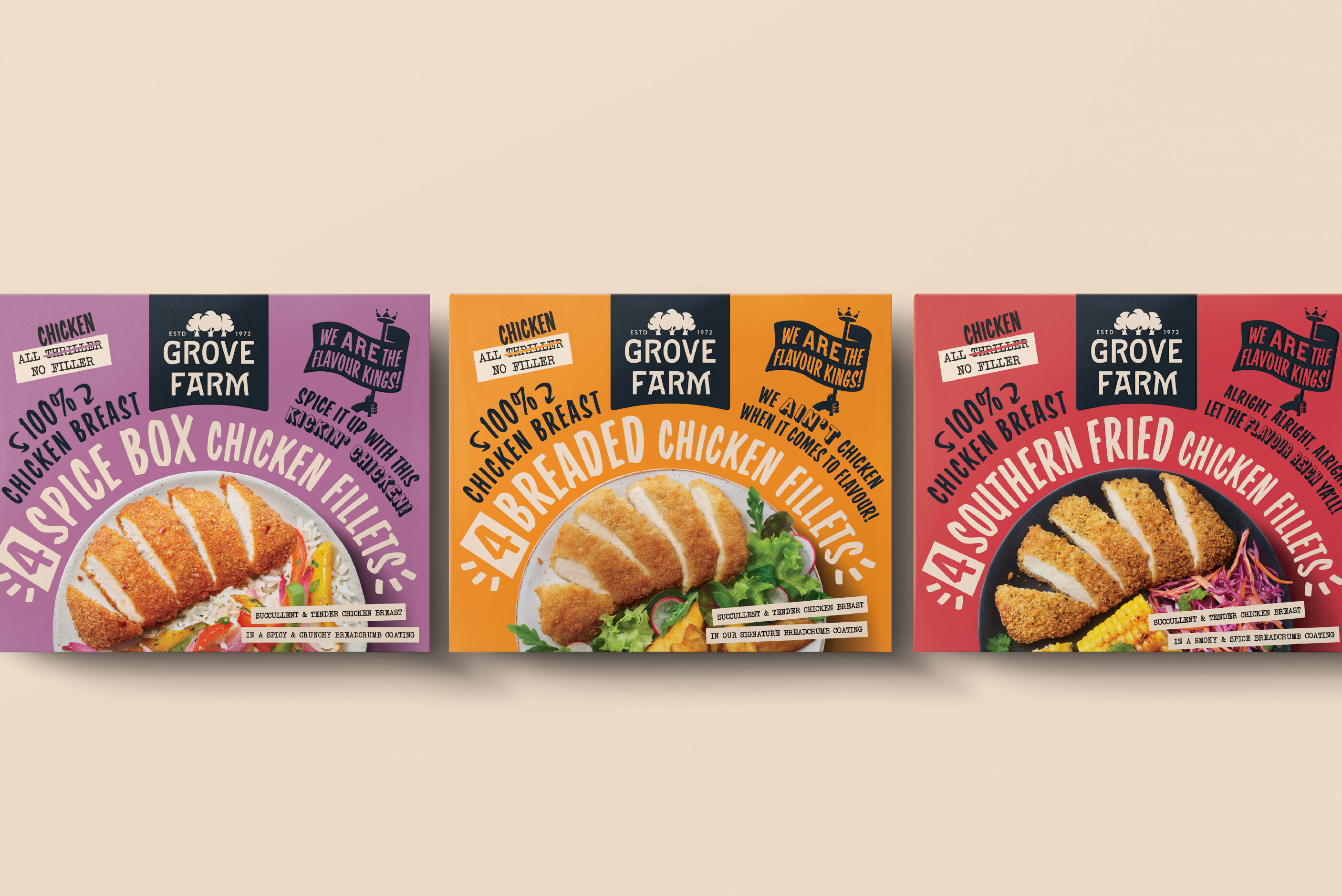
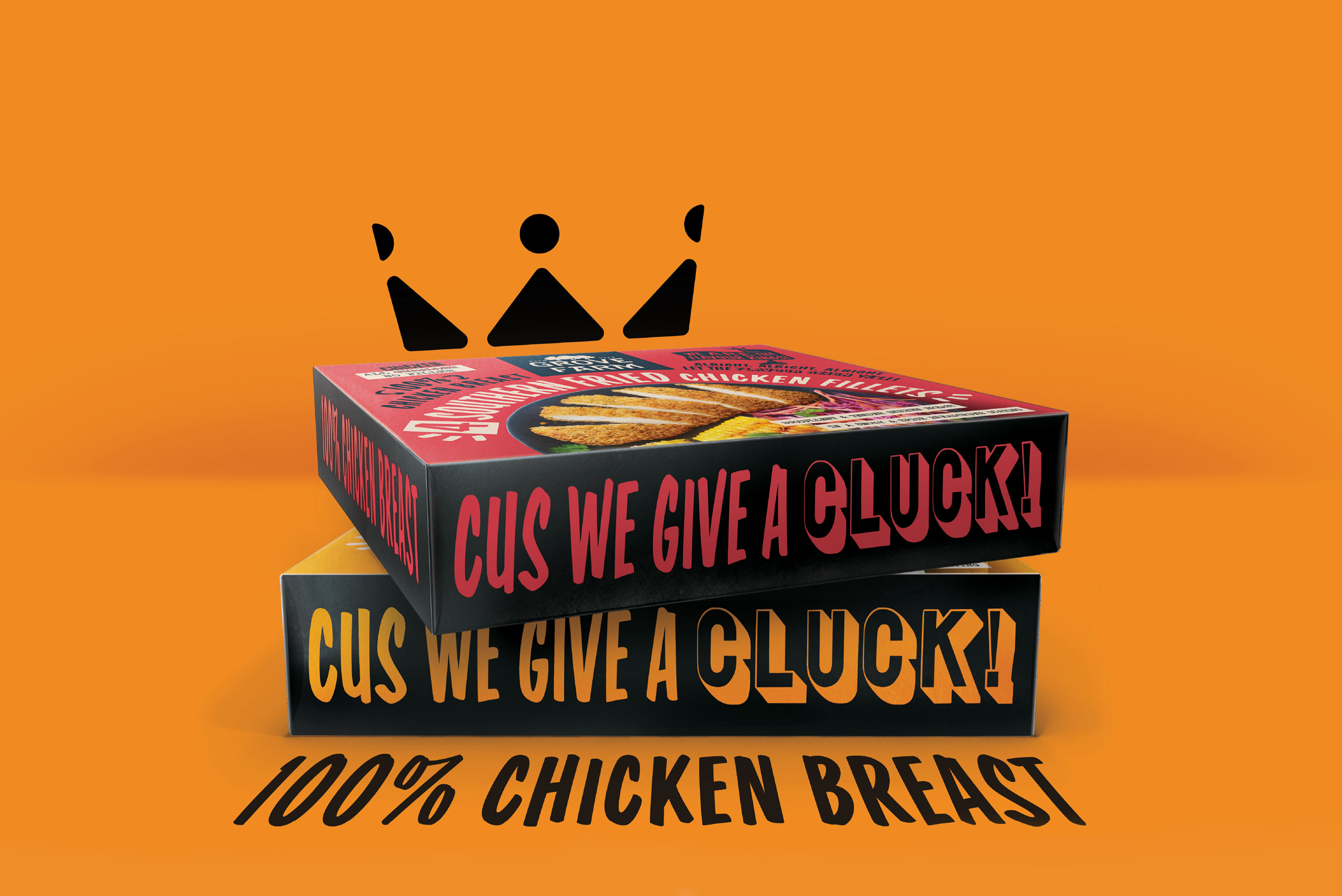
An impactful pack silhouette hero’s the product that is deliberately styled in a natural way. We wanted the product to receive little to no retouching. Food servings that are easy to achieve for any time-poor household are orbited by strong and characterful typography. This simplicity also lets the product be the focus of the shot. Bright colours were deliberately chosen so the packs can punch through the frost covered doors in the freezer aisle.
When the discussion of bag versus box was had, we steered the client to the box format as they are better treated and stacked in a category that can get a lot of physical interaction from consumers. Simply put, bags get thrown about and boxes are treated with a bit more respect. Thankfully they took our advice and the cumulative effect on shelf is consistent and very strong.
As for the language of the brand, it was all big and bold statements. With playful reinforcer's of flavour shouting proudly about how great the product is. We landed on some nice little nuggets and as we worked through the brand both on and off pack, the personality became something we could all relate to and enjoy.
Since Grove Farm are an existing company that are more known for the supply of Turkeys to own-label brands, their own identity was not up to the job of being consumer facing. Their current and generic brandmark gave no connection to the brands position of being a large multi-generational employer within the community and town of Smithboro, Co. Monaghan. Here we wanted to show a community ‘rally-around’ spirit. The visual metaphor of a group - or a grove - of trees was used to explain both the brand but also the ‘stronger together’ essence of the company. A stacked typesetting allowed for better application across a wide range of future products and activations.