G&S&
Designed by Garech Stone and Declan Stone at The Stone Twins
Logo/Monogram: Ramiro Espinoza
Motion Design: Matt Fowler (Order Design)
Web Development: Stuurmen
Photography: Milan Victor Hofman
Film: Marc Driessen
Categories: Website / Identity / Social Media
Industry: Commercial
Tags: Architecture / Typography / Digital
Website: gens.nl/en
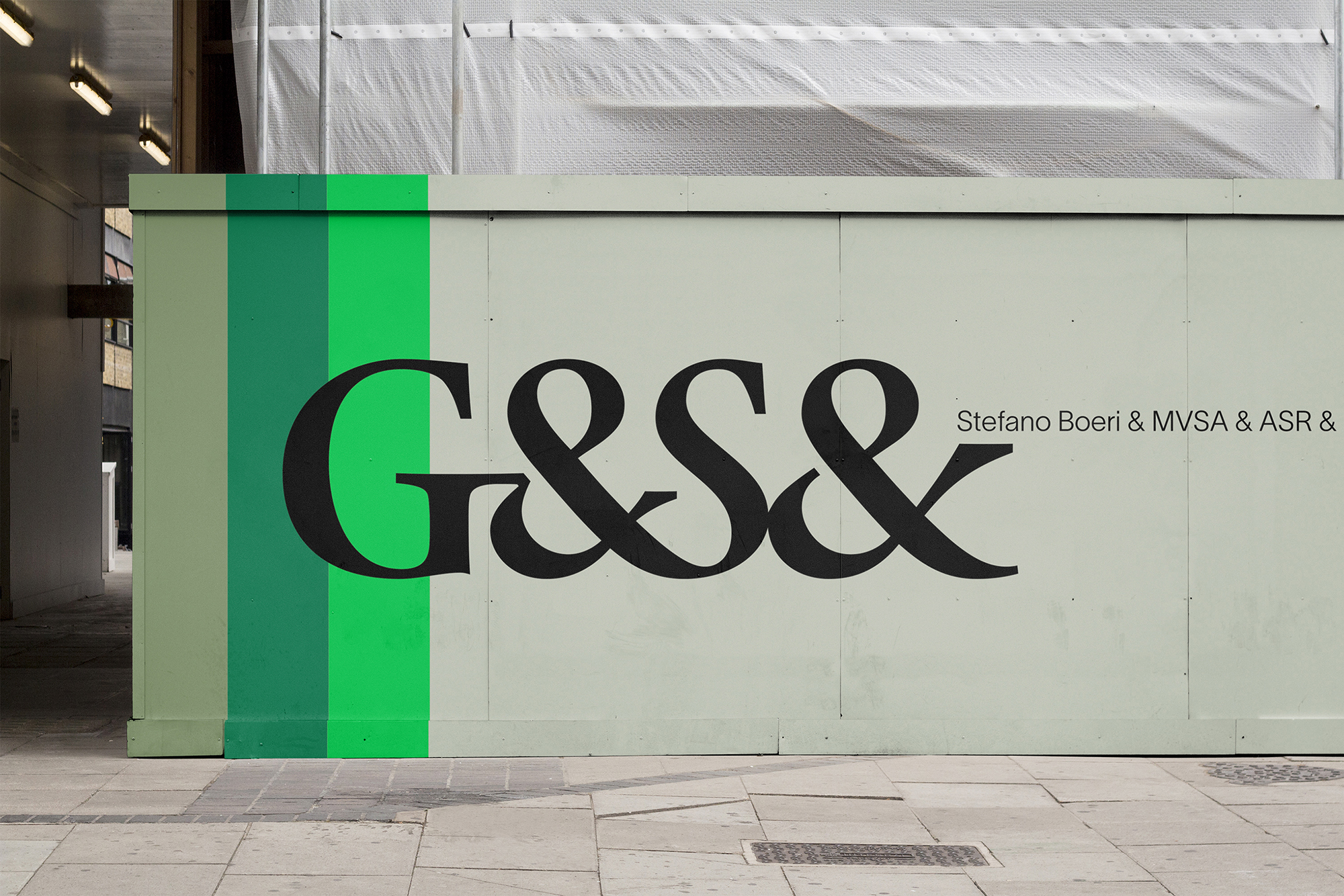
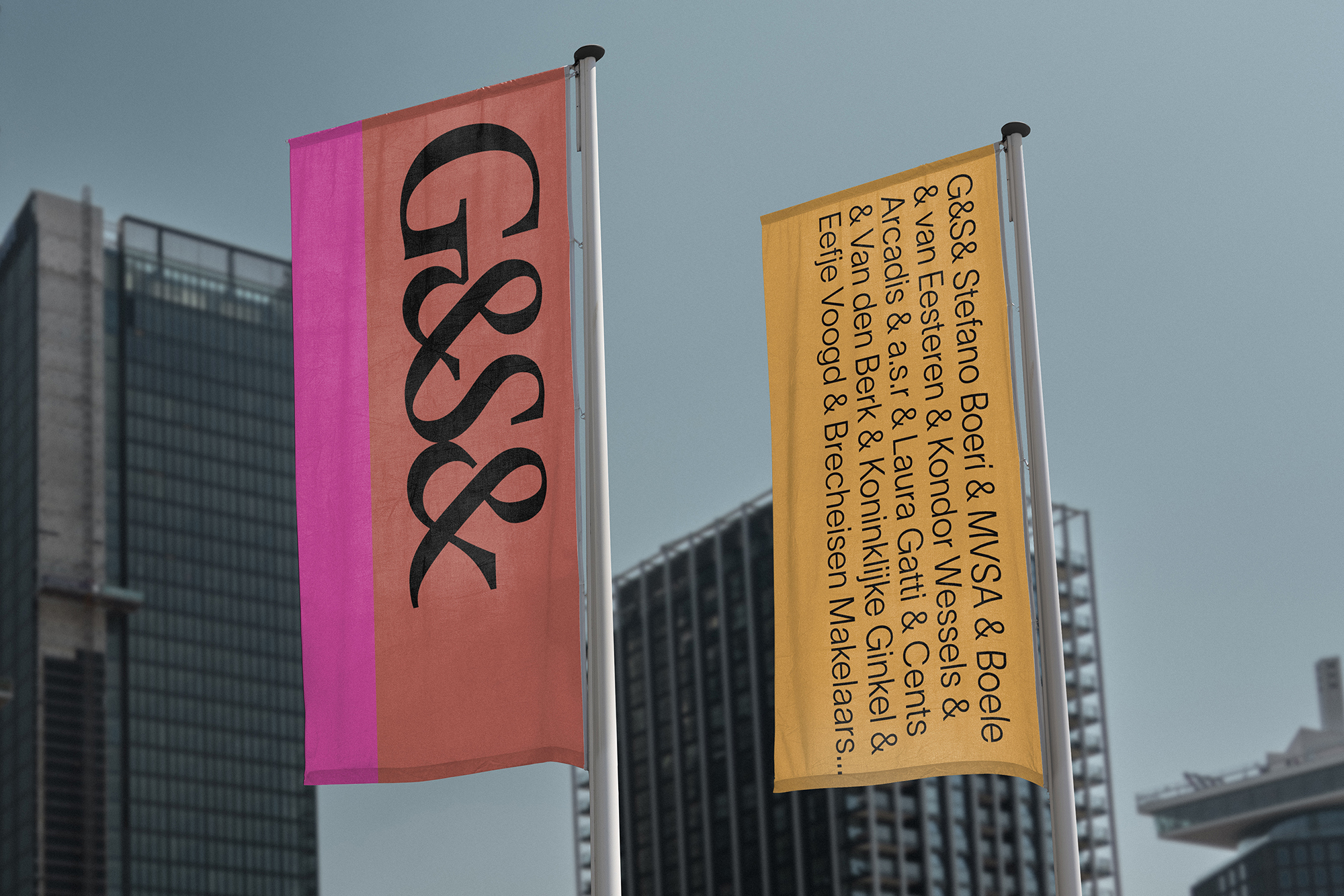
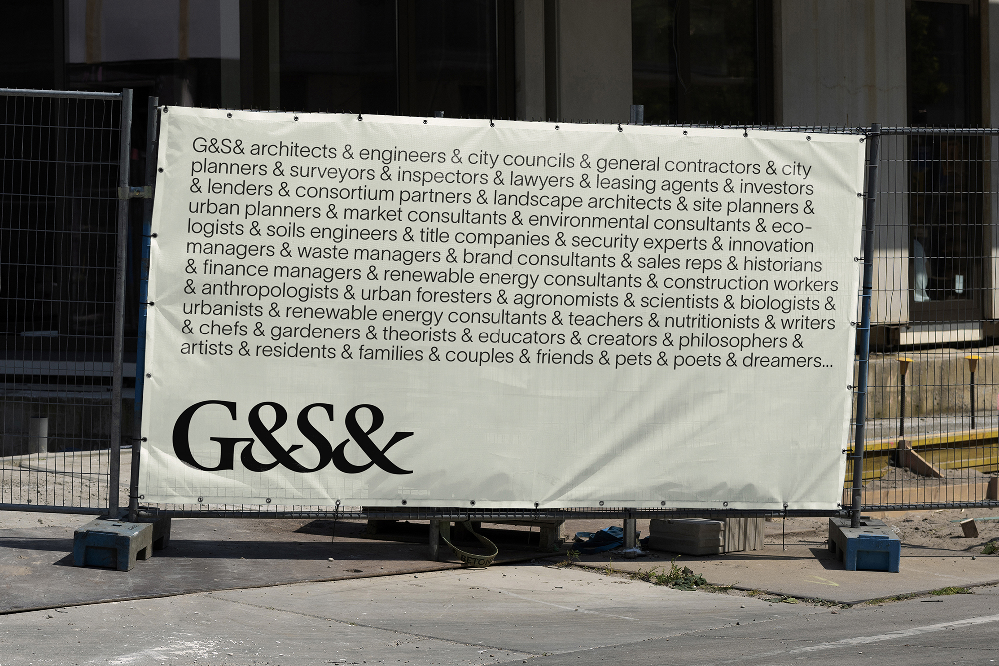
G&S& is a new real estate developer in the Netherlands, formed from the merger of G&S with BMB. We devised both the name and the brand identity for the consolidated company.
As G&S was the most well-known of the two firms, we decided to capitalise on its 40+ years of brand equity and established reputation. The extra ampersand (&) in the new name conveys how the company thrives off collaboration to build a better, more sustainable world. This idea is also expressed through the slogan ‘Collaborate for better.’
Together with a specialist typographer, we crafted a new logo, or monogram, based on classical letterforms. The unique and fluid form was initially drawn with a calligraphy reed pen, and then digitised. The resulting logo seeks to express the concepts of connection and collaboration, which are the central idea of the new G&S& brand.
The classic humanist logo is in stark contrast to the cold, modernist and engineered marks of G&S&’s competitors.