Gush
Designed by Jack Collins at Pentagram
Partner: Eddie Opara
Associate Partner: Brankica Harvey
Designer: Issabella Hindley-Cupper
Designer: Ruben Gijselhart
Designer: Chauncey Zhang
Designer: Justin Zhang
Designer: Ruairi Walsh
Project Manager: Dana Reginiano
Brand Strategy: Rachel Kash
Brand Strategy: Rebecca Vandesande
Packaging Design: Piotr Woronkowicz
Particle Renderings: Joseph Toereki
Particle Animations: Setu Choudhary
Illustration: Max Guther
Packaging Renderings: Goeun Choi
Categories: Print / Identity / Packaging / Screen
Industry: Commercial
Tags: Typography / Digital / Science / Art direction
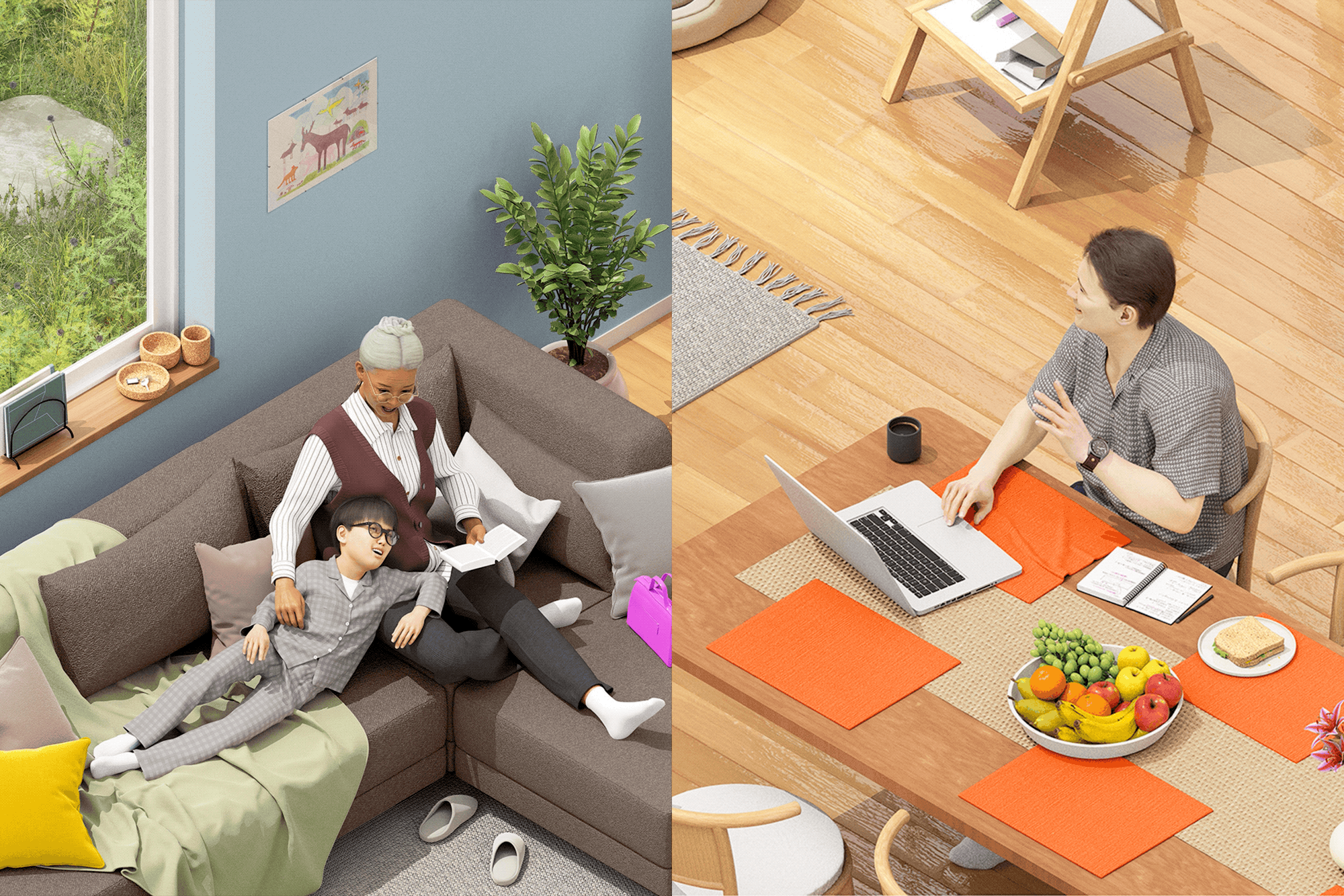
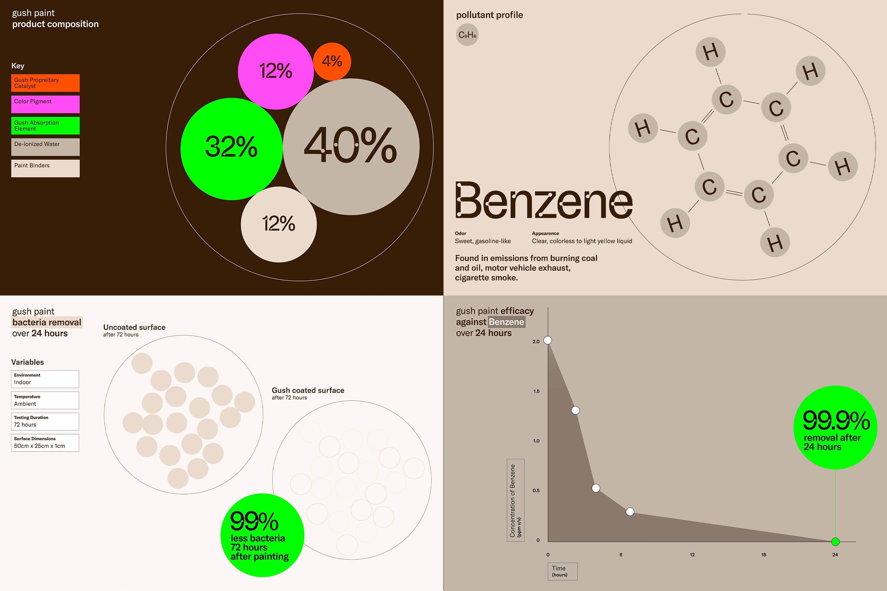
Brand identity framework for a company that creates innovative materials for the built environment that support well-being.
To achieve a truly sustainable future, it is necessary to build circular systems in which products, materials and the people who use them actively work together to form closed “loops” that recycle and regenerate. Gush is an advanced materials brand that offers breathable, air-purifying paint and other products that promote wellness and sustainability in the built environment. Beyond sprucing up homes, these help to safeguard the planet.
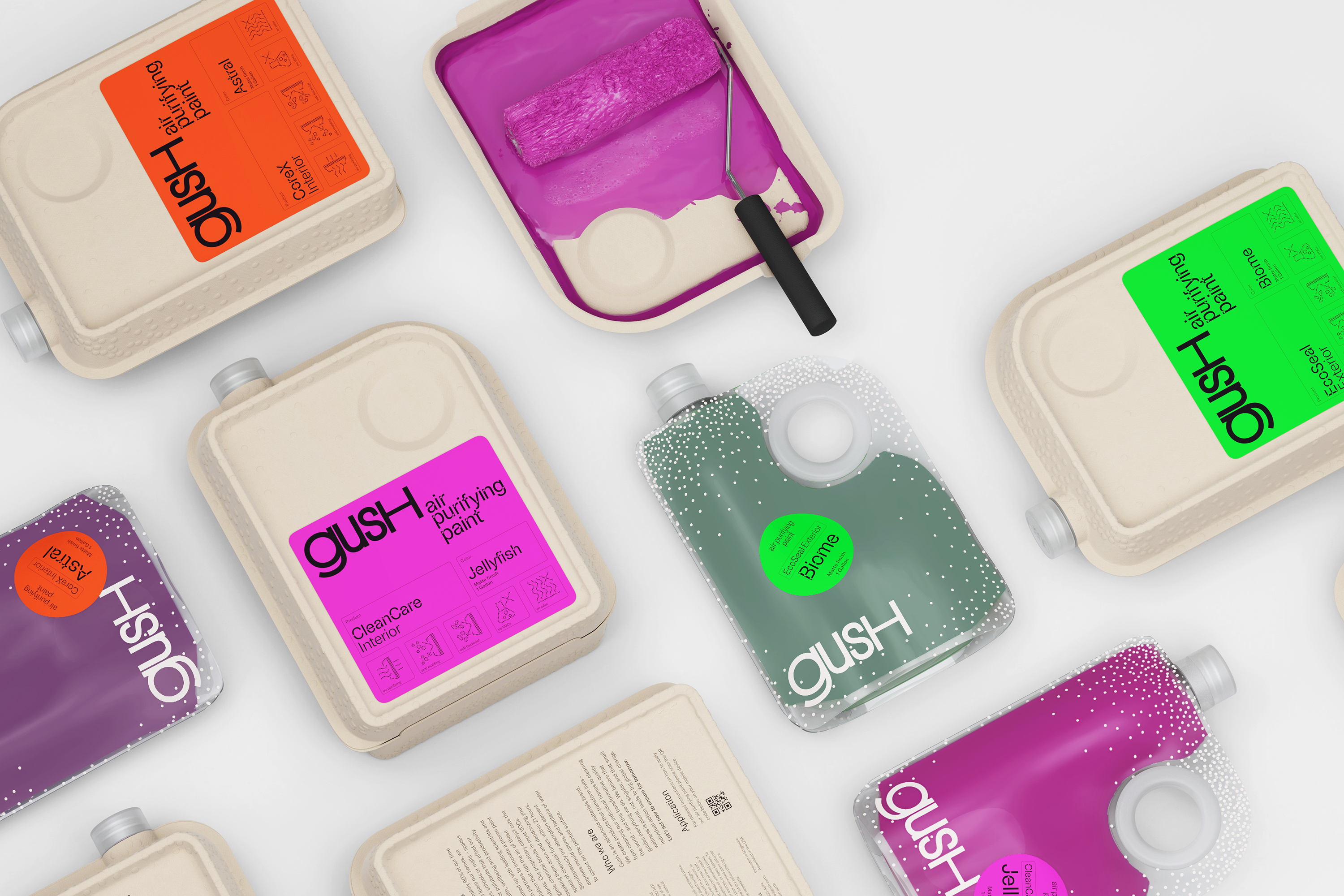
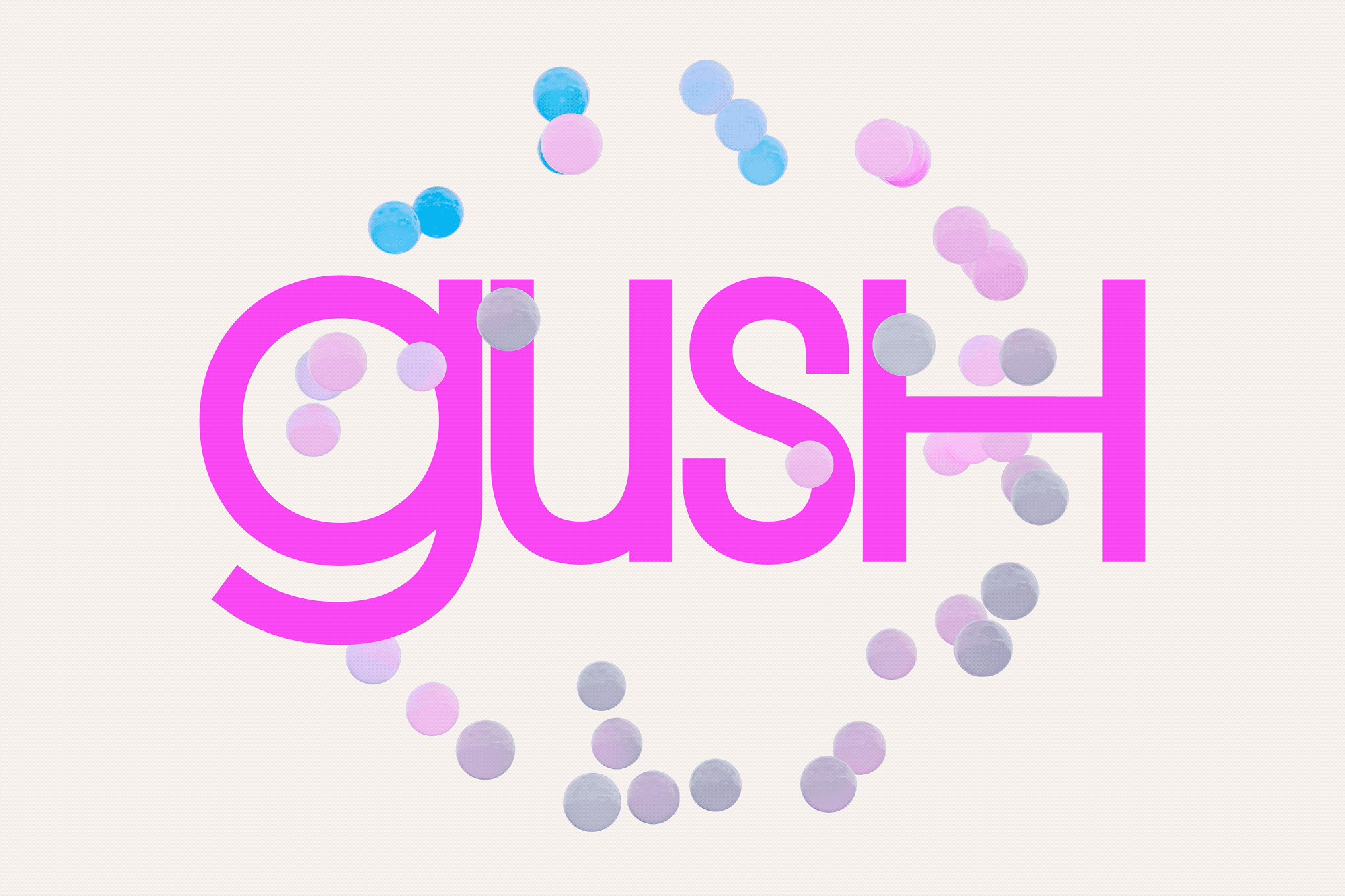
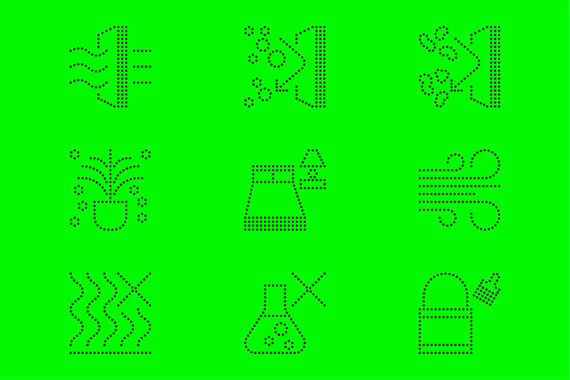
The brand identity framework for Gush reinforces the company’s belief that small everyday actions by individuals can drive big, purposeful global change. The identity centers on a circular symbol that explores the concept of the many making up something bigger than themselves. The logo is constructed of dots that evoke molecules or particles in the air coming together into a larger form—like a globe or community composed of individuals. Simple but scientific, the mark can evolve and change across scale, adding or subtracting particles for visual balance, or play with optical illusion. The density of the particles may vary, from a chain to a cluster to a cloud.
The particles of the logo extend to the brand’s dynamic visual language, where they are integrated into imagery, dispersed in motion graphics, and used to construct data visualizations. The circular forms can appear as flat dots in graphic patterns or as tactile spheres in immersive 3D renderings. Operating expressively, they may form stippled photographic images or be used to create icons. The particles appear in the brand typeface itself: ABC Camera was selected for the circular light traps or “holes” in the lines of its letterforms. For a human touch, this is balanced by the contemporary serif Reckless Neue as the secondary display typeface, while copy is set in GT America. Four vibrant neon colors make up the brand palette––pink, orange, green and yellow–– used in contrast with warm neutrals.
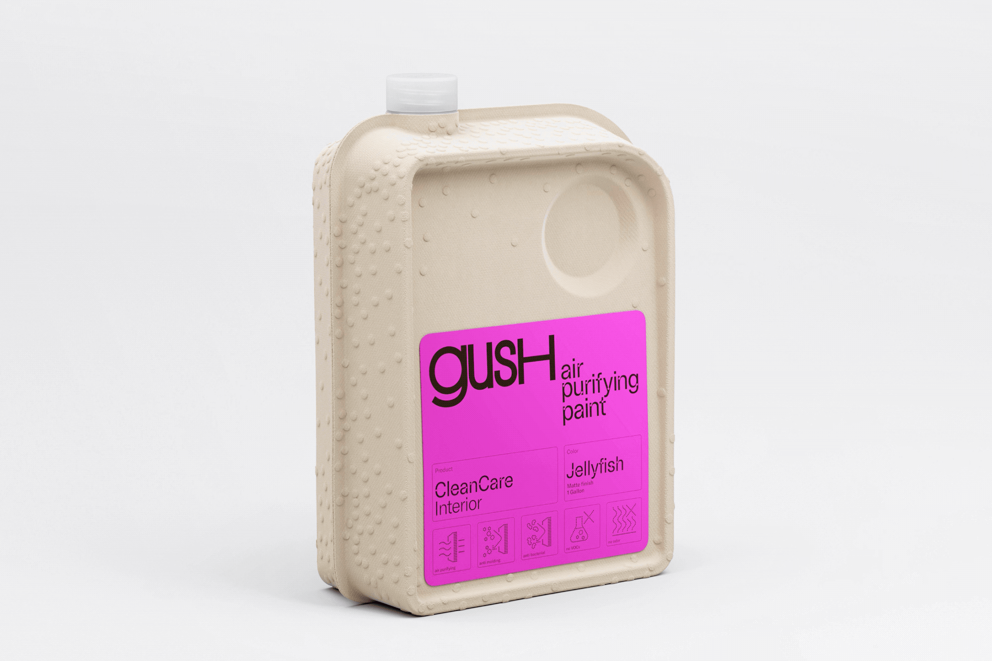
Beyond the identity, the designers worked to rethink the product packaging and find a more sustainable solution. They developed a new container that is sleek, modern and minimal, with a square footprint that is more efficient and made of low-impact materials. Each Gush container opens into two trays, with the paint housed in a transparent bag between them. Made of low-impact, biodegradable acetate, the bag has a flat bottom so it can stand upright and a clear cap to see the color. The container is made of molded paper pulp, which has never been used before for paint trays in the US. The circular handle echoes the shape of the Gush symbol, and a bubble pattern of particles is embossed into the molded pulp. The packaging is currently being fabricated and will be introduced in the coming year.