Hub 21
2025
Designed by Paula McEntee at saoi studio
Photography: Dalia Guzauskaite
Animation: Áine McGee
Categories: Identity
Industry: Charitable
Tags: Photography / Art direction / Social
Formerly known as The Down Syndrome Centre North East (DSCNE), Hub 21 was founded in 2018 in response to a recognised need in the North East region for the provision of support and facilities for families and carers of young children with Down syndrome.
Based in Carrickmacross, Co. Monaghan, the centre is run by a voluntary board of directors and parents of children with Down syndrome. Their charity has grown so much since they began, and they needed a new name and brand identity that reflects who they are, where they are going, and the wonderful community they support.
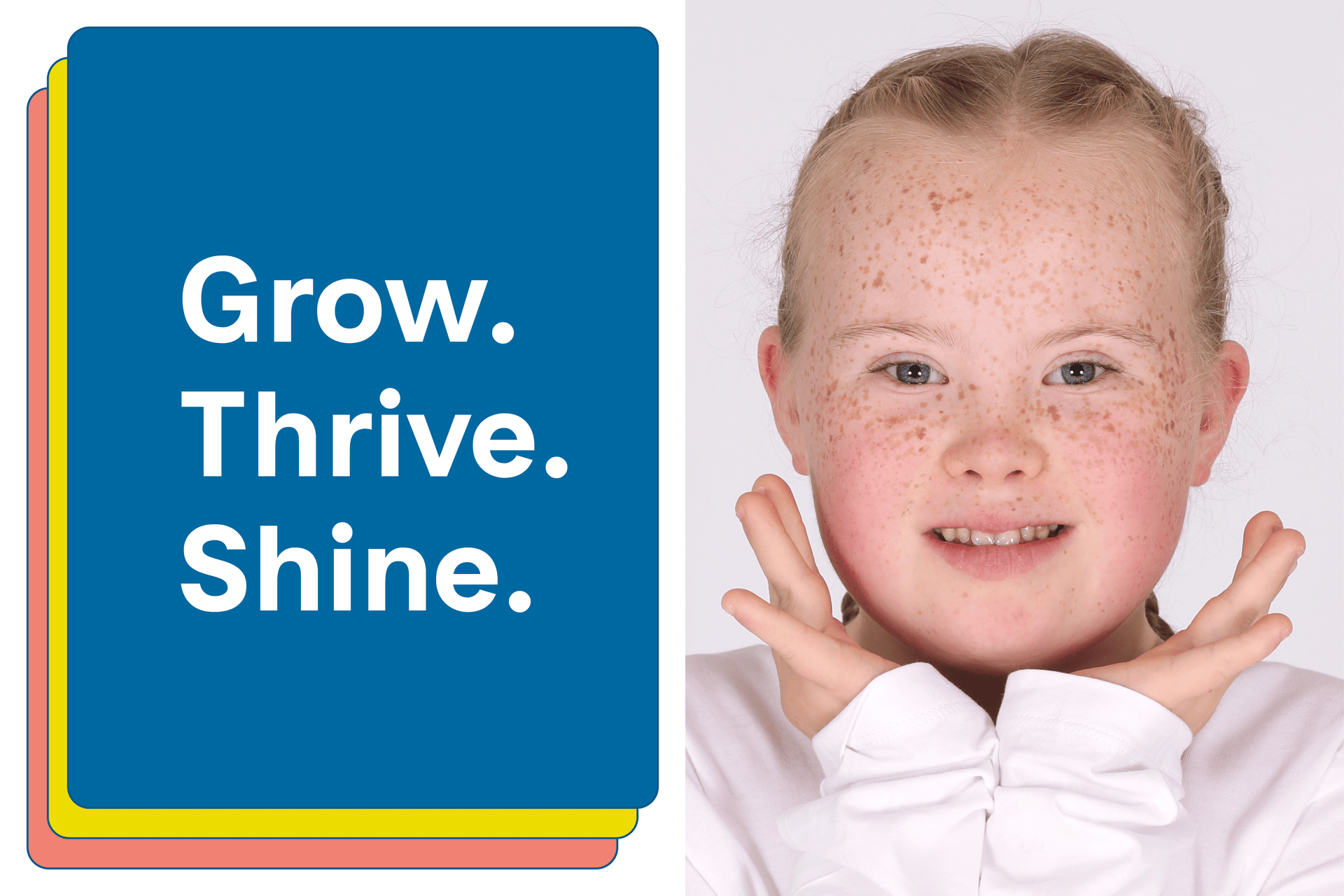
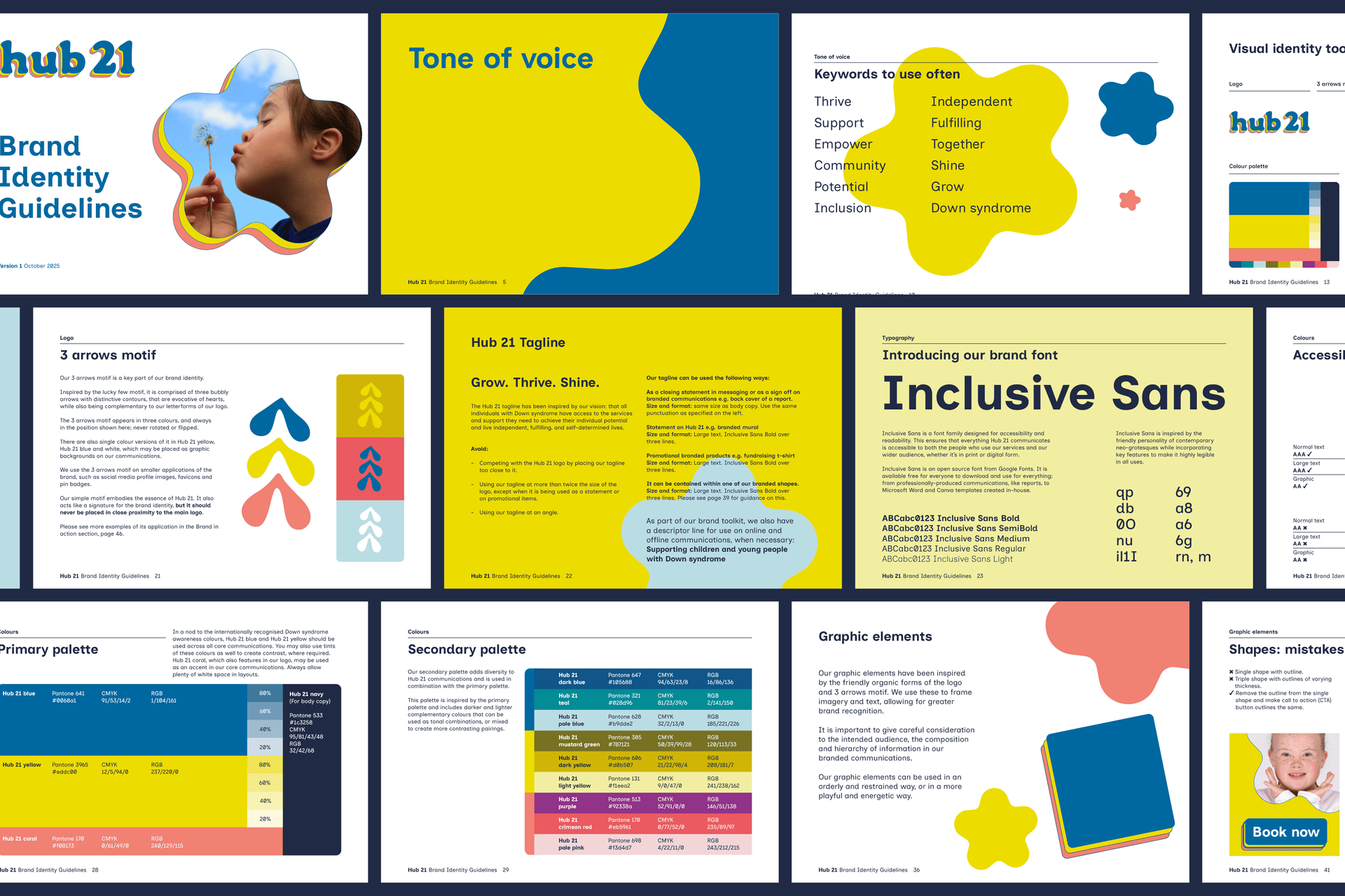
A hub is a centre of activity, connection, and support—just like their centre. And 21 represents the extra copy of chromosome 21 that makes people with Down syndrome unique, a number that resonates deeply with their families. The name Hub 21 captures their vision to grow, thrive, and shine.
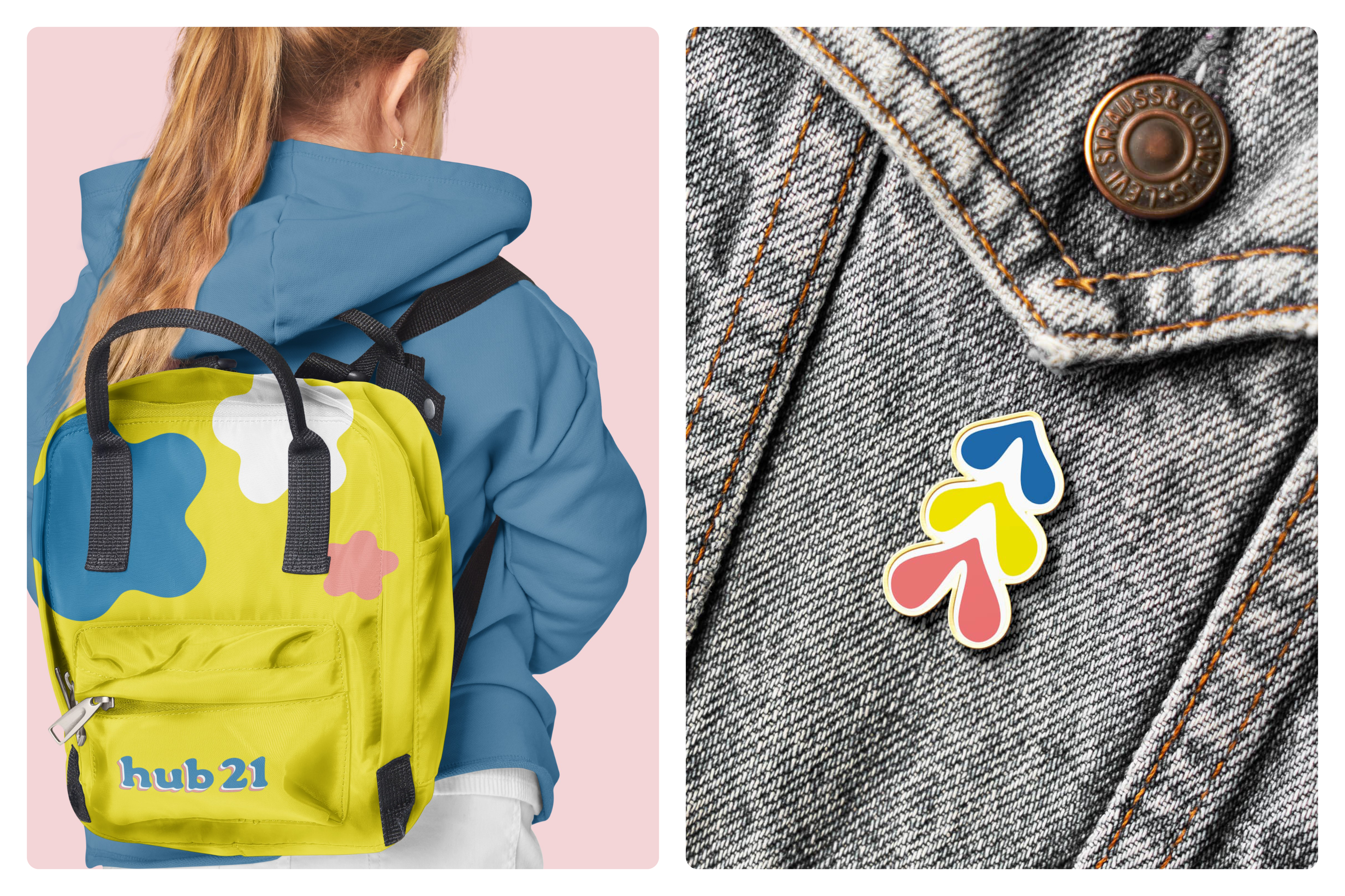
Hub 21 is all about enabling and empowering children and young people with Down syndrome to reach their full potential, therefore a logotype with soft and playful letterforms was created in a distinctive palette of blue, yellow and coral. The letters have been triplicated as a nod to the three copies of chromosome 21 and the logotype rises up, alluding to diversity, inclusion and empowerment. It features outlines that give the brand identity extra character, while alluding to the supportive framework that is available for all.
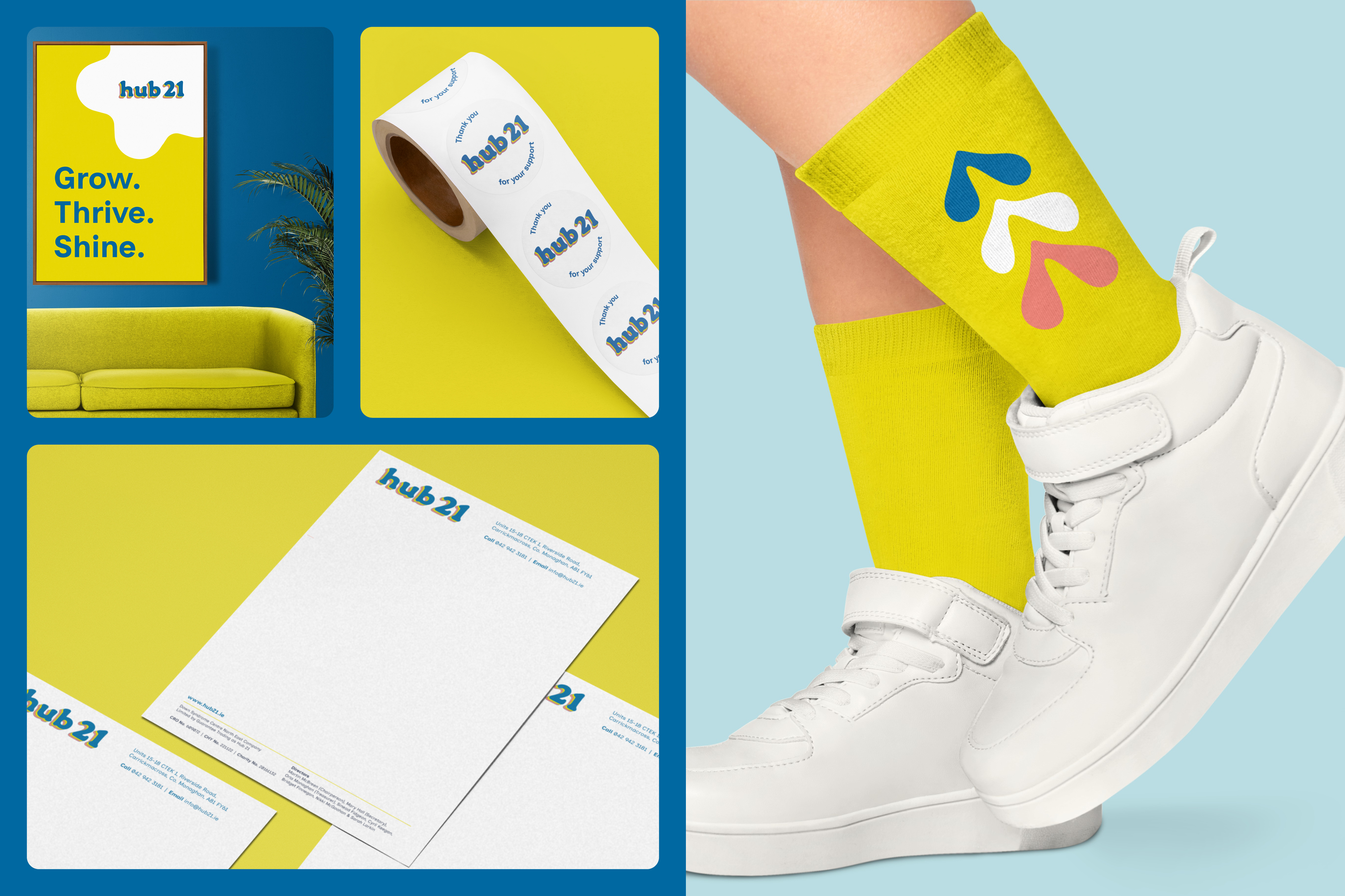
An independent secondary motif has been created as a part of the brand identity system. Inspired by the lucky few motif which is a recognised symbol in the sector, it is comprised of three bubbly arrows with distinctive contours that are evocative of hearts, while also being complementary to the letterforms of the logo. It embodies the essence of Hub 21, while also acting as a signature for the brand identity, as seen on the sock design for 'Lots of Socks' which is celebrated on World Down Syndrome Day.
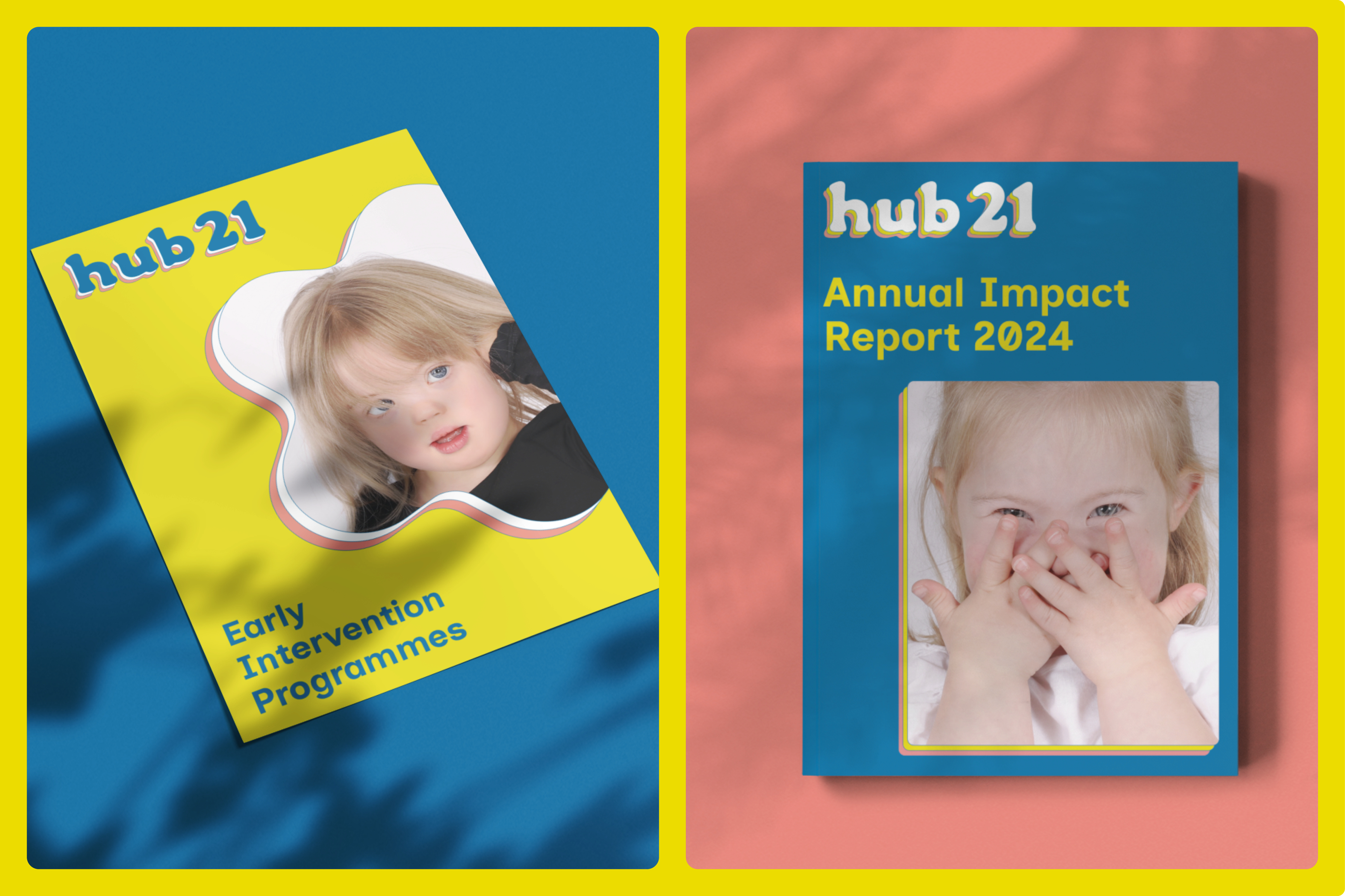
A special shape has been created to function as graphic device and as a container for imagery. It has dual symbolism; it resembles a star which alludes to the vision of shining. It also looks like a flower, which speaks to the concept of growing and blossoming. It is used alongside a quadrilateral with rounded corners, to ensure diversity. Three outlined layers of the quadrilateral or the star shapes may be used in limited circumstances to create emphasis and draw attention to a particular type of communications.
The primary brand palette leads with distinctive shades of blue and yellow as a nod to the internationally recognised colours for Down syndrome. They are accompanied by coral to give a sense of warmth and inclusion, and supported by a secondary palette for diversity across applications.
Accessibility has been critical for this brand identity. Inclusive Sans was chosen for its readability and accessibility, and all colours were tested for WCAG compliance.
The Hub 21 brand identity celebrates how individuals thrive and shine when they have the best of what they need surrounding them.
Portrait photography courtesy of Hub 21. Photographer: Dalia Guzauskaite.