Irish Independent Rebrand
Designed by Clare Bell and Max Phillips
Agency: Mark Porter Associates
Design Direction: Mark Porter
Design: Mark Porter
Design: Alan Keer
Type Design: Signal Type Foundry
Illustration: Andy Goodman
Motion Design: Dylan Griffith at Smörgåsbord Studio
Categories: Identity / Typeface
Industry: Corporate
Tags: Typography / Icons / Publishing
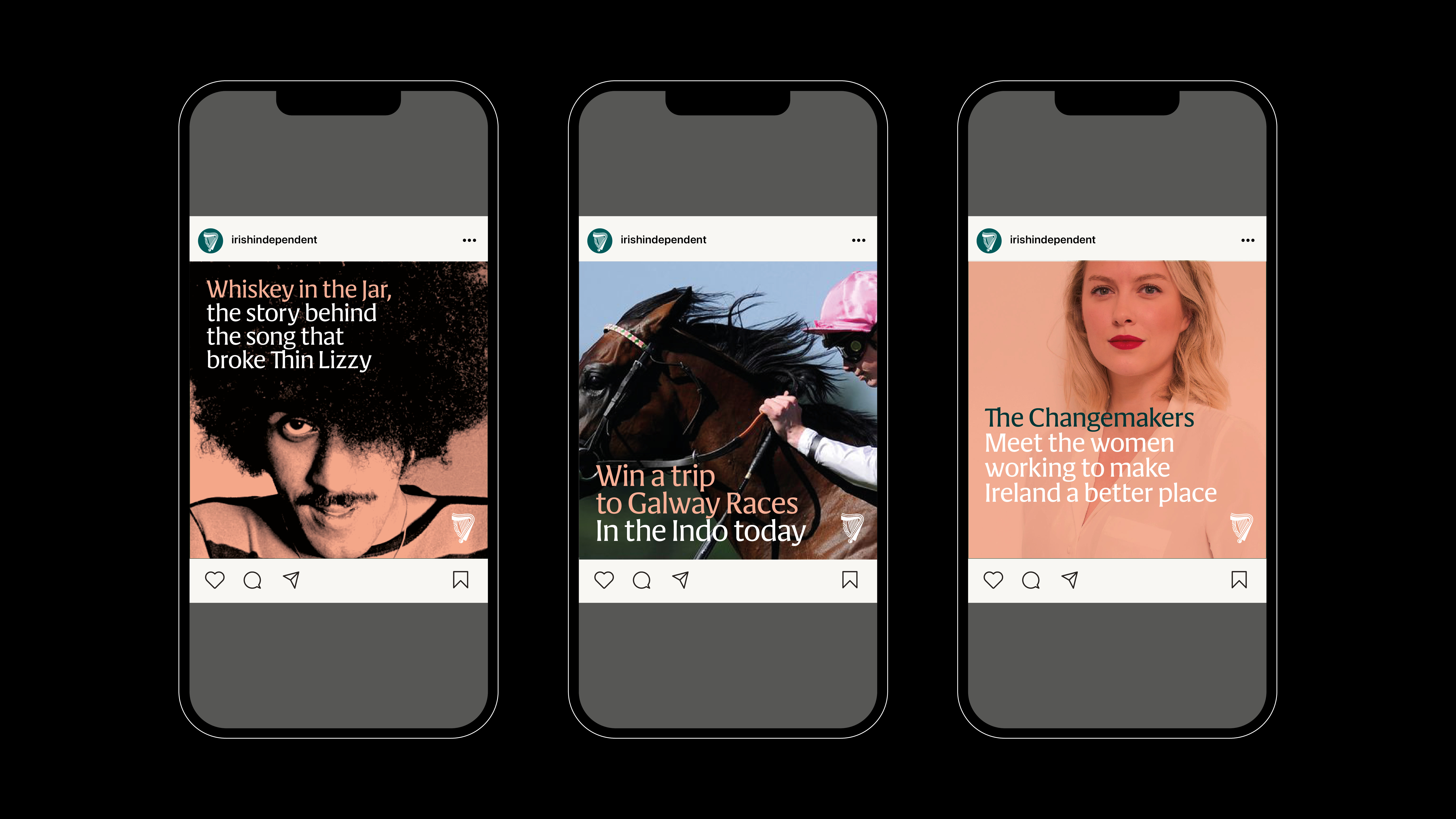
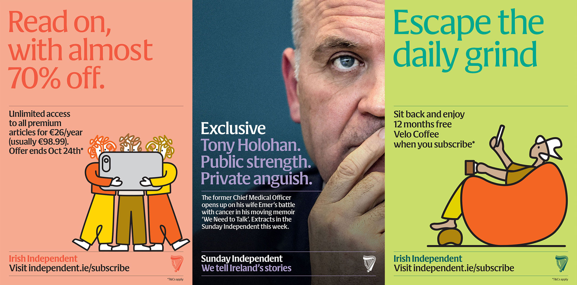
The 120-year-old Irish Independent wanted to consolidate their print, web, app, and podcast offerings into a unified multiplatform masterbrand to appeal to a wider audience. Their key values were: distinctiveness, modernity, inclusivity, and Irishness. One of the challenges was to reimagine the classic signifiers of “Irishness,” such as the harp and the colour green, into a form more relevant to a contemporary audience.
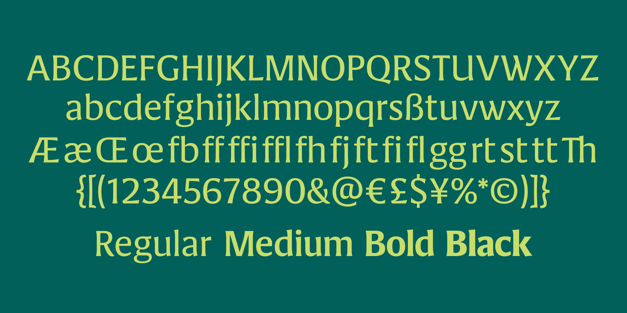
The rebrand introduced a bold new wordmark, which was expanded into a new typeface designed to work harmoniously with their existing type palette. Cláirseach (Irish for harp) is a four-weight flare-serif inspired by the distinctive wedge-shaped stroke endings of insular calligraphy. The Irish Independent harp emblem was redrawn to make an omnipresent national symbol more modern and more ownable; both frame and strings are now constructed from parallel stripes, a central formal element in Irish decorative arts since the Neolithic Era. These stripes were then unravelled to create a distinctive illustration style based on crisp, looping outlines.
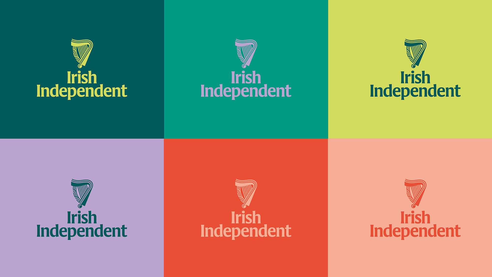
The new colour system was extended beyond a fresh and contemporary suite of greens to a range that includes lavender, coral, and tangerine, all based on the vibrant pigments used in the Book of Kells, a key referent for the design of Cláirseach. The result is flexible graphic language which unifies and energises the Independent’s communications across all channels and touchpoints.
