Irish Whiskey Magazine
2020
Designed by Rachel Copley McQuillan and Stina Sandström at Bureau Bonanza
Printing: GPS Colour Graphics Ltd
Categories: Printed Publication / Editorial
Industry: Commercial
Tags: Illustration / Typography / Food and drink / Publishing / Rebrand / System
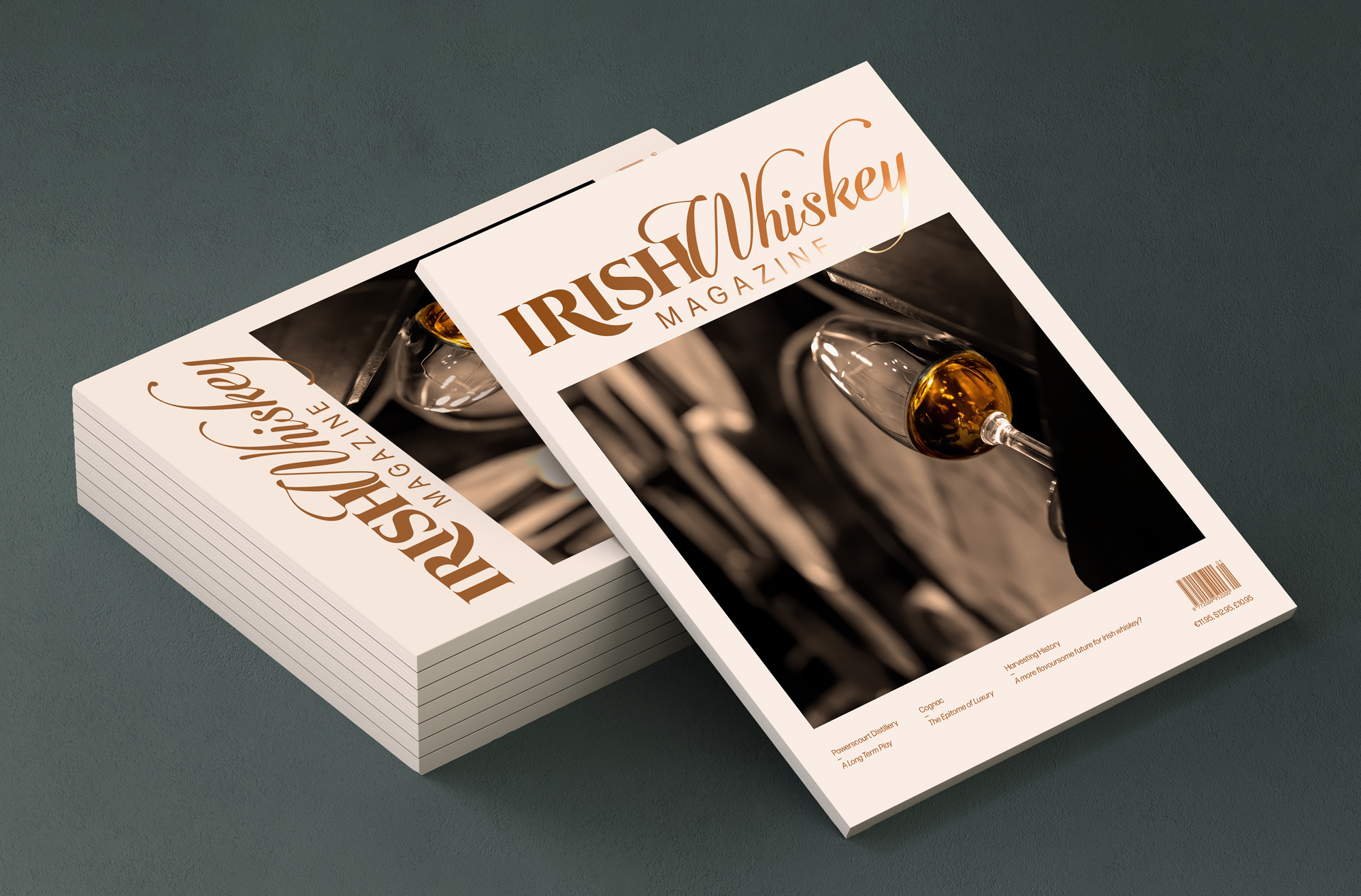
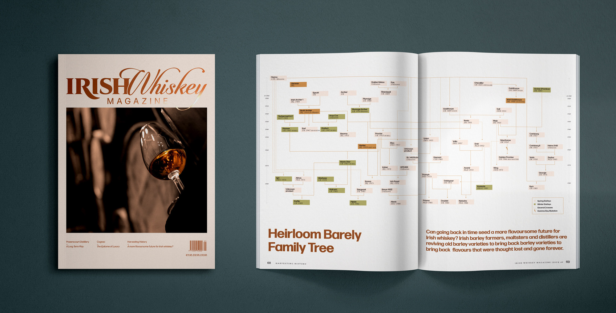
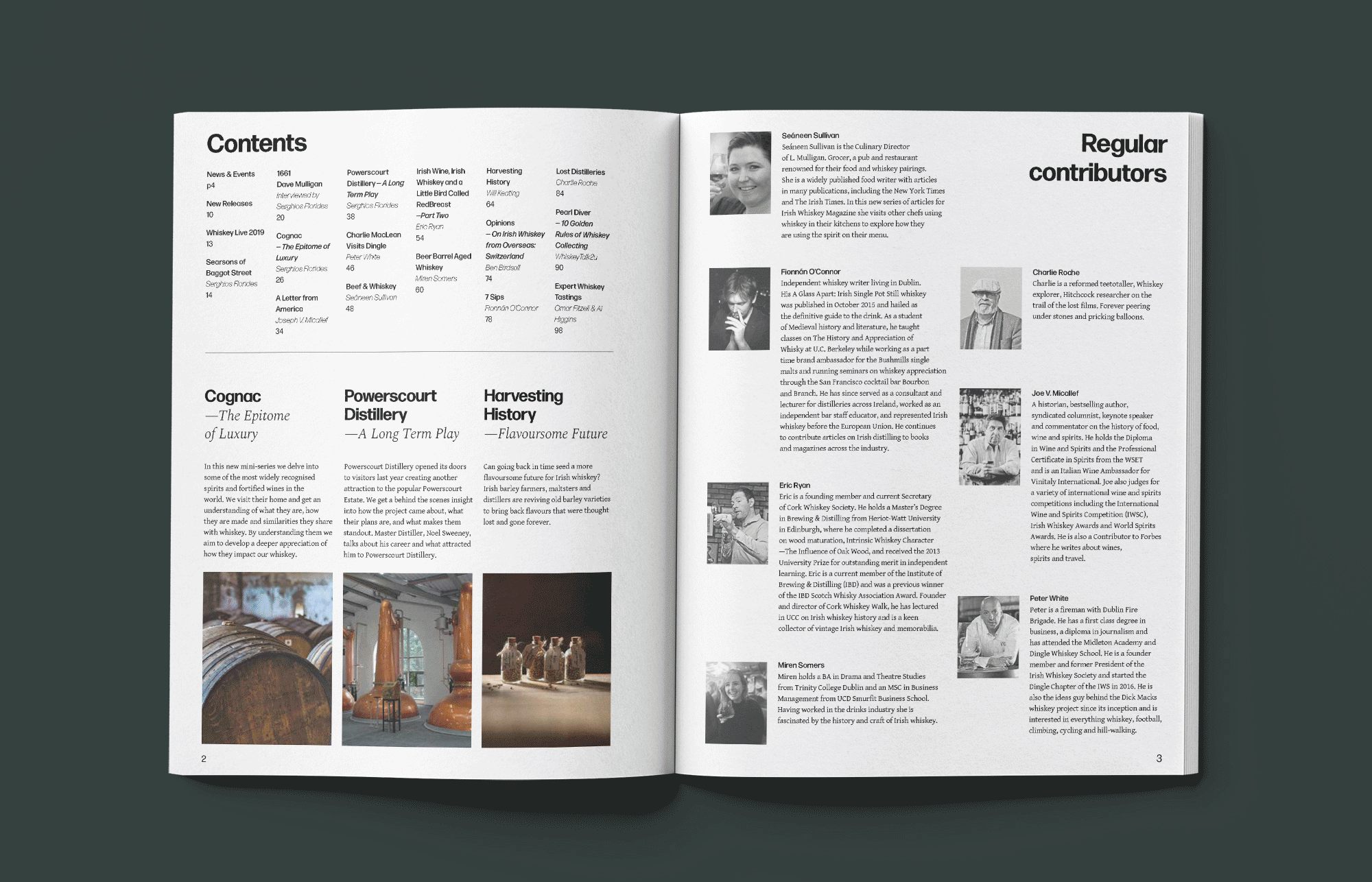
Redesign & Style Guide for Irish Whiskey Magazine.
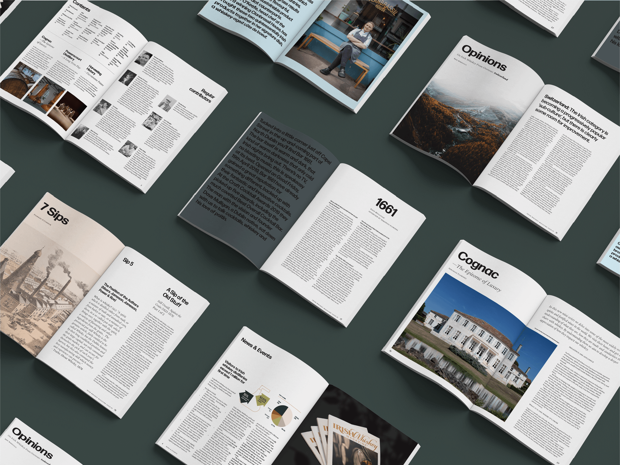
The quarterly publication had a legacy of chaotic last-minute design with no editorial structure, resulting in a printed publication lacking in visual cohesion and editorial flow. We created a robust yet flexible editorial structure and identity system that allows for a smooth workflow that can be easily adopted by any designer and still maintain the integrity of its design.
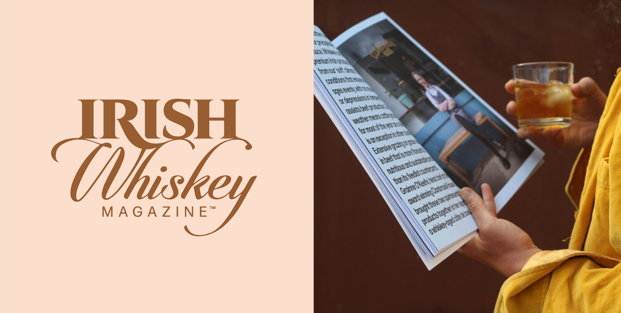
The redrawn masthead has a liquid flow and a new sharpness making it legible in small sizes and a new stacked logo version, making it adaptable to square and circular formats online. The brand elements were stripped down to only three, hard working typefaces, a muted and limited colour palate and a custom illustration style. The new typographic grid system allows for continuity and flexibility and the change of format from standard A4 to a custom size gives the magazine an air of exclusivity, making for a comfortable read, that oozes luxury and maturity while keeping within the original production costs.
The new identity was established with the 2020 Summer Issue, along with a detailed style guide and a set of templates to be used by the Irish Whiskey magazine designers.