James Joyce Gin
Designed by Shane O'Riordan (Freelance)
Art Director: Laurence O'Byrne
Photographer: James Day
Photographer: Eoghan Gahan Mullen
Categories: Identity / Packaging
Industry: Commercial
Tags: Typography
To authentically and tastefully represent one of Ireland's greatest ever literary minds for an alcohol brand is no easy task.
James Joyce is not only an Irish icon, but globally recognised genius, and with that comes absolute passion for his work in superfans and scholars.
One such scholar developed a gin brand in his name, and my job was to pay tribute to the writer.
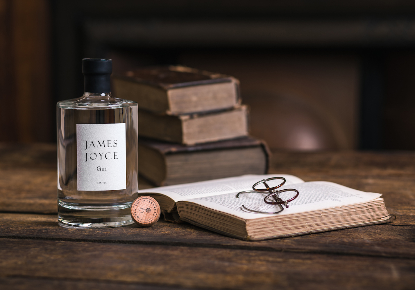
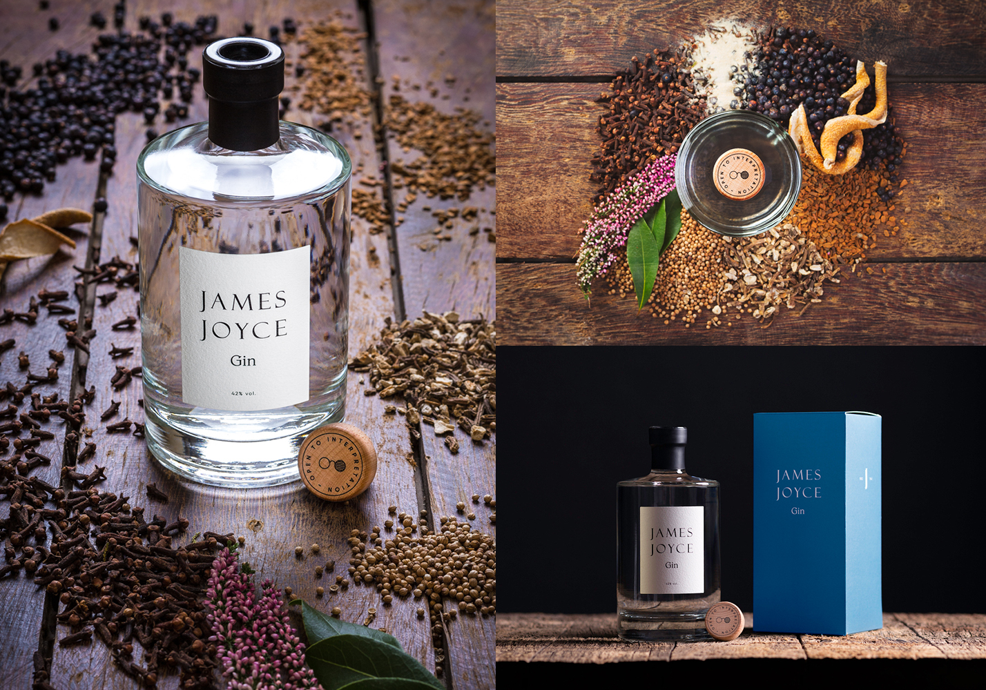
An inspirational trip to the archives of the National Library to view a rare first edition of Ulysses inspired me to stay true to the original design features of his work.
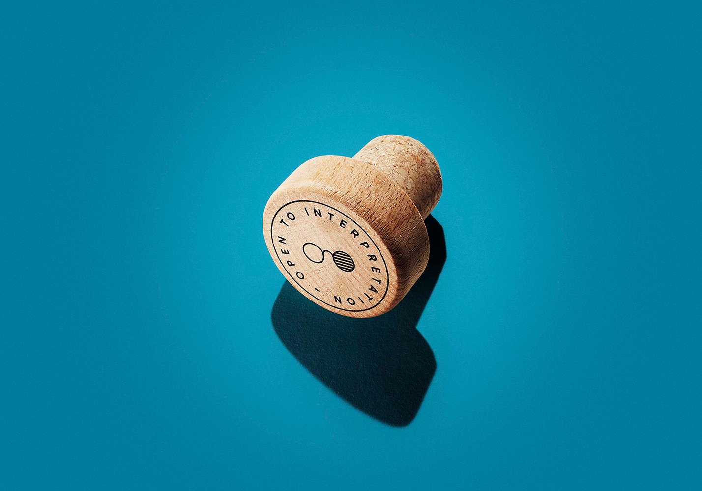
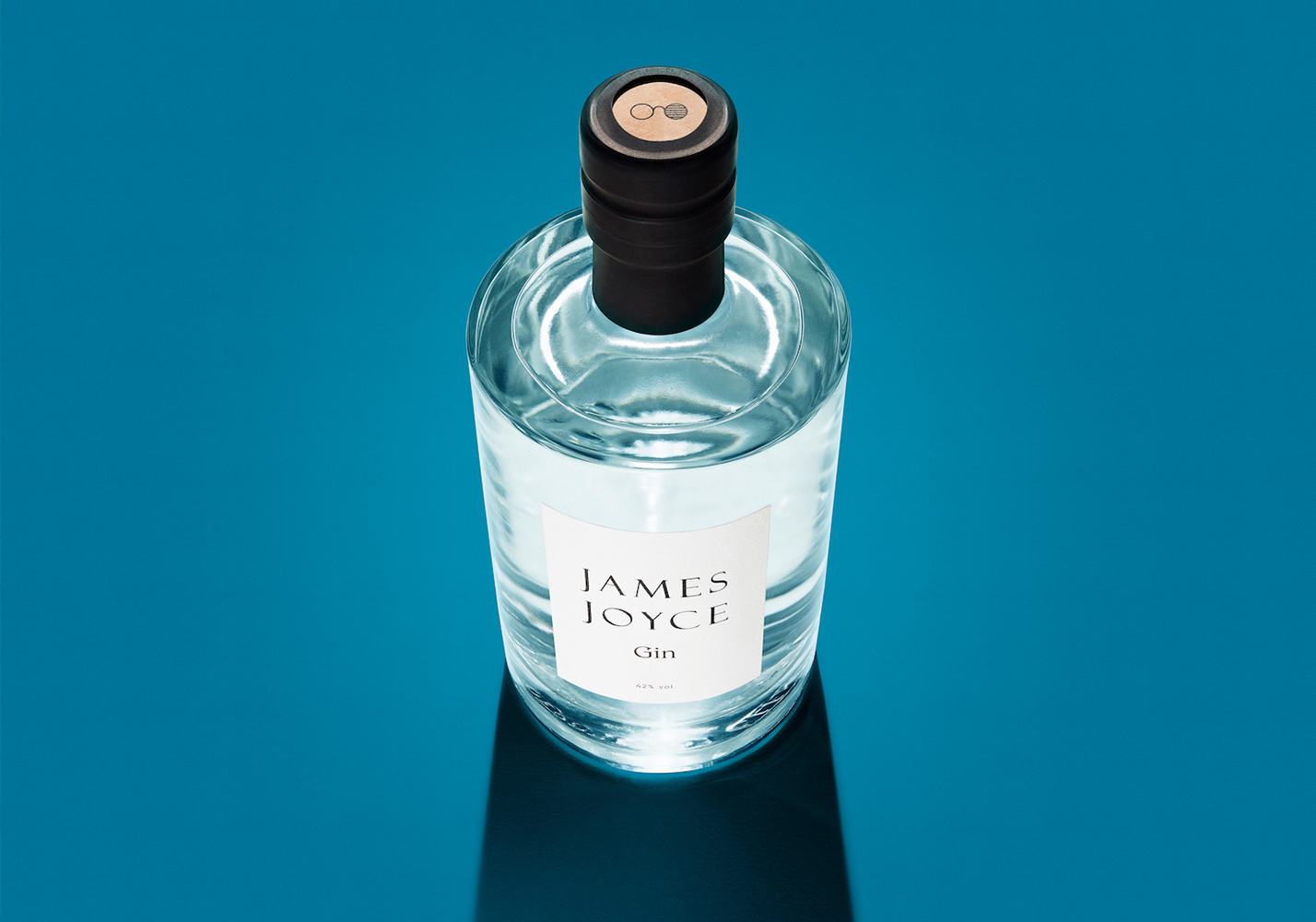
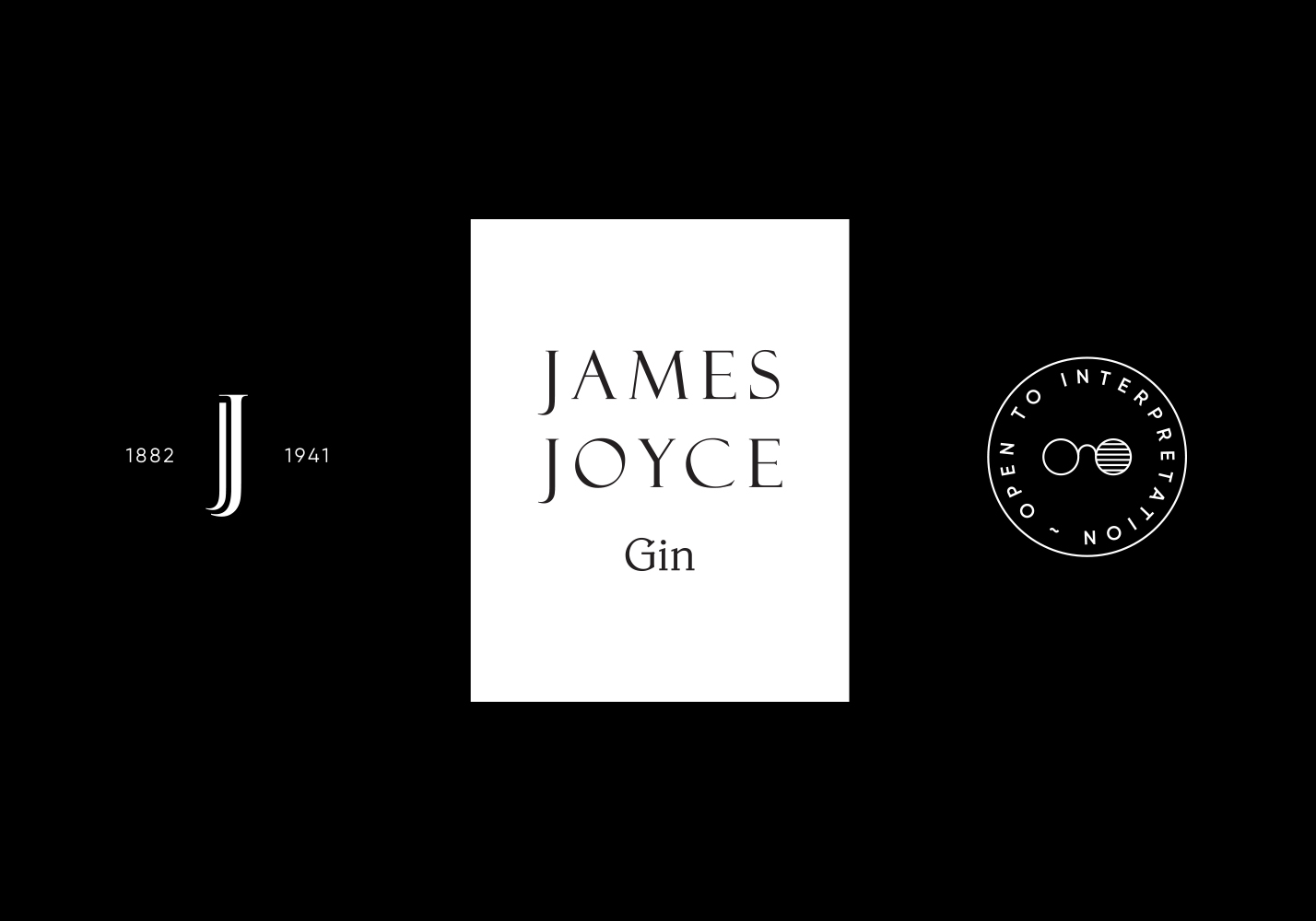
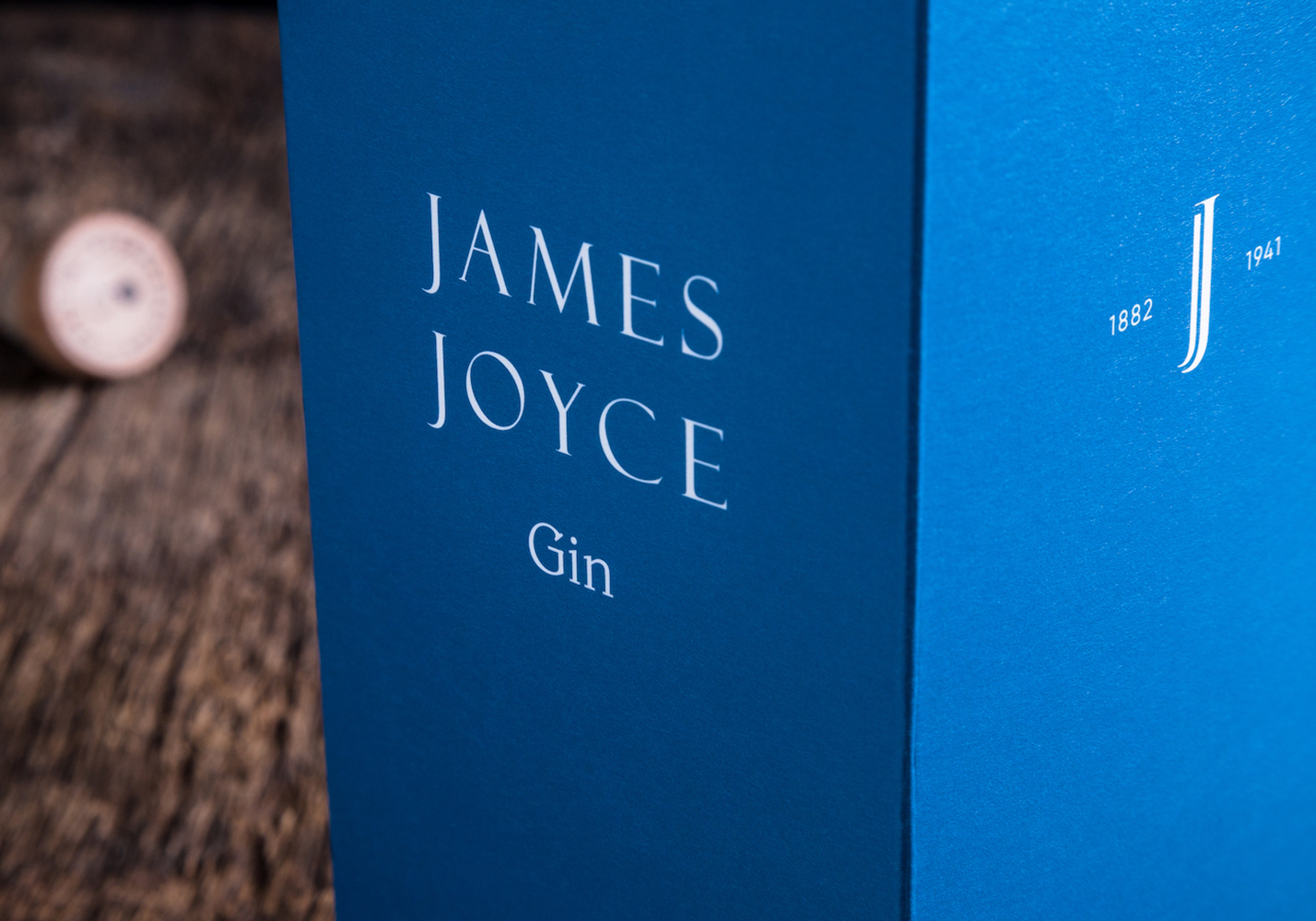
The result was a JJ monogram inspired by drop caps from that era. The label’s type treatment paid homage to the classical style of the day, in the black and white of the written word. That label is the exact proportions of his book covers. Joyce’s work can be read whether you start on the first or last page, leading to the tag line ‘open to interpretation'. The spectacle icon for fans is a simple nod to the visionaries’ constant issues with his left eye.
The bottle’s black collar exposes these glasses. The box is finished in the same Pantone as the iconic ‘Ulysses’.