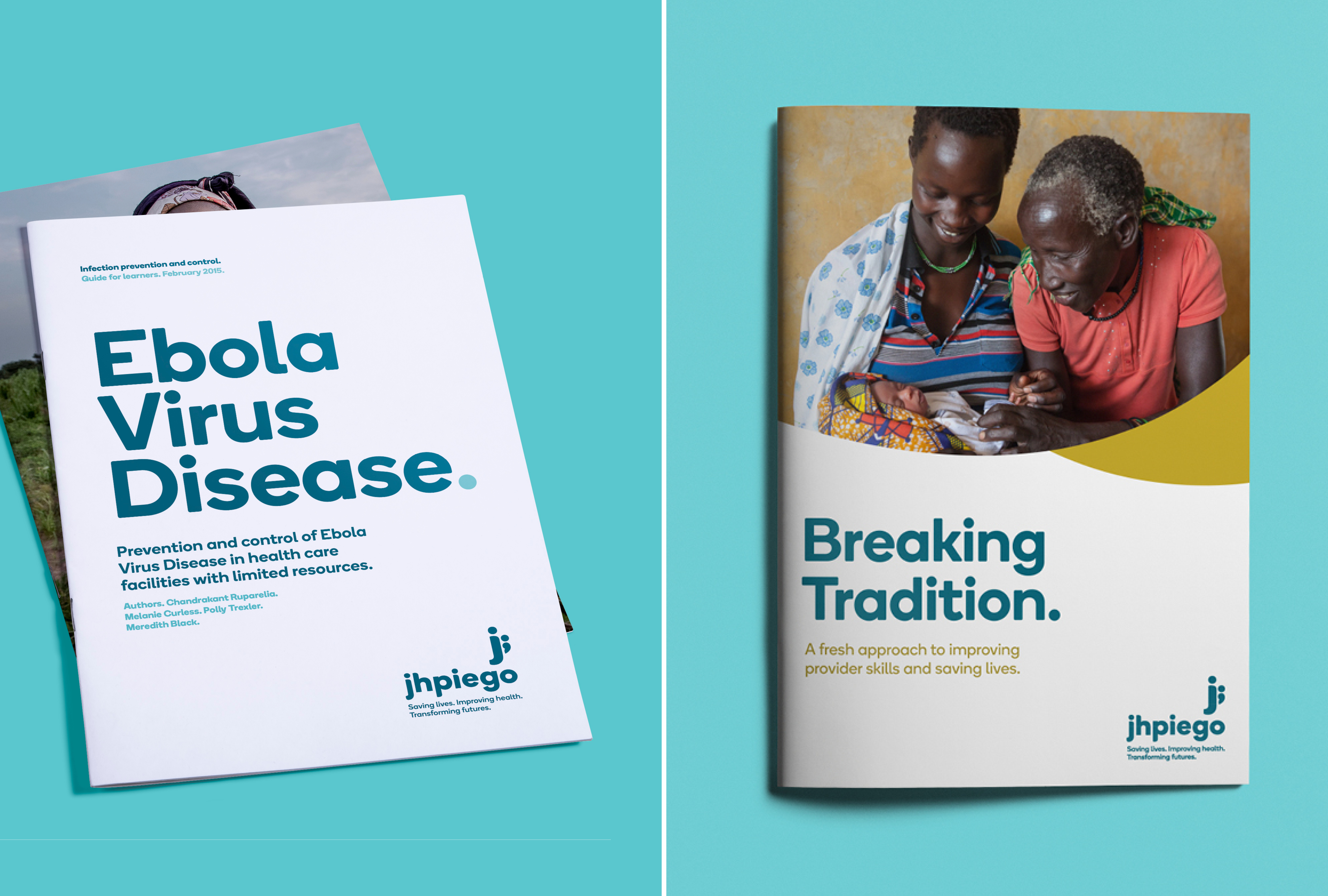
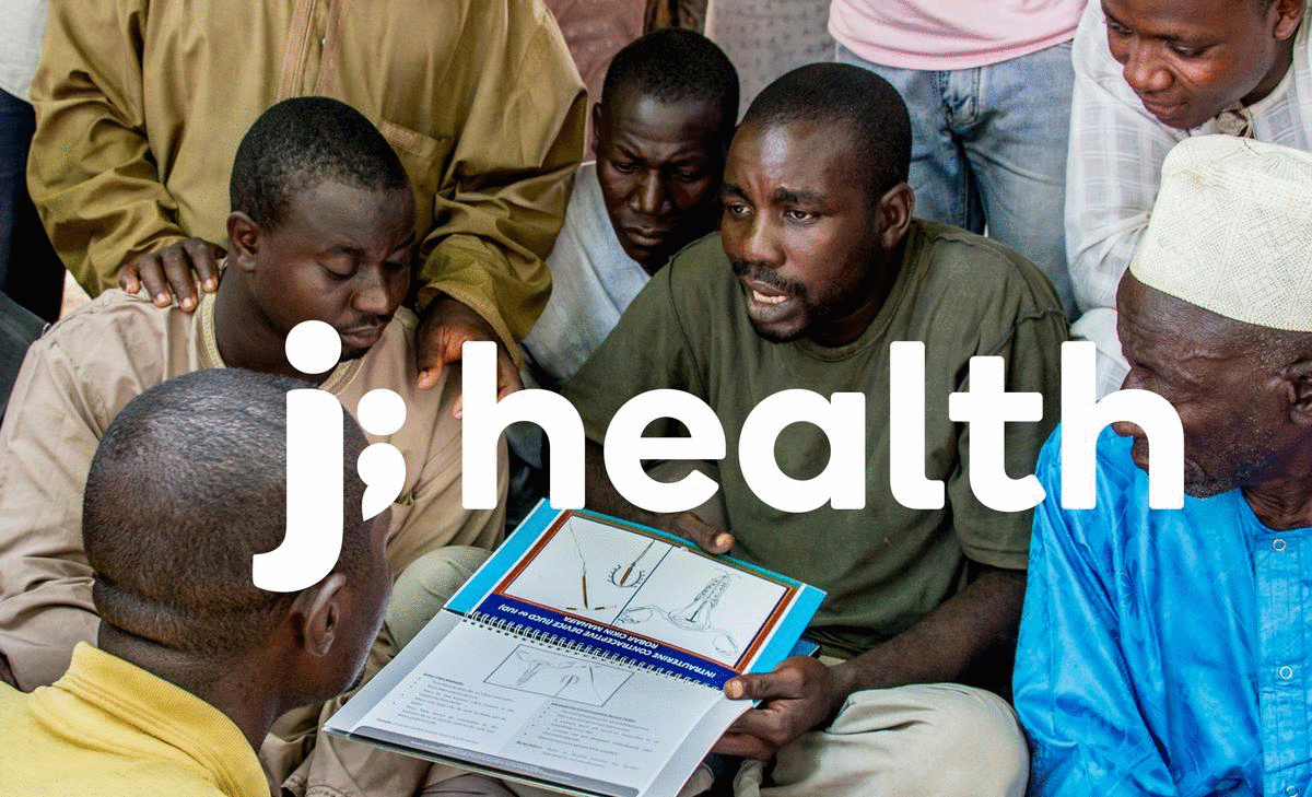
Jhpiego Rebrand
2011
Designed by Cat Robertson and Ruth Martin at Red Dog
Industry: Charitable
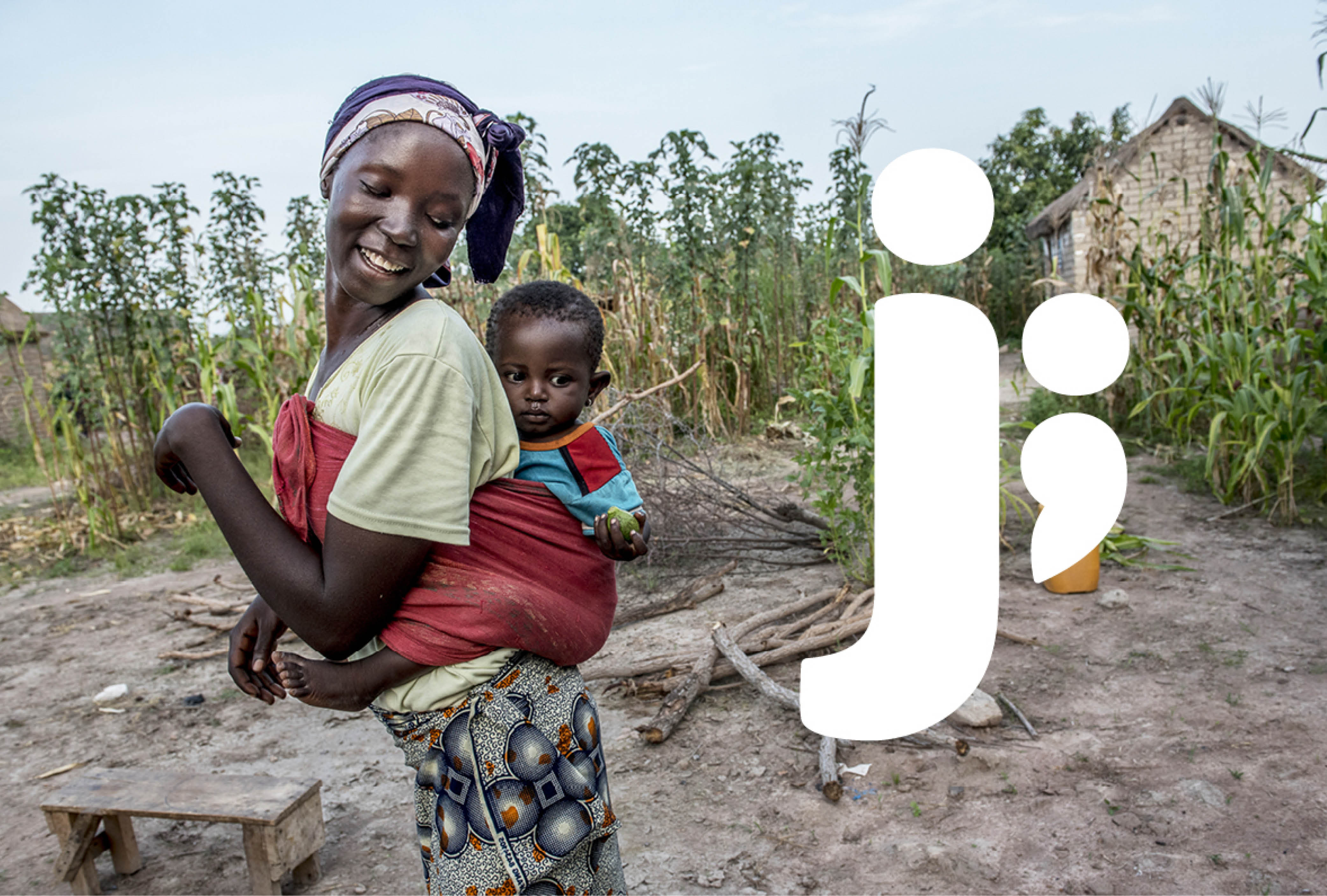
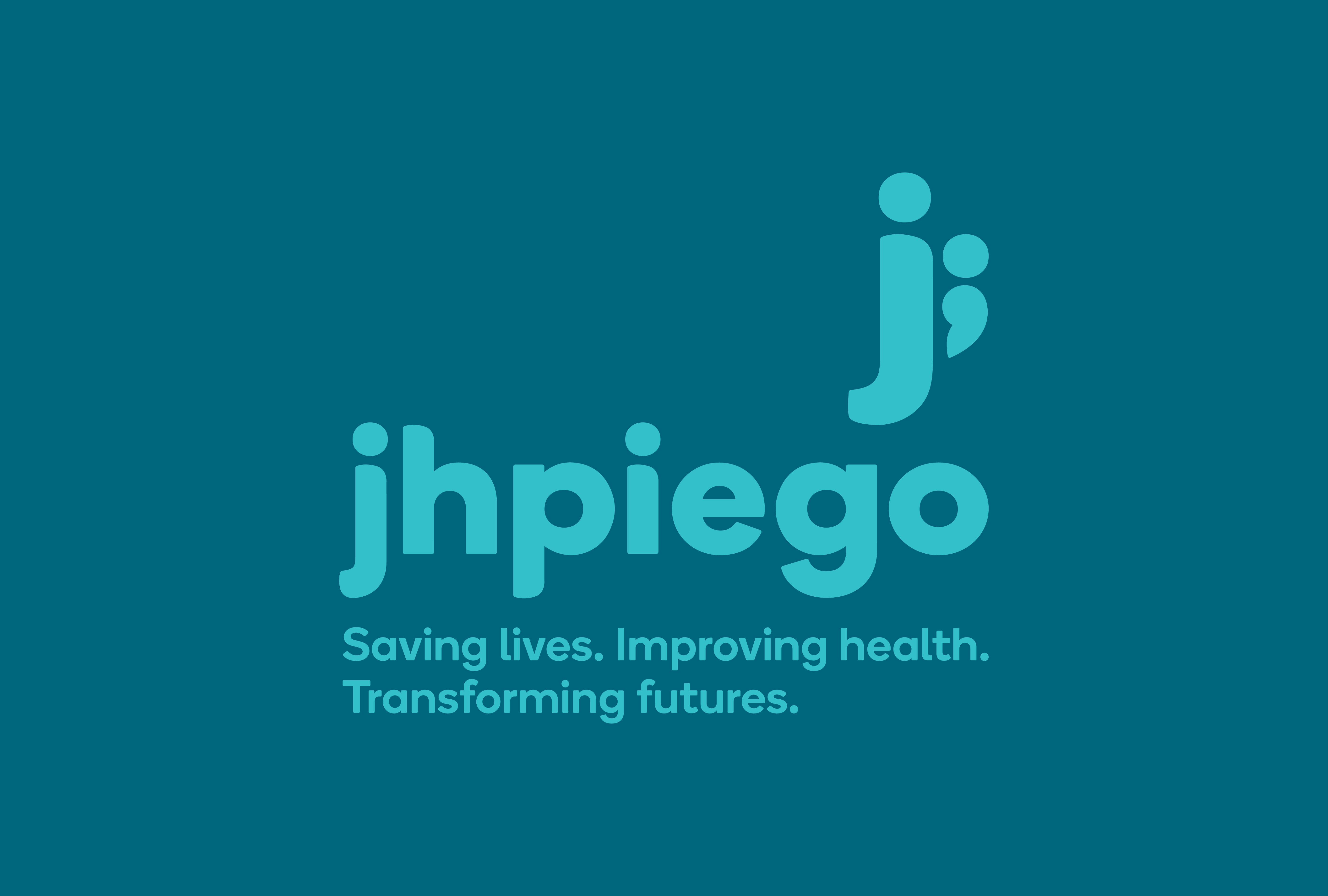
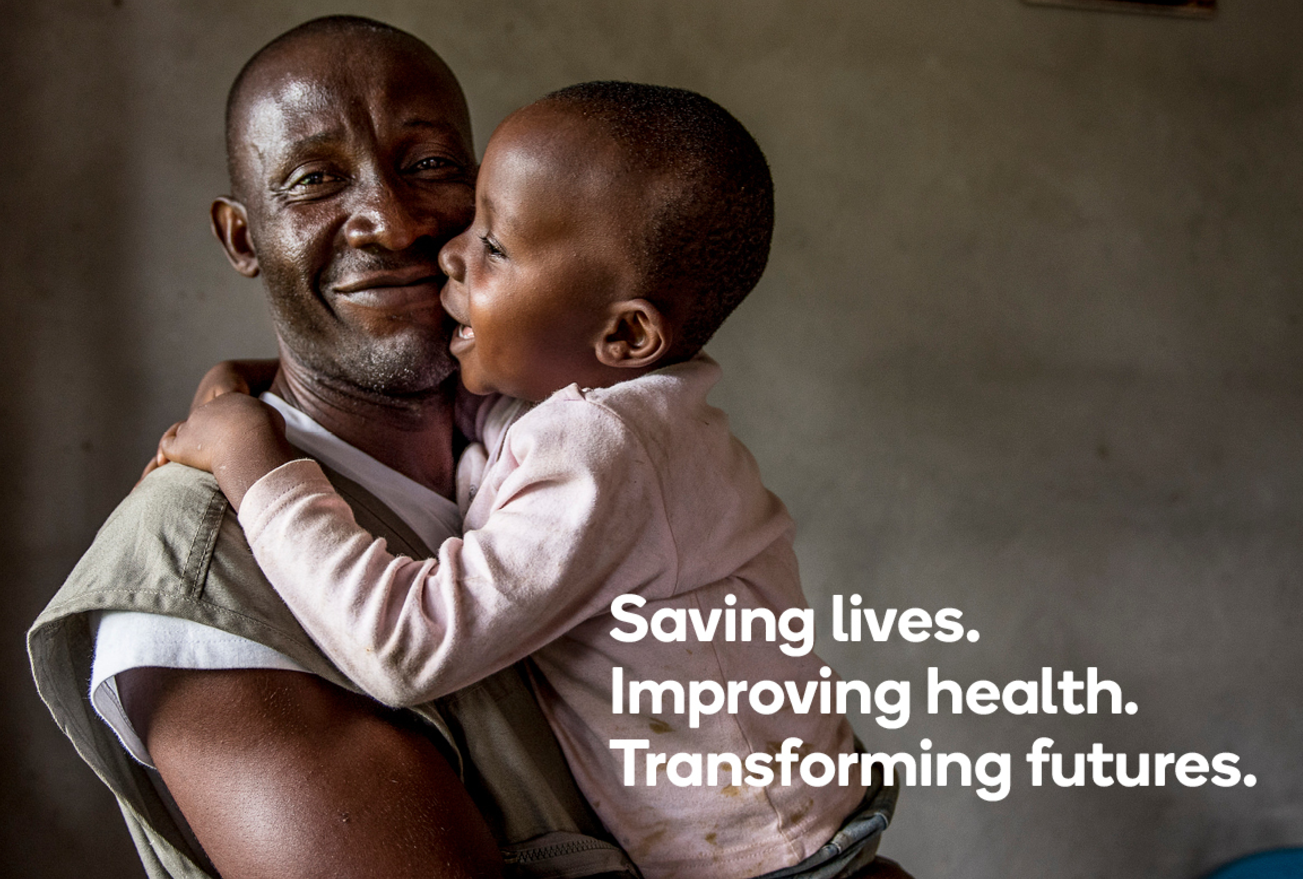
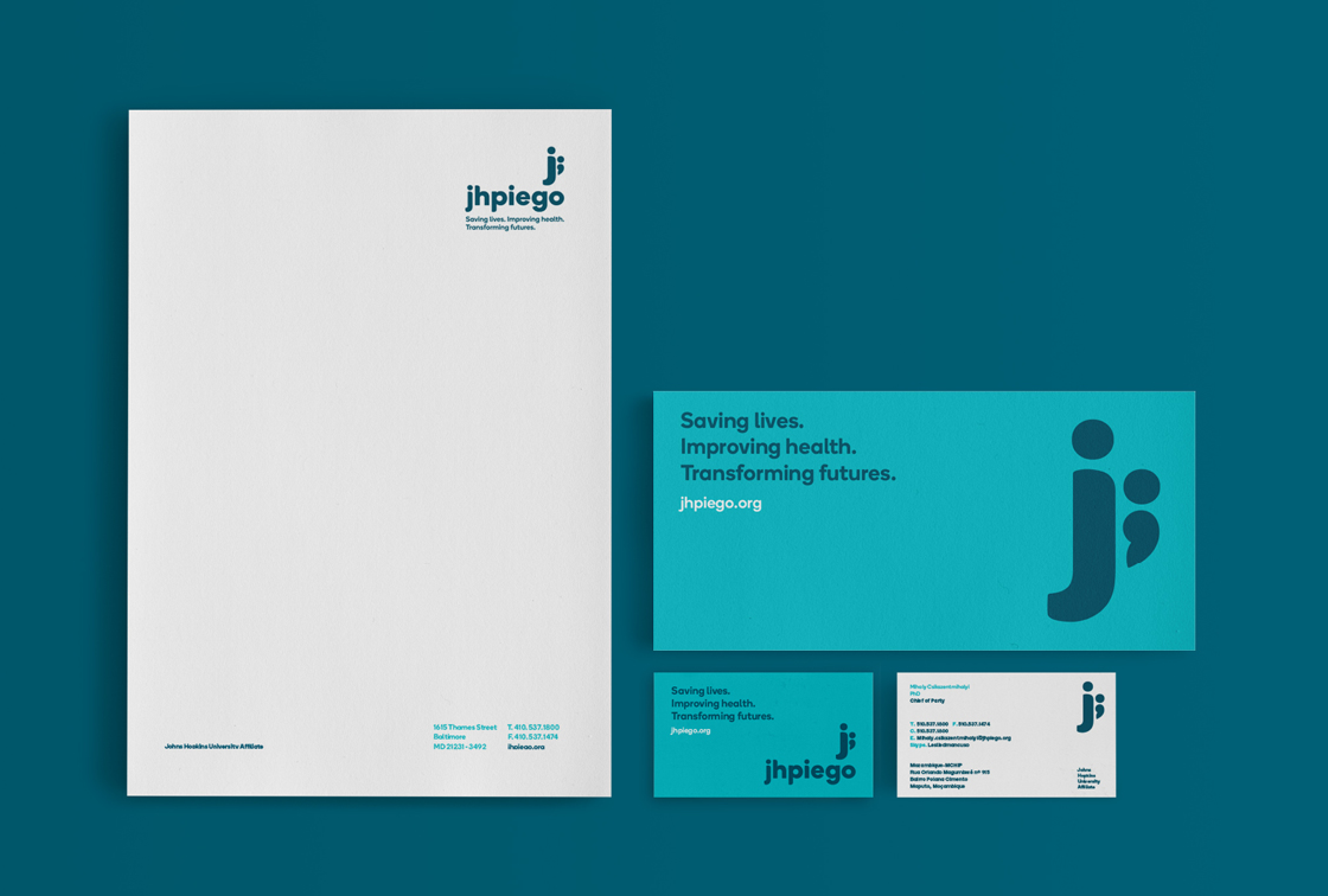
US charity Jhpiego have been breaking down barriers to high-quality healthcare for the world’s most vulnerable populations for more than 40 years. In order to engage effectively with potential funders, they needed a new identity to communicate their mission and values with greater impact, personality and focus – but without changing their name. The people at the heart of Jhpiego’s work; parents and their children were our inspiration. The universal image of a child being carried by a parent spoke instantly of care, support, and partnerships. The comparisons between this relationship and Jhpiego’s work of carrying forward the health of nations and their global partnerships supporting families and communities led to our ‘eureka’ moment. Using the letter ‘J’ we created an iconic monogram capturing the special relationship between a parent and their child. Paired with a semi-colon, the connection is made – literally and figuratively – to the organisation’s essential mission and its ambition, which is also reflected in the new tagline: saving lives, improving health, transforming futures.