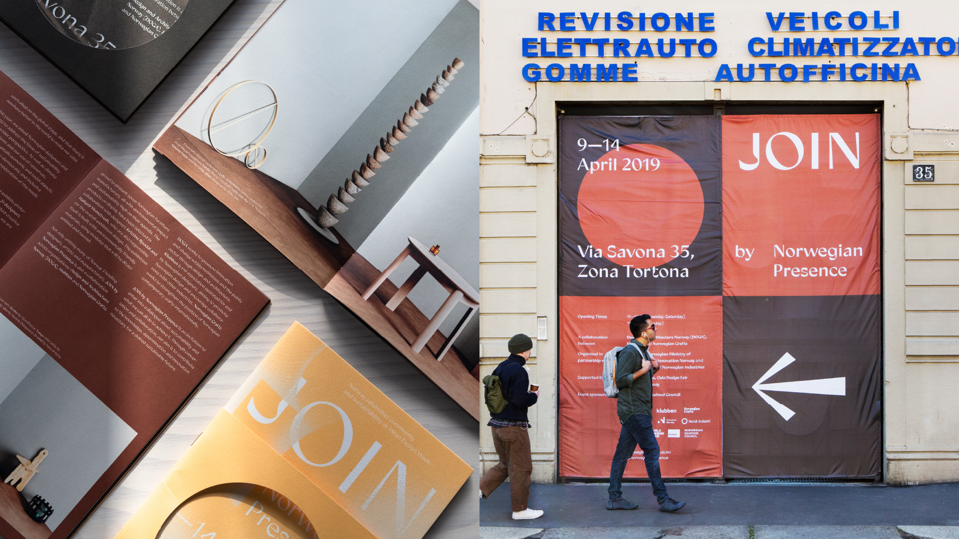
JOIN by Norwegian Presence
Designed by Evan McGuinness at Bielke+Yang
Creative Direction: Martin Yang
Creative Direction: Christian Bielke
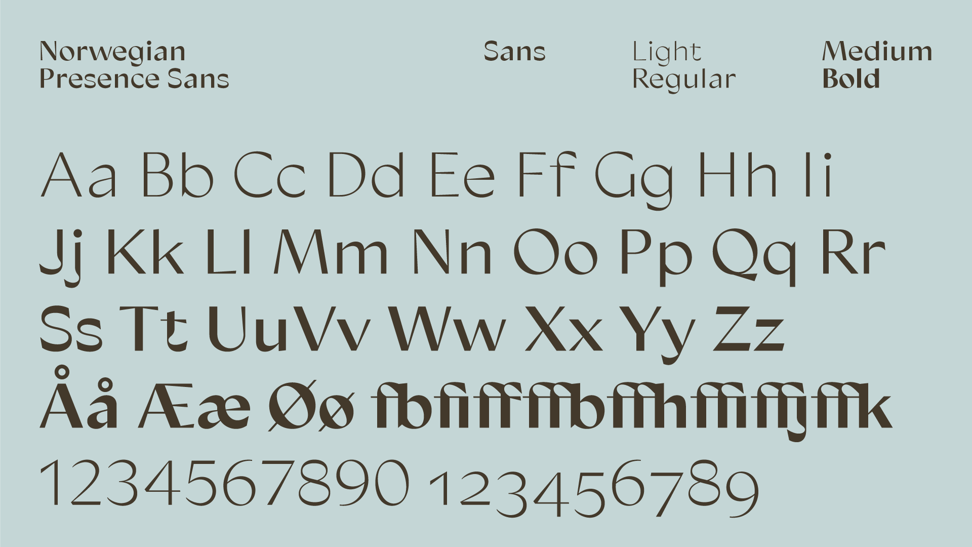
Type Design: Bobby Tannam
Exhibition Design: Kristine Bjaadal & Hallgeir Homstved
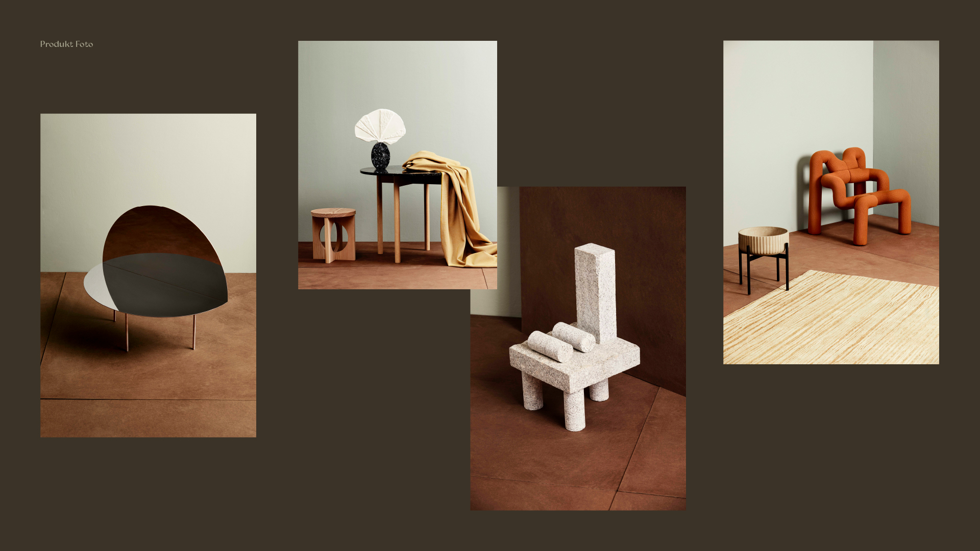
Styling and Curation: Kråkvik&D'Orazio
Studio Photography: Trine Hisdal
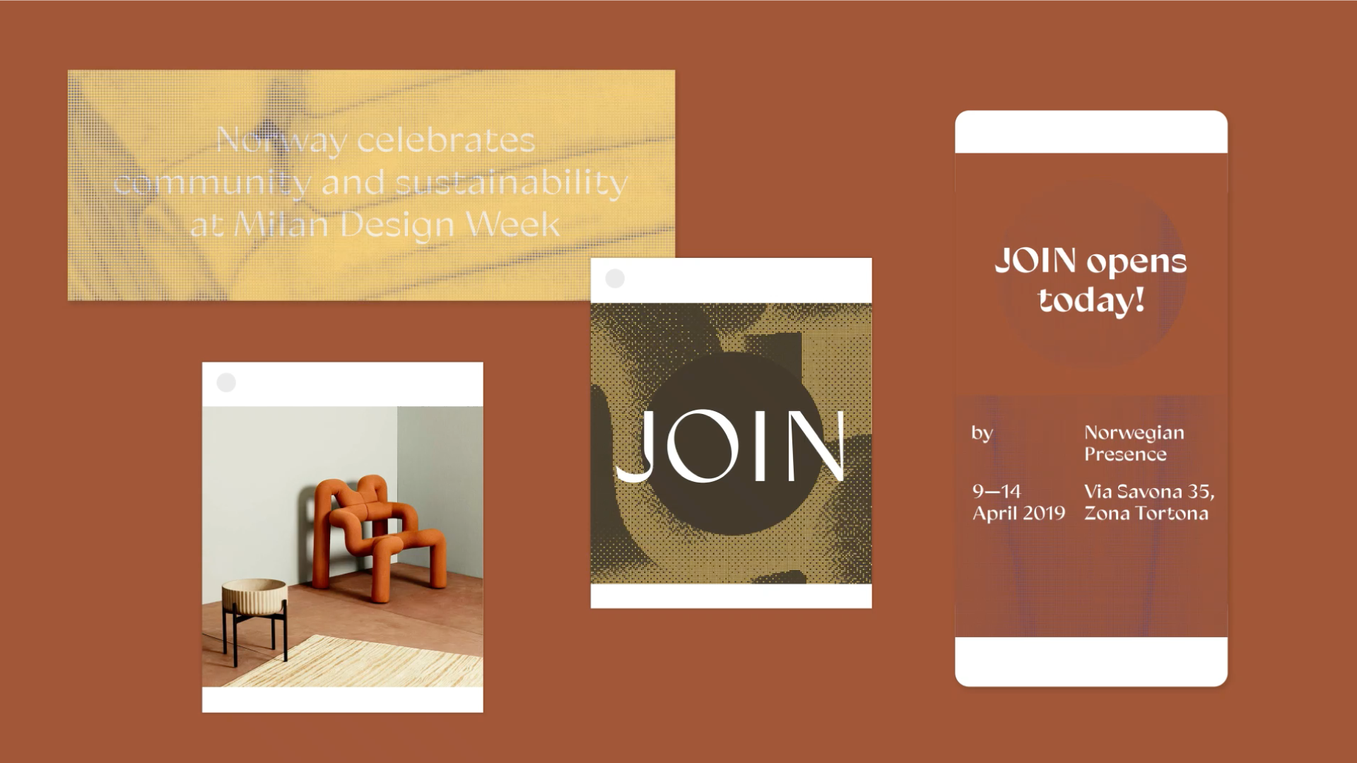
Website Development: Værsågod
Project Management: Grete Sivertsen/DOGA
PR and Promotion: Emma Collins/Zettler
Categories: Identity
Industry: Cultural
Website: norwegianpresence.no/2019/
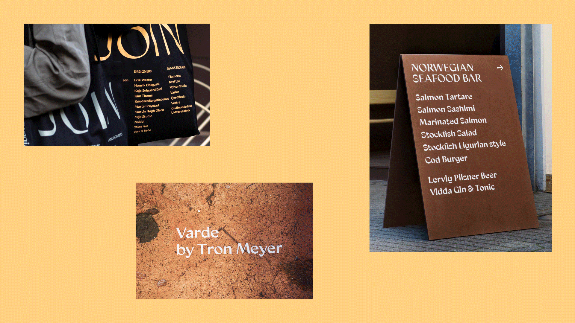
Norwegian Presence is an annual exhibition at Milan Design Week of handcrafted objects, product design prototypes and manufacturing of furniture, textiles, lighting, ceramics, metal, and glass, and is the sixth Milan collaboration between three of Norway's largest design and craft organisations: Klubben, Design and Architecture Norway (DOGA) and Norwegian Crafts.
Norway is a nation of creators and blessed with an abundance of raw materials such as wool, wood, stone, and steel. Community and collaboration are strong aspects of Norwegian culture, and as a result, the modern design landscape Norway is a place without a distinct ego, where boundaries to collaboration are low and opportunities are explored with a shared curiosity — hoping to create something beautiful, functional and timeless.
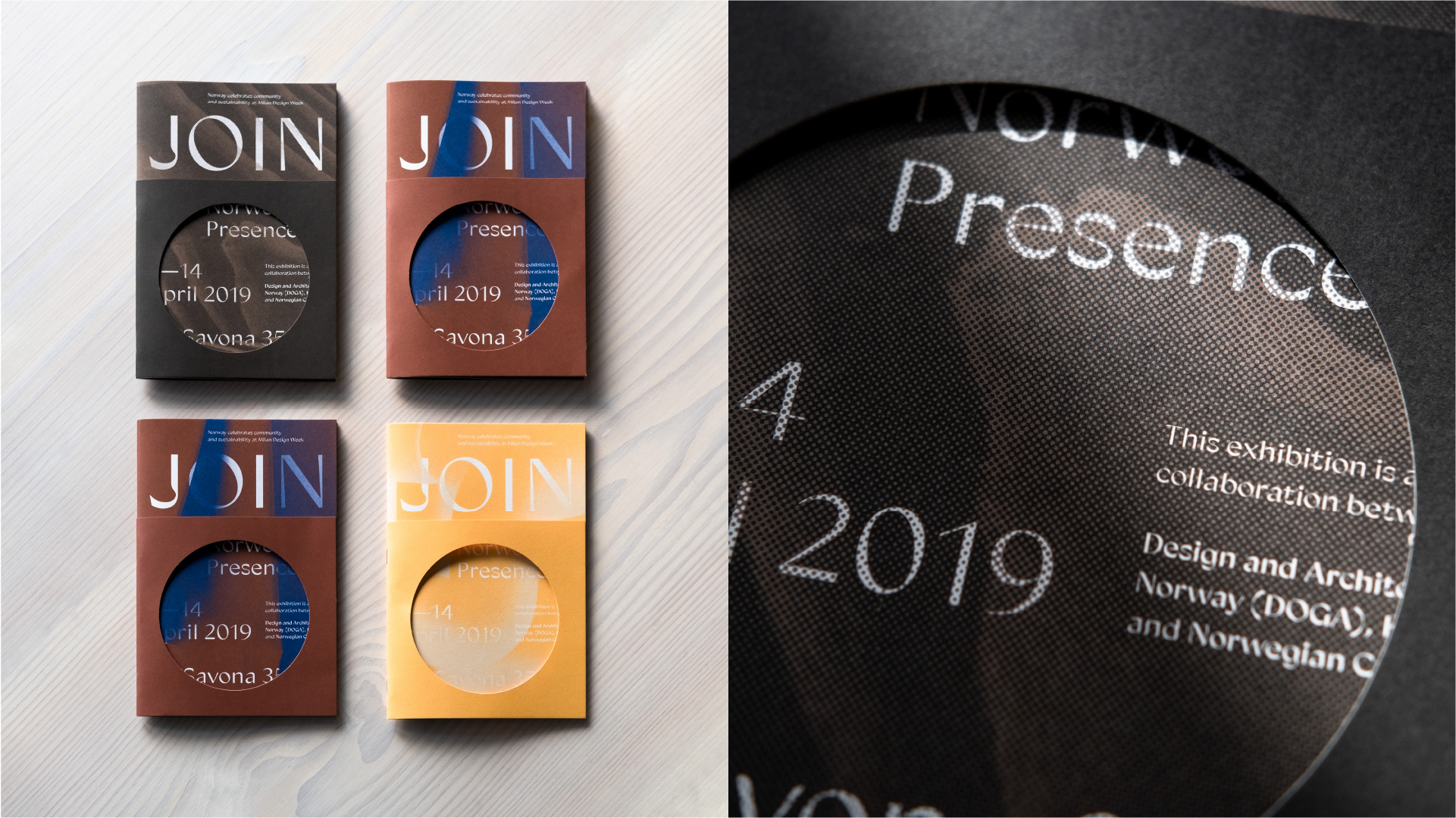
The theme for Norwegian Presence in 2019 was sustainability. The selected designers and craftspeople were therefore challenged to allow sustainability, climate, raw materials, and contemporary societal themes as the starting point for the work they exhibited. One of the purposes was to let the practitioners become more aware of these themes and to include them in their process from the start.
The identity of Norwegian Presence is developed by creating a bespoke iteration each year based on the themes and works on display while retaining the core identity. For the theme of sustainability in 2019, we incorporated simplified printing techniques, recyclable elements and simple modular forms as the framework of the identity to accompany the theme and the exhibited works. The colour palette is based on the location (a converted garage) the exhibtion design materials and the works on display. All of the exhibition material was reused after the exhibition to minimise the environmental impact of the exhibition.
The identity also features the second iteration of the Norwegian Presence typeface, an ongoing collaboration with Bobby Tannam. It is developed by creating a custom version each year, based on the same skeleton: the same proportions, spacing, and x-height, but adapted to this express year's
theme. In 2019 with special focus on the circular forms, representing the product/material life-cycle.