Joyof West African Food
2025
Designed by Clare Lynch (Creative) at Clare Lynch Creative
Categories: Packaging
Industry: Commercial
Tags: Illustration / Food and drink / Art direction
Website: joyoffoods.com
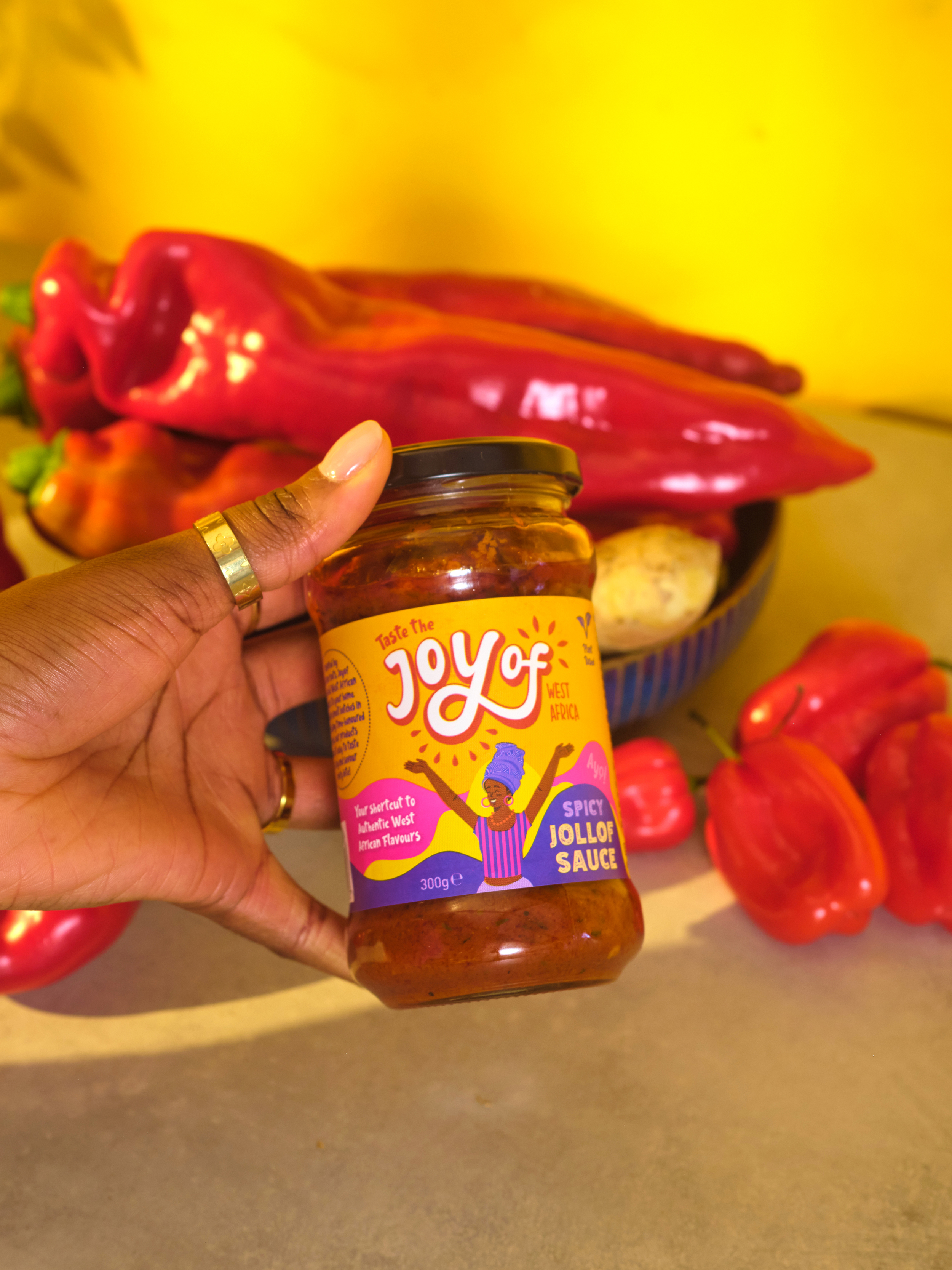
Joyof Foods set out to make authentic West African cuisine more accessible in Ireland, offering convenient, high-quality sauces that reduce cooking time without compromising flavour. The design challenge was to capture the joy, vibrancy, and cultural richness of West Africa in packaging that resonates with both African communities and new audiences.
Our concept drew inspiration from traditional African drawings and patterns, translating their playful energy into a contemporary brand identity. Hand-drawn typography reflects the handmade quality of the food while expressing authenticity and pride in cultural heritage. The wordmark evolved to integrate 'of' more seamlessly, turning Joyof into a single, celebratory expression. Surrounding shapes suggest bursts of energy and natural ingredients, while the bold, vibrant colour palette conveys freshness and vitality. The result is distinctive brand packaging identity, that balances cultural storytelling with strong shelf presence.
The completed packaging design delivers a distinctive and joyful identity that celebrates West African culture while meeting the demands of a contemporary retail environment. The design balances originality and cultural storytelling with professional execution and practical considerations.
The hand-drawn wordmark reinforces the handmade quality of the food and creates a unique, memorable identity. Adjustments to the lettering allowed 'Joyof' to be read as one cohesive expression, capturing the spirit of celebration at the heart of the brand. Surrounding dynamic shapes were inspired by the life and energy of African people and culture. This visual language, combined with a vibrant colour palette, creates strong shelf presence while authentically reflecting the vibrancy of West African cuisine.
Functionality and clarity were key to the solution. Product information is presented clearly alongside expressive graphics, giving confidence to consumers who may be discovering these flavours for the first time. The system applies consistently across the range, supporting recognition while leaving space for flavour differentiation.
Sustainability was embedded in the design decisions. The choice of glass jars ensures a format that is infinitely recyclable, highly reusable, and durable in the consumer’s kitchen. Labels are printed on recyclable paper stock, attached with minimal adhesive, and feature a clear icon signalling that both jar and label are fully recyclable. This communicates the sustainable values of the brand directly to consumers, encouraging responsible disposal while also reducing packaging waste. The minimal label design reduces unnecessary material use, ensuring efficiency without compromising visual impact.
The final result is packaging that is both joyful and responsible: it tells a story of cultural pride and accessibility while aligning with modern expectations around sustainability. By merging authentic heritage aesthetics with a clear, contemporary packaging system, the design elevates Joyof Foods as a brand that brings vibrant West African cuisine into everyday life in a way that is distinctive, convenient, and environmentally conscious.