JPA Brenson Lawlor
2022
Designed by Danielle OConnell, Richard Collier and Emma Woods at Good as Gold
Photography: Peter Evers
UX Copywriting: Lauren Higgs
Categories: Website / Identity
Industry: Corporate
Tags: Photography / Digital / Art direction
Website: jpabrensonlawlor.ie/
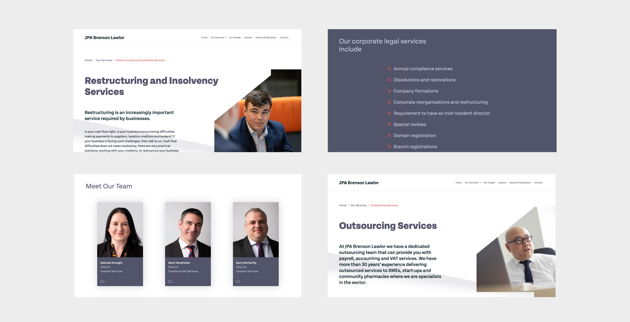
JPA Brenson Lawlor is a firm of chartered accountants which celebrated 50 years of business in 2022. During the pandemic, Managing Partner Ian Lawlor, and the team became increasingly aware of the changing need for a more digital-facing brand identity.
It was becoming a priority to create a digital presence that accurately portrayed their ethos and standing as a contemporary place of work in the fast-paced financial sector.
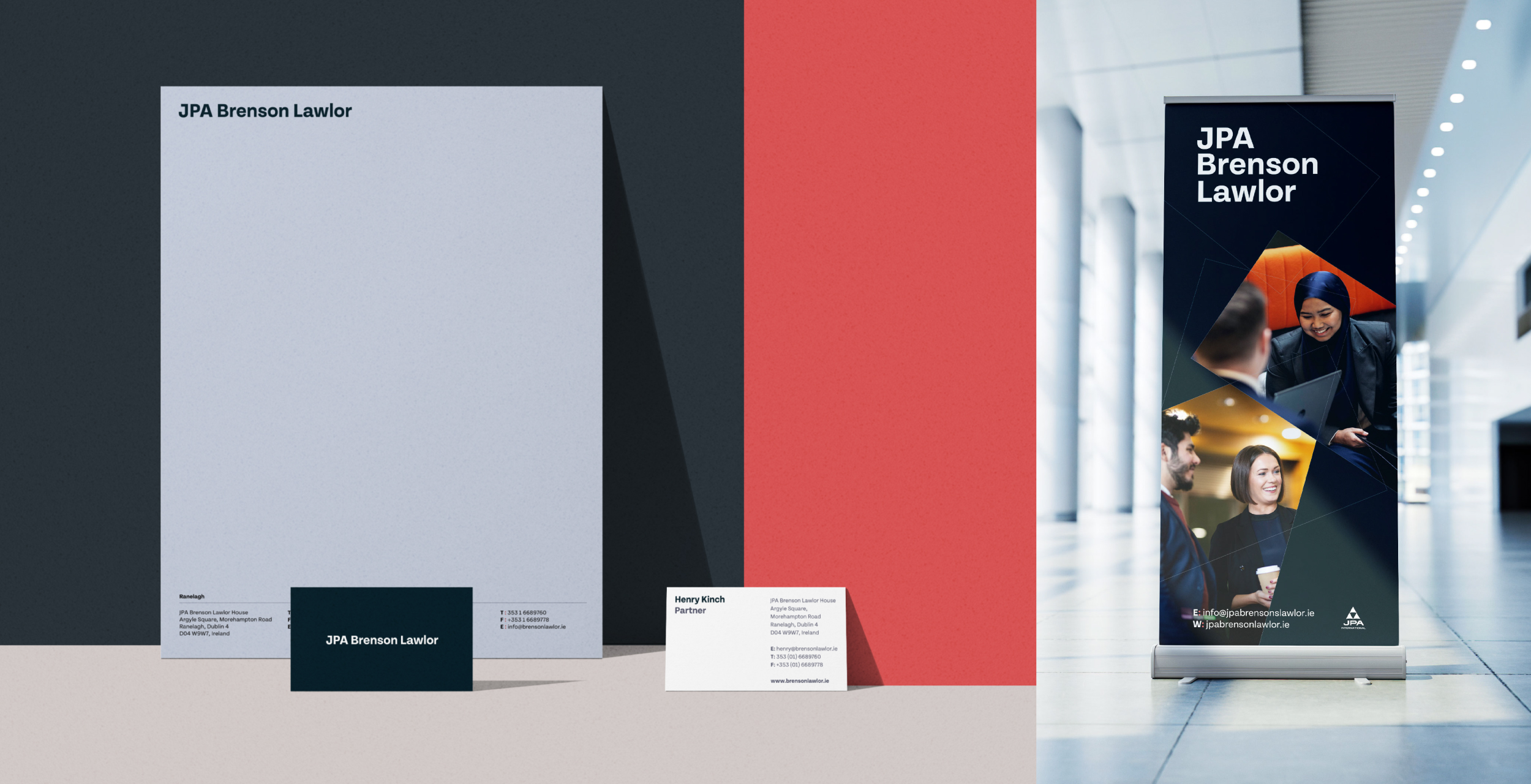
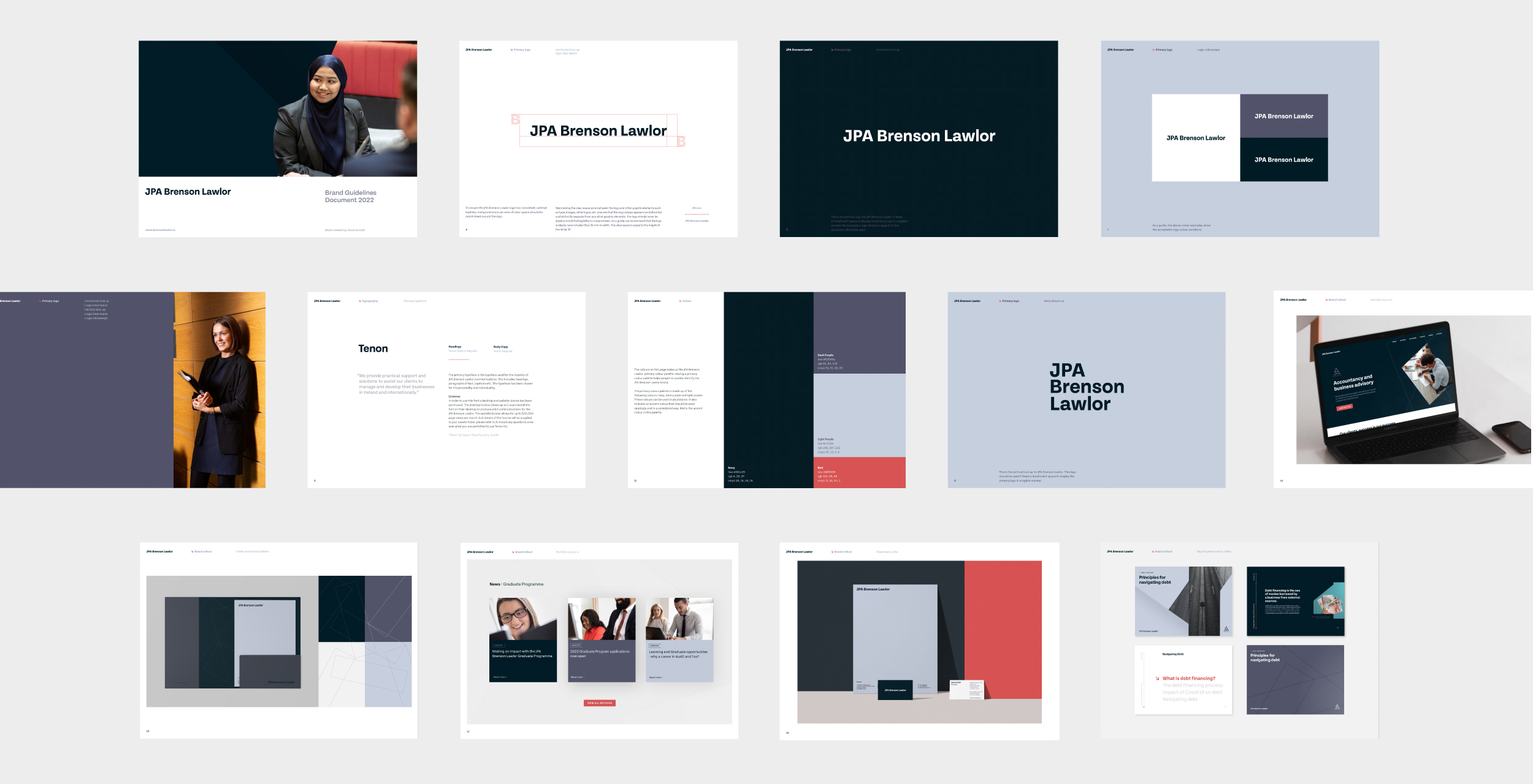
A key area for consideration was the official company name and logomark and whether to incorporate the JPA international logo—or not. Through consultation, research and exploration, final decisions were reached with company management. The design team created a fresh visual direction that centred around the people at the heart of the company and the concept of true, lasting professional partnerships.
A custom pattern that reflects movement, progress, and continuity forms the visual brand language. Integrating with photography, this pattern helps to provide a bold and impactful visual identity across all collateral. We paired this with a warm but bold colour palette coupled with a geometric, friendly logotype to help achieve an overall balanced brand aesthetic.
Working with photographer, Peter Evers, a suite of bespoke brand photography was generated in line with brand ethos and visuals for use on the website and all brand collateral.