Kinia
Designed by Adam Gallacher and Nik Dillon at Alkamee
Categories: Printed Publication / Identity
Industry: Charitable
Tags: Rebrand / Visual Communications / Identity / Brand Identity / Logomark
Camara Ireland and Suas Ireland, two established organizations in education approached us to build a brand that wholly represented the strength of their collaboration and one that would propel them forward in a transformative way. By merging, they would be capable of so much more and needed a purposeful and powerful entity united in its vision, all represented by a new name and brand identity.
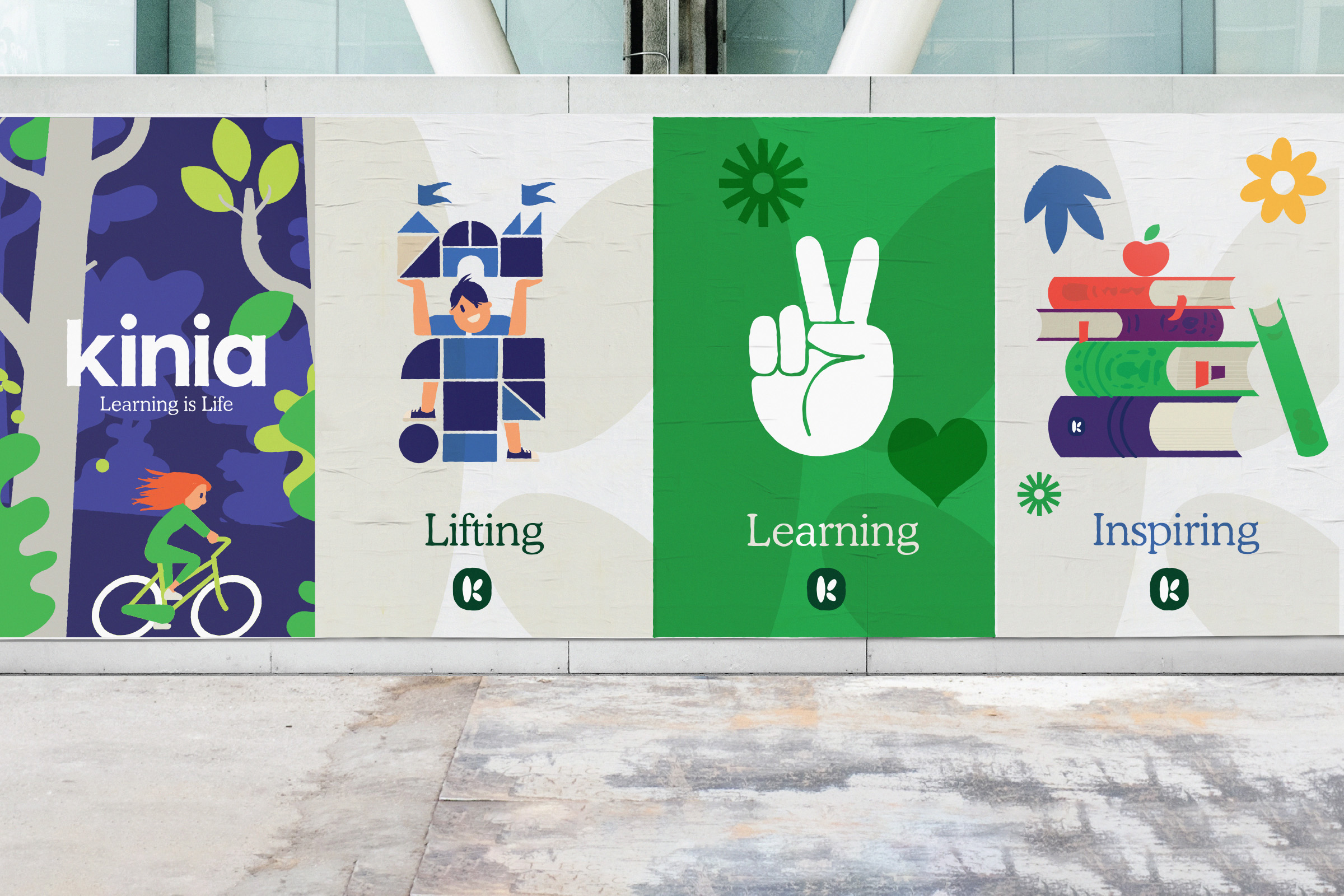
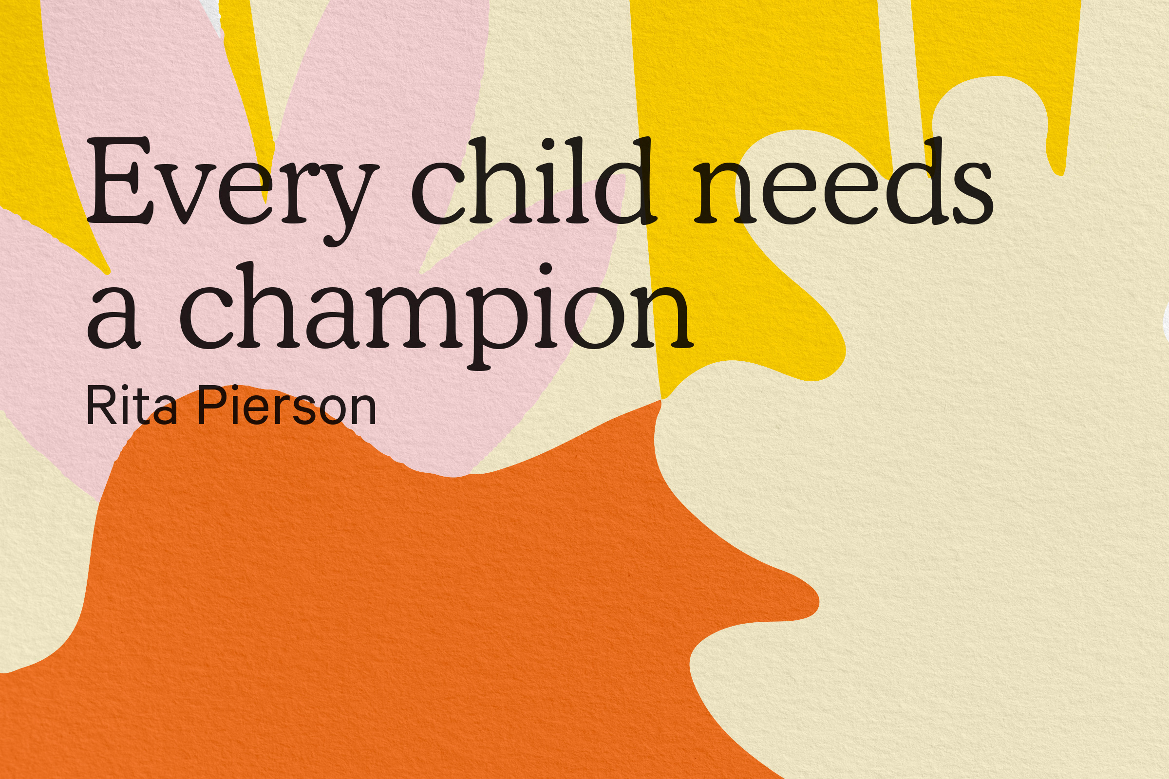
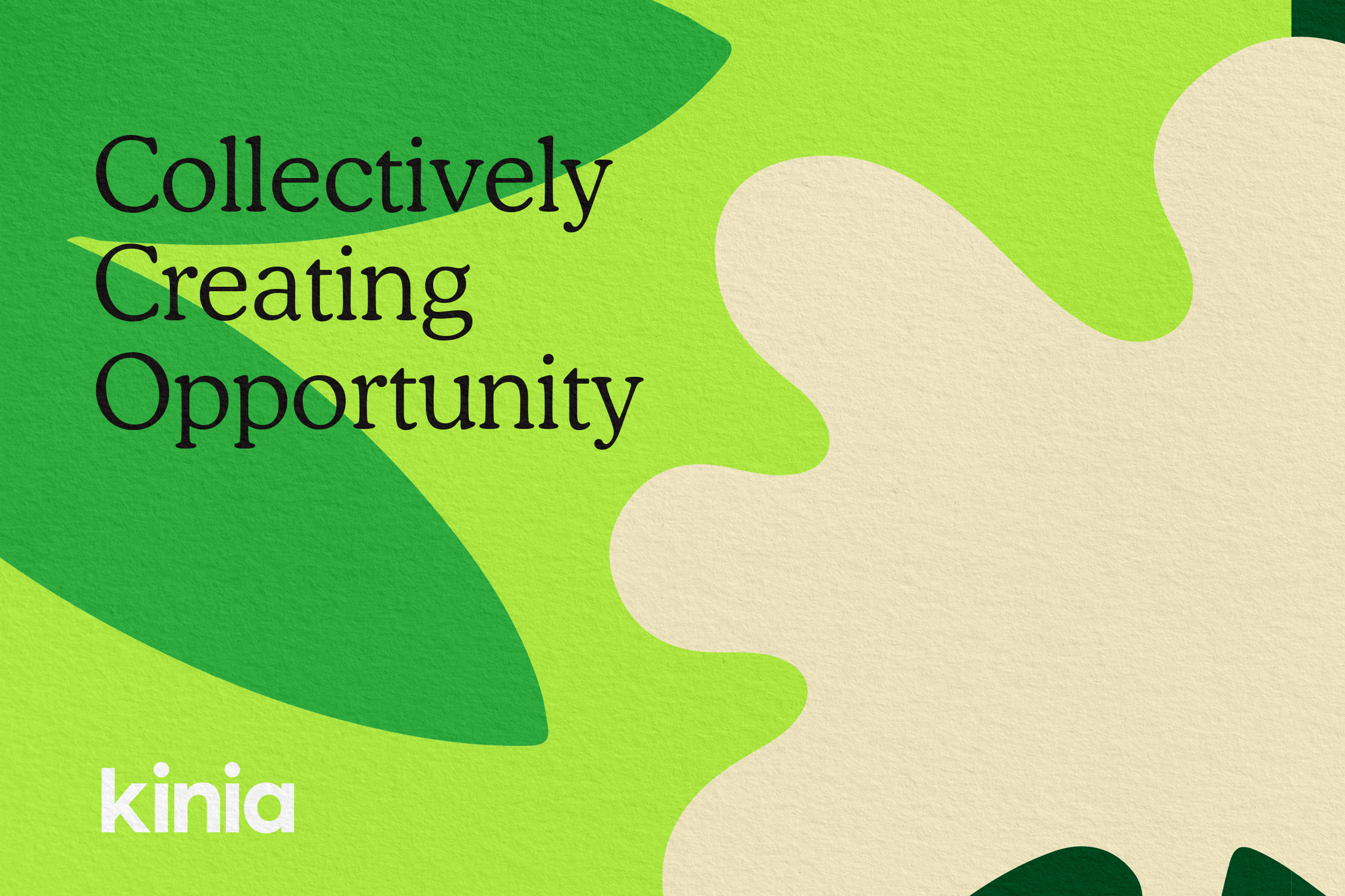
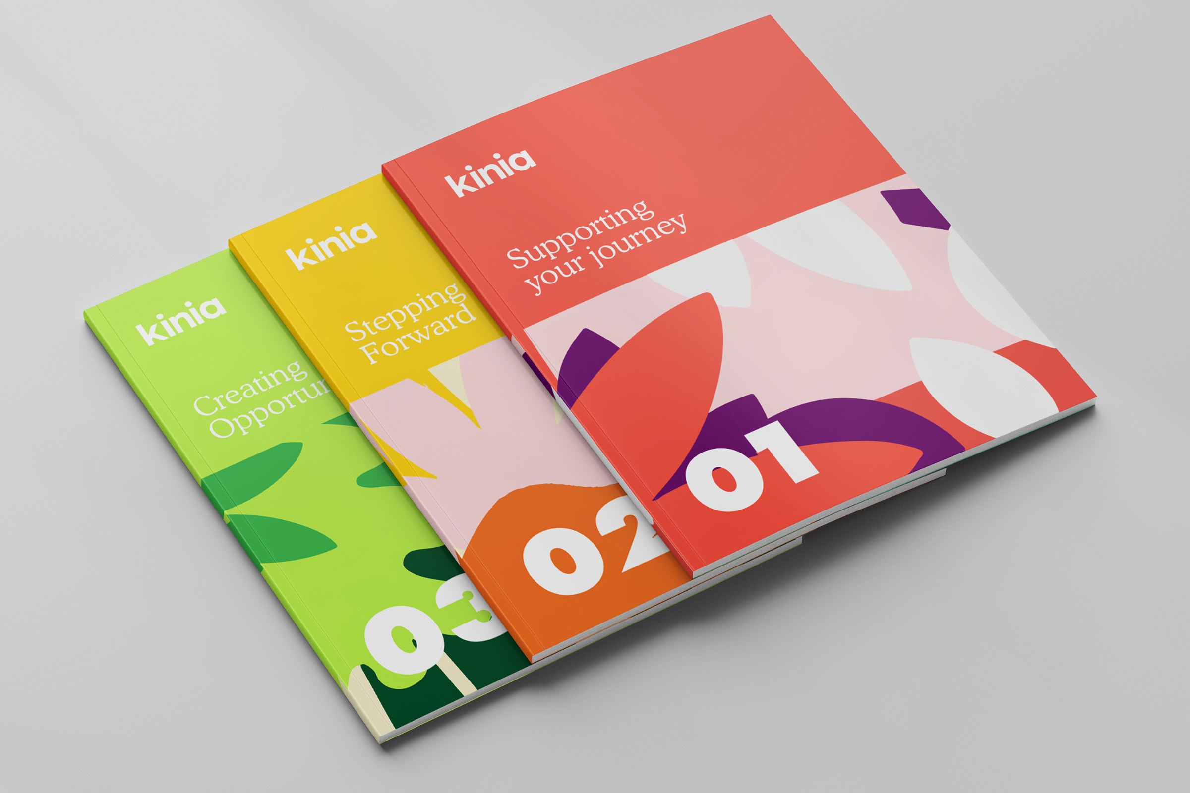
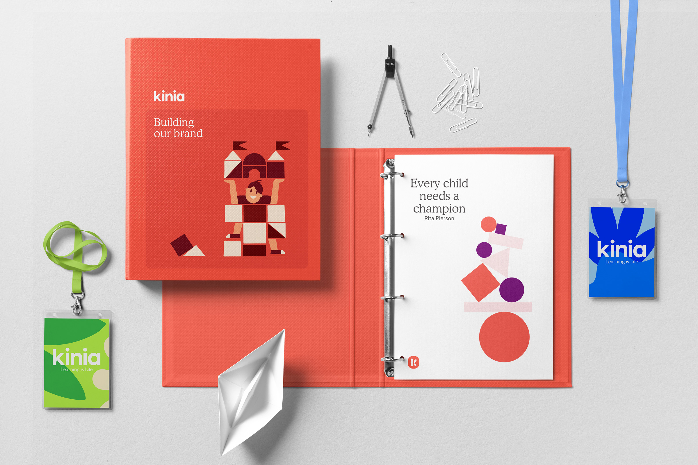
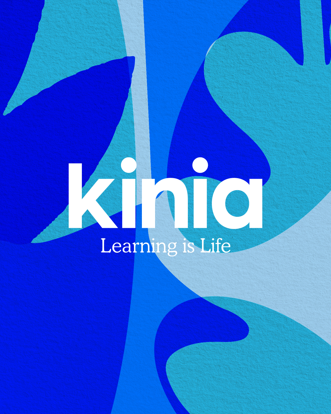
Learning builds a spirit of lifelong curiosity and imbues individuals with personal confidence. Both organisations were all about helping children reach higher and achieve their true potential. So we defined a solid positioning of 'Collectively creating opportunities for children, young people and their communities with an outward-facing brand purpose for the whole world to see – 'Learning is Life'.
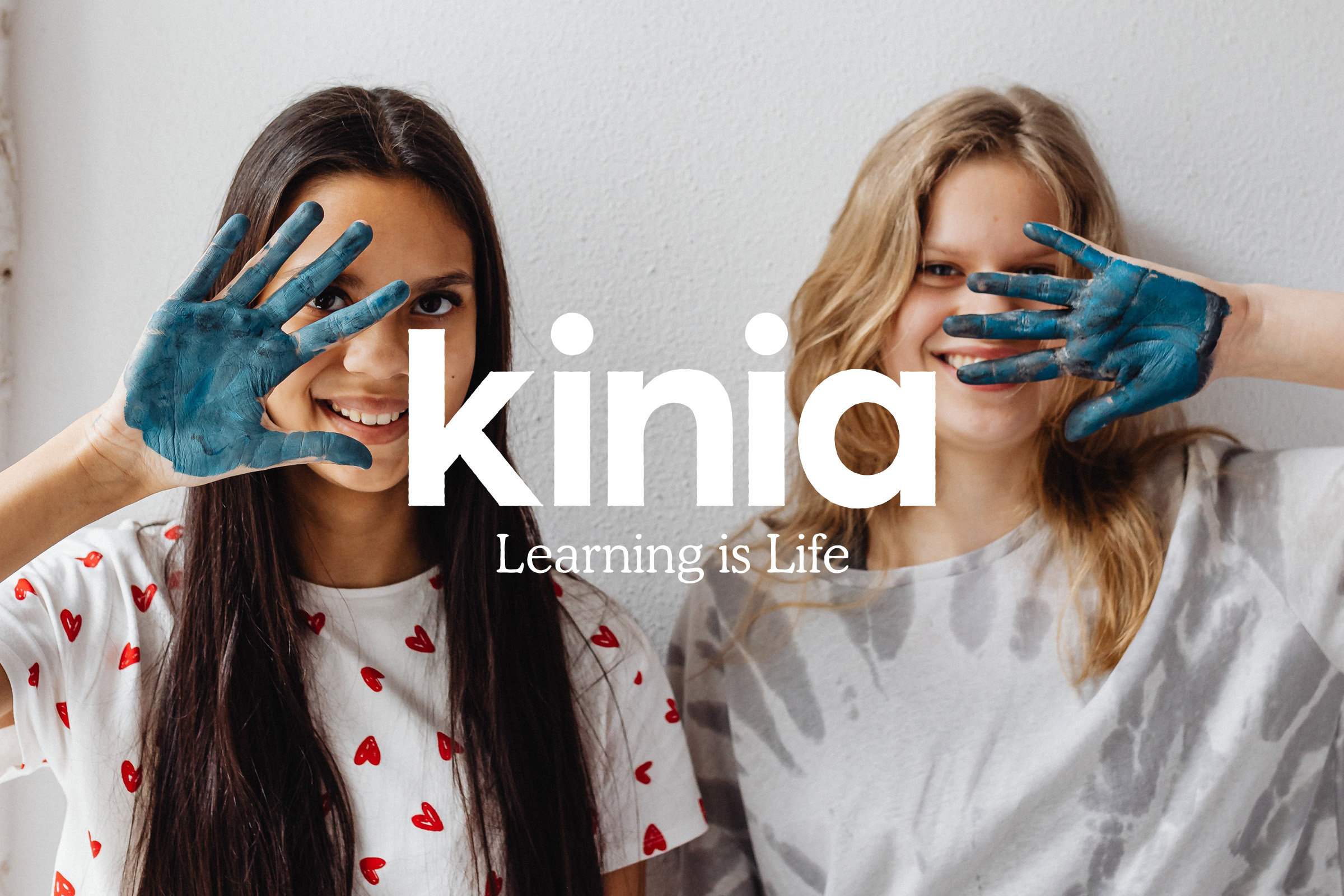
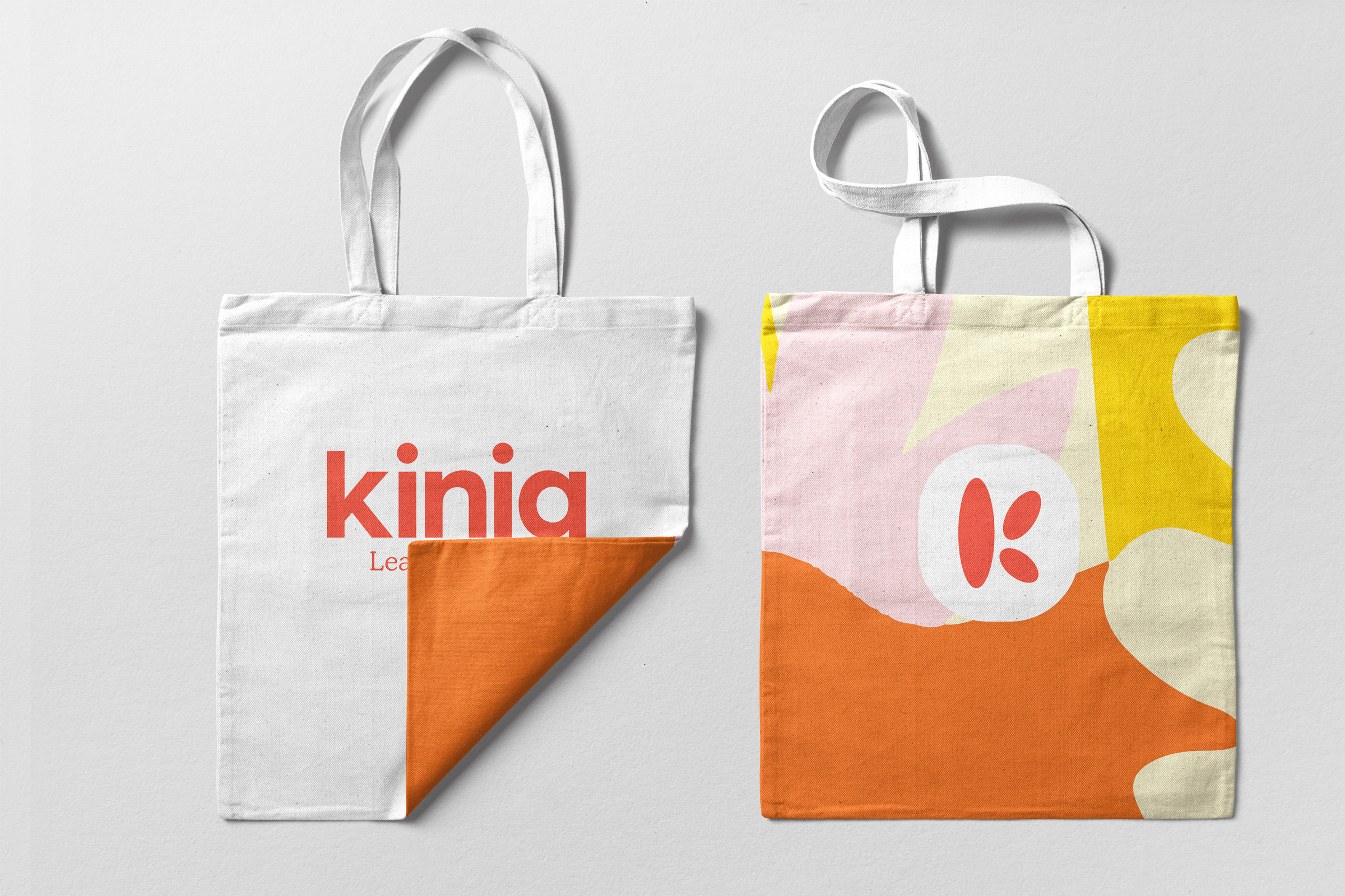
The new name Kinia stems from this positioning - one family coming together to collectively create opportunity, an organisation built around people. It's friendly, warm and communicates a collective coming together for joined action.
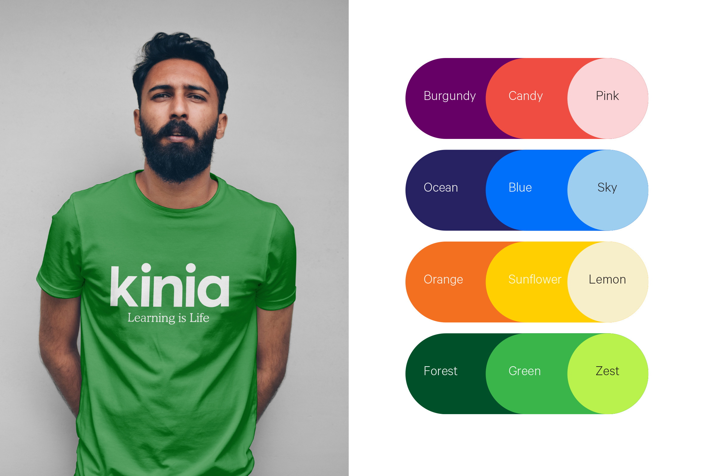
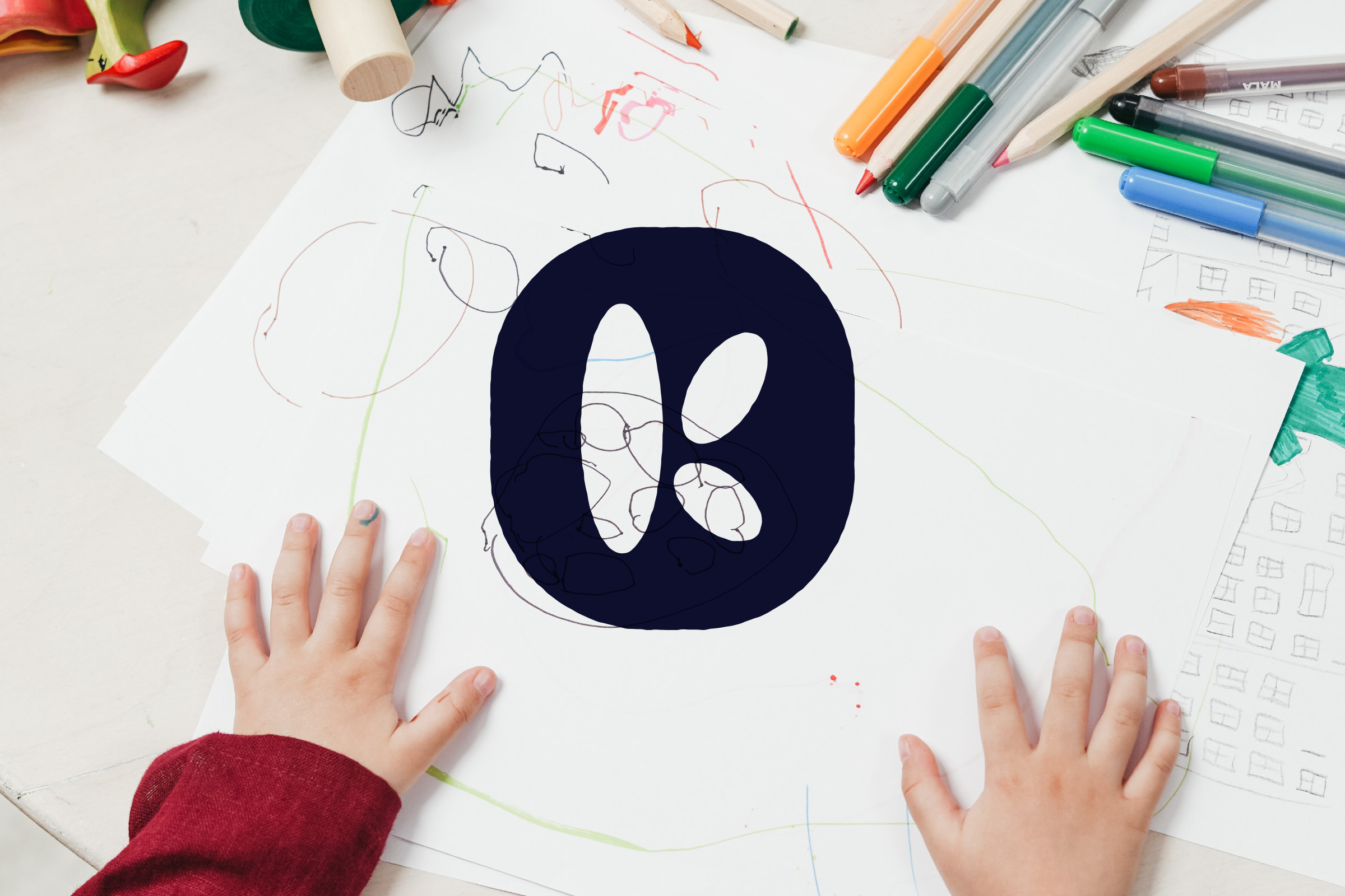
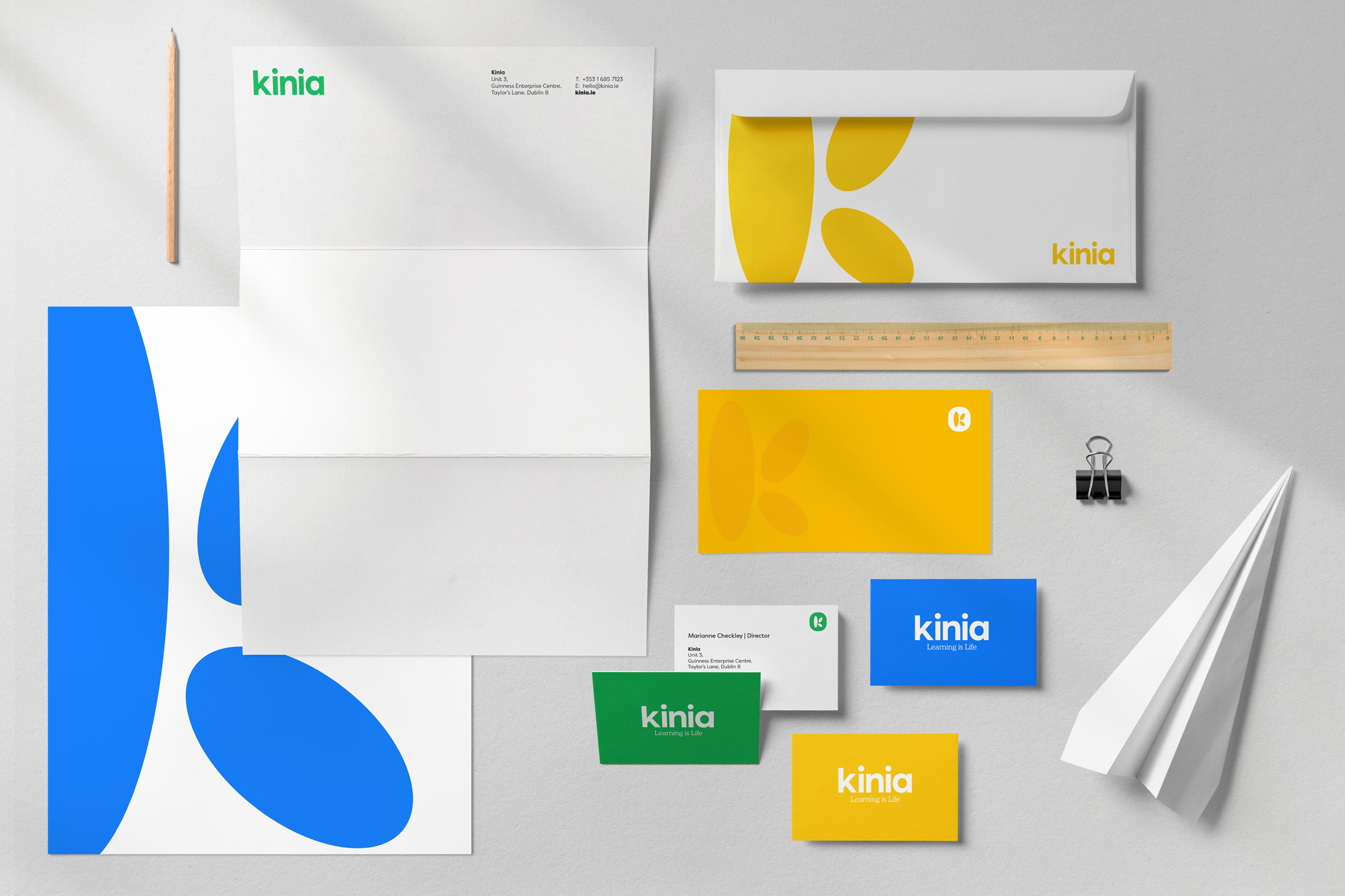
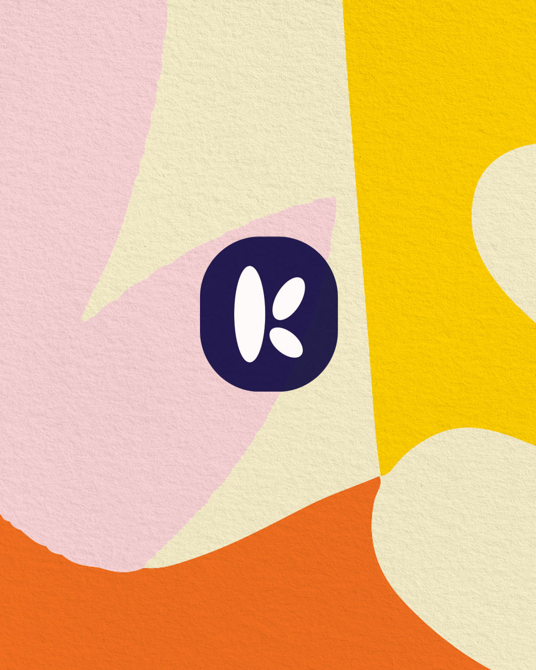
Our inspiration to visually bring all of this positivity to life came from the creativity of the classroom, cutting coloured paper to create shapes and forms that could express ideas with simplicity and strength. Inspired also by Henri Mattise and Keith Haring on bringing energy and light to the visual language, our shapes and forms and our core logo device came from this playful exploration. We created a ‘K’ monogram formed of differing parts coming together. Icons and illustrations were then created, based on different themes and finally patterns and organic shapes that could transcend from paper to pixel, and be created equally by designer or child, a brand that all could embrace.