Lanthorn
2025
Designed by Áine McGee, David Stanley, Susan Carberry, Alessandra Ravida, Mary Doherty and Michelle Lagan at Red Dog
Account Manager: Nadia Dzagmaidze
Photography: Paul McCarthy
Photography: Laurence McMahon
Account Manager: Mariana Nevado
Categories: Website / Identity
Industry: Commercial
Tags: Photography / Typography / Digital / Art direction / Stationery
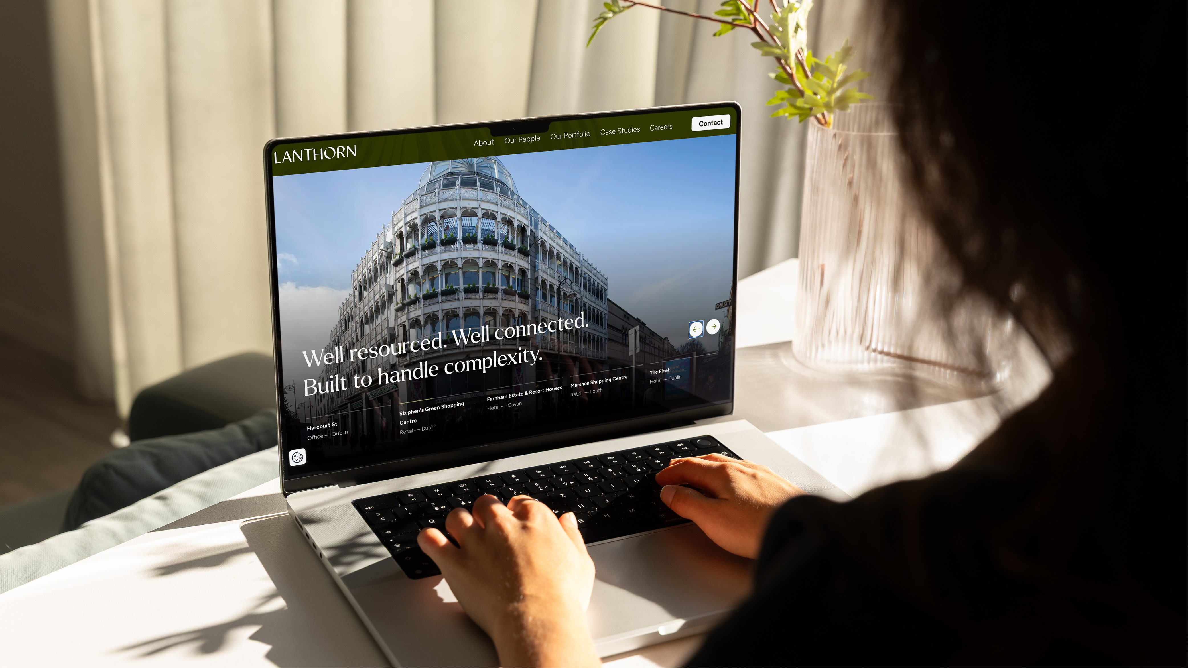
Website: lanthorn.ie/
Lanthorn communicates through craft and restraint rather than noise. A clear and confident new brand for an Irish commercial real estate business built on experience and long-term thinking.
The Background
Lanthorn is a new Irish-focussed property asset management company working across residential and commercial portfolios in Ireland. Operating behind the scenes of some of the country’s most valuable property assets, the business needed a brand that reflected trust, clarity and long-term thinking - without disappearing into the familiar and pretty dull language of corporate property.
We were engaged to develop the name, brand strategy and visual identity from the ground up, creating a brand that would resonate with institutional clients and investors, while remaining human, grounded and quietly confident.
The Idea
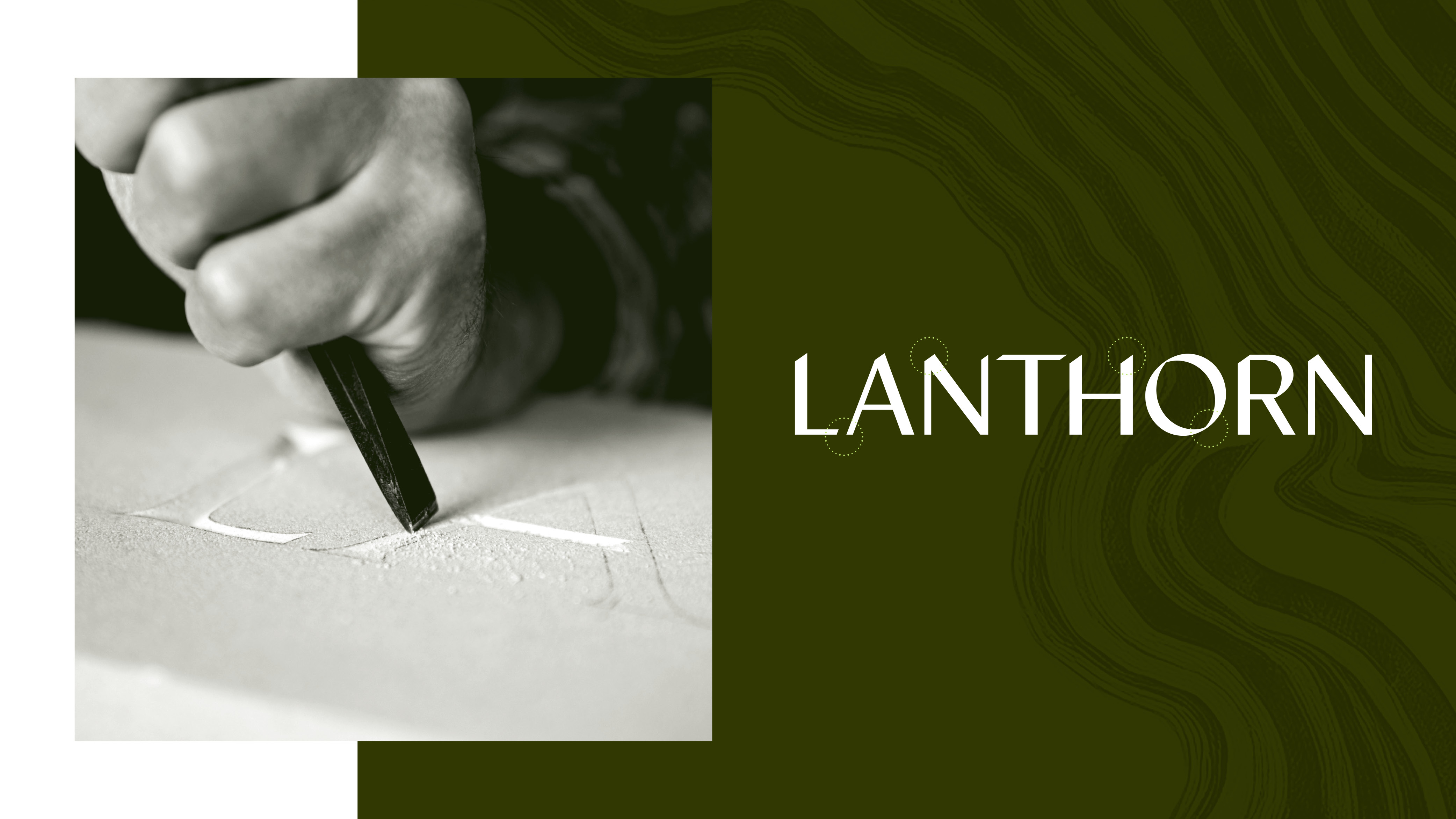
The name Lanthorn is a considered variation on lantern - a historic symbol of guidance, visibility and safe passage. For centuries, lanterns have helped people navigate uncertainty, marking routes forward and illuminating what matters. That idea became the conceptual foundation of the brand. And it just sounds right!
Rather than relying on a literal symbol to communicate this, the identity leans into typographic craft. That doesn’t make it any less unique than an icon - in fact, it allows the brand to express its values with greater subtlety. A clear and confident new brand for a commercial real estate business built on experience, ambition and long-term thinking.
Execution
At the heart of the identity is a customised, calligraphic wordmark developed from a contemporary typeface. It nods to the typography of scribes and financial institutions, while introducing fresh, modern refinements that firmly place it in the present. The calligraphic detailing adds warmth and humanity while the uppercase structure provides strength, stability and confidence.
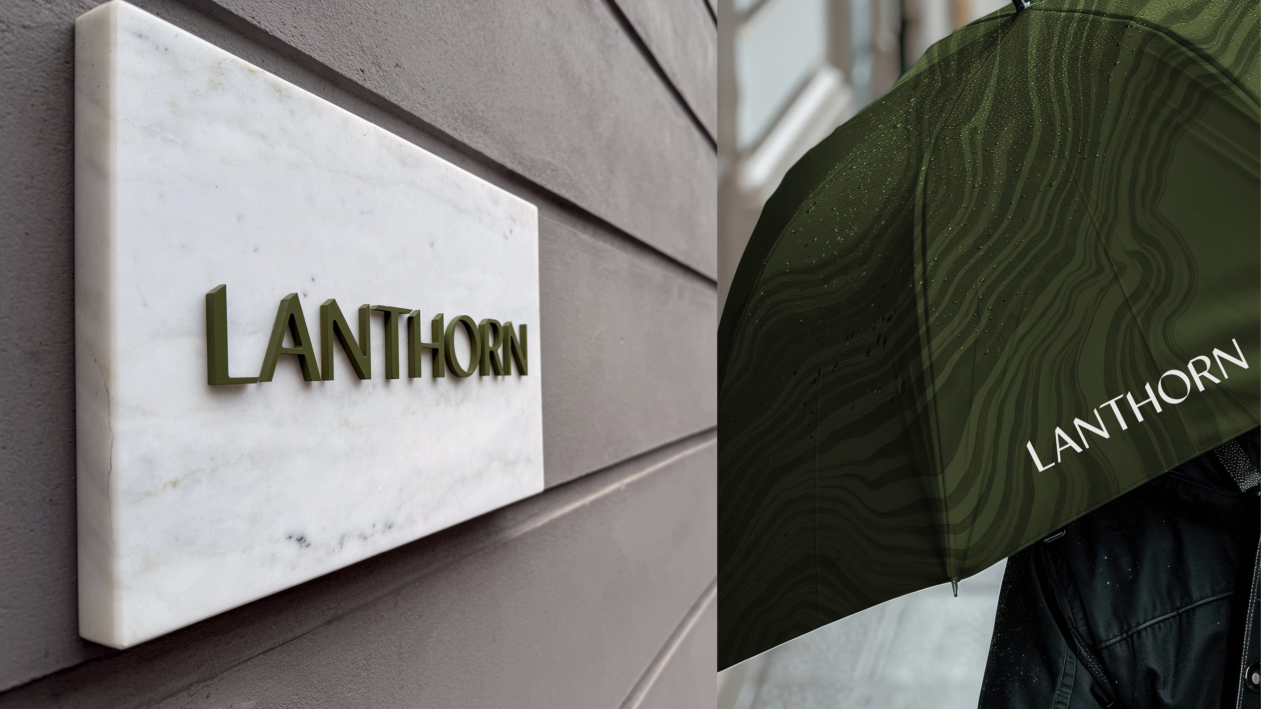
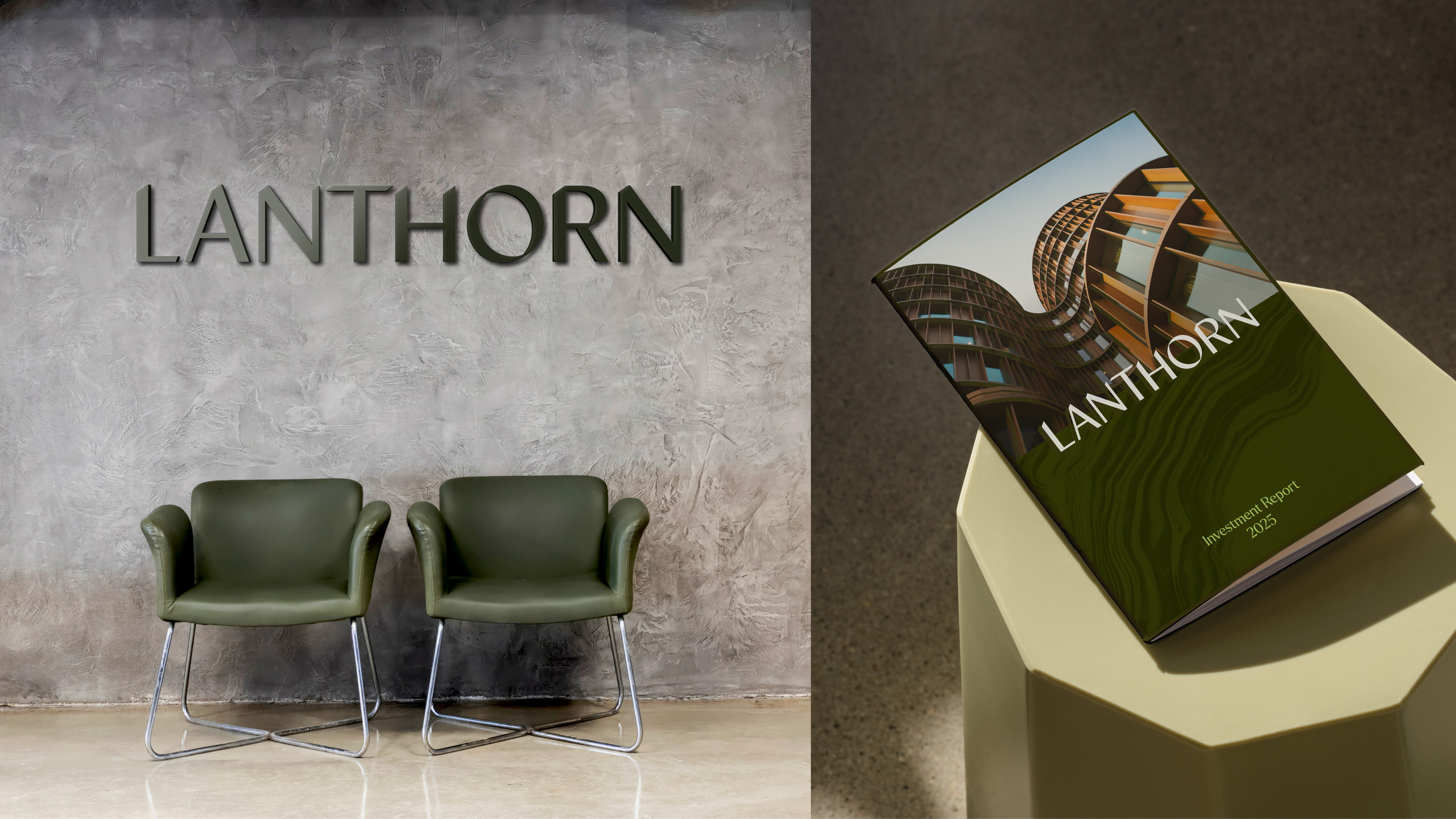
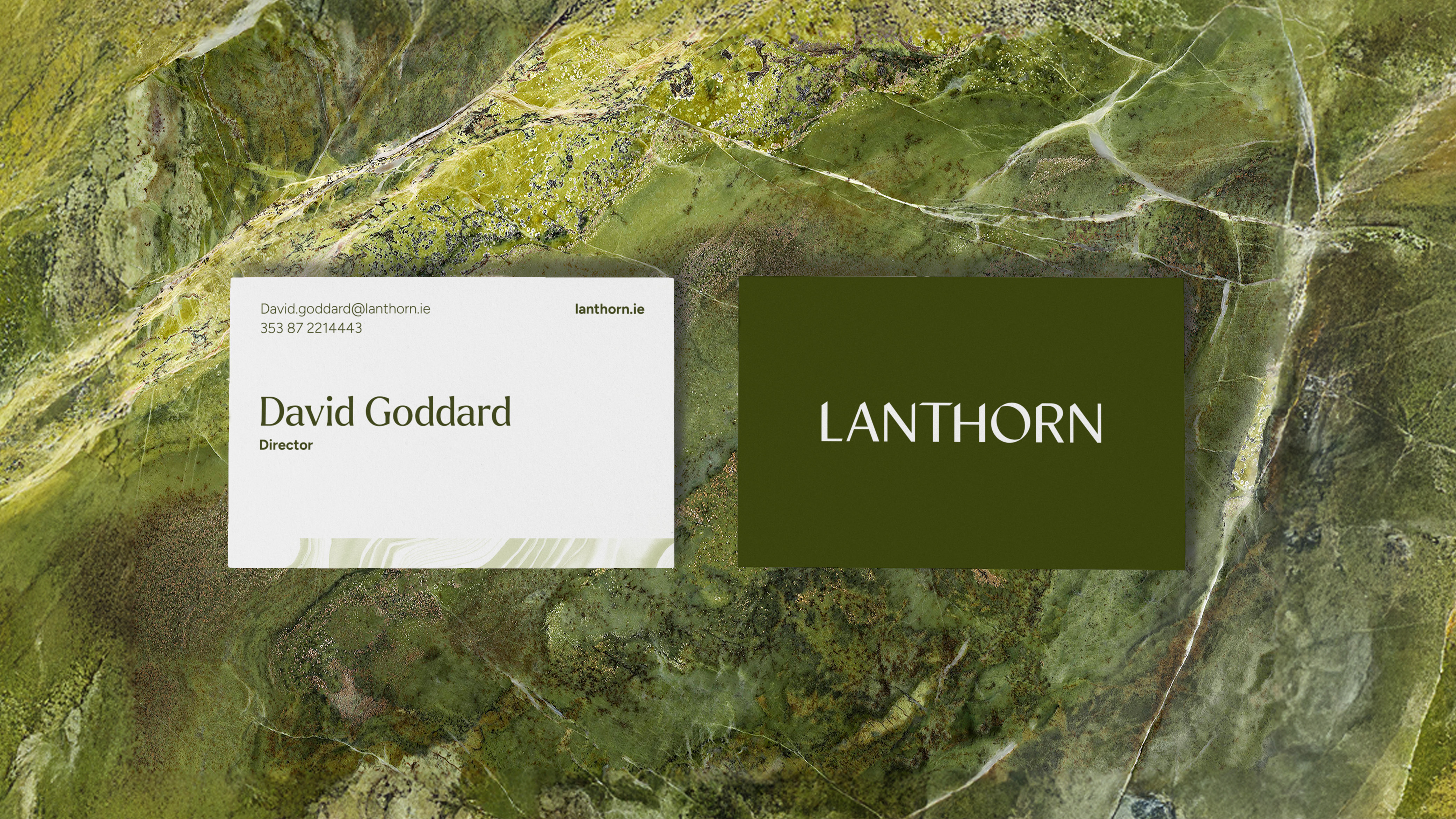
The colour palette plays an equally important role. Vibrant olive-toned greens form the foundation of the system, drawn directly from the natural variation found in Connemara marble. This reference grounds the brand in place, lending it a sense of prestige and permanence while quietly reinforcing its Irish context. Solid white and a bright lime accent are introduced to lift the palette particularly in digital environments where the brand needs to feel open. Used sparingly, the lime adds a contemporary edge and ensures the identity pops on screen.
Across all touchpoints, generous spacing, structured layouts and a disciplined visual rhythm reinforce Lanthorn’s role as a careful asset management steward. Every element is intentional and steered by an agreed brand personality of Trustworthy, Professional & Expert, Agile and Tenacious.
Why it’s working
Trust: A typographic-led identity that feels human, credible and assured. Clarity: A restrained system built around guidance, visibility and order. Distinctiveness: Familiar Irish cues refined into something more considered and ownable. Digital performance: A palette and layout system that feels confident and vibrant on screen. Longevity: Designed to endure beyond trends, supporting long-term asset stewardship.