Lingo
Designed by Lorenzo Tonti at Lorenzo Tonti Design
Categories: Identity
Industry: Cultural
Tags: Festival
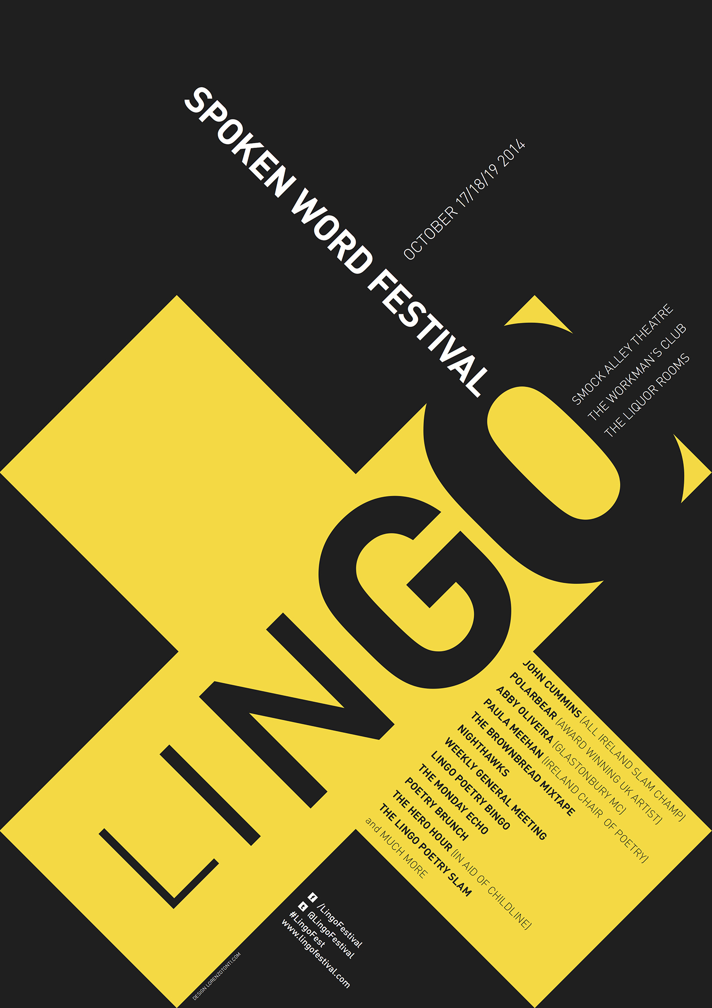
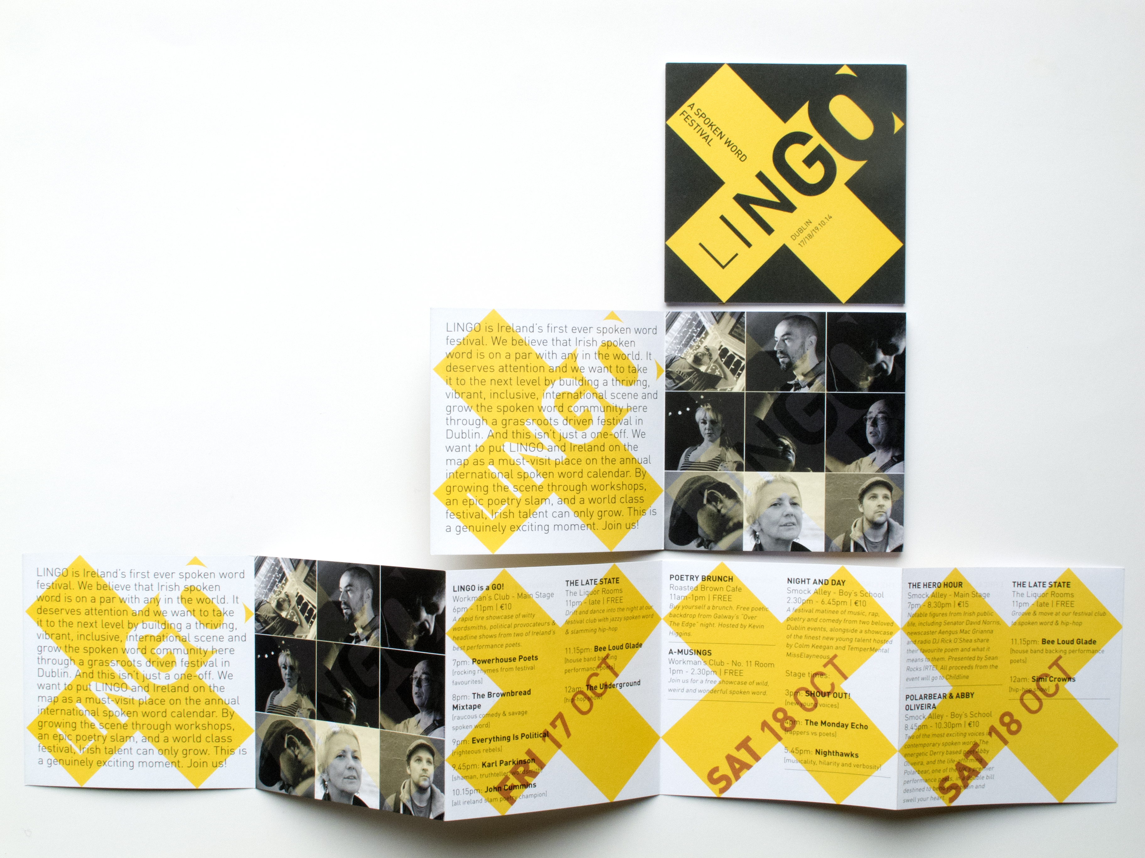
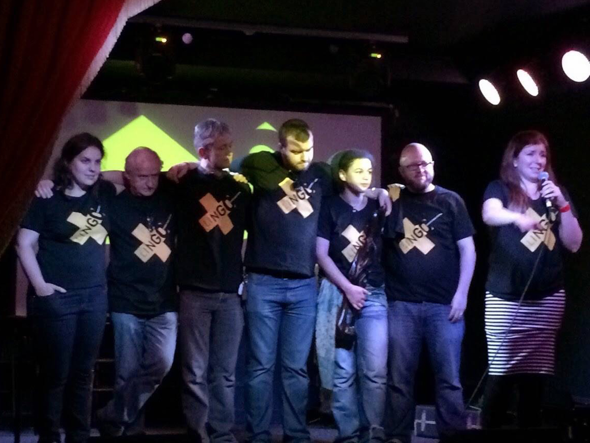
We were asked to create an identity for a new international festival of the spoken word which was launched in Dublin in 2014. Lingo celebrates language in all its spoken forms and has an emphasis on the alternative.
The brief was to create a distinctive mark which had to be strong and shout, just like some of the performers, as well as reflect the diversity of styles and venues.
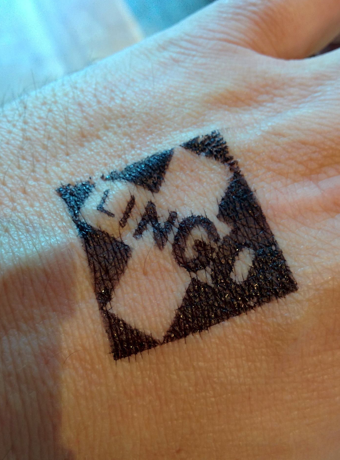
An 'X' was chosen as the symbol as it has many connotations to ideas which we felt reflected the spirit of the festival. As well as being a strong visual mark, the 'X' is a visual metaphor for censorship, a substitute for a signature as well as having an element of subversion. 'X' also marked the spot where events were happening.
The different weights and spacing of the individual letters of Lingo is designed to communicate the modulation and intonation of the human voice. Lingo starts quietly and gets louder as it shouts 'Go' with the two final letters. The spacing of the letters represents the rhythm of spoken words as well as the silences between words.