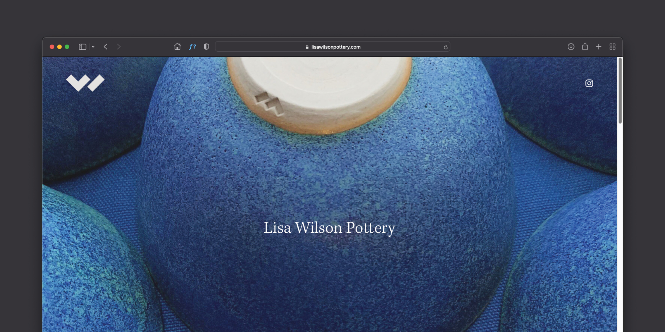
Lisa Wilson Pottery
Designed by Brian Wilson at Wilson Creative
Categories: Identity
Industry: Commercial
Tags: Logo / Brand Identity / Logo Design / Logomark
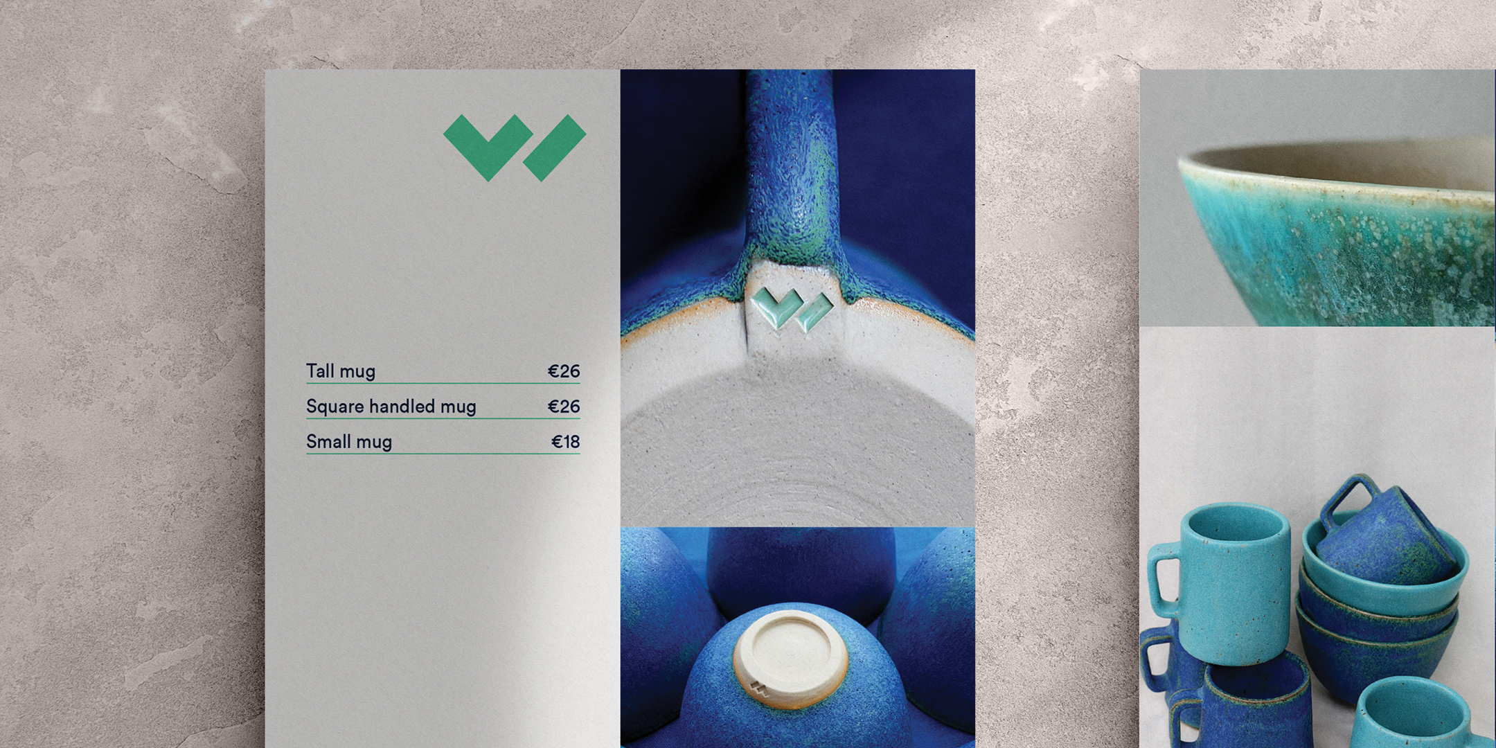
Brand mark and identity elements for Lisa Wilson Pottery in Kinsale. The mark needed to be very simple in order to work as a stamp on Lisa's stoneware so we created a stylised LW to represent the brand and left off any formal functional typography and led with the mark on it's own as the sole symbol to represents her brand ID. We also wanted the mark to represent and stand for her love of simple, bold forms and bright colours. There is a dedicated support combination of a serif and sans, alongside bright and bold colours that work in harmony with her core product colours. A suite of stamps were created for the stoneware itself, alongside stationery, promo collateral and a website.