Loughran Brewing Stores
2020
Designed by Richard Walshe and Marta Okulicz at Workhouse
Categories: Identity
Industry: Commercial
Tags: Typography / Food and drink / Art direction
Website: malt.ie/
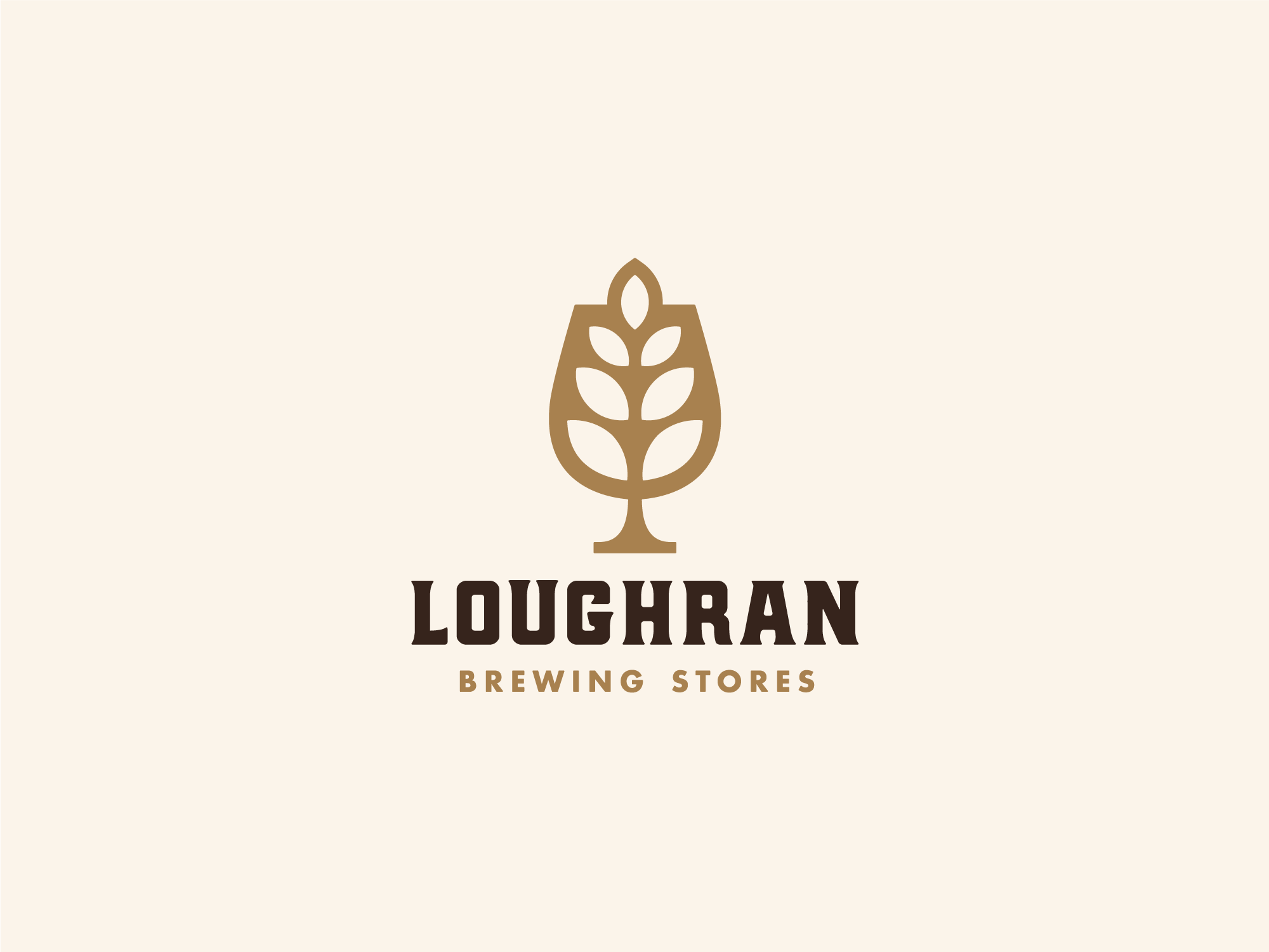
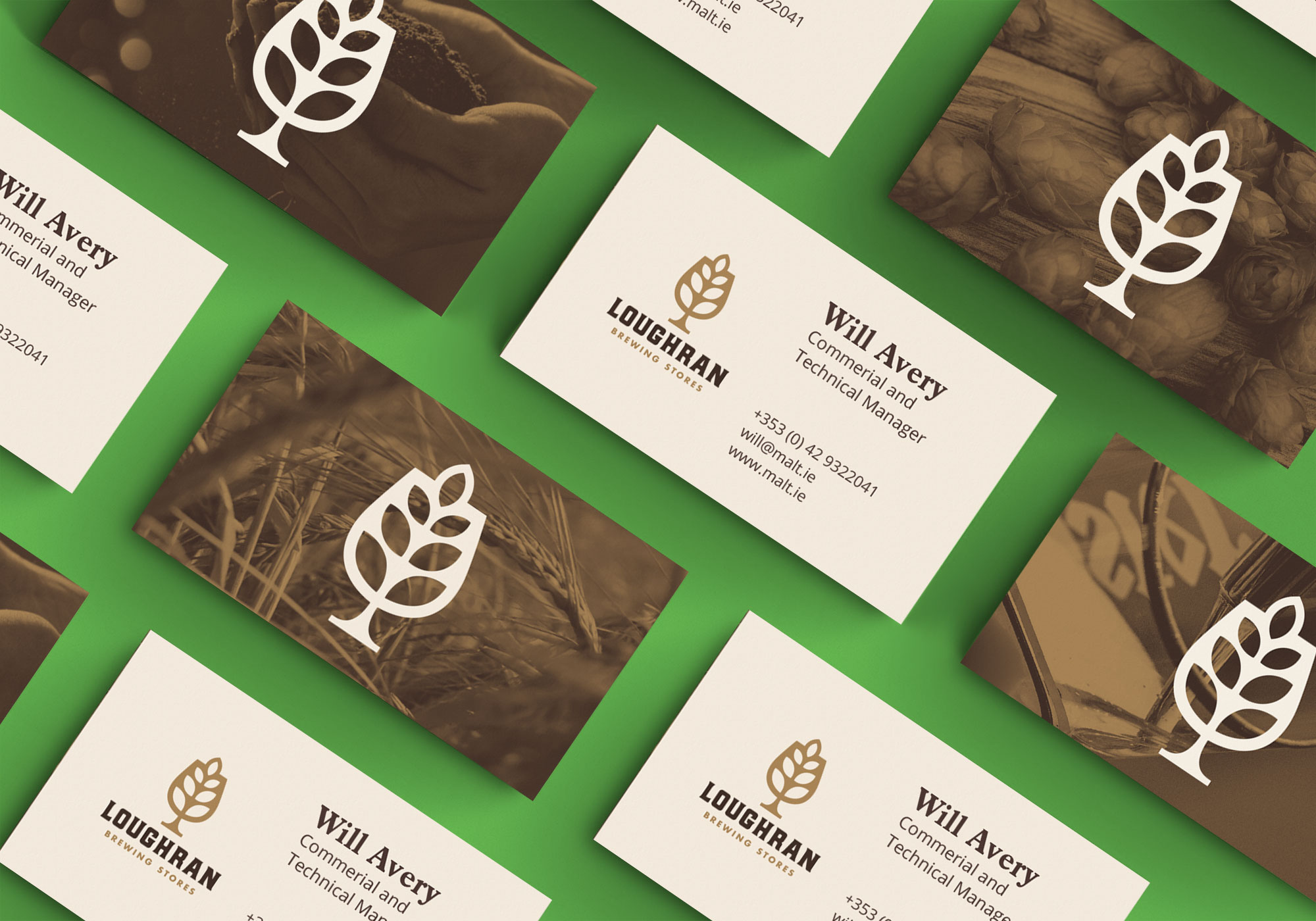
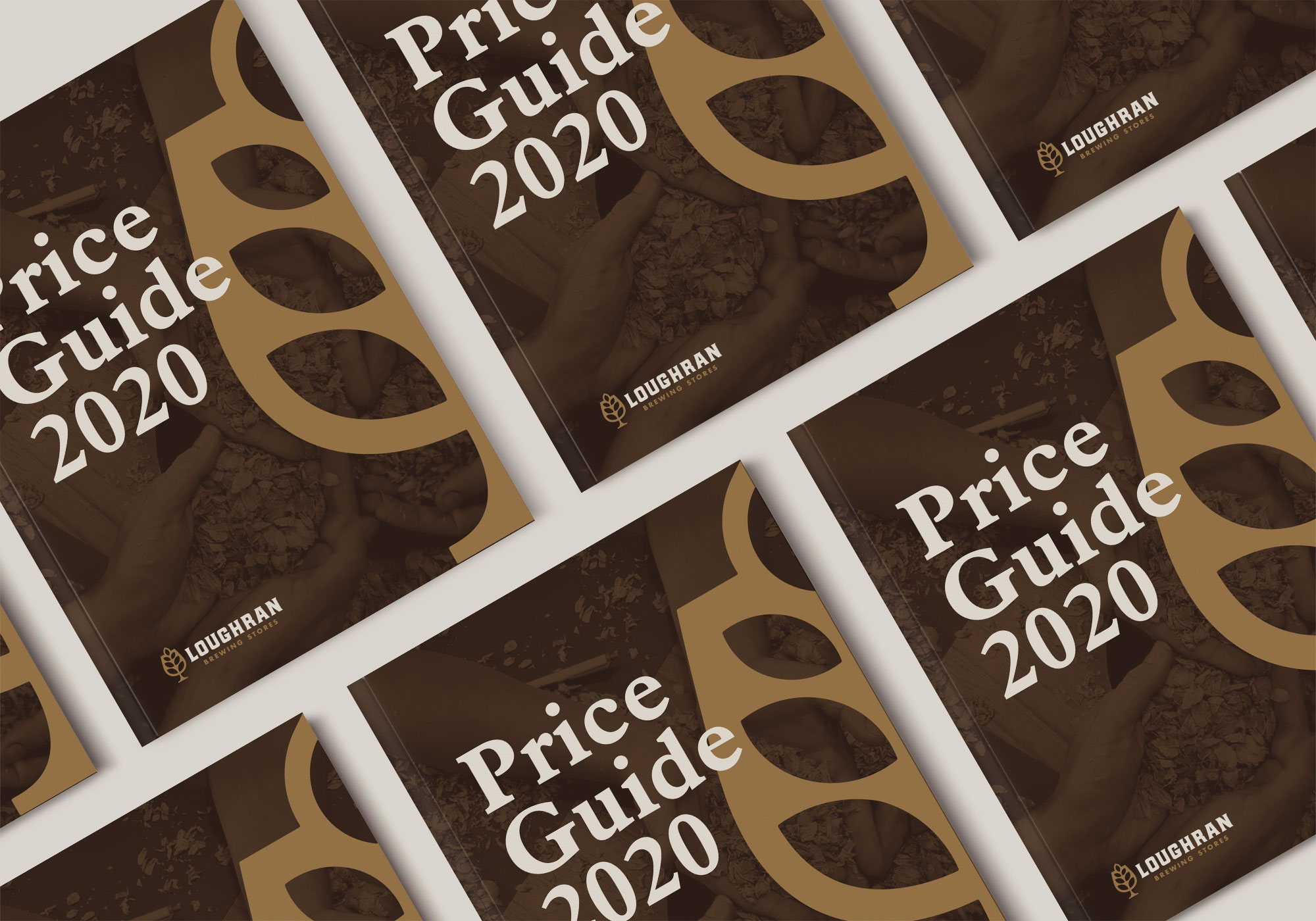
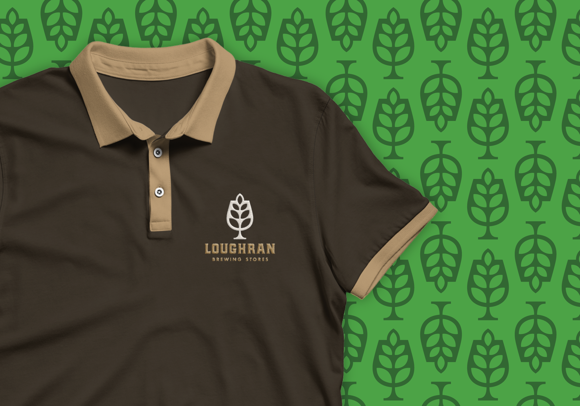
Loughran is Ireland’s leading brewing ingredients supplier with a great heritage going back generations. Throughout the years Loughran has gone from being a malt supplier to offering a much wider range of brewing ingredients while evolving into a more innovative and responsive company. Having found themselves at the cutting edge of a new business, they needed a new visual identity showing that they are as modern as their customers, craft brewers, while continuing to underscore the brand heritage. The new visual identity is inspired by their past to drive the brand forward for the future. The logo mark is a metaphor for what Loughran’s business is about – supplying brewers with the best quality beer ingredients. The plant leaves represent Loughran products, natural beer ingredients. We intentionally moved away from the generic idea of portraying any particular ingredient such as a hop or a malt to make the brand more unique, proudly standing out from the crowd. The beer glass represents the brewing industry, their main target group. Strong and sturdy, combined with the sharp leaves pointing up creates a tree-like image which is a perfect representation of the stable growth of the company. The logotype set in Hochstadt Serif speaks for the craft, expertise, and uniqueness of the brand, showing off its personality whereas the tagline set in Futura adds more contemporary touch while perfectly balancing the logotype. The supporting imagery, colours, shapes, and fonts tie the brand together creating a unique visual representation for Loughran.