LouYoga
2011
Designed by Clara FitzGerald and Seán O'Beacháin at So&So
Photographer: Al Higgins
Developer: Joe Czucha
Categories: Identity
Industry: Commercial
Website: louyoga.com/
Louise Horgan, has been a yoga teacher for over 20 years. Her areas of speciality have always included pregnancy yoga and active birth. Through her practice and teachings she has become aware of the patterns in nature and how they represent the patterns in our bodies, specifically women.
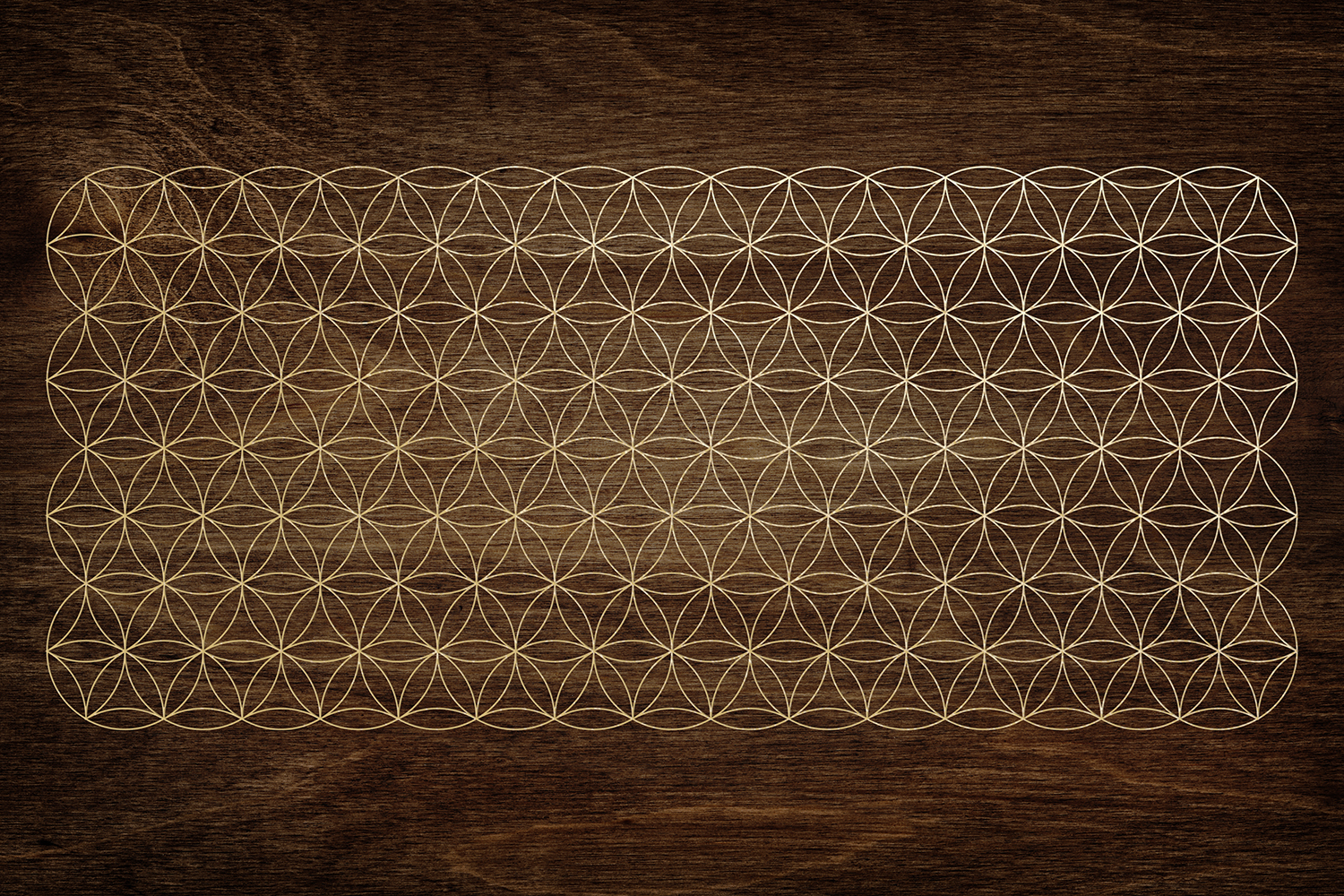
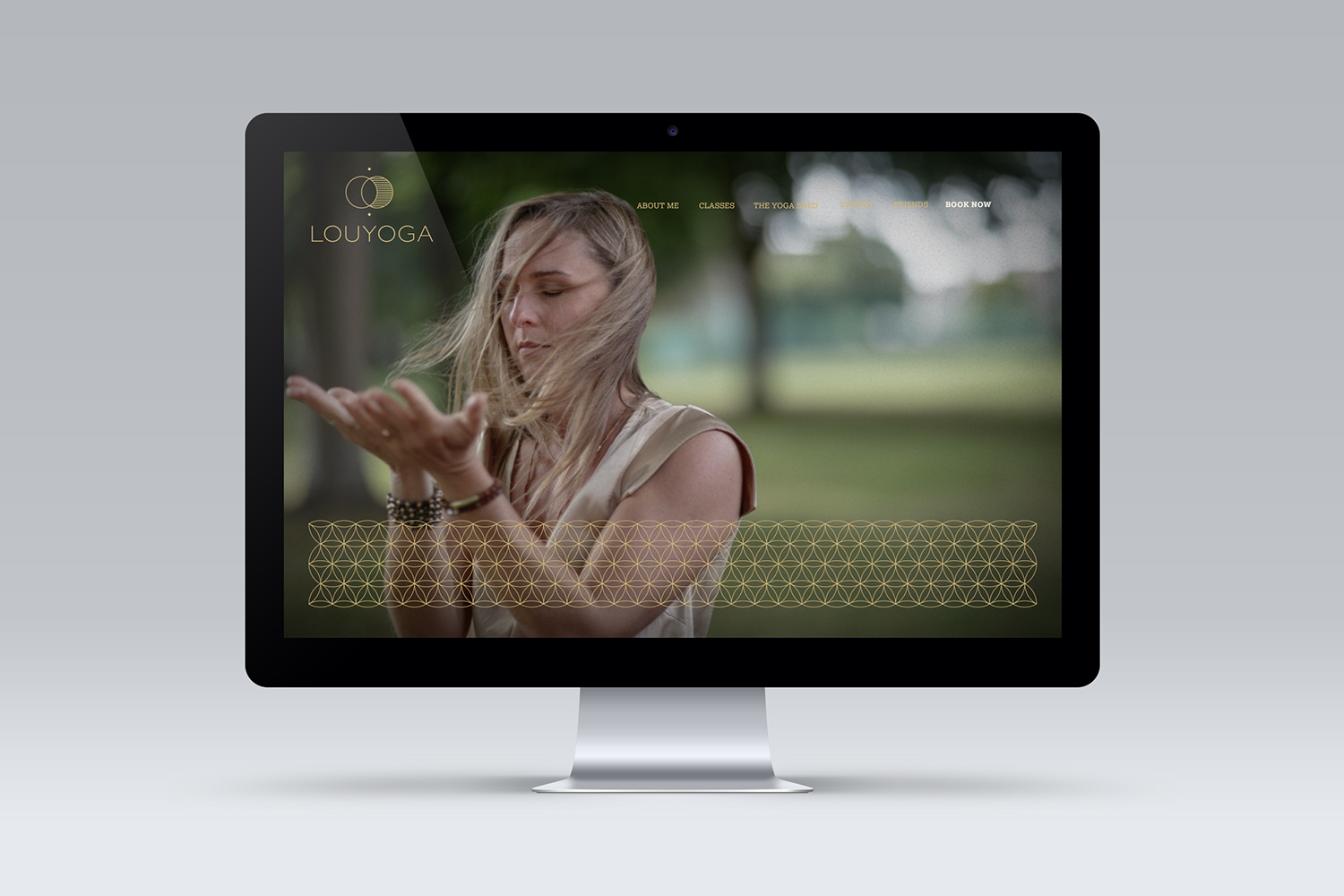
We worked with Louise to identify what made her unique, helped her build her brand story and her visual identity. The mark represents the balance of sun and the moon, the masculine and the feminine. The small diamonds represent the crown and root chakras – she believes in connecting with a bigger consciousness while being grounded on earth. The pattern is created from a sacred geometric shape – the seed of life.
We created the mark, language, website and art directed the photography. We wanted to show Louise at peace in her studio and out in nature, walking barefoot on the grass, where she is most at home.
.jpg)
.jpg)