M.CO Rebrand
2011
Designed by Eva Sunderland, Seán Harte, Rosie Barrett and Fiach O'Neill at M-CO
Strategy: Eva Sunderland
Copywriting: Alex Calder
Photography: M.CO
Photography Assistant: Megan Killeen
Printing: Plus Print
Industry: Corporate
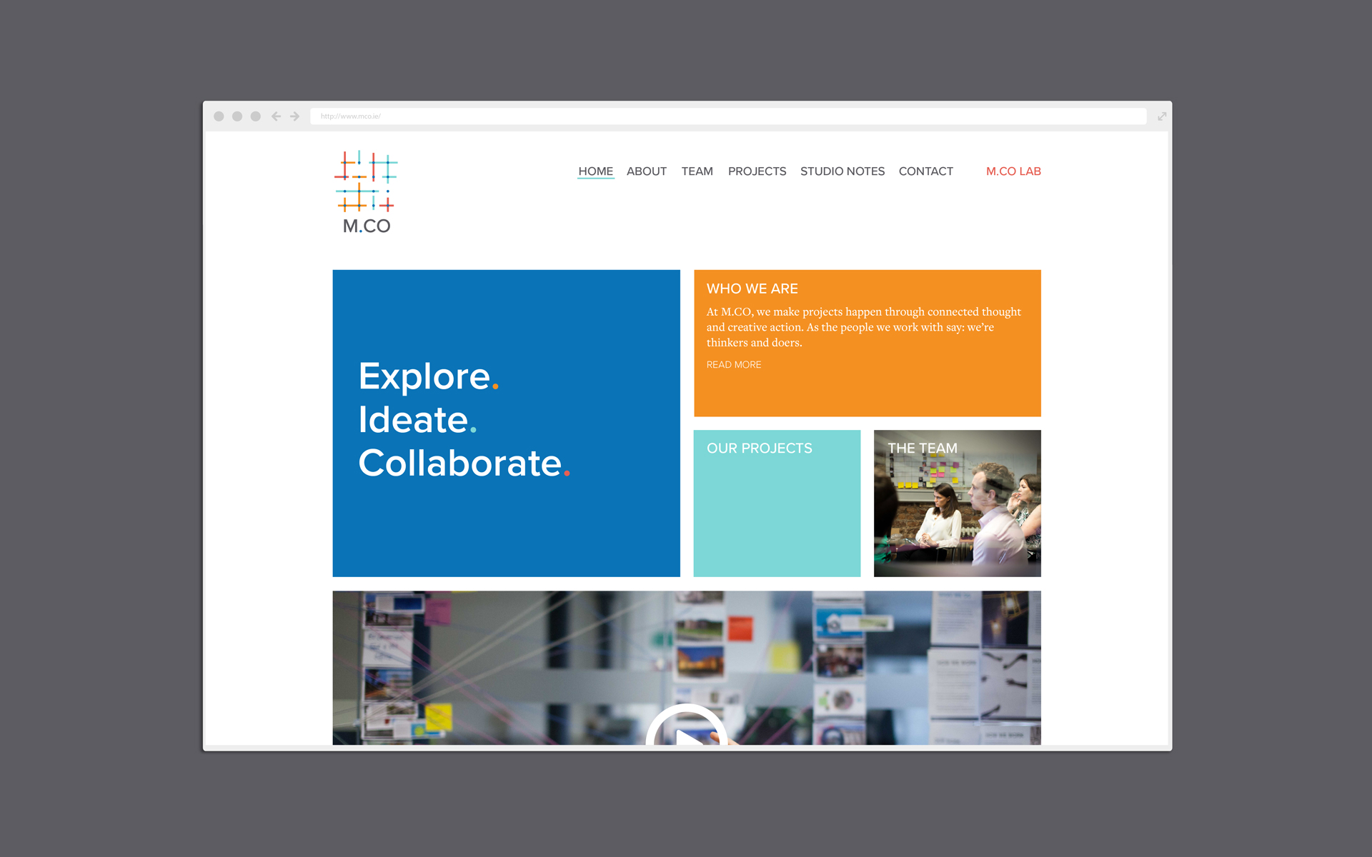
Website: mco.ie
For this project, an internal design team explored the mission, vision and values with the 35 people in M.CO to define the cornerstones of the company culture and inform a new identity.
The new identity was integrated as part of a change process for the company, with the co-founders in a client role. The big challenge was to capture how M.CO balances creativity with pragmatism and to reflect our unique multidisciplinary team offer.
Our clients say it better reflects who we are now, what we do, and the value we bring. It works brilliantly for staff, with the flexibility and adaptability in application that we need for our broad service offer.
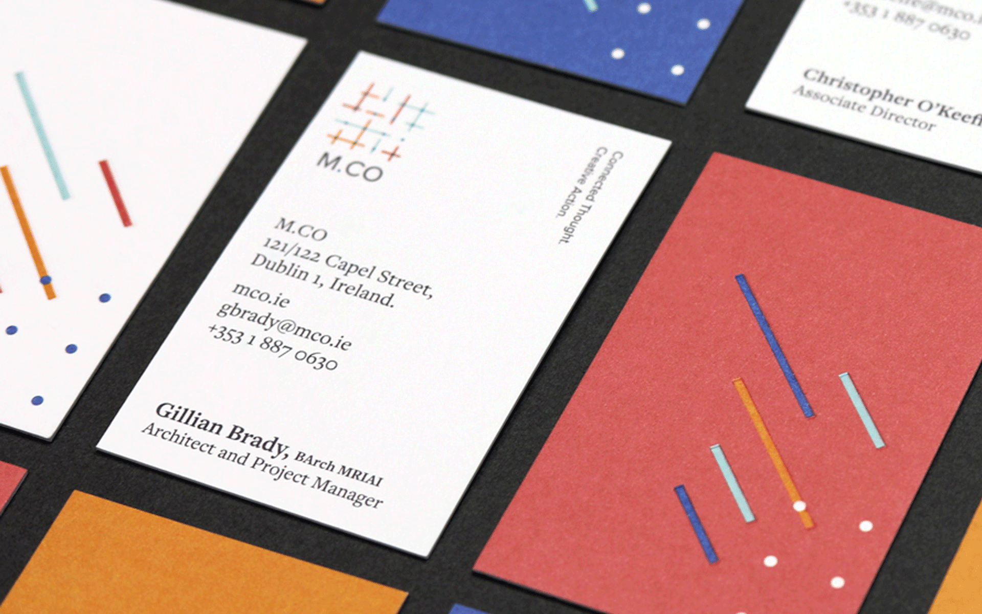
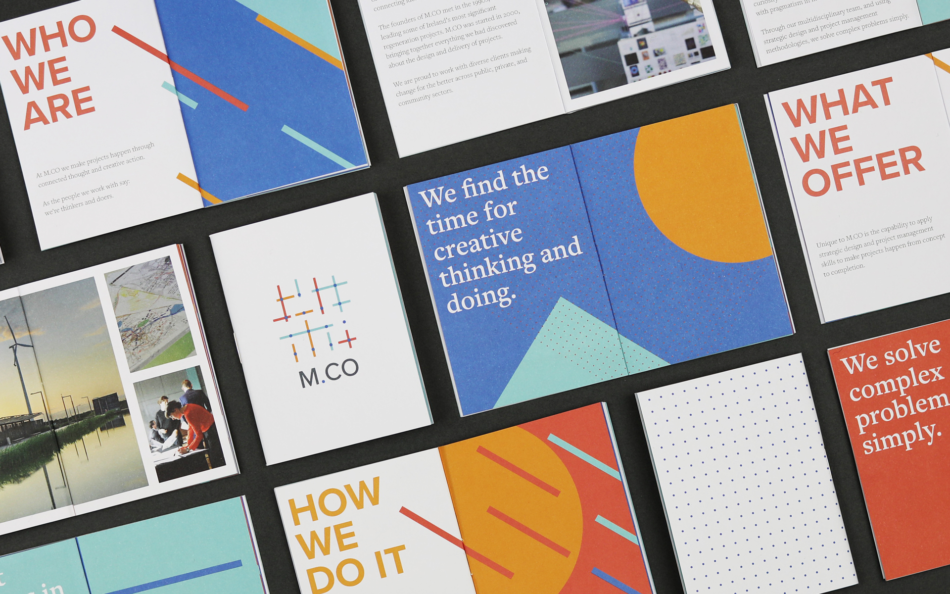
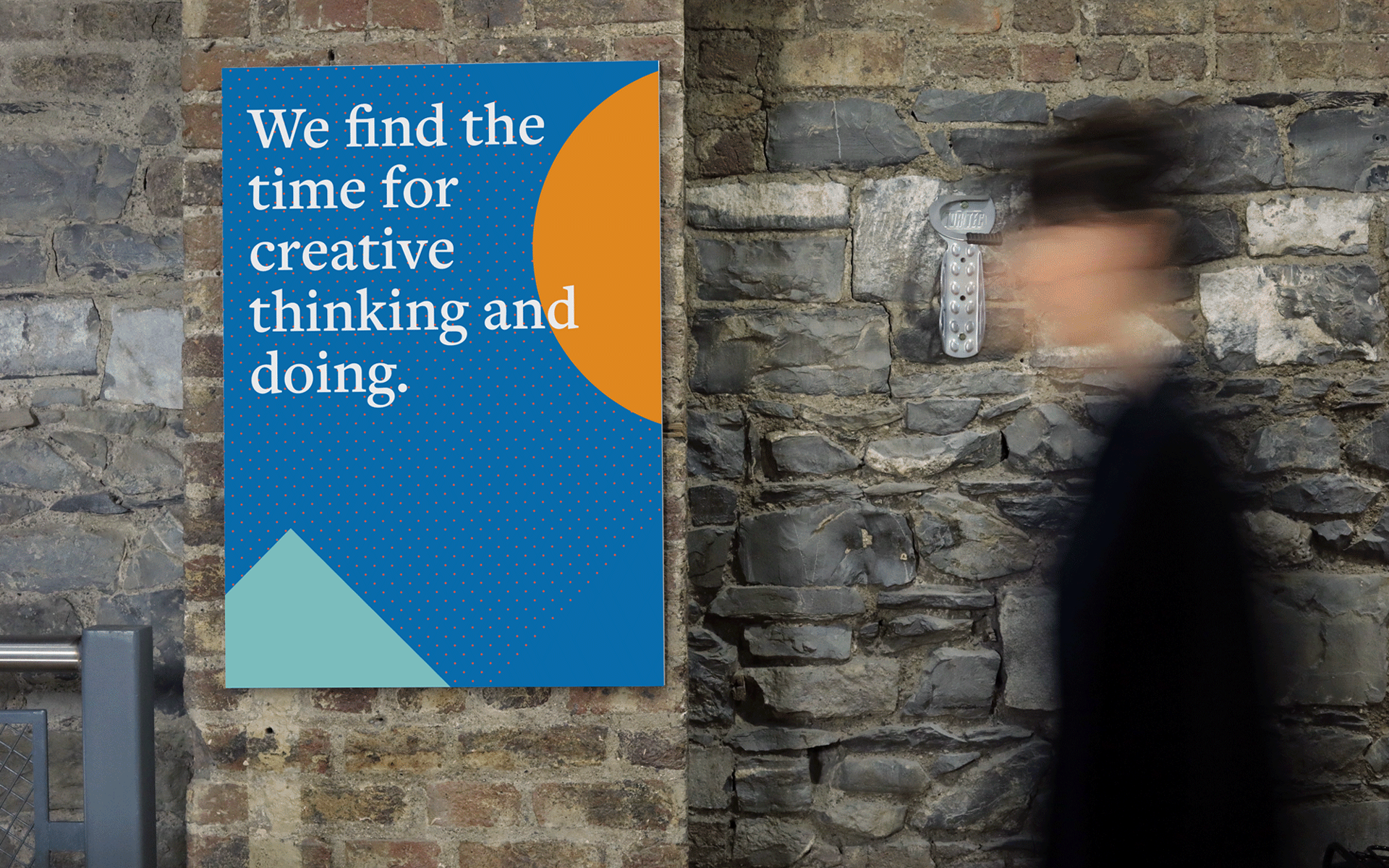
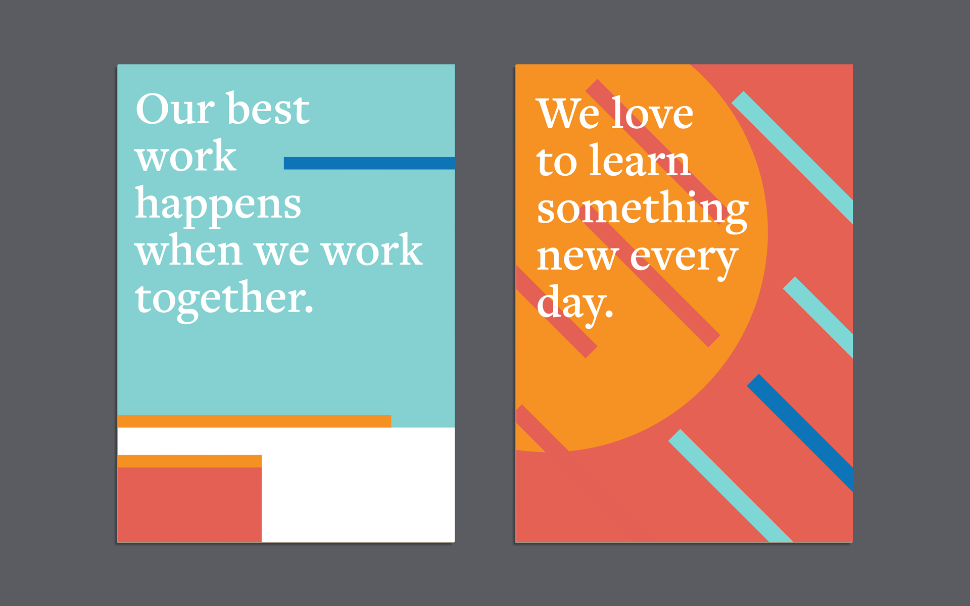
Strong and bold, it communicates central themes of connection, action, and simplifying complexity. The dot acts as the foundation for the brand, and as a launchpad for our unique way of thinking and doing. The grid represents how M.CO understands context and plans projects, laying a strong foundation for mapping out key project points, times, places, people and aims. The lines represent M.CO methodologies and connecting the dots with a multi-faceted approach to creative problem solving. Representing a multidisciplinary team, the colours signify our diversity and our shared values.