Midnight Logo
2011
Designed by Cillian Griffith at Midnight
Categories: Identity
Industry: Commercial
Website: midnight.ie/
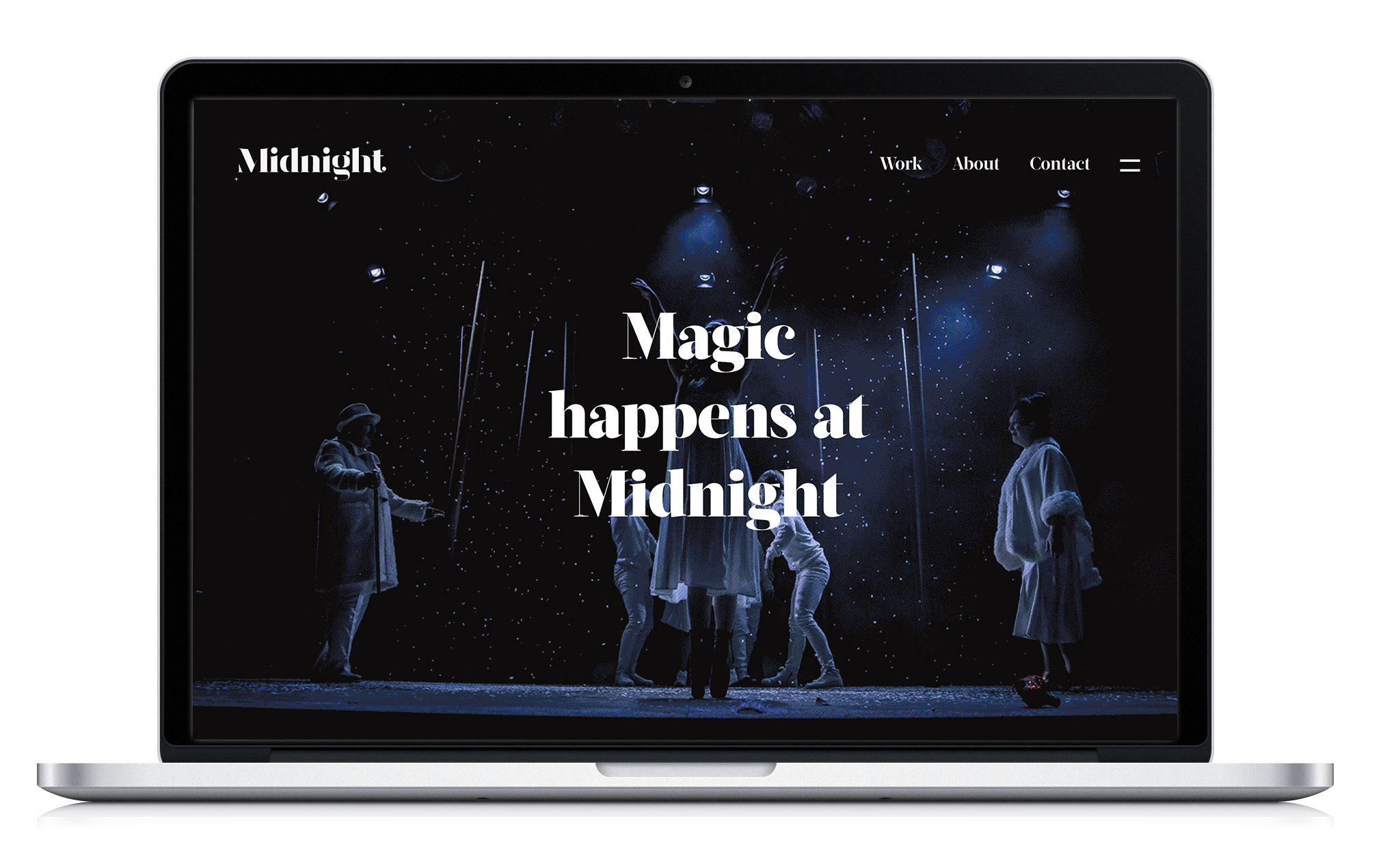
Creating something magical for Midnight.
Creating a logo for a new branding agency is no easy task. For Midnight the logo needed to represent confidence and craft with a hint of magic. The name came from childhood wonder around the magical time of Midnight, which inspired the brand name and tagline – magic happens at Midnight.
The approach was to create a typographical logo mark that would embody the key attributes of Midnight; craft, creativity, objectivity and a desire to solve any communication problem. Our font would be central to achieving this, and would need to have a unique, hand crafted look and feel.
Each character of the logo has been individually created to achieve a sleek font with bold lines, swooping curves across the tops of the characters, slim elegant lines and an overall sense of magic and playfulness highlighted by the two stars sparkling above and below the logo. The light and bold elements reflect the idea of harsh light at midnight with heavy shadows and beams of light created by the moon.
The colour palette again references the colours associated with Midnight, with rich navy and blacks complimenting the deign.