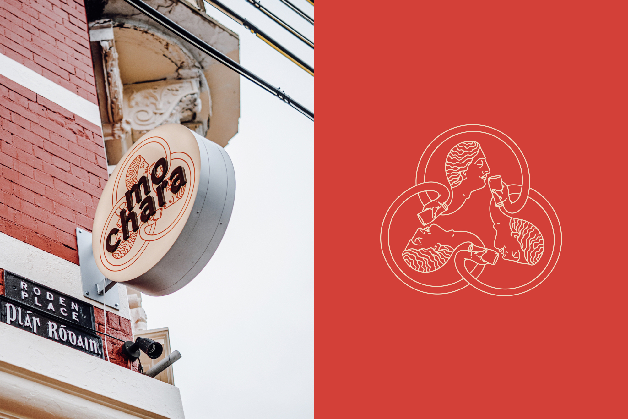
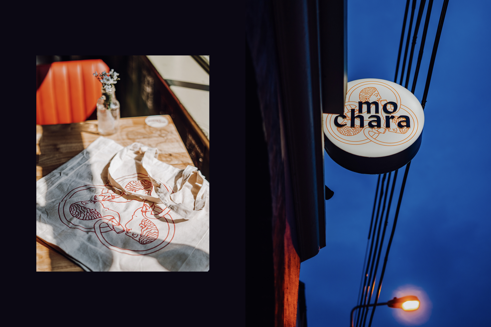
Mo Chara
Designed by Steph Connolly, Jake Heavey and Killian Walsh at Grandson
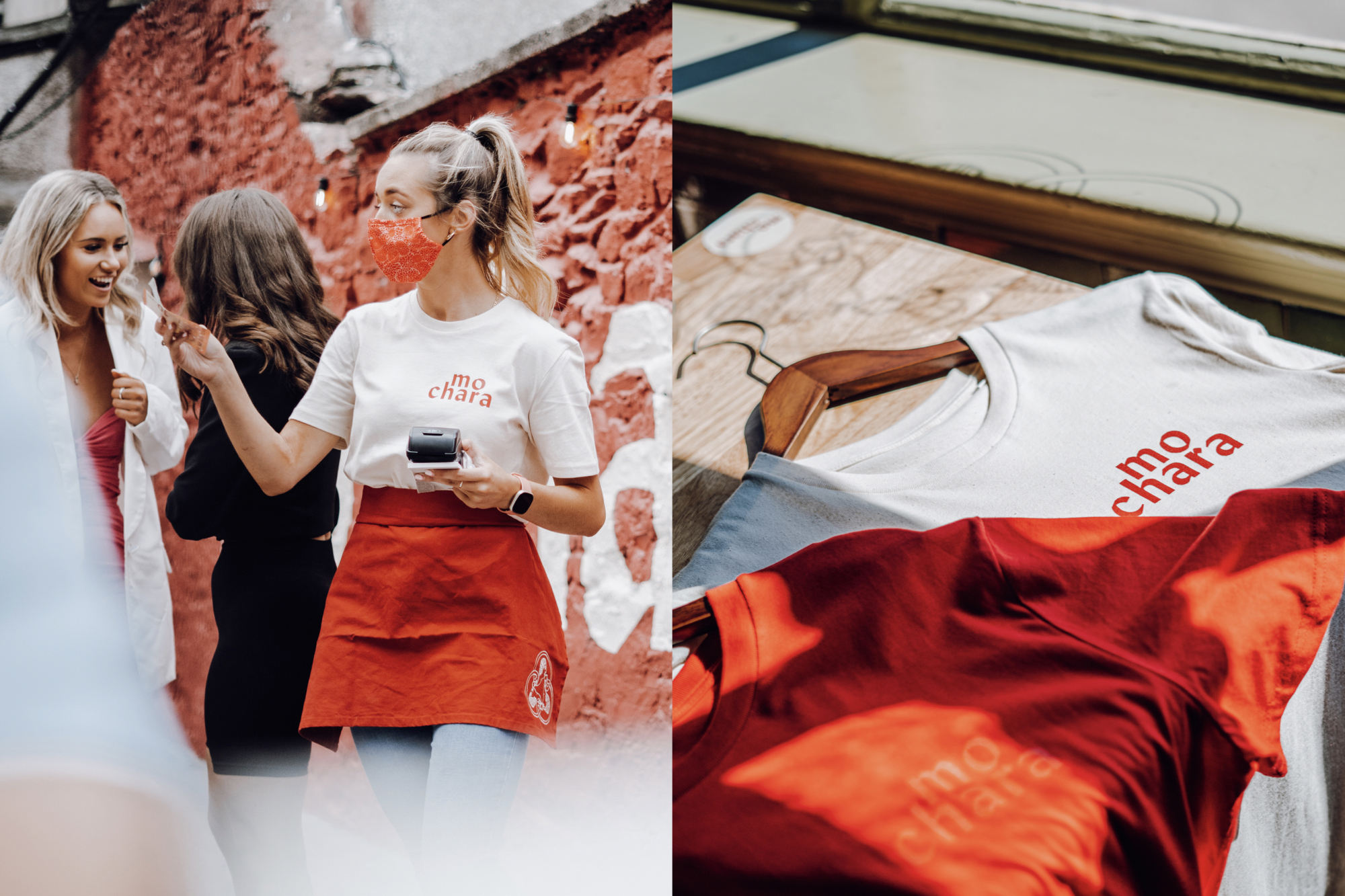
Sapient Media: Photography | Video
Wonders & Signs: Signwriting
Forja Works: Fit Out
Categories: Identity
Industry: Commercial
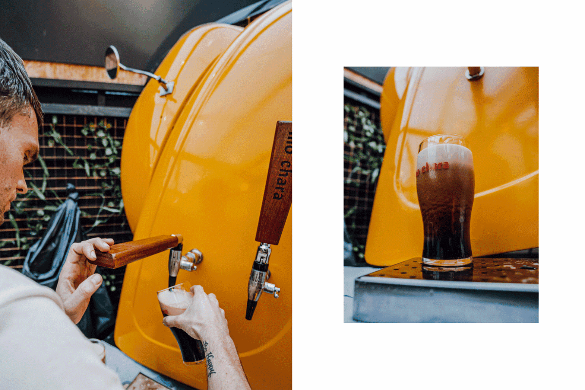
Tags: Illustration / Food and drink / Signage / Branding / Identity / Brand Identity / Brand / Brewing / Beer
Website: mo-chara.ie/
Overview
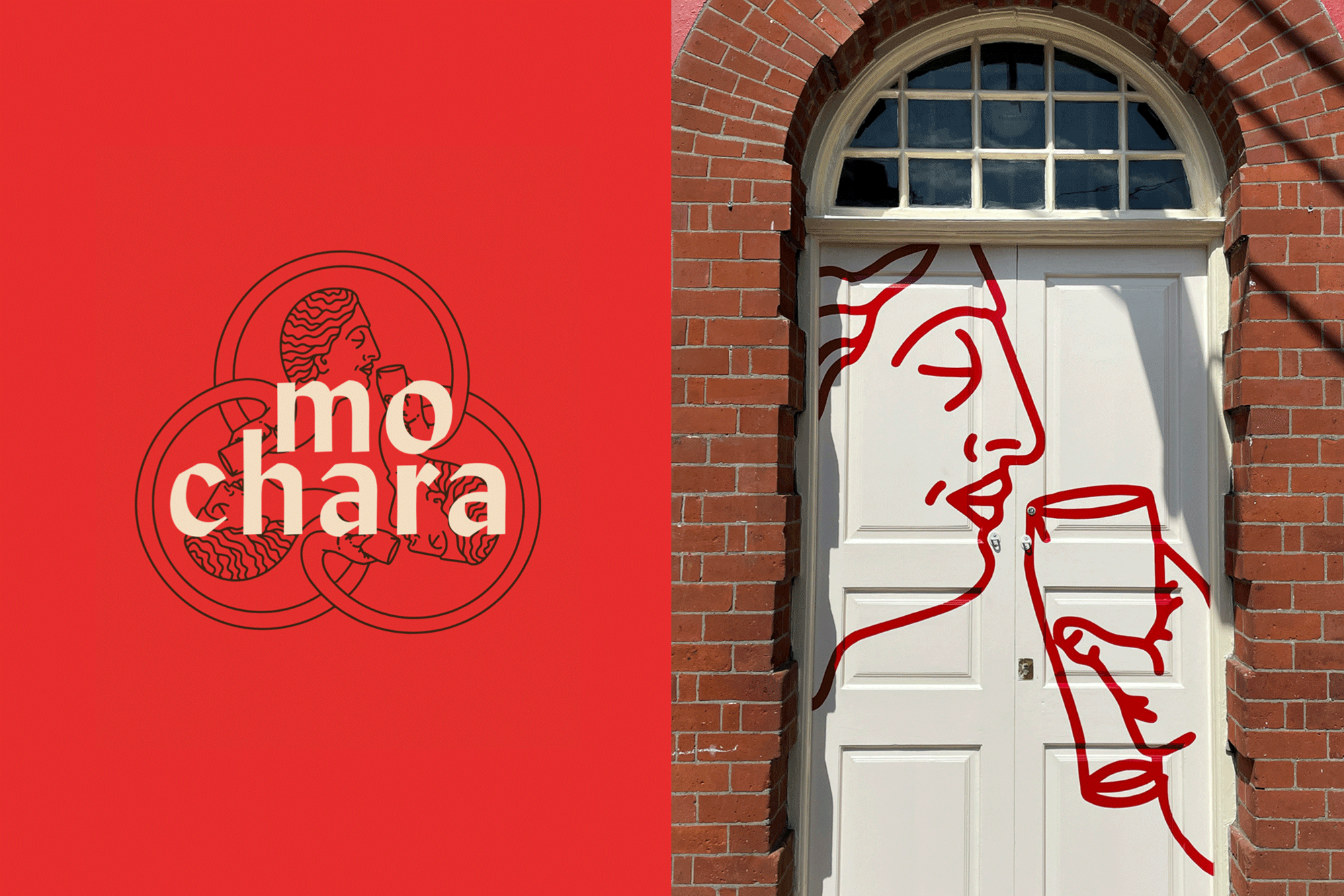
Three long life friends with the one dream, to open their own pub.‘Mo Chara’ which means ‘My Friend’ in Gaelic.
Based around the concept of friendship and unity, we interpreted the ancient Celtic circular symbol for friendship, to create a “Grecian, Wildean eternal circle of pint drinking” motif for the brand identity.
Design Notes
Using the typeface Lydian, with its humanist calligraphic characteristics, a nod to Uncial type and tied in with the Gaelic premises name. With the name itself being of Gaelic origin ‘Mo Chara’, we were conscious of not producing something that could be interpreted as an ‘Irish tourist bar’. We wanted this to have its own modernity with a nod to the past.
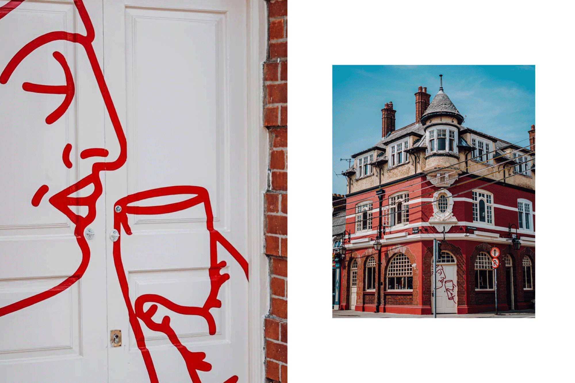
This brand identity was inspired by the unique building the business is based in. Remaining sympathetic to its architectural features, we drew inspiration from the typography inside the location, from the carved wood, to ornate tiles and antique terrazo flooring.
The location itself, an architectural listed building from 1902, as designed by Terrance McDonald, fed into the brand design and inspired us toproduce a brand that was complementary to the character and soul of a very historic building.