Mortise & Tenon
Designed by Max Phillips and Seán Mongey at Signal Type Foundry
Categories: Typeface
Industry: Commercial
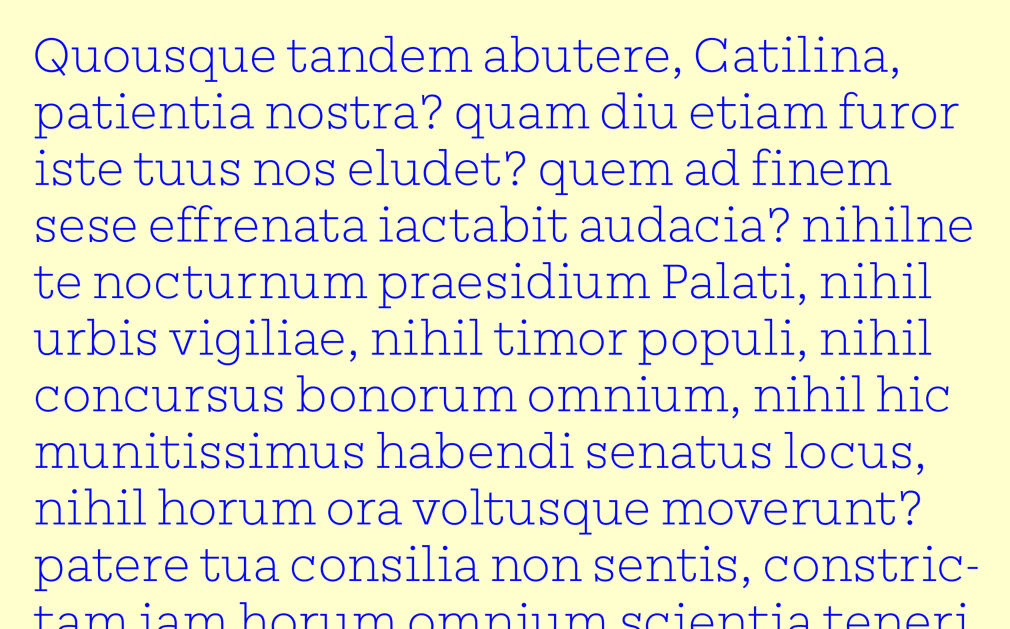
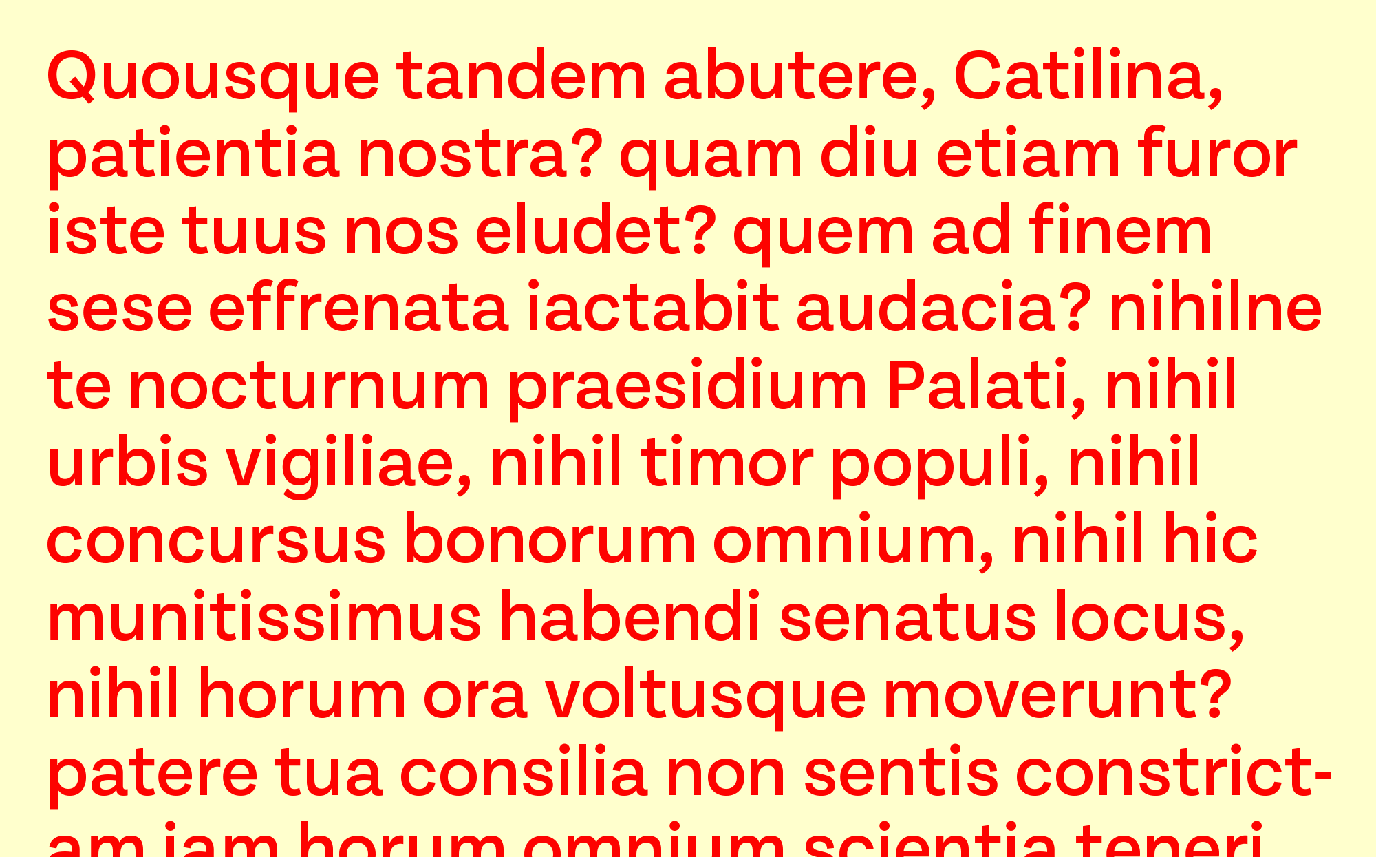
Mortise is a solidly constructed new slab serif. Its generous x-height, open counters, wide proportions, and monoline strokes make it readable and practical, while the long, slightly curved vertical serifs give it a raffish, mustache-twirling air. When we trimmed the serifs off, we found Tenon, a plain, efficient sans that marches through the uncanny valley between grotesk and geometric, with almost circular bowls that lend extra energy to the line. Tenon’s sturdy open forms suit small sizes and small screens; used larger, its brisk, optimistic air makes it a good choice for projects ranging from editorial design to signage. Together, Mortise and Tenon are a versatile serif/sans superfamily, available in six weights.