Murcom
2013
Designed by Kieran Duffy and Kieran Duffy at CDG Brand
Categories: Identity / Website
Industry: Commercial
Website: murcom.ie/
Murcom’s core business is within the construction and interior fit-out sector. Murcom collaborates with the country’s leading architectural, interior designers and quantity surveying practices. Murcom brings a unique energy and vision to every project they undertake, always striving to exceed expectations. In all their projects, the principles of value for money, quality customer service and on-time completions are applied to ensure a seamless contract delivery due to a planned procurement and coordination of on-site activities, coupled with head office support resources. Murcom has over 30 years’ experience in the construction industry with the necessary knowledge and resources to undertake complex projects and has a long history in commercial, educational and medical construction operations. Murcom has been involved in numerous projects throughout Dublin, Leinster and across Ireland.
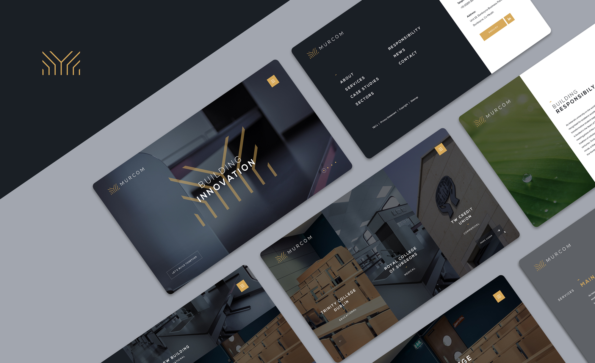
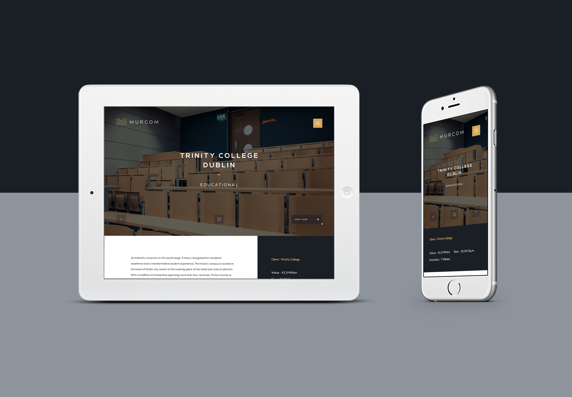
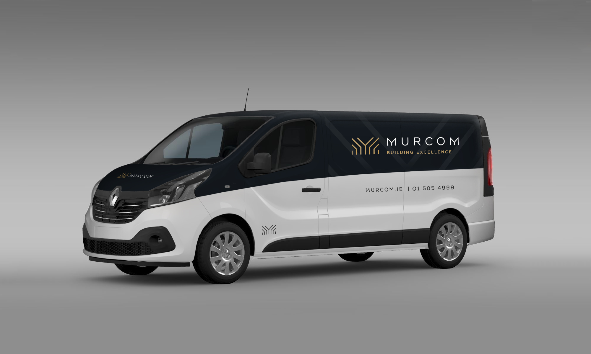
We where given the task to design a new corporate brand identity along with digital marketing collateral and promotional website. Our goal was to translate the core values of the company through an icon mark that represents what the company offer. Our main challenge was to create a contemporary icon that would empathise with their core target audiences while accommodating the principals they work within. The revitalised Brand Identity would fit with a new website that would be easy to use and visually pleasing while accommodating all the browsers needs.
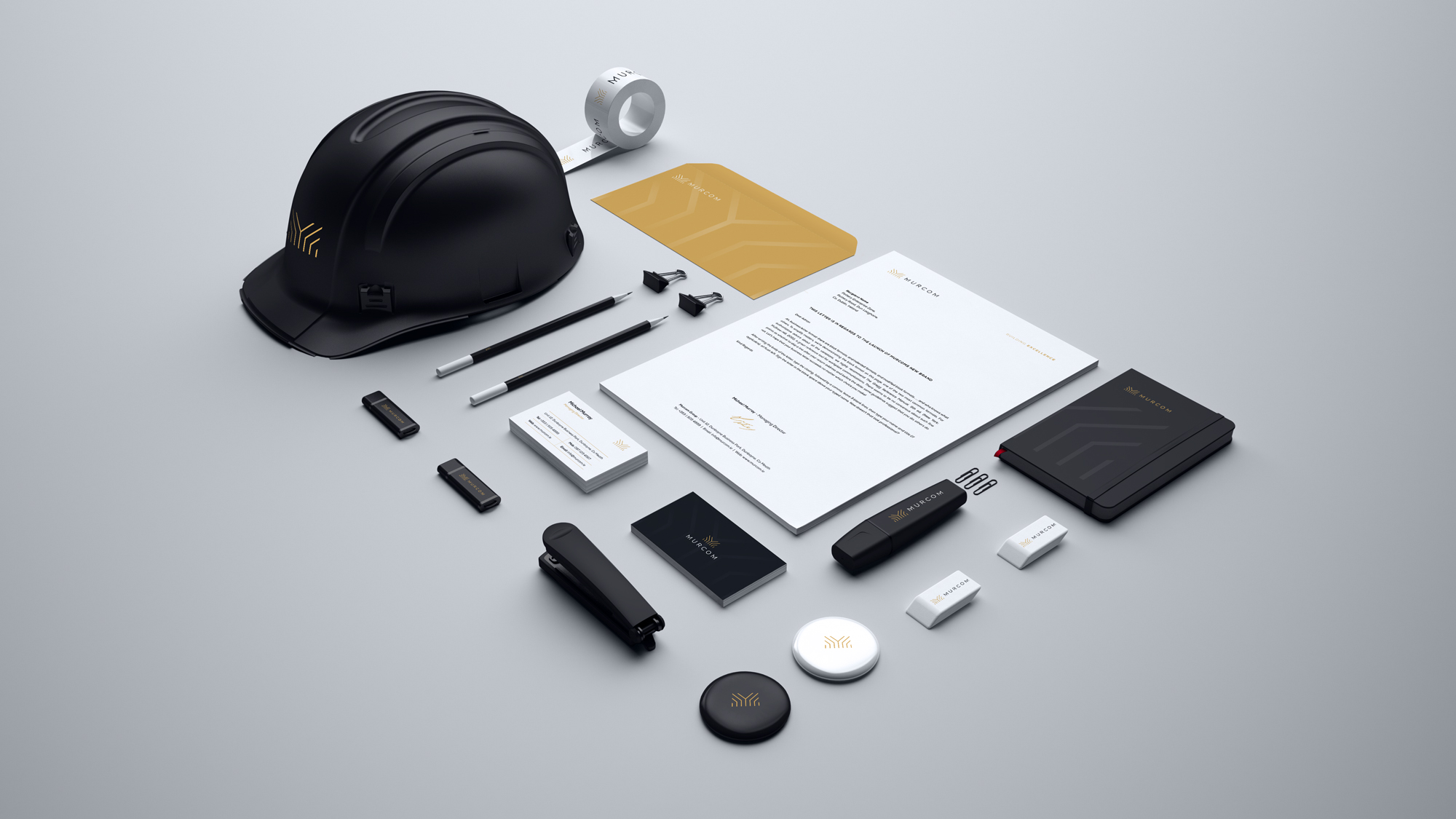
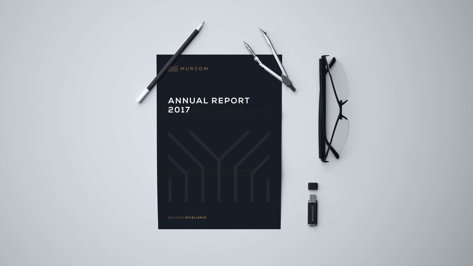
The icon designed was a hybrid mark of uniform structure, elevation, and growth. The architectural shape emulating the M and also evoking the idea of nature with the underlying theme of a Tree. The tree symbolised the growth and eco principals and the rising lines symbolised the structural form. It has a more delicate nature which plays on the ideas of interior design and accuracy. Together the elements bring a total form that represents Murcom for its values and principals. The colour pallet was chosen to convey a rich up upmarket feel that would suggest quality and high principals. The blend of macro Photography and fine lines convey the uniqueness of a company dedicated to precision and accuracy. We created an additional suite of icons to blend with company collateral and website. Murcoms photography was shot by our staff and digitally enhanced to show clean form. The website while simple and short combines a level of Java development that enhances the user engagement and generating a richness to the browser experience. The overall visual brand experience has uplifted the companies presence fourfold.