National Disability Services Association
2020
Designed by Seán Harte at M-CO
Strategy: Colleen Savage (M.CO)
Categories: Website / Identity / Screen
Industry: Charitable
Tags: Digital / Art direction / Rebrand / Website / Not for Profit / Branding
Website: NDSA.ie
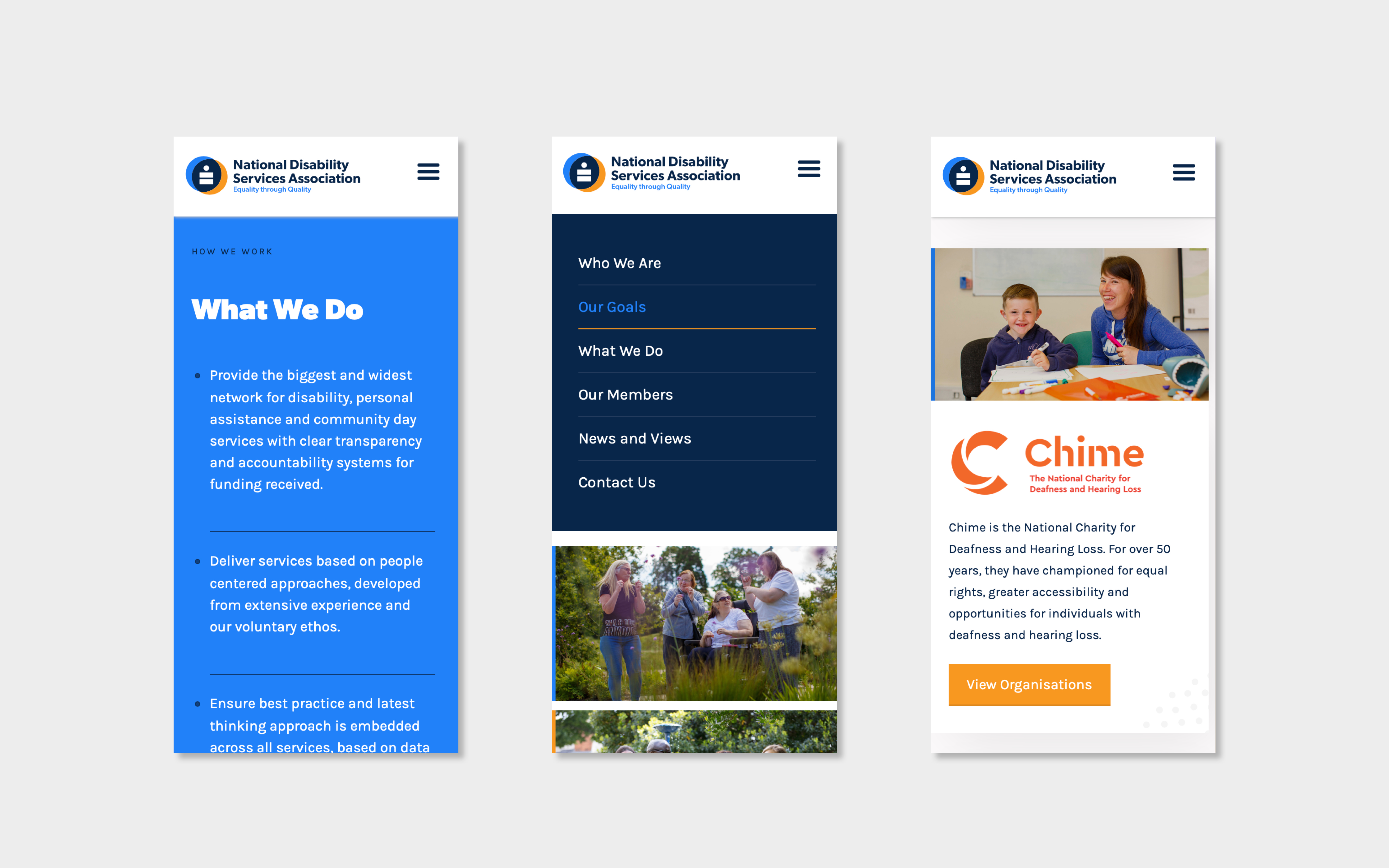
What’s in a name? An opportunity to improve the impact and awareness of a very important organisation. In 2020 M.CO worked with the National Disability Services Association to change their name from the Not for Profit Association, and to develop a brand identity and website to match. The team worked with the NDSA to find a visual identity to bring the new name to life and to bring to life the strength of the association, and the vision of Irish society they want to deliver.
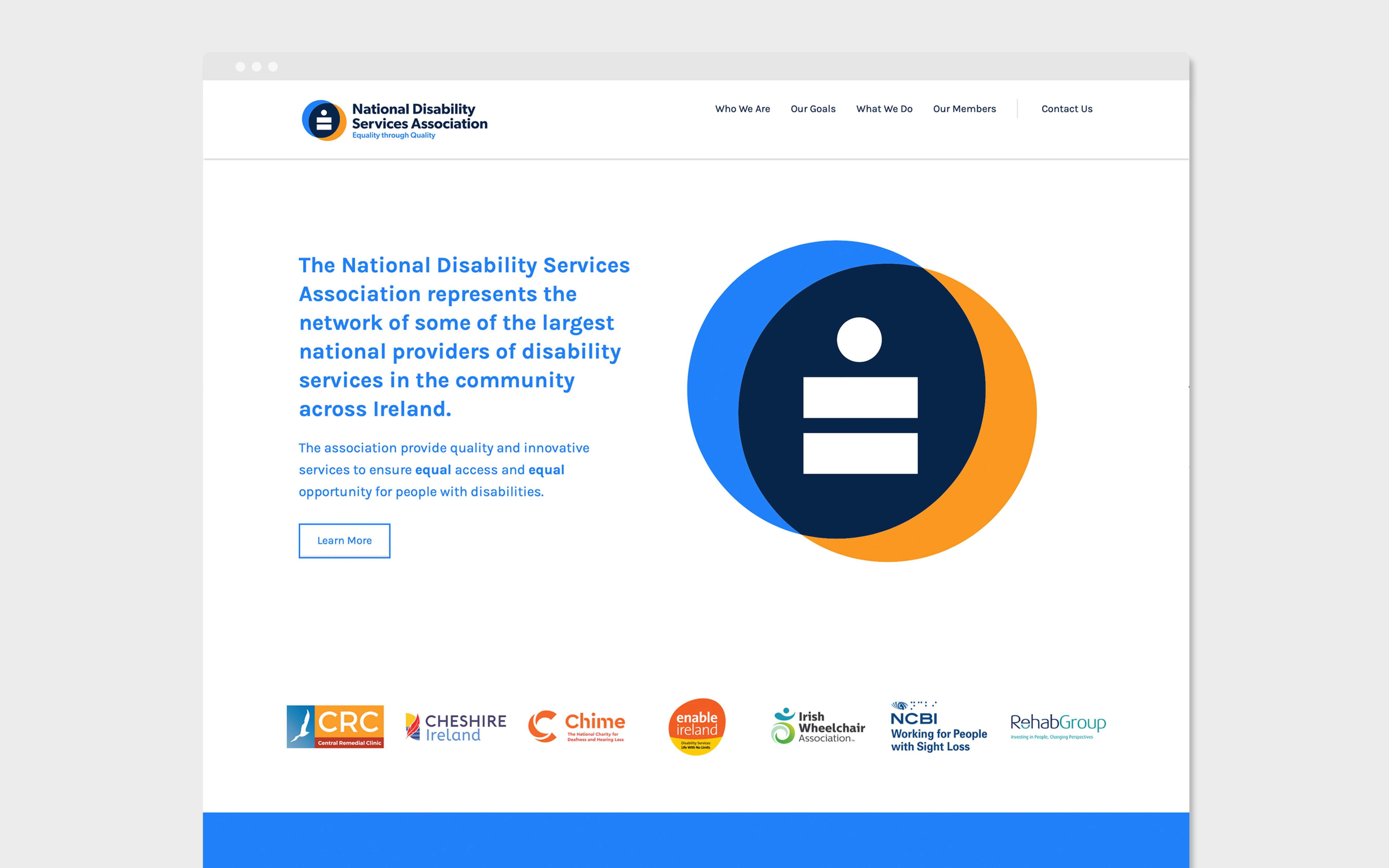
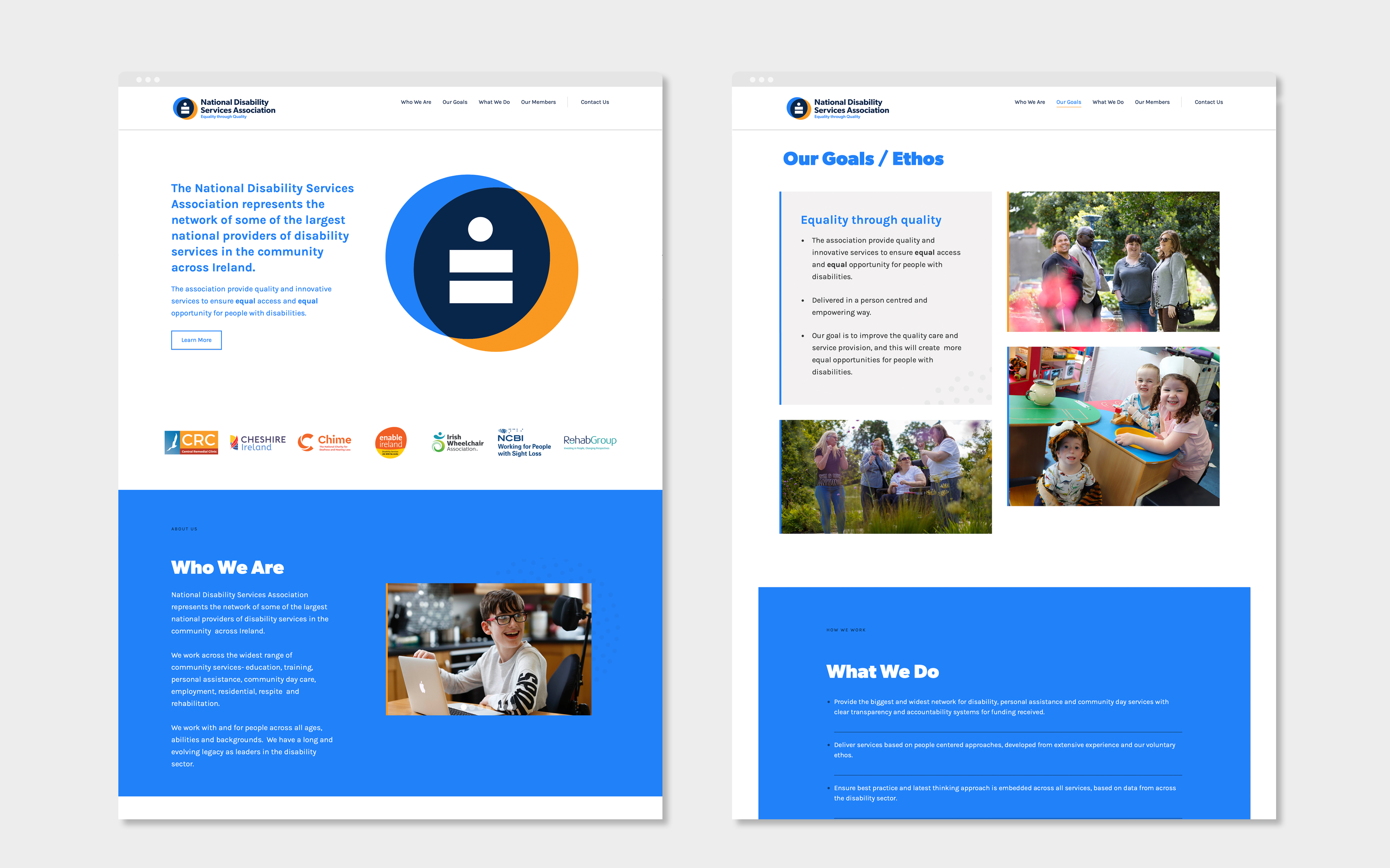
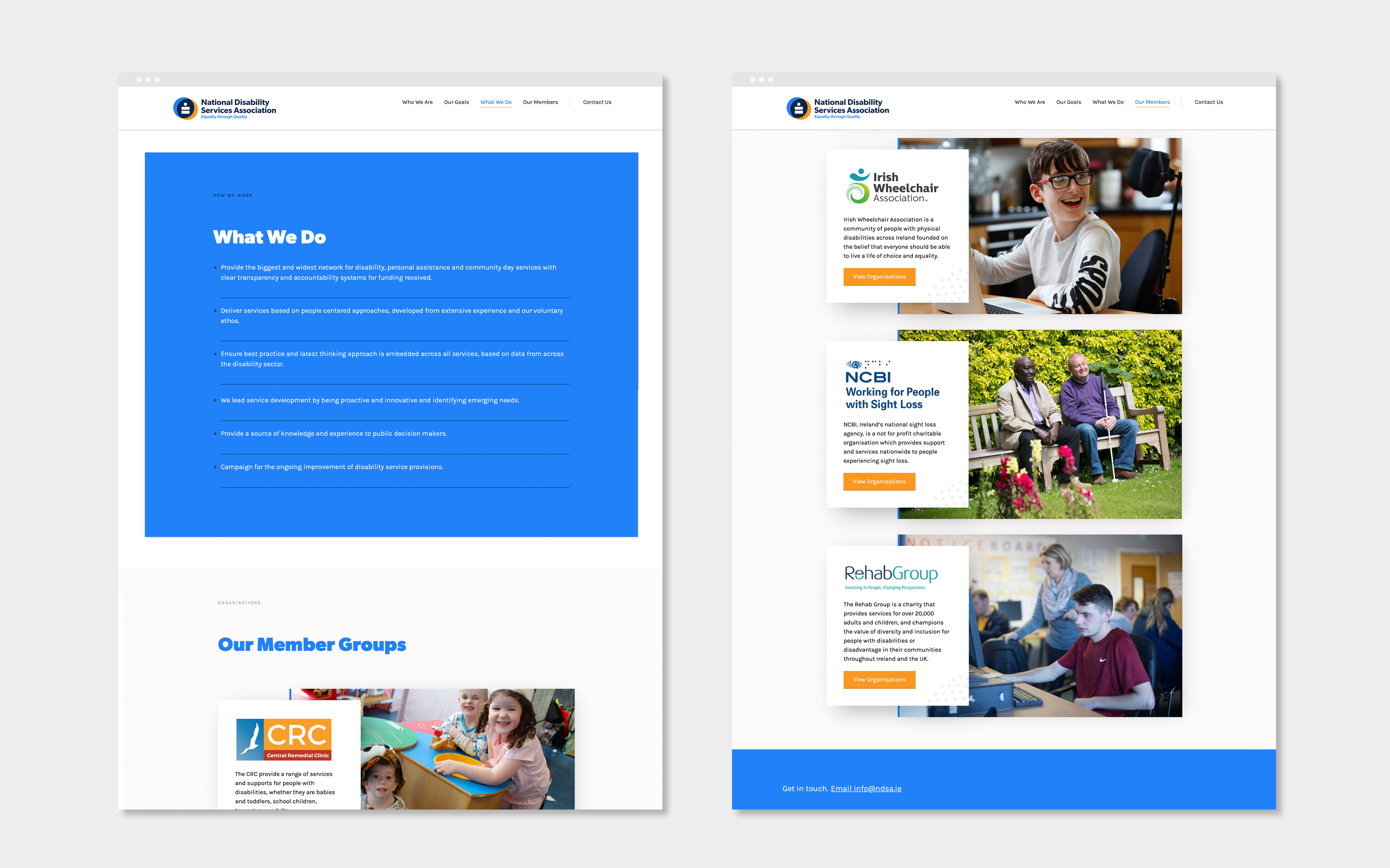
Our challenge was to create an association brand, reflecting the members’ joint strengths and purpose. The NDSA represents a network of some of the largest national providers of disability services across Ireland, including the Central Remedial Clinic, Cheshire Ireland, Chime, Enable Ireland, the Irish Wheelchair Association, NCBI and Rehab Group. It delivers crucial support, providing quality and innovative services to ensure equal access and equal opportunity for people with disabilities. As well as reflecting the strength and importance through the new name, we wanted the brand identity to reflect the ethos and impact of their work.
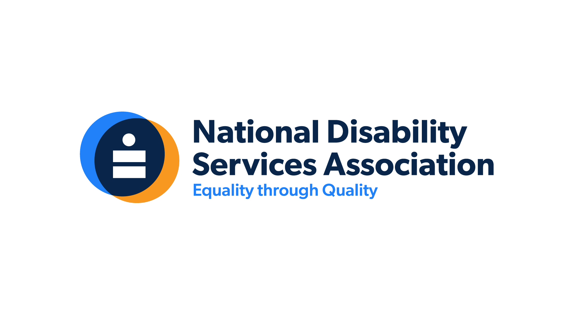
As we worked closely with the member group, it was clear that their strength lay in the impact of their services, facilitating real equality of inclusion at all stages of life. The scale and scope of services on offer was very impressive, but it was the shared ethos of human-centred care and empowerment that provided inspiration for the brand logo. The equal sign became the core of the new brand identity, imbued with a clear human connection and warmth.
We created a person-centred logo that would also reflect the wider association goals of inclusion and equality. The collective strength of the members is reflected in a colour palette draw from their individual logos. The brand, including carefully considered form, colour and type, led to a modern and positive design, centred around accessibility principles.
This new brand clearly outlines the purpose and strength of the association, providing a platform and a calling card to advocate for their members and their goals.