National Youth Assembly
2025
Designed by Paula McEntee, Susan Carberry and Áine McGee at Red Dog
Account Manager: Ashley Caprani
Categories: Identity
Industry: Civic
Tags: Typography
A national identity for a forum designed to make space for young people’s voices at the highest level of Government, balancing authority with openness and structure with real expression.
Background
The National Youth Assembly brings together young people aged 12 to 24 from across Ireland to engage directly with Government on issues of national importance. Established by the Department of Children, Equality, Disability, Integration and Youth, it operates alongside Comhairle na nÓg, creating a parallel structure for youth participation at a national scale.
Delegates are drawn from diverse backgrounds, geographies and lived experiences, and contribute through formal assemblies, working groups and policy forums. The identity needed to reflect this seriousness of purpose, while clearly signalling that the Assembly is shaped by youth, not simply designed for them. It also needed to sit comfortably alongside Government departments and institutions without becoming overly formal or remote (or indeed boring).
The Idea
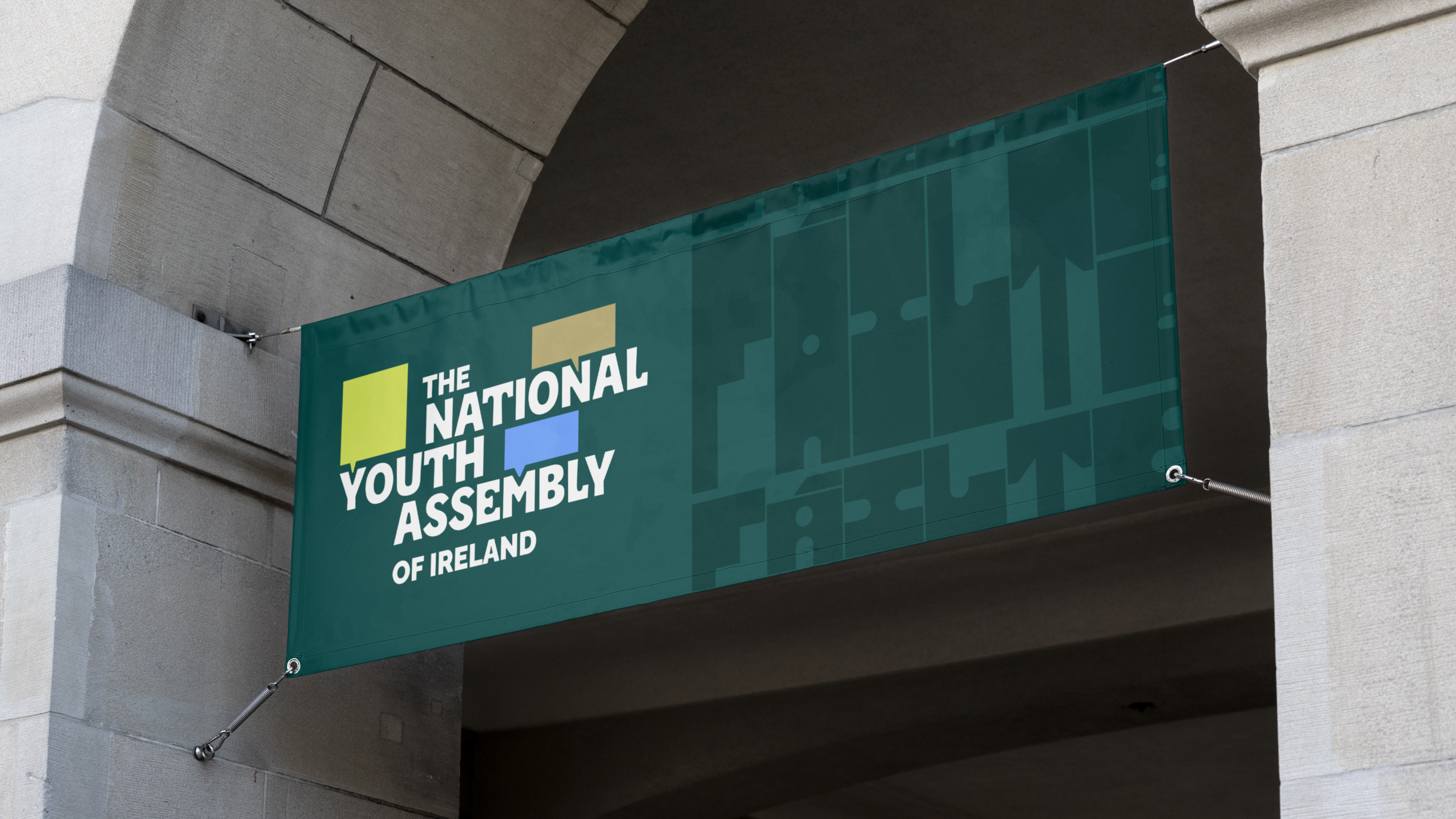
The creative concept is built around the idea of “a space for voices”. Rather than leaning on symbolism or illustration, the identity gives visual form to participation itself.
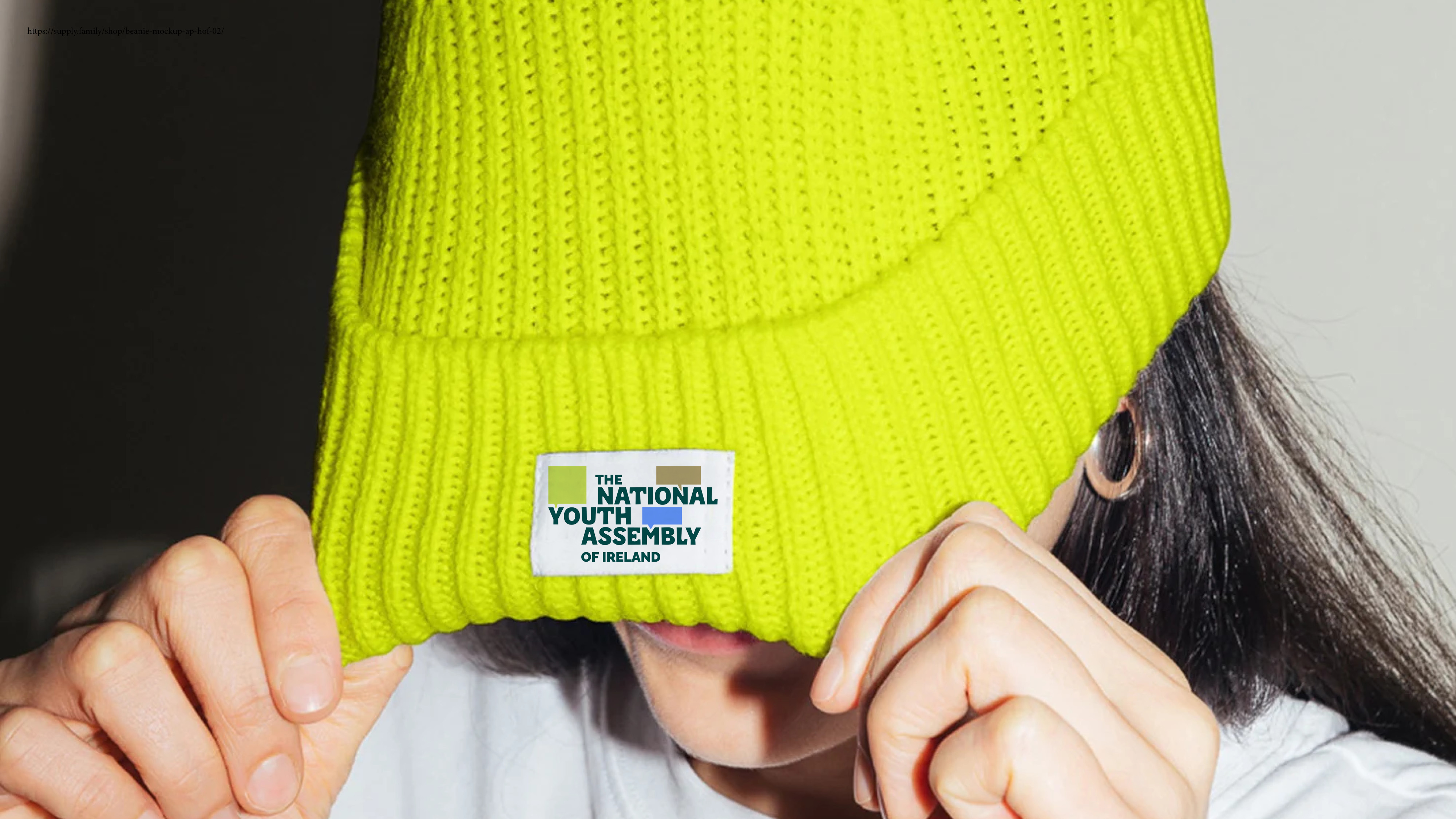
At the centre is a typographic logotype where speech bubbles emerge from the negative spaces between letters. These moments of interruption and expansion suggest voices entering the conversation and ideas taking shape. The logotype is intentionally dynamic, able to shift and reconfigure, reflecting the changing nature of dialogue and debate. We know that the speech bubble is quite a ‘used’ symbol but we feel that it is warranted and successful here - giving it a new perspective.
Set in uppercase, the wordmark conveys strength and credibility, while softened curves and subtle quirks prevent it from feeling rigid or institutional. The result is a mark that feels confident but open, formal yet human.
Execution
The colour palette draws from established civic references while introducing a distinct tone of its own. Greens link back to Comhairle na nÓg, creating a clear family connection, while gold and blue reference the Government of Ireland. A restrained set of accent colours adds flexibility and warmth, allowing the system to adapt across events, materials and audiences without losing meaning.
Raleway was chosen as the primary typeface for all written communication. As an open source font, it ensures accessibility and ease of use across a large, distributed organisation. Its open counters, clear distinctions between similar letterforms and balanced proportions supports legibility for a broad range of audiences which is vital.
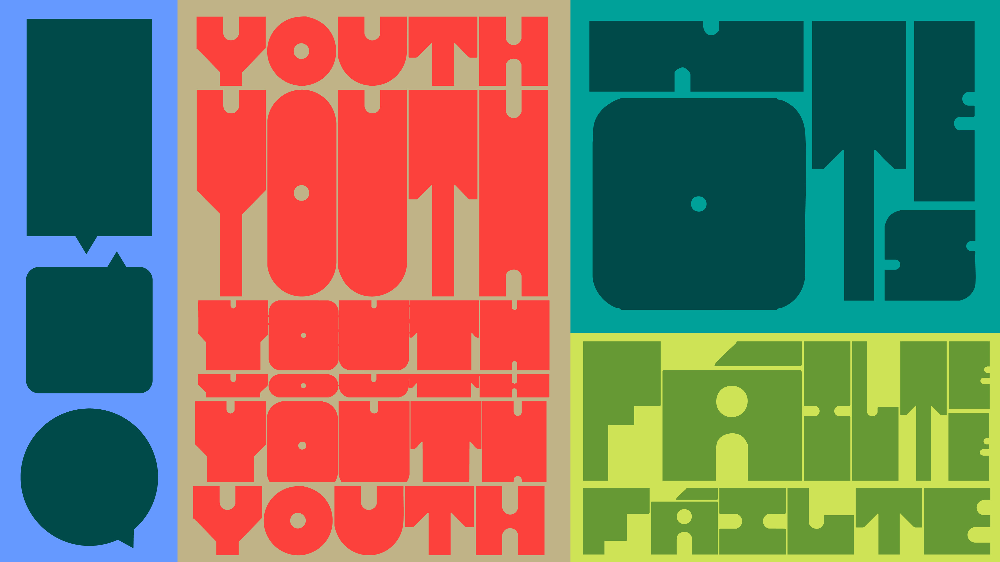
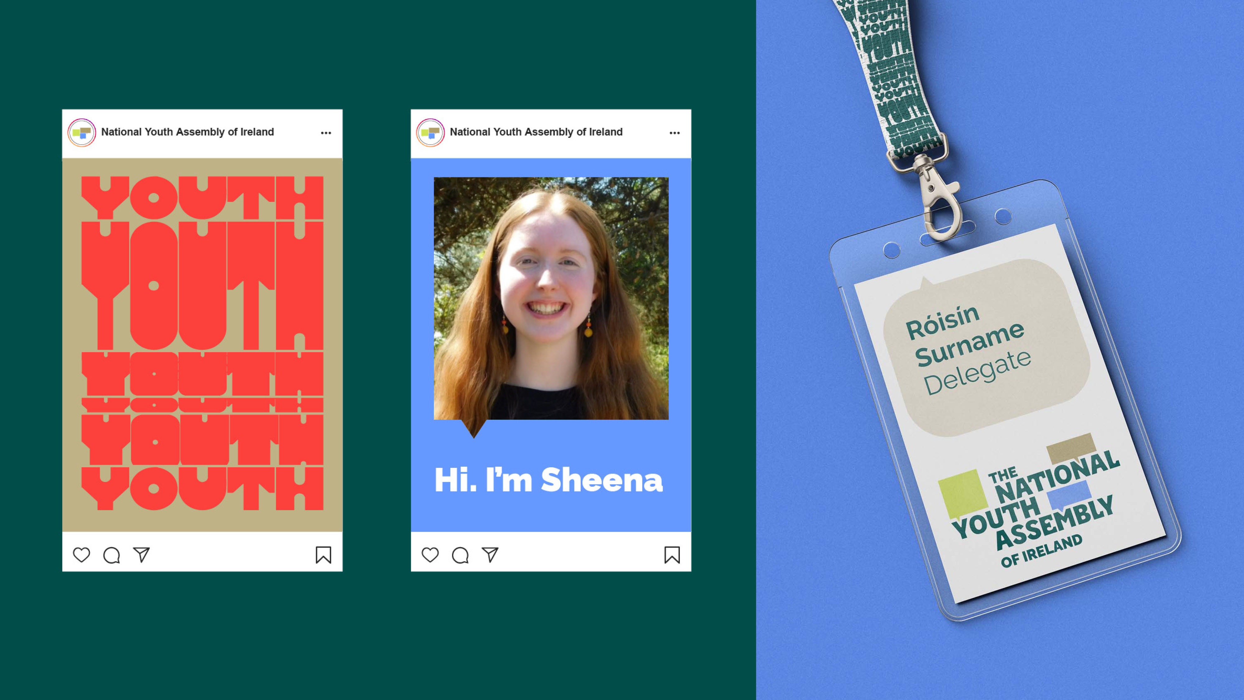
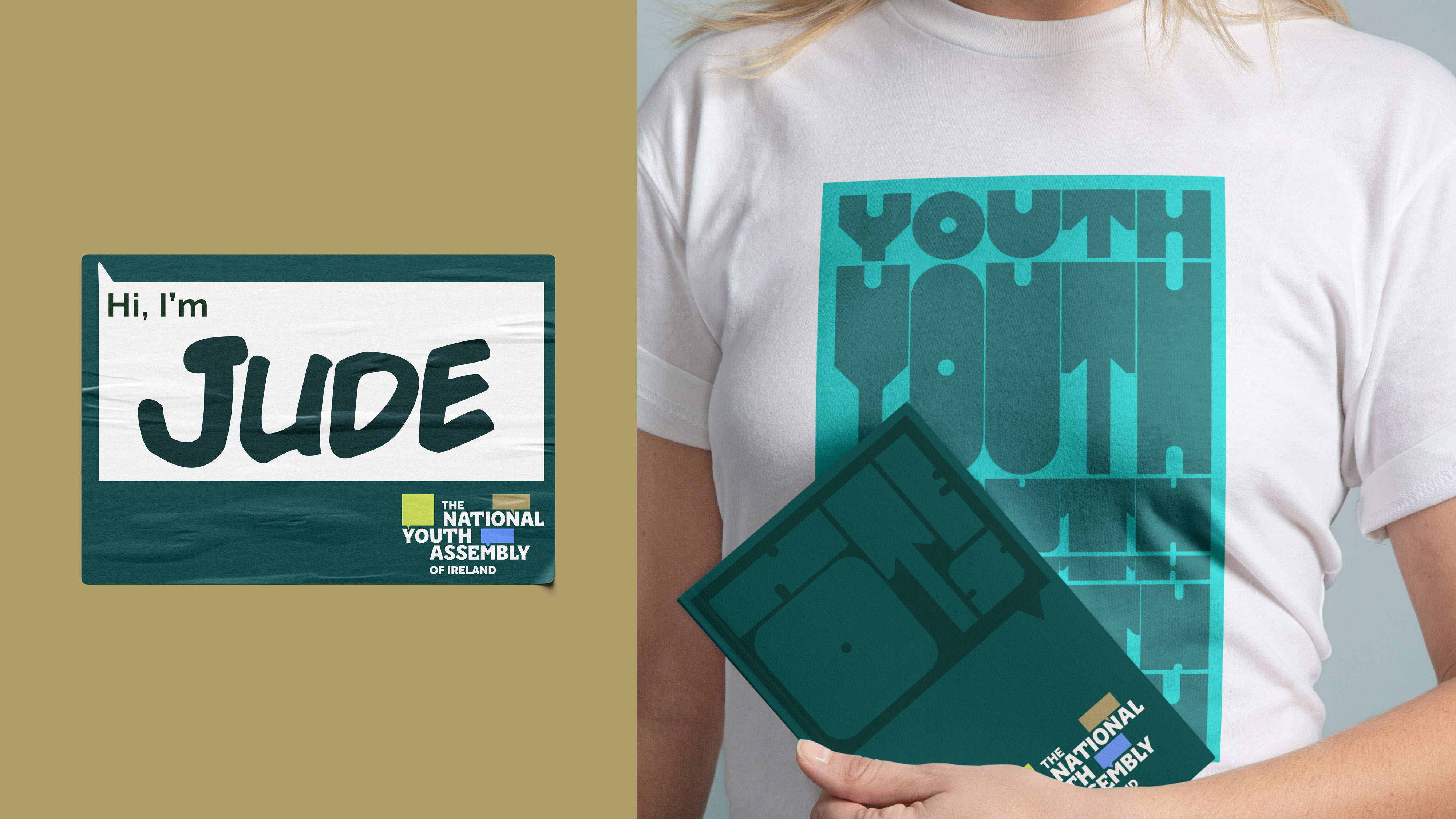
Supporting the core identity is an expressive typographic system using a variable display typeface. This functions as a graphic backdrop rather than a content carrier, forming dense, energetic compositions housed within speech bubble shapes. It represents the convergence of many voices and perspectives, and can be amplified for youth-led moments or restrained for more formal settings.
Why it’s working
Purposeful: A system rooted in participation (getting ‘stuck in’) rather than decoration.
Credible: Confident enough to sit within Government contexts without losing character.
Flexible: Designed to scale across documents, environments, merchandise and motion.
Inclusive: Built with accessibility, legibility and diversity at its core.
Enduring: A framework that can evolve as new voices enter the conversation.