Norwegian Radiation and Nuclear Safety Authority (DSA)
2020
Designed by Evan McGuinness at Bielke+Yang
Creative Direction: Christian Bielke
Creative Direction: Martin Yang
Photography: Åsmund Holien Mo
Categories: Identity
Industry: Civic
Norway is a special place. Not because it's usually found on top of lists like best places to live, or happiest inhabitants, but because of its geography: Located between Russia in the east, the Atlantic in the west and the European Union in the south, Norway is of strategic interest amongst many. The Norwegian Radiation and Nuclear Safety Authority (DSA) plays an important role in this landscape, being the national authority and expert body in matters concerning nuclear security, radiation use, natural radiation and radioactive contamination in the environment.
Back in 1987, DSA worked only with radiation. This particular year the catastrophic Chernobyl disaster caused deaths and harm from radiation all over Europe, for years to come. DSA then measured radiation, gave advice and shared knowledge with the international radiation community on how to stay safe after the disaster. Today, DSA continues to work with nuclear security and other sensitive topics, making it important for DSA to make people feel safe and secure. Therefore, it was essential to create a visual identity that encourages a sense of calm, and at the same time communicates how the DSA has oversight of the international and national radiation landscape, as an expert the population of Norway can trust.
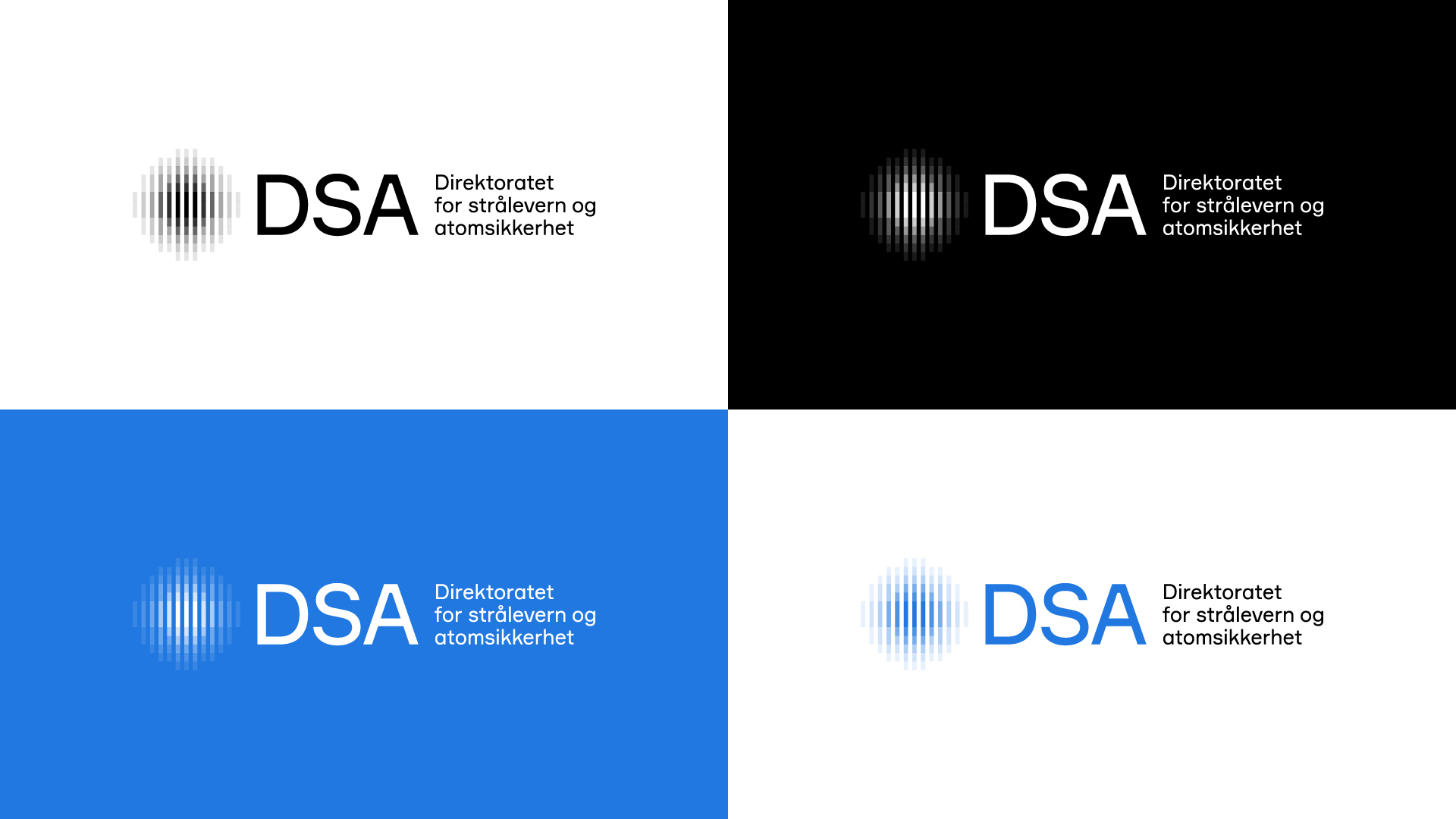
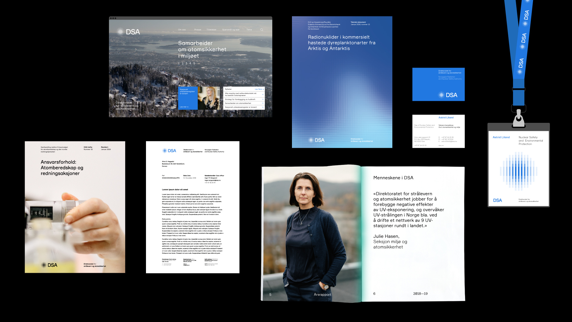
Other organizations working with nuclear security and radiation typically use the nuclear core in its logo symbols. Making the new visual identity for DSA, we wanted to show that radiation is something more than an atomic symbol, but acknowledge that it is a constantly moving and changing force which we are surrounded by at all times that should be respected. DSA recognise this fact and by expressing this movement in their logo they make it clear that they are not avoiding the responsibility or trust people have put in them when dealing with such a dangerous substance in all its forms. Rather they understand its potential so well they can educate and inform the population on all aspects of radiation; from awareness to working in close connection to it. The abstract symbol is also inspired by instruments DSA uses to measure radiation. From those instruments, we also gathered a broad spectrum colour palette, that symbolizes the depth of expertise found within DSA. The blue main colour is from the center of the colour spectrum, from where DSA works with different aspects of radiation.
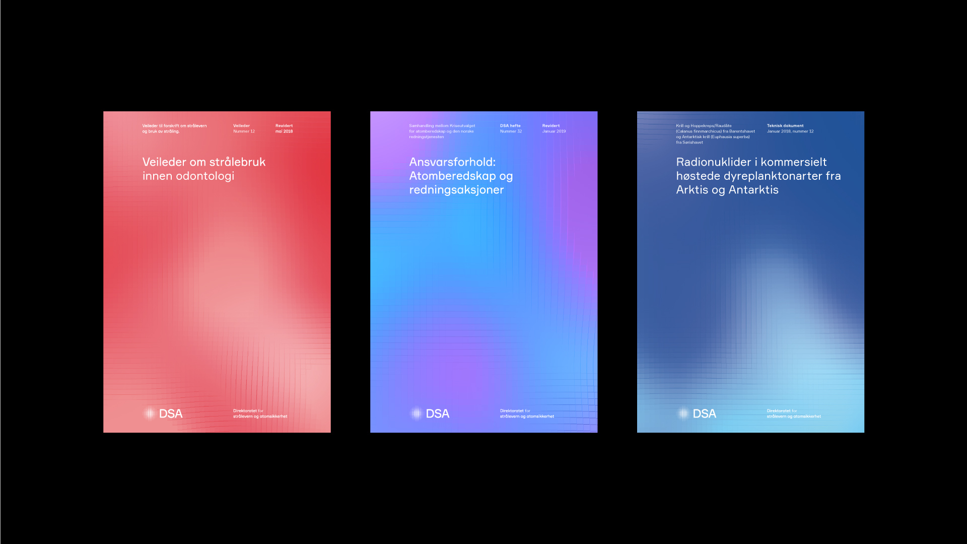
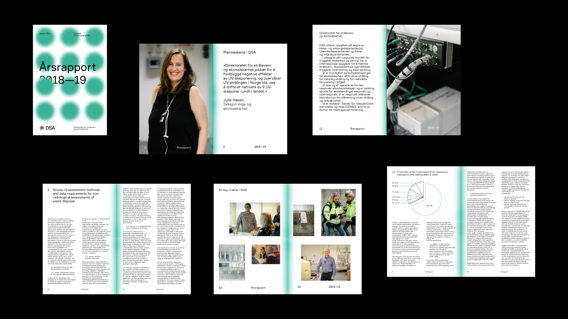
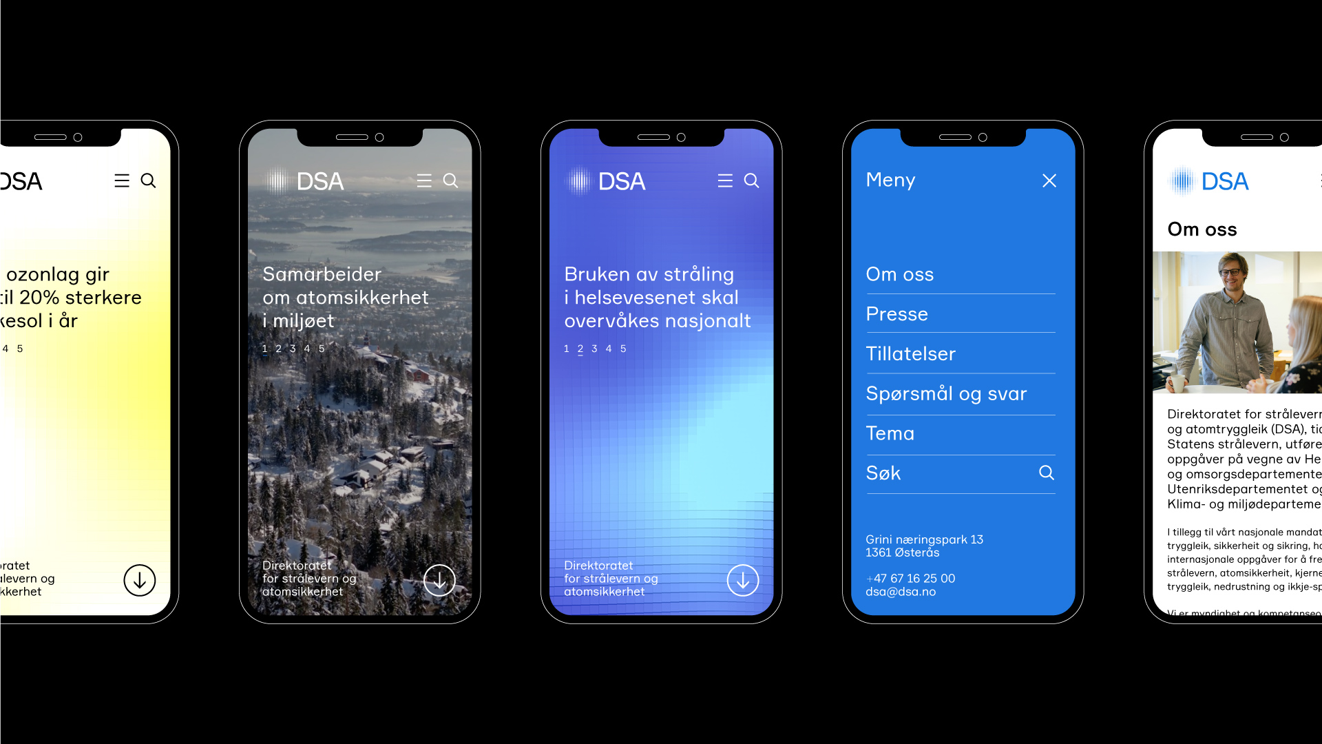
A key element of the DSA identity is the gradient pattern that appears across various profile elements; website, report covers and posters. The pattern is constructed from small squares and is an extension of the thinking and form of the DSA logo. The collective movement of these forms is linked to the idea of collaboration while also referencing the constantly moving and changing force that is radiation.
