Nunaïa Beauty - Brand Identity
2013
Designed by Bridget Kerrigan
Photographer & Videographer: Diego Gavilan www.diegogavilan.myportfolio.com
Illustration, Brand Design, Pack Design: Bridget Kerrigan, Bammedia
Categories: Identity / Packaging
Industry: Corporate
Website: nunaia.com
BACKGROUND
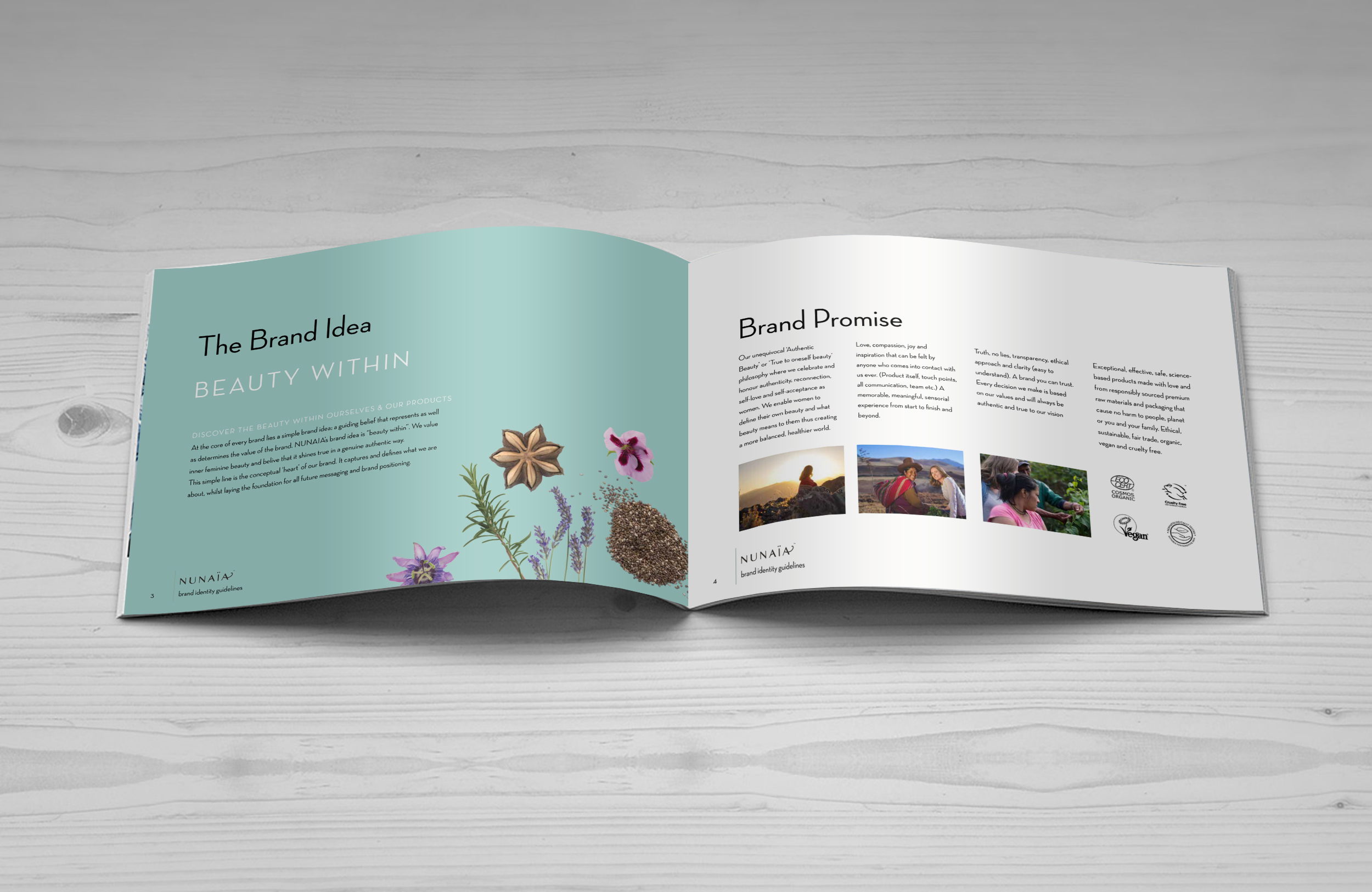
Nunaïa is the brainchild of herbalist Nicola Connolly who developed her business idea, a wellness beauty brand, whilst living in the harsh arid climate of Peru. Immersed in Peruvian botanicals, Nicola was inspired to create a range of beauty products with these ingredients. As a strong believer in wellness / ethical consumption, Nicola wanted to bring a sense of her holistic values to her brand.
Key challenges outlined in the brief were crucial to our brand positioning, such as;
- Customers are confused about skincare brands, products and beauty regimes. They are untrustworthy of beauty claims - certification, truth and proof is important to them.
- Customers are tired of conventional beauty industry messaging “look younger” and “be beautiful” - they feel disconnected from their true self.
We were tasked to create a brand identity that considered these challenges and that reflected the brand values of ‘authenticity’, ‘natural’, ‘elegance’ and ‘wild femininity’.
THE NAME
Nunaïa, pronounced [noo-nigh-yah], is a blend of 3 words meaning "Soul Tribe" from the Quechua language of the Andes Mountains. All credit for the name goes to Nicola, the brand founder.
THE BRAND ESSENCE
“BEAUTY WITHIN” was chosen as that single minded message that underpins all brand activity. DISCOVER THE 'BEAUTY WITHIN' OURSELVES AND OUR PRODUCTS.
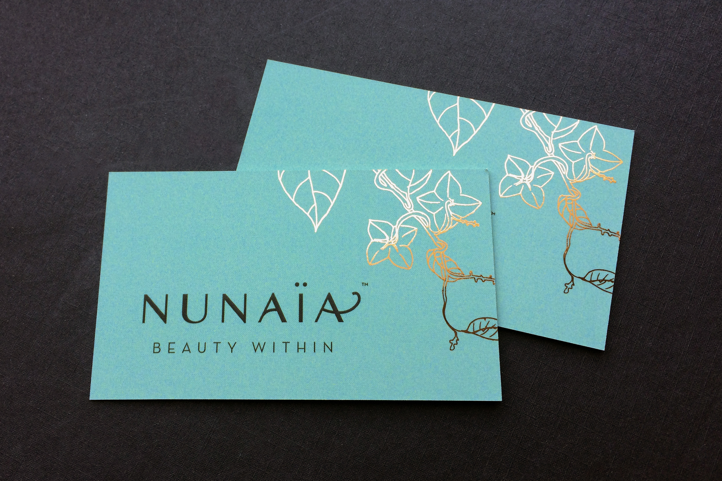
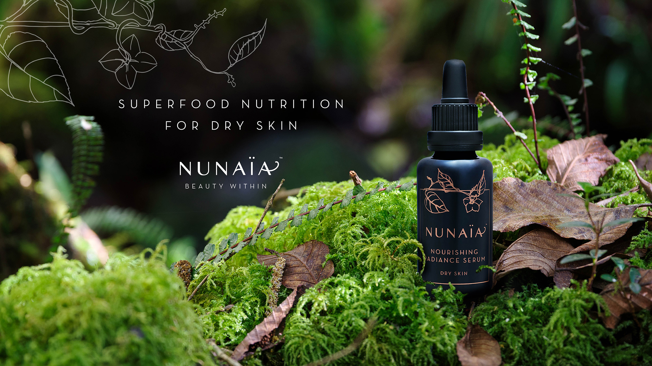
THE BRAND MARK
Echoing the brand values, we created a simple elegant brand mark with nature at its core. We accentuated the crossbars of the two letter A’s to represent the natural flow of a plant or vine central to the brand. The neoclassical base font MYANMAR was chosen for elegance, strength and femininity, ensuring that the final brand mark would work close up, on screen and on shelf.
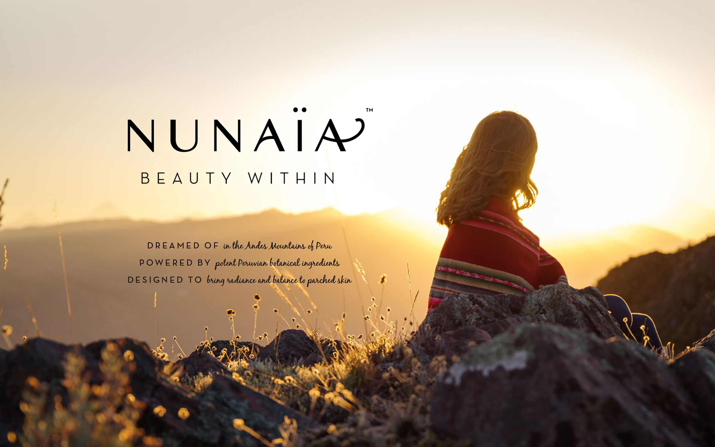
THE PHOTOS
A bank of key promotional photography was taken on-site in Peru, under the art-direction of our creative director. Images captured include; sourcing ingredients, the founder, ingredient growers. A key promotional image of Nicola reflecting on a hilltop against the beautiful Peruvian landscape forms the basis of our promotional product for the debut product - a 'nourishing radiance facial serum'.
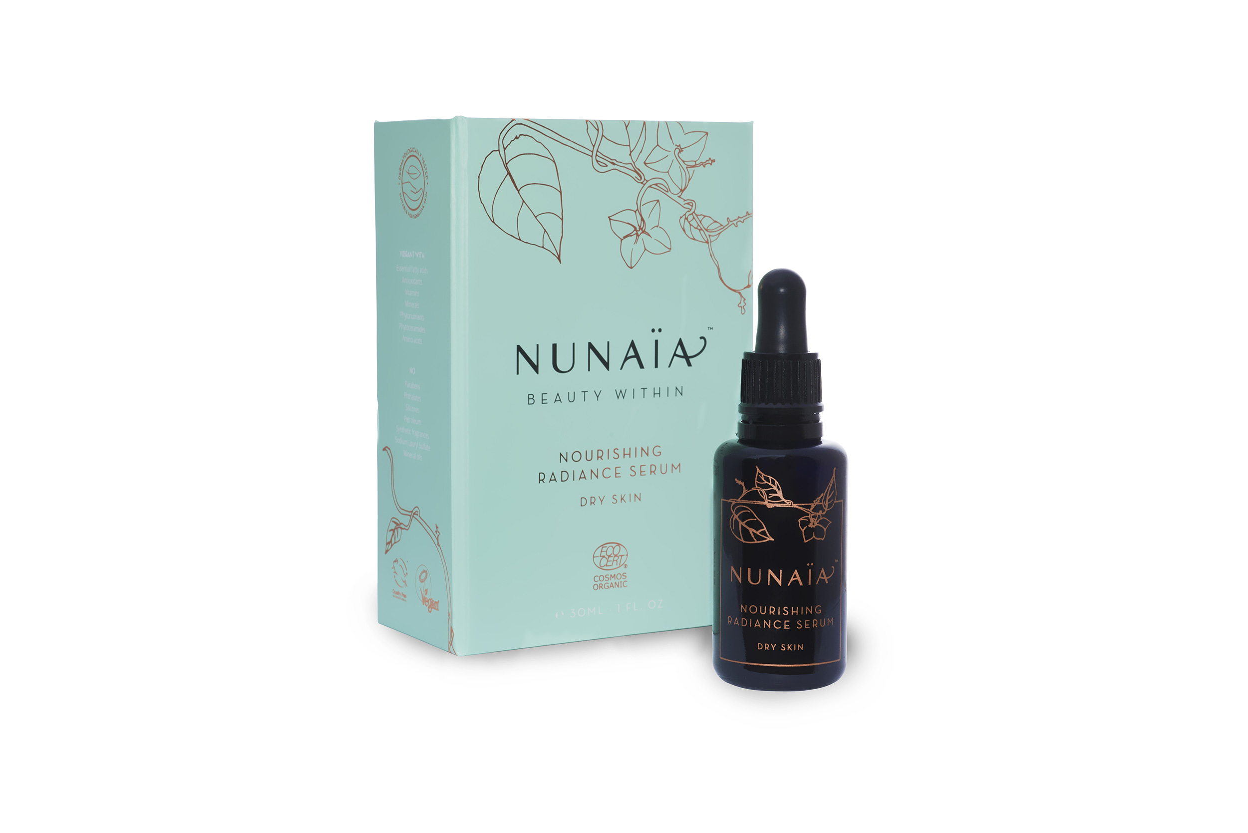
THE ILLUSTRATIONS
Original hand illustrations of the Sacha Inchi and Maracuja plants were created to reinforce the organic natural story. Ingredients are key to the products and as such feature heavily across a variety of brand applications.
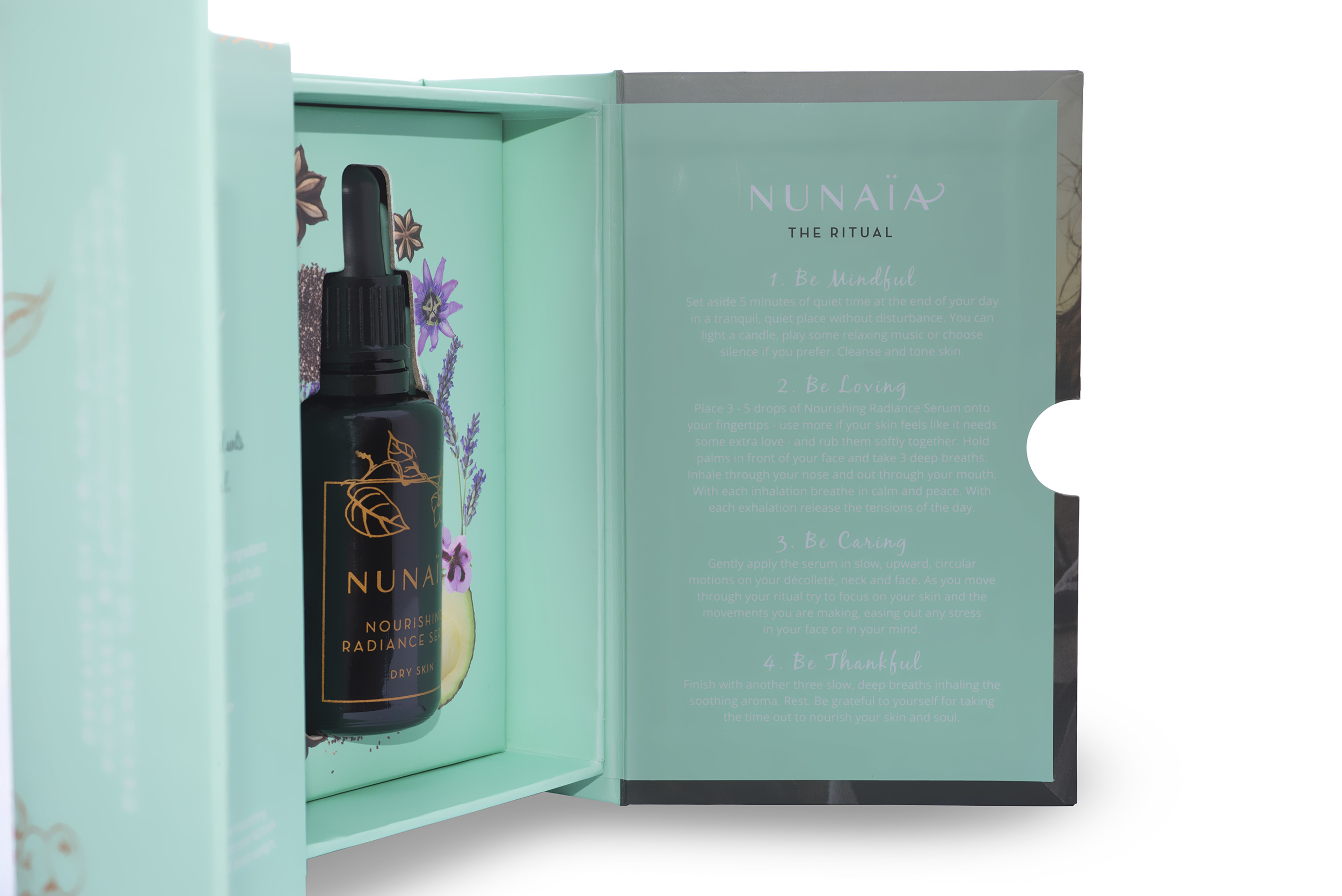
THE PACKAGING:
The concept was to create a beautifully crafted rigid protective box enclosing the ‘beauty within’ – the delicate precious oil. As well as offering protection in transit, our rigid box and indeed the dark Miron glass bottle were chosen to reduce the amount of UV light hitting the oil, as this reduces the potency of active ingredients over time. The rigid box has an additional panel to create an unboxing / revealing element for the customer.
THE COLOURS
Our core brand colour is bright, vibrant, yet calming and tranquil. The turquoise tone pairs perfectly with black and copper foil, chosen to highlight the premium luxury nature of the brand.
THE RESULT
We have created a luxurious authentic organic wellness brand that stands out in its space while remaining true to its values.