NYCI Rebrand
Designed by Al Murphy, Kim Robinson, Elena Stevant and Paula McEntee at Red Dog
Illustration: Holly Pereira
Illustration: Ruan van Vliet
Illustration: Donough O’Malley
Illustration: Harriet Yakub
Animation: Elena Stevant
Categories: Identity
Industry: Charitable
Tags: Illustration / Typography
The National Youth Council of Ireland (NYCI) is the representative body for voluntary youth organisations in Ireland. It uses its collective experience to act on issues that impact on young people. It represents over 50 member organisations that work with over 380,000 young people each year.
Project Objective: A brand identity that reflects the changes/progress in NYCI and reinforces its sector leading position.
Success Externally would be: Consistency and clarity in our messaging and brand, supporting credibility and authority of NYCI.
Success Internally would be: The further breaking down of silos so NYCI is not just a collective of excellent programmes but all working to be greater than the sum of our parts.
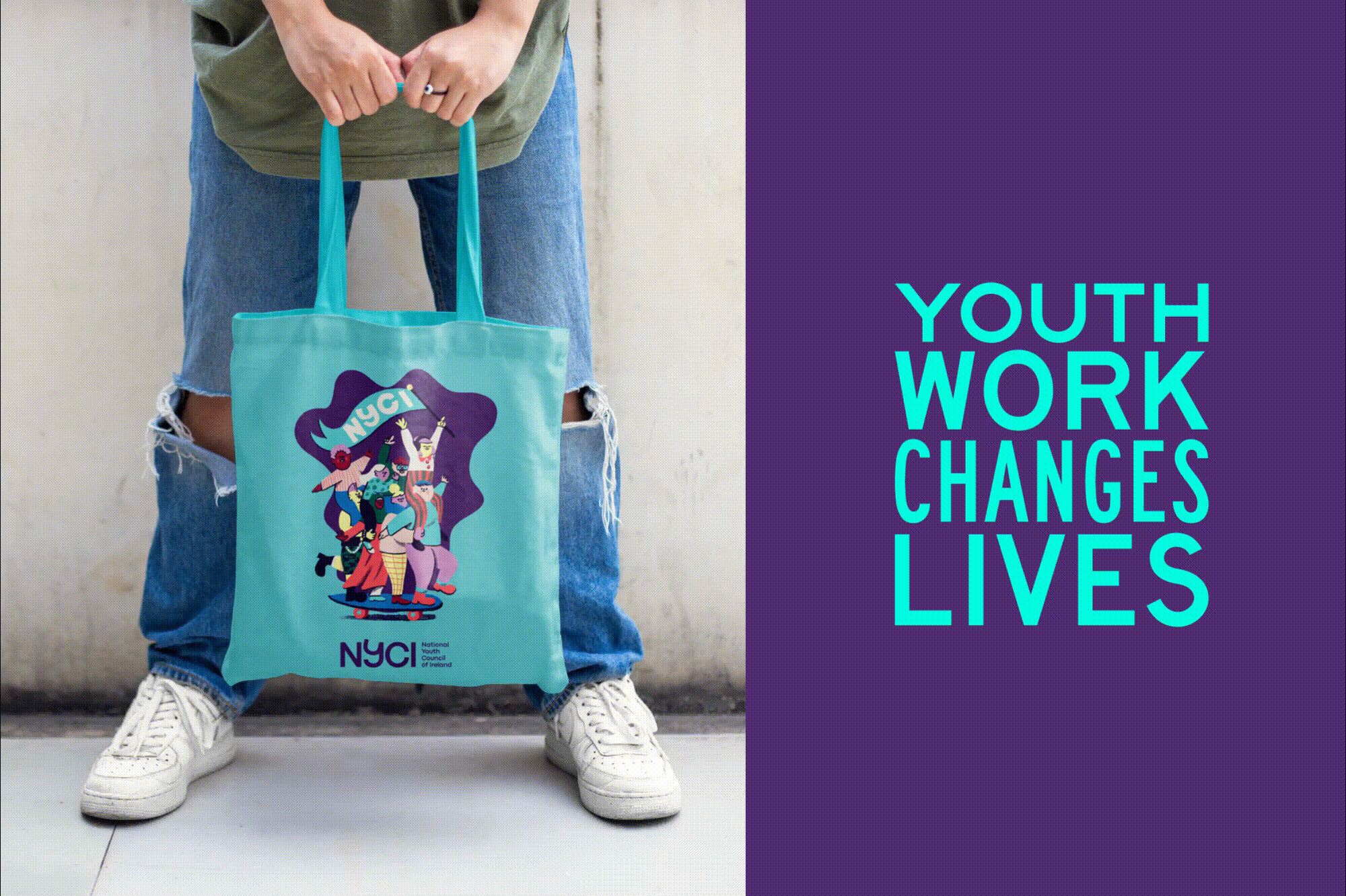
The new logotype places emphasis on the word ‘Youth’. It features a playful bespoke letter ‘y’ that delivers vibrancy and dynamism. Its affectionately called the 'jaunty y' - anchored on either side by solid letterforms that allude to NYCI’s role as the leading representative body for voluntary youth organisations, the logotype achieves a balance of being approachable, while conveying authority too.
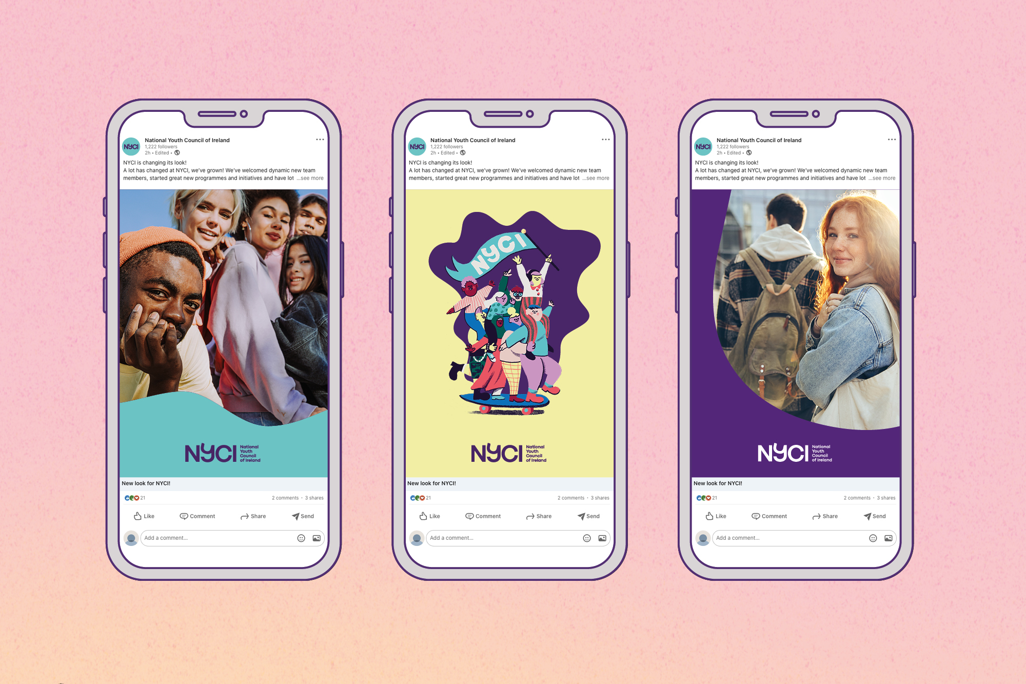
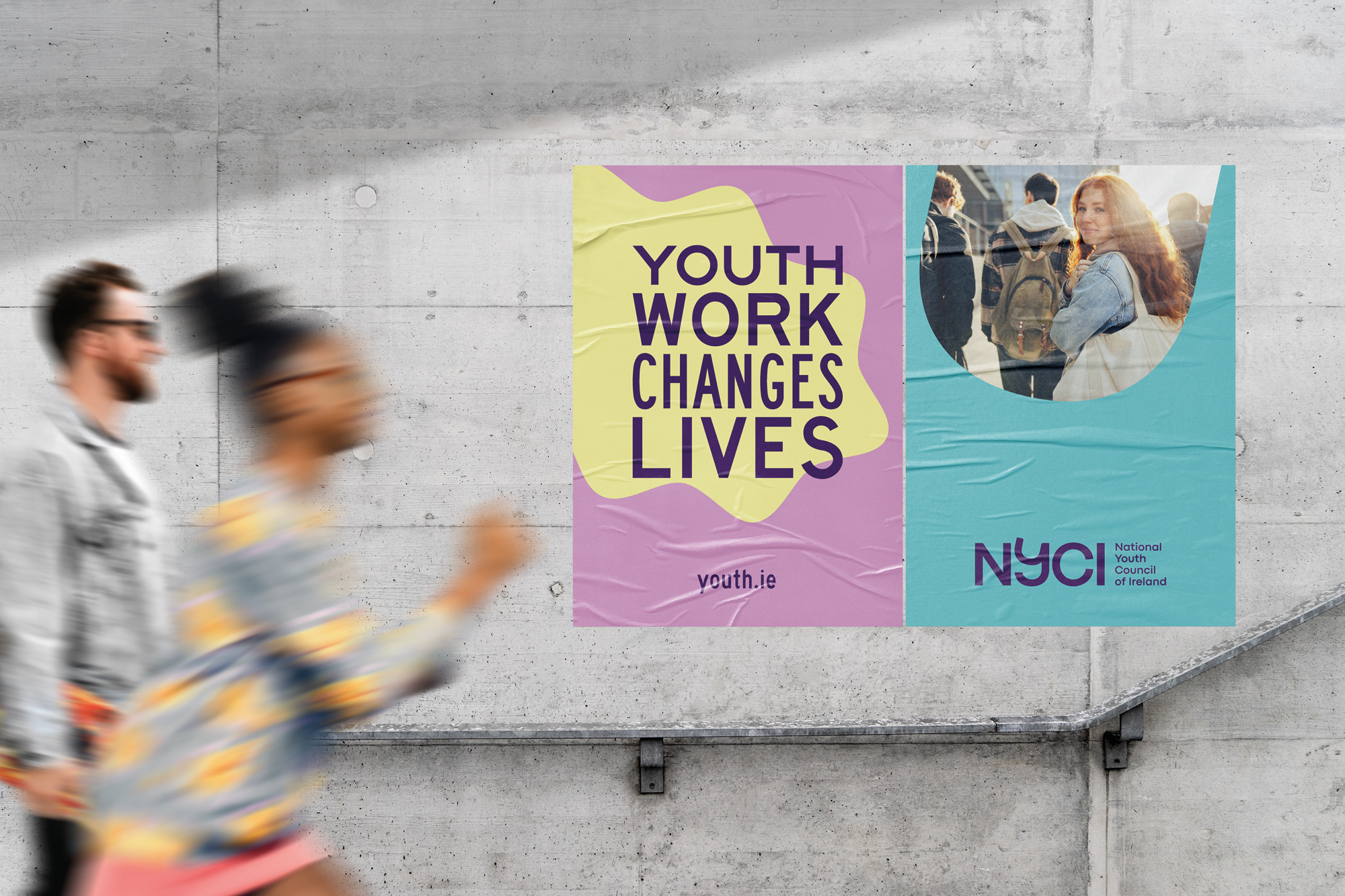
The visual language system has been created with the potential to be dialled up to be expressive or dialled down for more conservative audiences. It features two shapes; the Ripple and the ‘U’ shape which is derived from the ‘Y’ in the NYCI logotype. These can contain messaging or imagery.
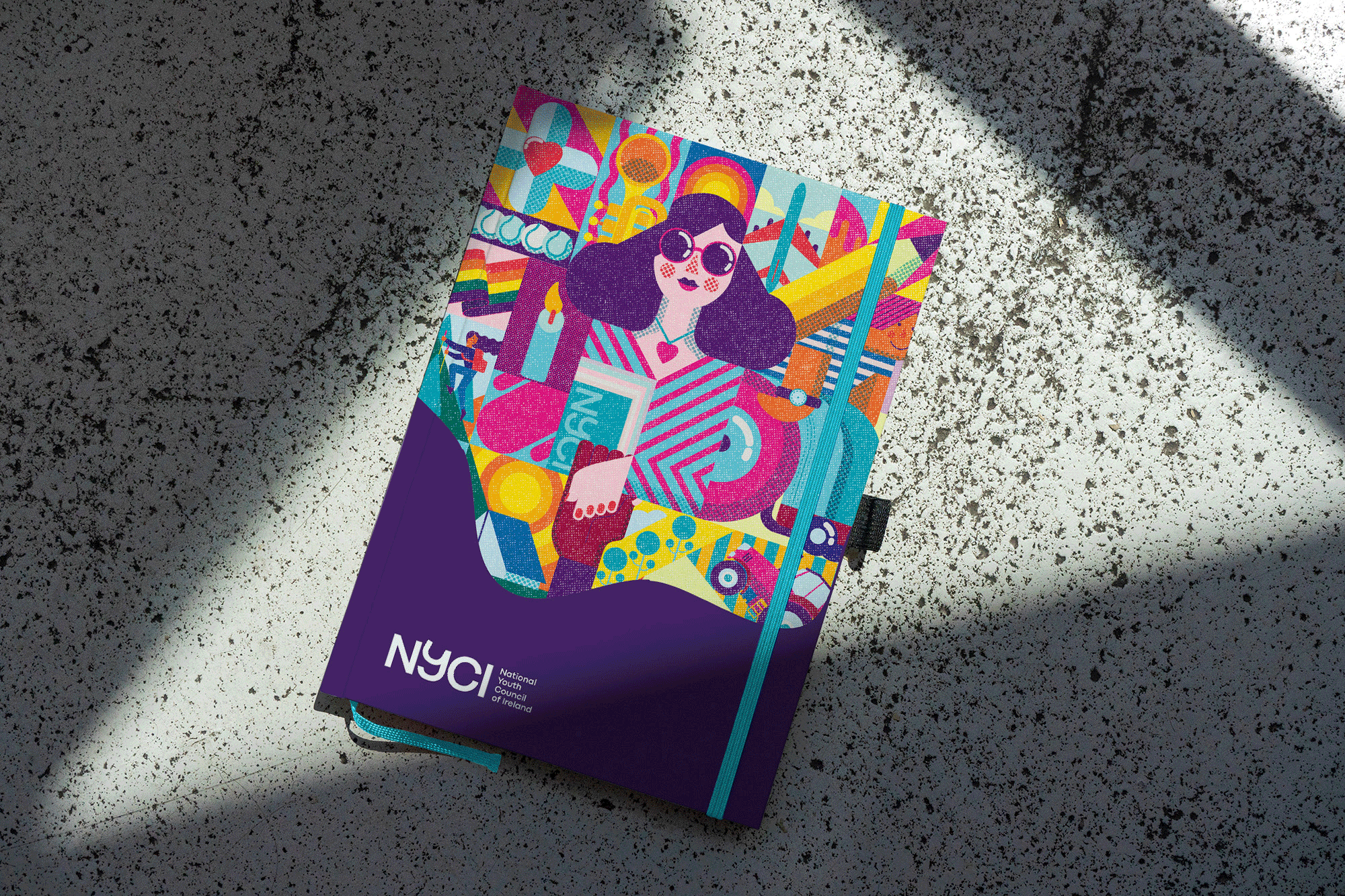
We commissioned a suite of brand illustrations to celebrate the diversity of NYCI’s members and the young people it supports. The illustrations by Ruan van Vliet, Donough O’Malley, Harriet Yakub and Holly Pereira are intentionally very different in style, but all use the NYCI brand palette. These illustrations are applied to core communications and the ambition is to build on these with the work of other illustrators in future.
The new brand system we delivered expresses that NYCI is a mature person, with lots of youthful energy and enthusiasm. They like to act and speak in a considered, purposeful way, basing their assertions on evidence – whether that is the collective voice of their members; their knowledge of trends/approaches in best practice in youth work; their own sense of current or emerging issues to be addressed in the lives of young people or in response to specific challenges that need urgent attention.
This identity was created to have the ability to catch the attention of diverse audiences in different and creative ways, always pointing out a way forward, identifying solutions that work, recognising that ‘one size does not fit all’ for the diversity of young people and the communities in Ireland today.