obodo
2020
Designed by Therese McGuinness and Deirdre Corcoran at Chapter.
Logo animation: Kieran Rigby
Categories: Identity
Industry: Commercial
Tags: Sports, Fitness & Leisure / Branding / Identity
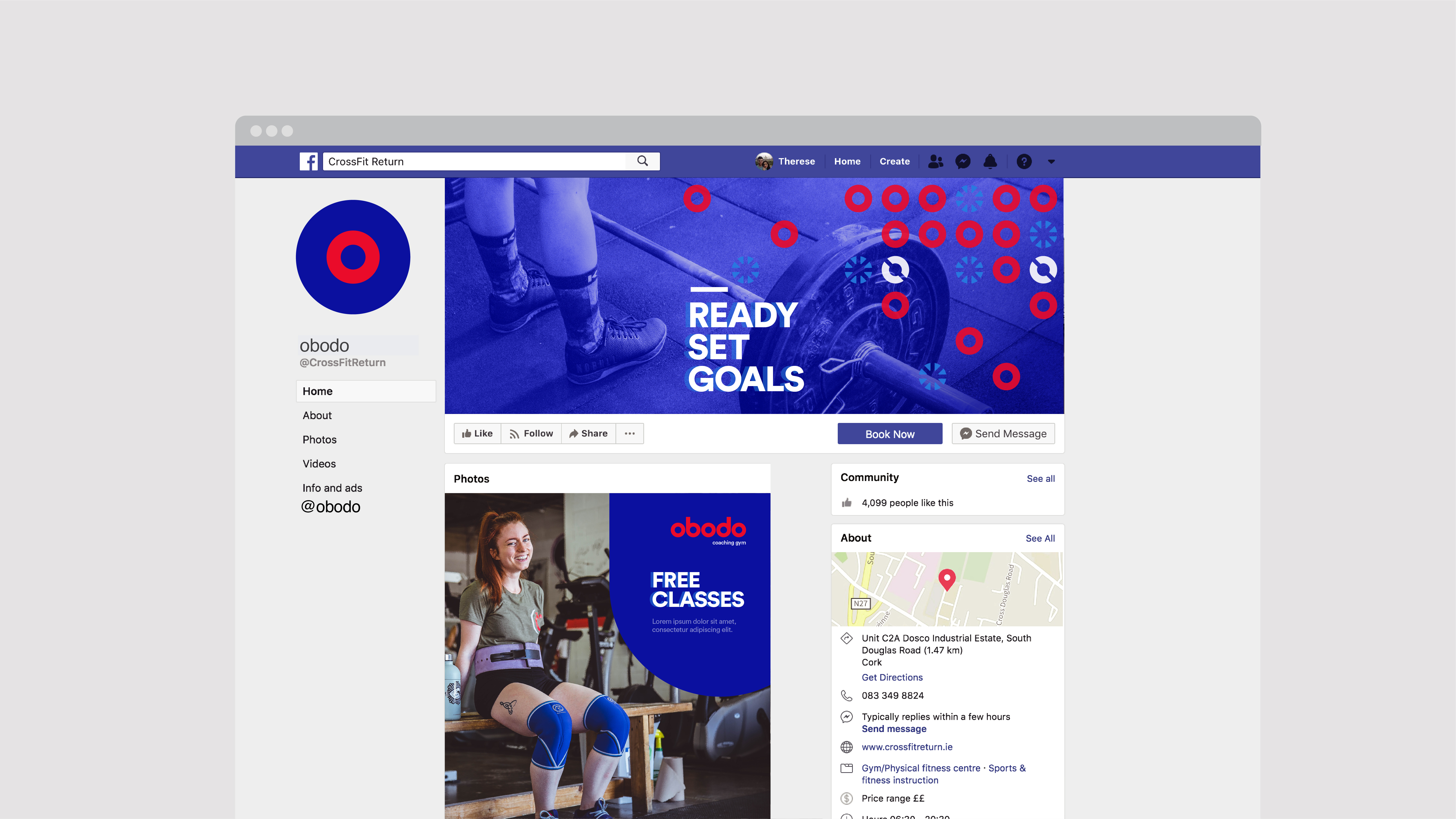
CrossFit Return needed a new name and identity that would allow them to expand their offering whilst retaining the core premise and benefits of a CrossFit style gym. Their calibre of classes and coaching meant that membership was priced at a premium, so we needed to create a brand that could live up to this. We were challenged to create an identity that communicated quality and to position their membership as covetable.
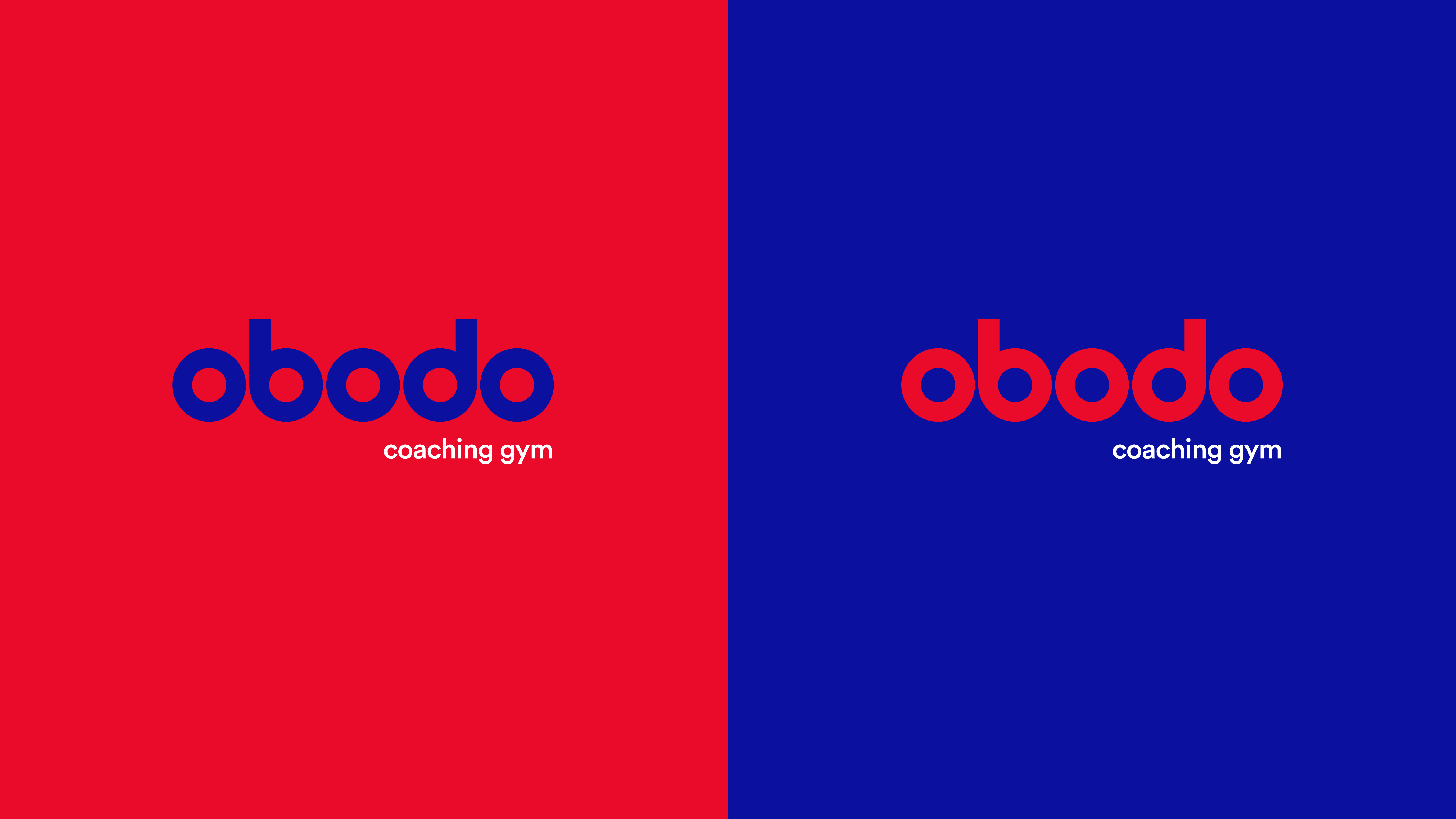
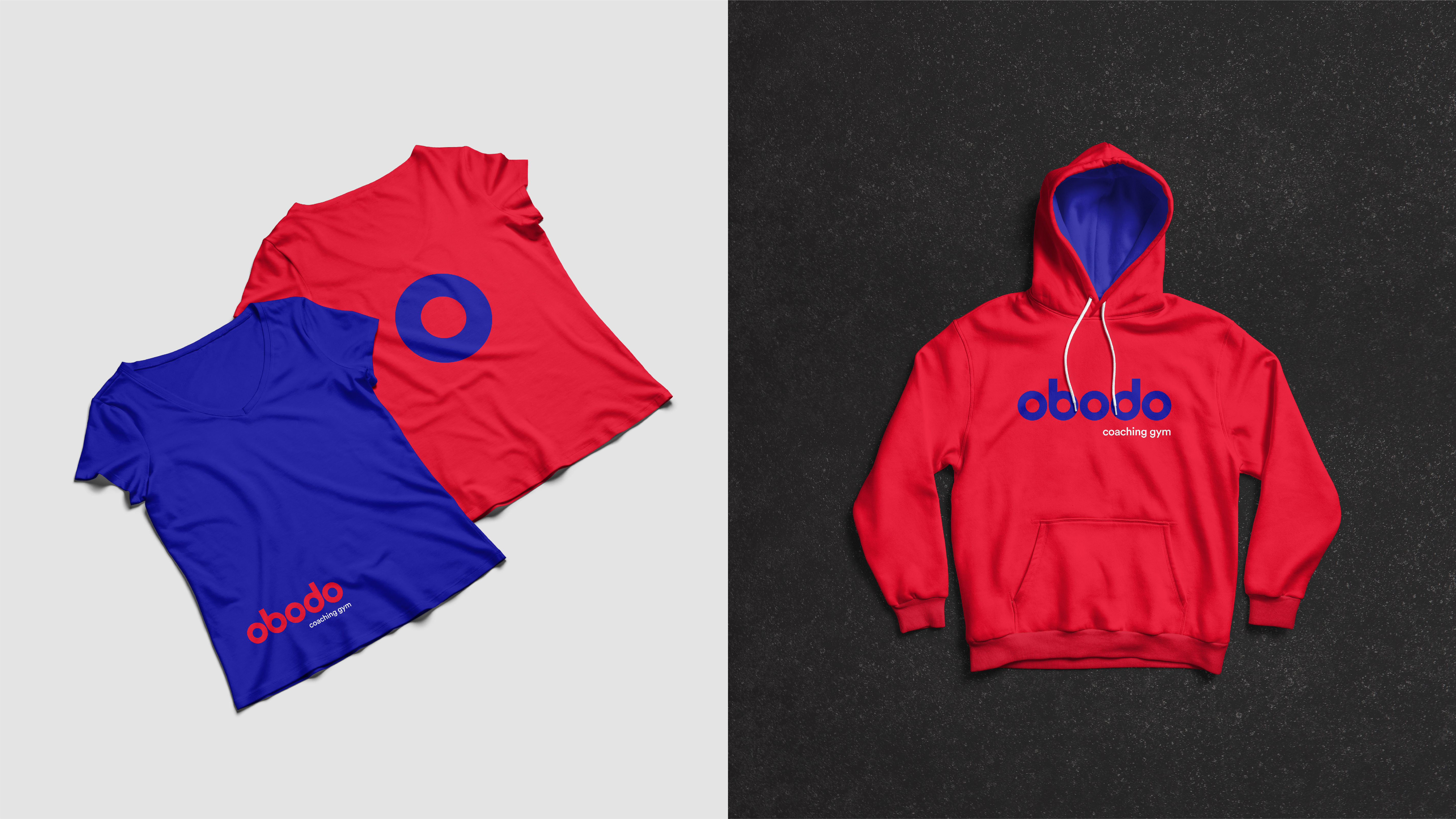
After conducting brand strategy workshops with their team, we concluded that it was the interaction and coming together of group members that was the heart of a CrossFit atmosphere. The name ‘obodo’, meaning ‘community’, in the African language Igbo, summed up their offering in a single beautiful palindrome that became a unique differentiator for the brand. The tagline ‘coaching gym’ also helped to further communicate the hands-on approach inside the gym.
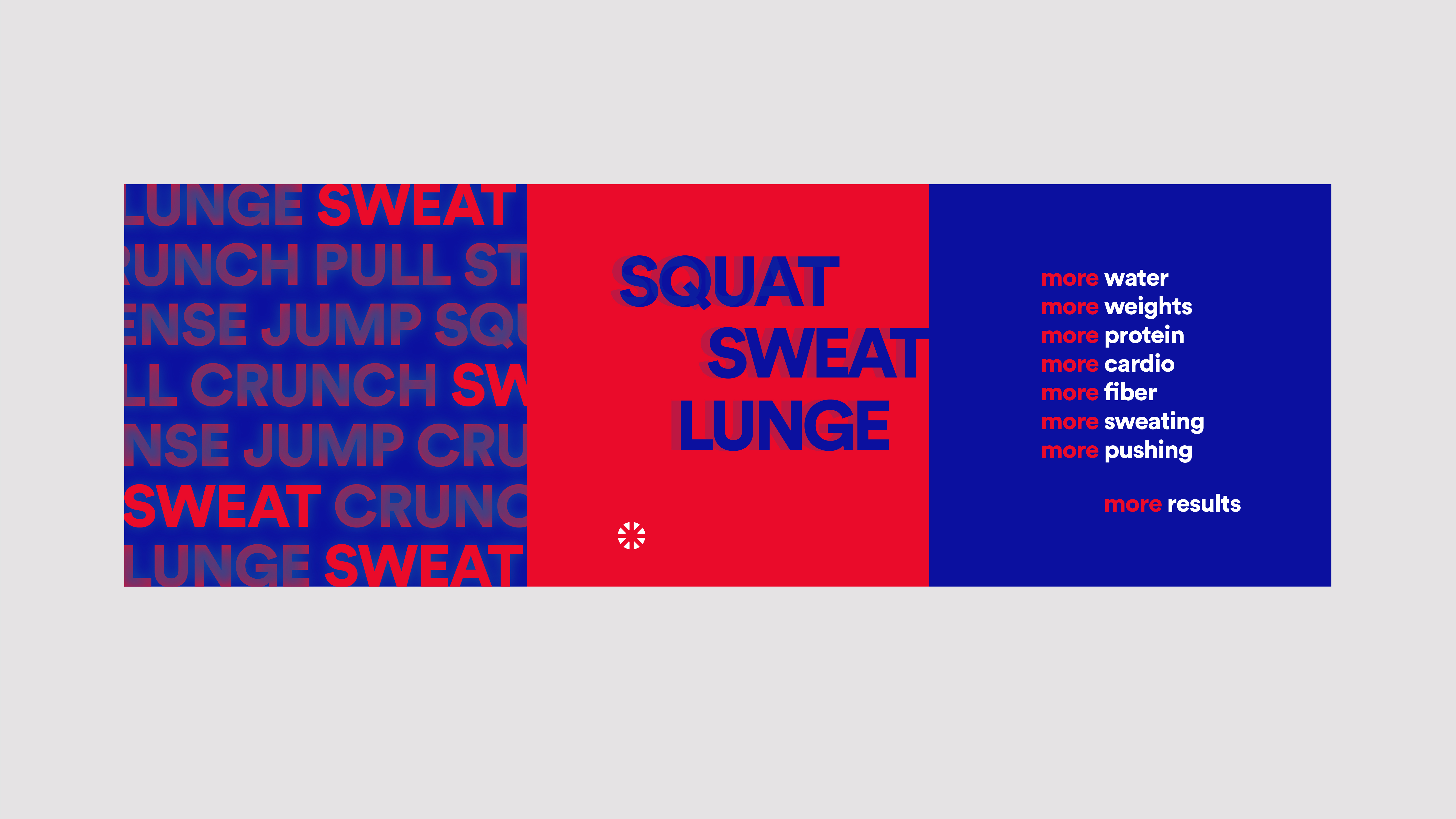
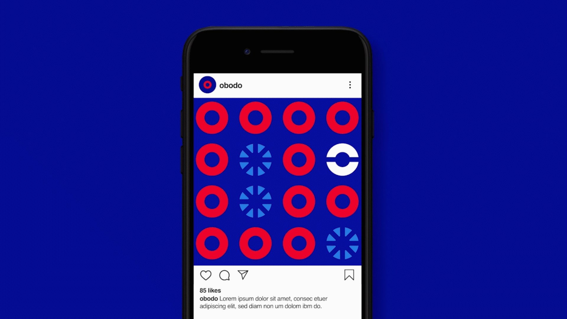
The new vibrant colour palette and playful graphics successfully capture the fun nature of their classes and their tight-knit team. The brand identity now truly reflects the premium nature of their offering and brings an energy to their presence online and in the gym.