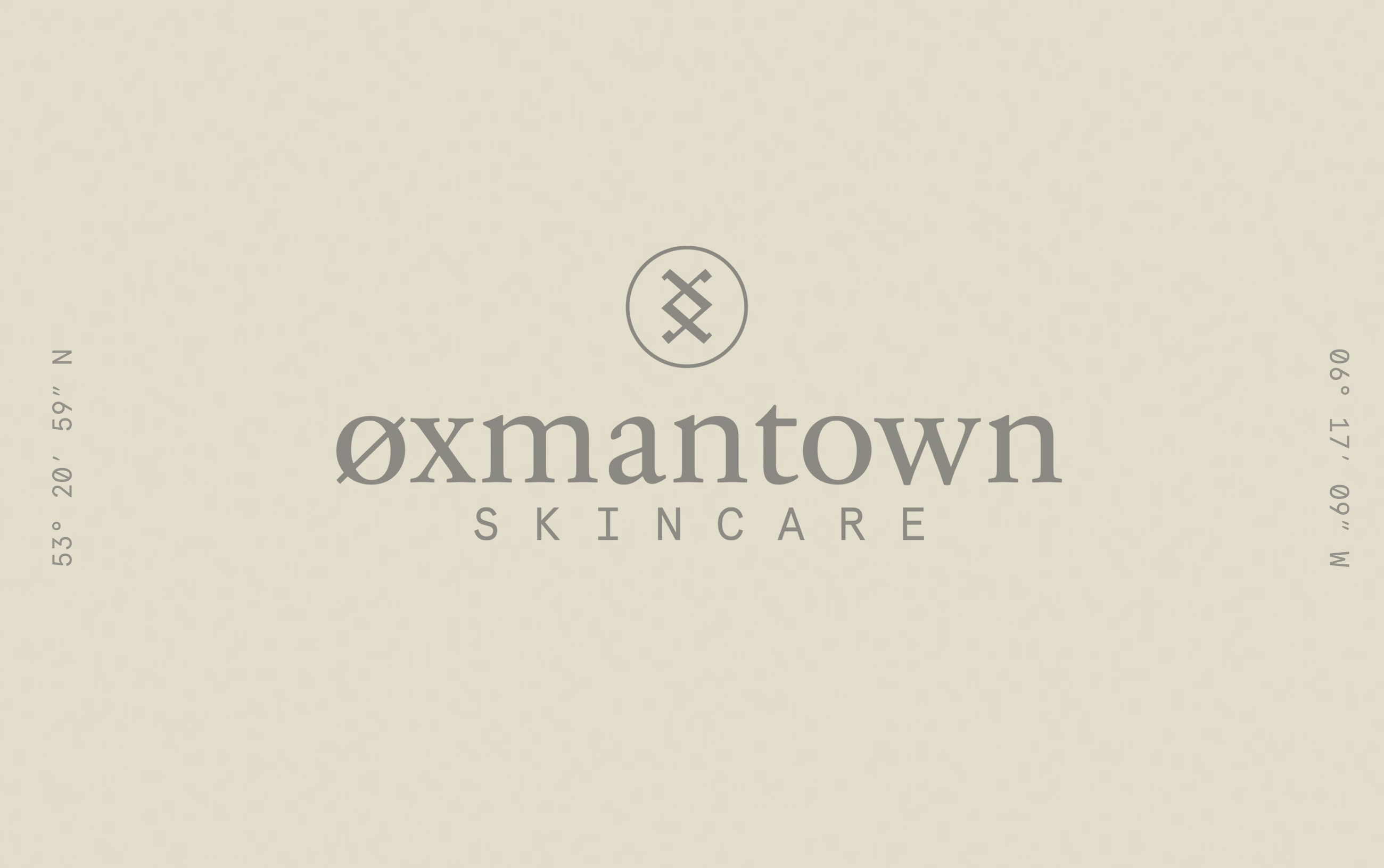
Øxmantown Skincare
Designed by Trevor Finnegan and Shane Bonfield at Revert Design
Intern: Eva Martin
Categories: Identity / Packaging
Industry: Commercial
Tags: Typography
Website: oxmantownskincare.ie
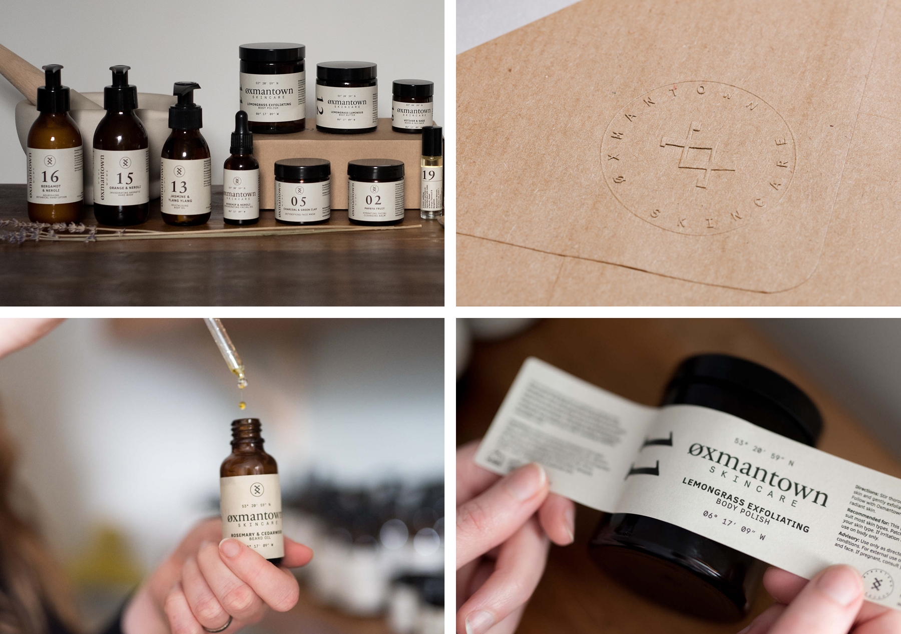
Øxmantown Skincare is a natural, ethical and environmentally friendly skincare producer based in Stoneybatter Dublin.
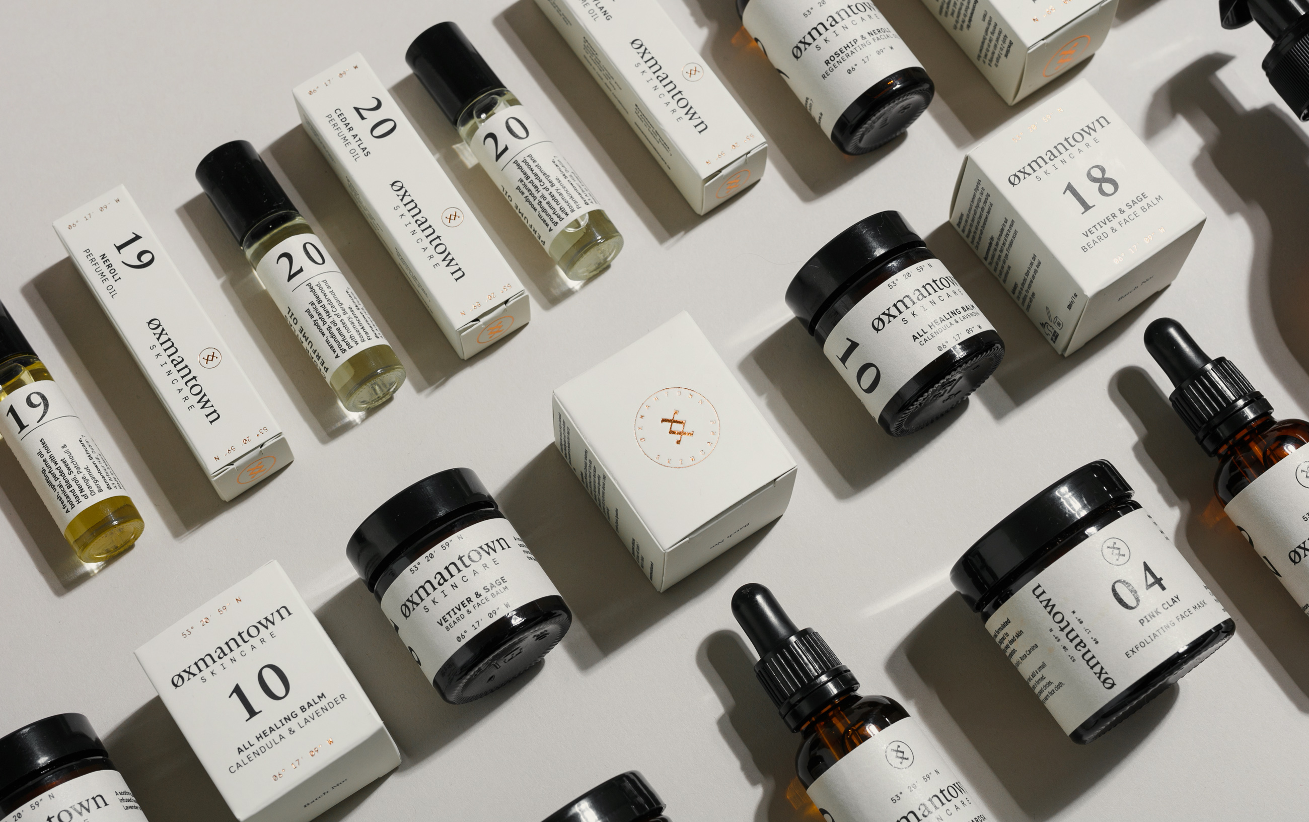
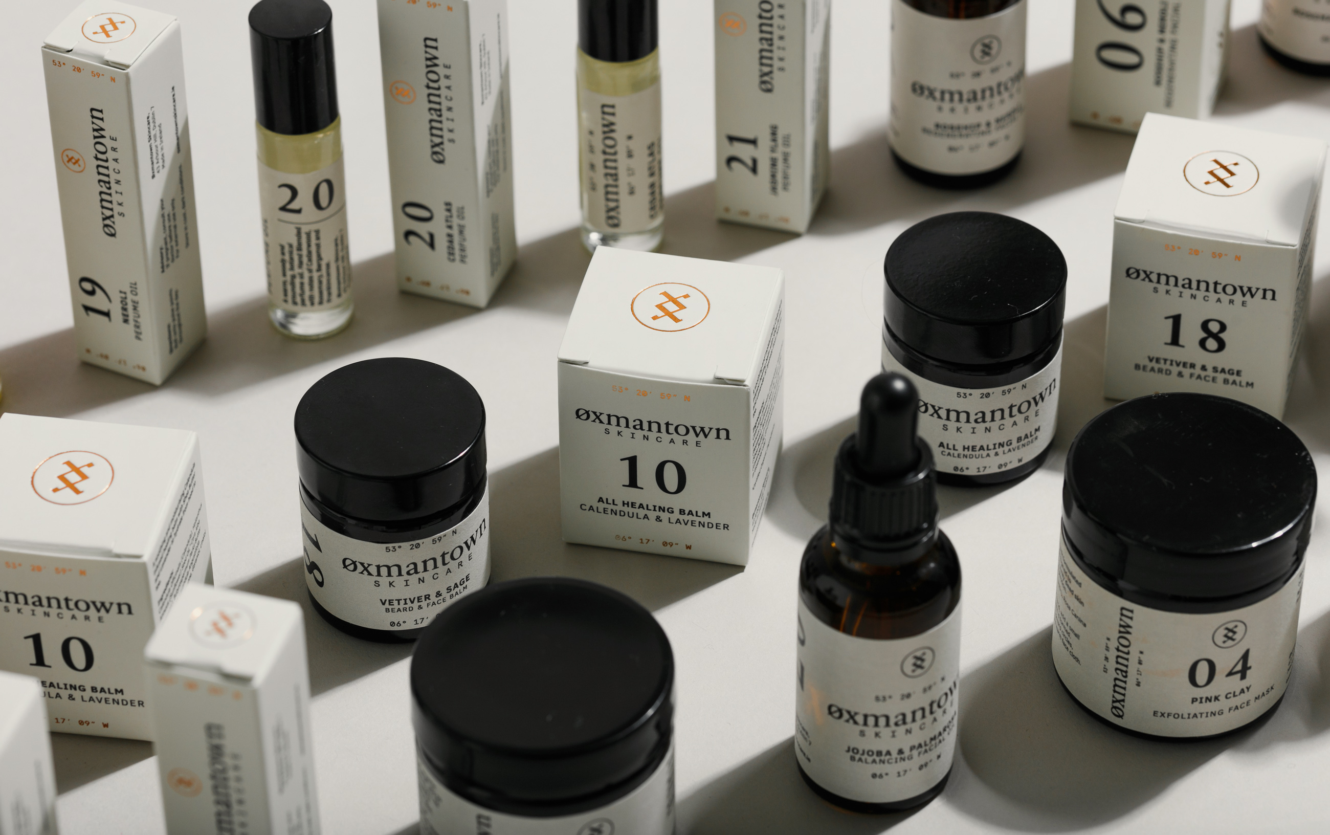
The name originates from an area of Dublin that the Vikings lived, they were known to locals as Oxmen, hence the name. We explored the Runic symbolism that originated in Scandinavia and found the symbol of Norse god 'Inguz' was the symbol for Fertility and youth. We used this across the Øxmantown brand and applied it as a copper foil on the product packaging as an ode to the copper traditions of the Vikings in Ireland.
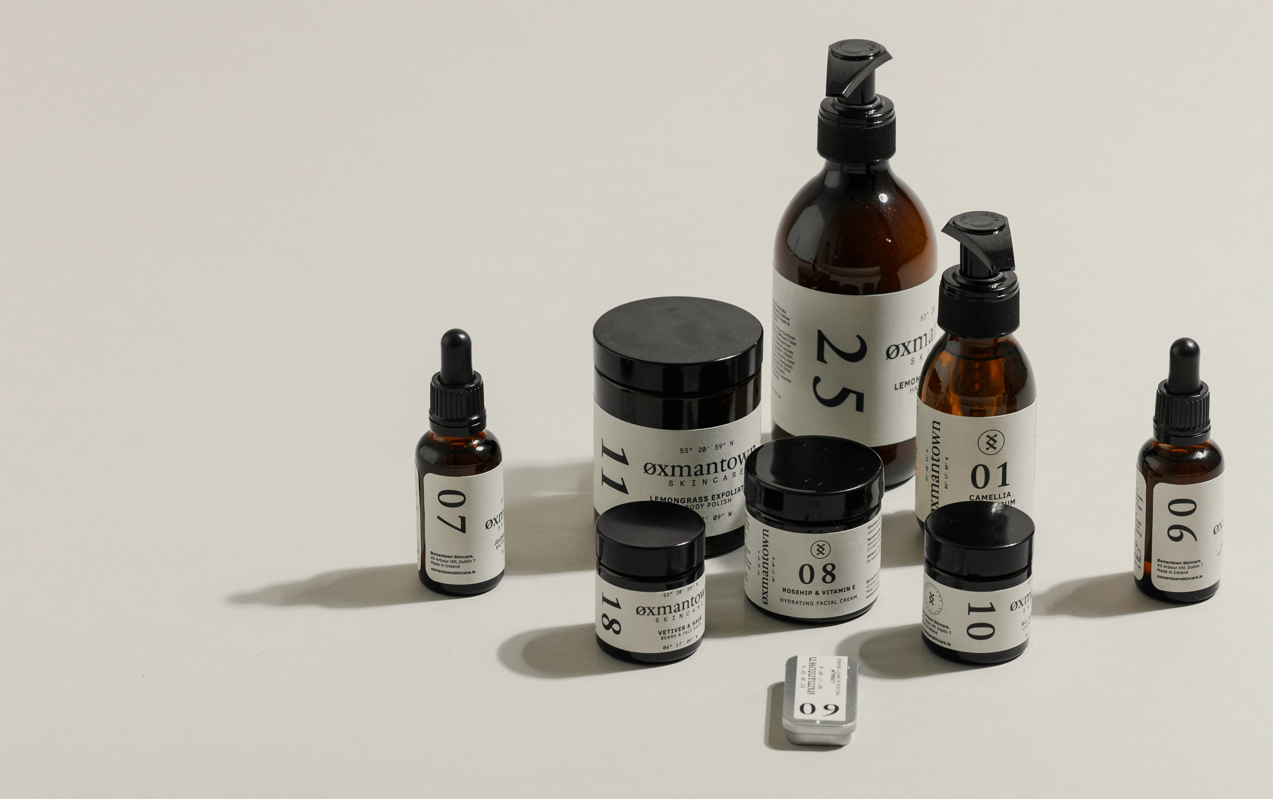
We created a numbering system for the individual products to help consumers easily recognise the various products on the shelf. We also built the website and online store for Øxmantown which has helped grow sales both in Ireland and internationally over the past year.